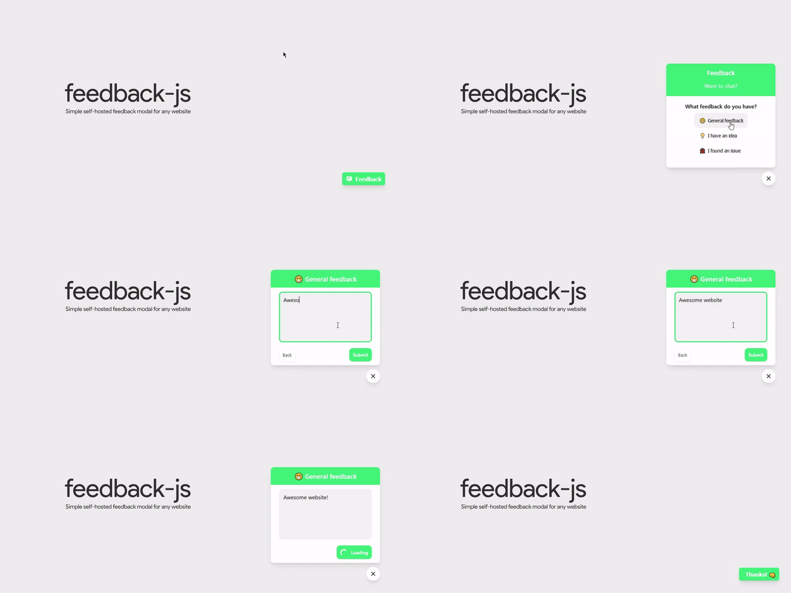
- Easy to integrate with any site (via script tag or NPM)
- Simple and modern design
- Customize feedback types and text
- Works with any backend (self-hosted or form providers)
- Use the default feedback button or trigger the modal from any HTML element
Add this to your HTML page:
<script src="https://cdn.jsdelivr.net/npm/@betahuhn/feedback-js/dist/feedback-js.min.js" data-feedback-endpoint="https://your-custom-endpoint"></script>Install feedback-js using NPM:
npm install @betahuhn/feedback-jsThen add the following JavaScript code:
import Feedback from '@betahuhn/feedback-js'

new Feedback({ endpoint: 'https://example.com/feedback' }).renderButton()
By default feedback-js will add a feedback button to the bottom right corner of your page with the default colors and text. This can be configured using the options object.
There are multiple ways to use feedback-js. The easiest is to include the provided script tag in your HTML file and specify the form endpoint with data-feedback-endpoint:
<script src="https://cdn.jsdelivr.net/npm/@betahuhn/feedback-js/dist/feedback-js.min.js" data-feedback-endpoint="https://your-custom-endpoint"></script>If you want to customize feedback-js further, you can use the data-feedback-opts attribute:
<script data-feedback-opts='{ "endpoint": "http://172.21.52.196:6600/form/feedback", "id": "example", "emailField": true }'></script>You can add the attributes to any HTML element, not just the script tag e.g. <div data-feedback-opts=""></div>.
You can also set it up manually with JavaScript:
import Feedback from '@betahuhn/feedback-js'

const options = {
    endpoint: 'https://example.com/feedback',
    id: 'example',
    emailField: true
}

new Feedback(options).renderButton()
They both achieve the same result.
By default if you specify a data-feedback-endpoint or data-feedback-opts attribute or call .renderButton() the default feedback button will be rendered.
You can also trigger the modal from any element by adding data-feedback-trigger to it:
<button data-feedback-trigger>Give Feedback</button>This will open the modal and the user can give his feedback.
Once the user submits the form, the data will be sent to the specified endpoint.
You will have to handle the submission on the backend yourself. feedback-js will make a POST request to your specified endpoint with the following body:
{
    "id": "example",
    "email": "[email protected]",
    "feedbackType": "issue",
    "url": "https://example.com",
    "message": "When I click x nothing happens."
}
See Node.js example
const express = require('express')
const app = express()
const port = 3000

app.post('/feedback', async (req, res) => {
	const { id, feedbackType, message, email, url } = req.body

	console.log(`New ${ feedbackType } feedback for form ${ id } from user ${ email } on page ${ url }: ${ message }`)
	// do something with feedback

	res.send('ok')
})

app.listen(port, () => {
	console.log(`Listening at http://localhost:${ port }`)
})You can customize feedback-js by passing a options object to new Feedback() or use the data-feedback-opts attribute.
All available options:
const options = {
    id: 'feedback', // id to identify the form on the backend
    endpoint: 'https://example.com/feedback', // enpoint of your backend to handle the submission
    emailField: true, // show email input field, default: false
    events: false, // Emit feedback-submit event instead of sending data to endpoint
    forceShowButton: false, // Show the default button even if you use `data-feedback-trigger`
    types: { // Feedback types
        general: {
            text: 'General Feedback',
            icon: '😁'
        },
        idea: {
            text: 'I have an idea',
            icon: '💡'
        },
        bug: {
            text: 'I found an issue',
            icon: '🐞'
        }
    },
    btnTitle: 'Feedback', // title of button
    title: 'Company Feedback', // text at the top
    inputPlaceholder: 'Your feedback goes here!',
    emailPlaceholder: 'Email address (optional)',
    submitText: 'Submit', // text for submit button
	backText: 'Back', // text for back button
    contactText: 'Or send an email!', // text for other contact option
    contactLink: 'mailto:[email protected]', // link for other contact option
    typeMessage: 'What feedback do you have?', // message for selecting feedback type
    success: 'Thanks! 👊', // message displayed on successfull submission
    failedTitle: 'Oops, an error ocurred!', // title displayed on error
    failedMessage: 'Please try again. If this keeps happening, try to send an email instead.', // default error message if backend doesn't return one
    position: 'right', // position of button left/right
    primary: 'rgb(53, 222, 118)', // primary color
    background: '#fff', // background color
    color: '#000' // font color
}

const feedback = new Feedback(options)
feedback.renderButton()By default the email field will be hidden, you can enable it with the emailField option.
If you want to handle the form submission yourself, you can enable events and listen for the feedback-submit event:
import Feedback from '@betahuhn/feedback-js'

const options = {
    events: true
}

new Feedback(options).renderButton()

window.addEventListener('feedback-submit', (event) => {
    console.log(event.detail) // will contain the feedback data which would have been sent to the endpoint
})By default there are 3 feedback types, general, idea and bug. You can modify their text/icons or even add your own with the types option:
import Feedback from '@betahuhn/feedback-js'

const options = {
    endpoint: 'https://example.com/feedback',
    types: {
        general: {
            text: 'General Feedback',
            icon: '⚠️'
        },
        idea: {
            text: 'I have an idea',
            icon: '💡'
        },
        love: {
            text: 'Send love',
            icon: '💖'
        }
    }
}

new Feedback(options).renderButton()Issues and PRs are very welcome!
The actual source code of this library is in the feedback.js file in the src folder.
- run
yarn lintornpm run lintto run eslint. - run
yarn watchornpm run watchto watch for changes and build to thedistfolder. - run
yarn buildornpm run buildto produce a production version of feedback-js in thedistfolder.
This library was developed by me (@betahuhn) in my free time. If you want to support me:
The design of the feedback form was inspired by @kangabru's feedback form on the Panda Snap dashboard.
Copyright 2021 Maximilian Schiller
This project is licensed under the MIT License - see the LICENSE file for details


