Cookbook v3.0
- How to customize message component
- Message bubble with full width
- Message bubble with custom text styles & fonts
- Message with custom reactions
- Instagram style double-tap reaction
- Slack style messages all on the left side
- Message bubble with name of sender
- Swipe message left to delete and right to reply
- Keyboard
- How to modify the underlying
FlatListofMessageListorChannelList - Image compression
- Override or intercept message actions (edit, delete, reaction, reply, etc.)
- How to change the layout of
MessageInputcomponent - Disable autocomplete feature on input (mentions and commands)
- Push Notifications
Channel component accepts following props, for which you can provide your own components:
-
Message - This is a higher order component, that wraps the UI component (MessageSimple) for message bubble. This component provides underlying UI component with all the handlers necessary. Mostly you shouldn't need to use customize this component, unless you want to write your own handlers for message actions, gesture etc. Using the Message Component as an example can be helpful to understand what props and hooks provide different information to the component. It is also suggested you optimize the component for rendering using memoization as is the standard suggested practice for
FlatListitems.
<OverlayProvider
  bottomInset={bottom}
  i18nInstance={streami18n}
>
  <Chat client={chatClient} i18nInstance={streami18n}>
    <Channel
      channel={channel}
      keyboardVerticalOffset={headerHeight}
      Message={CustomMessageComponent}
    >
      <View style={{ flex: 1 }}>
        <MessageList />
        <MessageInput />
      </View>
    </Channel>
  </Chat>
</OverlayProvider>-
MessageSimple - This is the actual UI component for message bubble. You can still get access to all the handlers defined in Message HOC via
useMessageContext
const CustomMessageUIComponent = () => {
  /** Custom implementation */
}

<OverlayProvider
  bottomInset={bottom}
  i18nInstance={streami18n}
>
  <Chat client={chatClient} i18nInstance={streami18n}>
    <Channel
      channel={channel}
      keyboardVerticalOffset={headerHeight}
      MessageSimple={CustomMessageUIComponent}
    >
      <View style={{ flex: 1 }}>
        <MessageList />
        <MessageInput />
      </View>
    </Channel>
  </Chat>
</OverlayProvider>
If you want to customize only a specific part of MessageSimple component, you can add your own custom UI components, by providing following props on Channel component:
- MessageHeader
- MessageFooter
- MessageAvatar
- MessageStatus
- MessageText
- MessageSystem
- MessageContent
- Attachment
- Giphy
- Card
- FileAttachmentGroup
- FileAttachment
- Gallery
- UrlPreview
<Channel
  channel={channel}
  keyboardVerticalOffset={headerHeight}
  MessageAvatar={CustomAvatarComponent}
  MessageText={CustomTextComponent}
>Because of richness of default message bubble (reactions, attachments, etc), we didn't want to add support this feature OOTB for the simplicity of maintainance. This is something that needs to themed on app level. Here is how you can implement full width message:
import { vw } from 'stream-chat-react-native';

const maxWidth = vw(100) - 72;
const themeStyle = {
  messageSimple: {
    card: {
      container: {
        width: maxWidth,
      },
    },
    content: {
      container: {
        width: maxWidth,
      },
      textContainer: {
        width: maxWidth,
        maxWidth: maxWidth,
      },
      wrapper: { width: maxWidth },
    },
    gallery: {
      // -2 because of the 2px border
      width: maxWidth - 2,
    },
    giphy: {
      container: {
        width: maxWidth,
      },
    },
  },
  // Override reply so the reuse of message style does not overflow text in the message input
  reply: {
    textContainer: {
      maxWidth: undefined,
      width: undefined,
    },
  },
};

<Chat style={themeStyle}>
  ...
</Chat>We use react-native-simple-markdown library internally in the Message component to render markdown content of the text. Thus styling text in the Message component requires a slightly different approach than styling just a single standard Text component in React Native.
In the theme there are multiple text types such as replies and emoji-only messages that have the associated type MarkdownStyle, for the main message text this falls in messageSimple -> content -> markdown within theme. To modify the style of the markdown, text styles can be provided for each of the markdown sub-components that are applied based on text parsing.
export type MarkdownStyle = Partial<{
autolink: TextStyle;
blockQuoteBar: ViewStyle;
blockQuoteSection: ViewStyle;
blockQuoteSectionBar: ViewStyle;
blockQuoteText: TextStyle | ViewStyle;
br: TextStyle;
codeBlock: TextStyle;
del: TextStyle;
em: TextStyle;
heading: TextStyle;
heading1: TextStyle;
heading2: TextStyle;
heading3: TextStyle;
heading4: TextStyle;
heading5: TextStyle;
heading6: TextStyle;
hr: ViewStyle;
image: ImageStyle;
inlineCode: TextStyle;
list: ViewStyle;
listItem: ViewStyle;
listItemBullet: TextStyle;
listItemNumber: TextStyle;
listItemText: TextStyle;
listRow: ViewStyle;
mailTo: TextStyle;
mentions: TextStyle;
newline: TextStyle;
noMargin: TextStyle;
paragraph: TextStyle;
paragraphCenter: TextStyle;
paragraphWithImage: ViewStyle;
strong: TextStyle;
sublist: ViewStyle;
table: ViewStyle;
tableHeader: ViewStyle;
tableHeaderCell: TextStyle;
tableRow: ViewStyle;
tableRowCell: ViewStyle;
tableRowLast: ViewStyle;
text: TextStyle;
u: TextStyle;
view: ViewStyle;
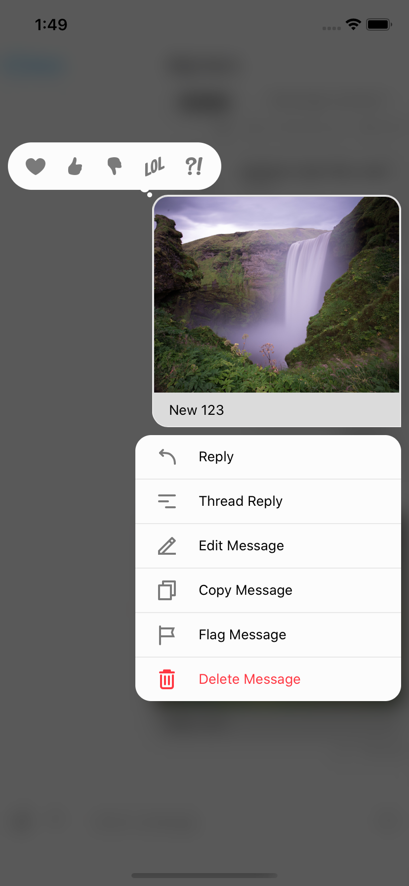
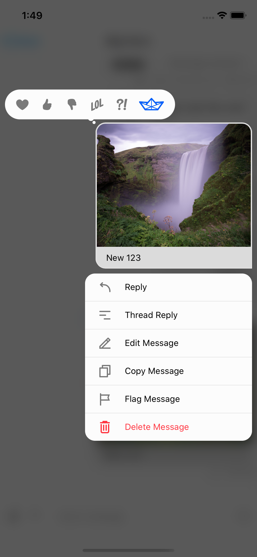
}>;To add custom reactions you need to use the supportedReactions prop on Channel. supportedReactions is an array of ReactionData. The default supportedReactions array contains 5 reactions.
export const reactionData: ReactionData[] = [
  {
    Icon: LoveReaction,
    type: 'love',
  },
  {
    Icon: ThumbsUpReaction,
    type: 'like',
  },
  {
    Icon: ThumbsDownReaction,
    type: 'sad',
  },
  {
    Icon: LOLReaction,
    type: 'haha',
  },
  {
    Icon: WutReaction,
    type: 'wow',
  },
];
To create your own reaction you need both a type and Icon. The Icon is a component with IconProps it is suggested you take advantage of react-native-svg for scaling purposes. It is suggested you look at the default icons for examples of how to create your own that is able to properly use the theme and sizing that are provided via props. Using exported type from stream-chat-react-native a custom reaction can be created and added.
export const StreamReaction: React.FC<IconProps> = (props) => (
  <RootSvg height={21} width={42} {...props} viewBox='0 0 42 21'>
    <RootPath
      d='M26.1491984,6.42806971 L38.9522984,5.52046971 C39.7973984,5.46056971 40.3294984,6.41296971 39.8353984,7.10116971 L30.8790984,19.5763697 C30.6912984,19.8379697 30.3888984,19.9931697 30.0667984,19.9931697 L9.98229842,19.9931697 C9.66069842,19.9931697 9.35869842,19.8384697 9.17069842,19.5773697 L0.190598415,7.10216971 C-0.304701585,6.41406971 0.227398415,5.46036971 1.07319842,5.52046971 L13.8372984,6.42816971 L19.2889984,0.333269706 C19.6884984,-0.113330294 20.3884984,-0.110730294 20.7846984,0.338969706 L26.1491984,6.42806971 Z M28.8303984,18.0152734 L20.5212984,14.9099734 L20.5212984,18.0152734 L28.8303984,18.0152734 Z M19.5212984,18.0152734 L19.5212984,14.9099734 L11.2121984,18.0152734 L19.5212984,18.0152734 Z M18.5624984,14.1681697 L10.0729984,17.3371697 L3.82739842,8.65556971 L18.5624984,14.1681697 Z M21.4627984,14.1681697 L29.9522984,17.3371697 L36.1978984,8.65556971 L21.4627984,14.1681697 Z M19.5292984,13.4435697 L19.5292984,2.99476971 L12.5878984,10.8305697 L19.5292984,13.4435697 Z M20.5212984,13.4435697 L20.5212984,2.99606971 L27.4627984,10.8305697 L20.5212984,13.4435697 Z M10.5522984,10.1082697 L12.1493984,8.31366971 L4.34669842,7.75446971 L10.5522984,10.1082697 Z M29.4148984,10.1082697 L27.8178984,8.31366971 L35.6205984,7.75446971 L29.4148984,10.1082697 Z'
      {...props}
    />
  </RootSvg>
);

const newReactionData = [...reactionData, { type: 'stream', Icon: StreamReaction }];
Both the resulting reaction picker and reaction result can then utilize this additional option.
 |
 |
 |
| Standard Reactions | Modified Reactions | Modified Reaction |
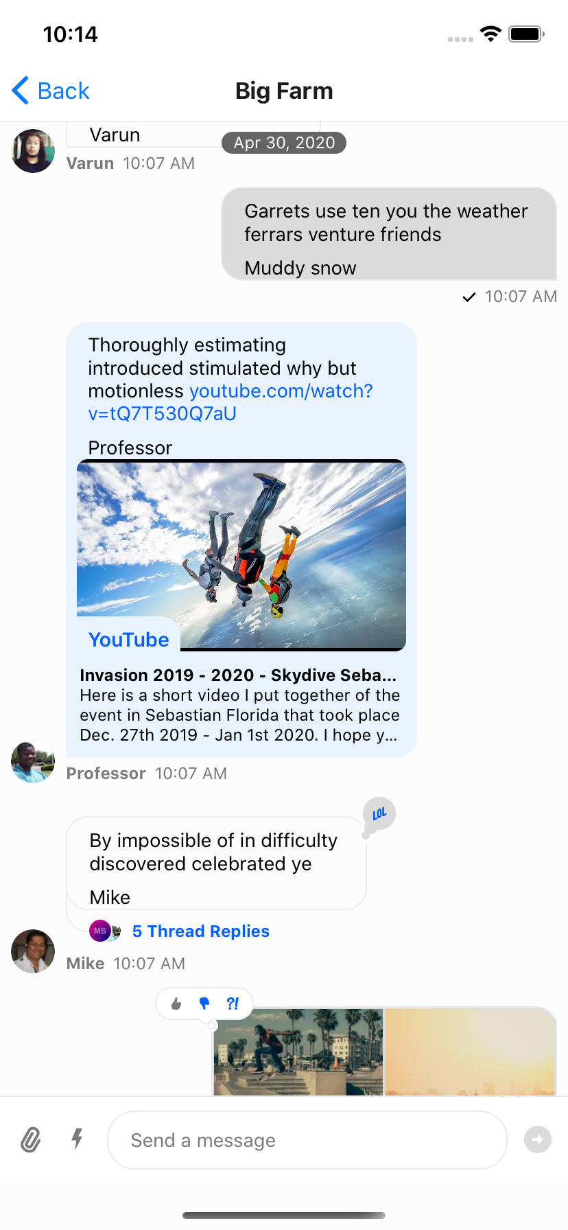
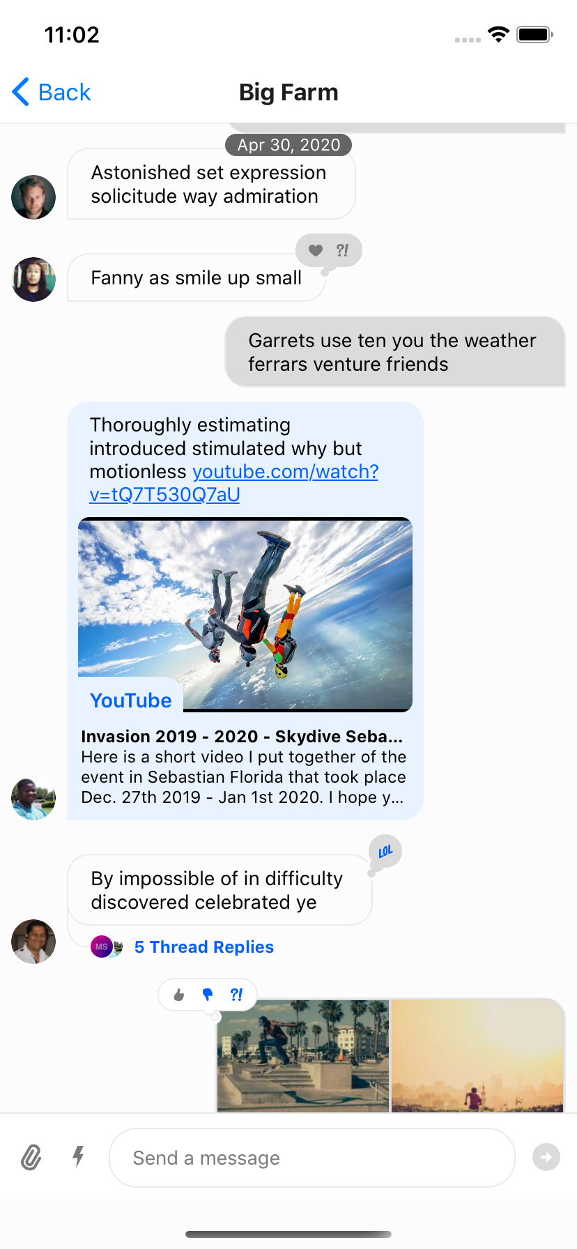
stream-chat-react-native uses a combination of react-native-gesture-handler and standard react-native touchables to provide animations to the UI. Because of this there are conditions in which multiple interactions are taking place at once.
e.g. If you press on a message it begins to depress and after a long hold will present the context menu for the message. But release sooner and if you are pressing on an image, the image viewer will appear.
Therefore to allow for something like double-tap reactions three props are required, onPressInMessage, onLongPressMessage, and onDoubleTapMessage. The first is used to prevent the onPress of inner react-native touchable components from firing while waiting for the double press to be evaluated by react-native-gesture-handler. Using a timeout the original onPress can be called if a second press has not ocurred in the expected time for the double tap to fire.
To prevent this event from firing when a long press occurs onLongPressMessage should be set to a function that cancels the timeout.
The onDoubleTapMessage prop can then be used to add a reaction as it is a function that is provided the message for which it is double tapped. This uses react-native-gesture-handler to track double taps. For convenience, as this is a common design pattern, the function is also is passed the handleReactionDoubleTap function. If defined (this is undefined when there is an error message or the status of the message is failed), this function can be passed a string of the reaction type to add or remove a reaction.
To complete the Instagram feel, setting the OverlayReactionList component to an empty component and limiting the supportedReactions as shown allows only 1 type of reaction and limits the UI to double-tap only to add or remove it.
const lastTap = React.useRef<number | null>(null);
const timeOut = React.useRef<NodeJS.Timeout | null>(null);
const handleDoubleTap = (
  _: GestureResponderEvent,
  defaultTap?: () => void,
) => {
  const now = Date.now();
  if (lastTap.current && now - lastTap.current < 500) {
    if (timeOut.current) {
      clearTimeout(timeOut.current);
    }
  } else {
    lastTap.current = now;
    timeOut.current = setTimeout(() => {
      if (defaultTap) {
        defaultTap();
      }
    }, 500);
  }
};

const onLongPressMessage = () => {
  if (timeOut.current) {
    clearTimeout(timeOut.current);
  }
};

<Channel
  channel={channel}
  keyboardVerticalOffset={headerHeight}
  onDoubleTapMessage={(_message, handleReactionDoubleTap) =>
    if (handleReactionDoubleTap) {
      handleReactionDoubleTap('stream')
    }
  }
  onLongPressMessage={onLongPressMessage}
  onPressInMessage={handleDoubleTap}
  OverlayReactionList={() => null}
  supportedReactions={[{ type: 'stream', Icon: StreamReaction }]}
  thread={thread}
>By default, received messages are shown on left side of the MessageList and sent messages are shown on right side of the MessageList.
You can change this at the Message level via the prop forceAlignMessages or set the alignment for the entire Channel using the same forceAlignMessages prop.
<Channel
  channel={channel}
  forceAlignMessages='left'
  keyboardVerticalOffset={headerHeight}
  thread={thread}
>In group messaging it's important to show the name of the sender associated message bubble - similar to Slack or WhatsApp. By default this is done in the MessageFooter component. This component is fully replaceable via props on Channel and is provided a set of props itself, MessageFooterProps, that can be used for rendering. Any additional data for rendering a custom footer can be pulled from contexts such as the MessageContext via the useMessageContext hook.
If you wanted to move the information about the sender to the top of the message you can provide a MessageHeader component to Channel which is provided the same props, MessageHeaderProps, as the footer, MessageFooterProps, and again can utilize the contexts as needed.
<Channel
  channel={channel}
  keyboardVerticalOffset={headerHeight}
  MessageHeader={(props) =>
    props.message?.user?.id !== chatClient.userID ? (
      <View
        style={{ flexDirection: 'row' }}
      >
        {Object.keys(props.members).length > 2 &&
          props.message.user?.name ? (
            <Text style={[{ color: grey, marginRight: 8 }]}>
              {props.message.user.name}
            </Text>
          ) : null}
        <Text style={[{ color: grey, textAlign: props.alignment }]}>
          {props.formattedDate}
        </Text>
      </View>
    ) : null
  }
  MessageFooter={() => null}
  thread={thread}
> |
 |
 |
| Standard Footer | No Footer | Header Added |
To add swipe controls to your messages it is suggested that you create a custom Message component to replace the default one. An easy solution is to wrap the standard exported message component from stream-chat-react-native in a Swipeable from react-native-gesture-handler/Swipeable. You can then use the functions provided by Swipeable to fine tune to functionality to your liking.
You can add reply functionality by calling setQuotedMessageState, available from the useMessagesContext hook. Or you can delete the message using a combination of client.deleteMessage and updateMessage, the latter of which is also available from the useMessagesContext hook. You can find the internal implementation of these functions in the Message component; or you can add any other functionality you like. It is suggested to add custom logic when implementing swipeable messages to ensure you only can swipe appropriate messages, i.e. you can only swipe to delete messages you have the ability to delete and have not yet been deleted. Using Message props and contexts this is easily achievable.
const SwipeableMessage = (
  props: MessageProps<
    AttachmentType,
    ChannelType,
    CommandType,
    EventType,
    MessageType,
    ResponseType,
    UserType
  >,
) => {
  return (
    <Swipeable
      onSwipeableLeftOpen={reply(props.message)}
      onSwipeableRightOpen={delete(props.message)}
      overshootLeft={false}
      overshootRight={false}
      renderLeftActions={(progress) => (
        <Animated.View
          style={{
            backgroundColor: 'blue',
            transform: [
              {
                translateX: progress.interpolate({
                  inputRange: [0, 1],
                  outputRange: [-100, 0],
                }),
              },
            ],
            width: 100,
          }}
        />
      )}
      renderRightActions={(progress) => (
        <Animated.View
          style={{
            justifyContent: 'center',
            opacity: progress.interpolate({
              inputRange: [0, 1],
              outputRange: [0, 1],
            }),
          }}
        >
          <StreamReaction />
        </Animated.View>
      )}
    >
      <Message {...props} />
    </Swipeable>
  );
}; |
 |
 |
| Swiping partially open (opacity partial) | Swiping all the way open | Swiping using transform -> translateX |
React Native provides an in built component called KeyboardAvoidingView. This component works well for most of the cases where height of the component is 100% relative to screen. If you have a fixed height then it may create some issues (it depends on your use case - and how you use wrappers such as navigation around chat components).
To avoid this issue we built our own component - KeyboardCompatibleView. It contains simple logic - when keyboard is opened (which we can know from events of Keyboard module), adjust the height of Channel component, and when keyboard is dismissed, again adjust the height of Channel component accordingly. KeyboardCompatibleView is near identical to KeyboardAvoidingView from react-native, with some adjustments for app state.
You can provide following props to Channel to customize the builtin KeyboardCompatibleView behavior.
disableKeyboardCompatibleView - boolean
keyboardBehavior - 'padding' | 'position' | 'height'
keyboardVerticalOffset  - number
You can pass additional props directly to the component using the additionalKeyboardAvoidingViewProps.
You can also replace the KeyboardCompatibleView with your own custom component by passing it as a prop to channel.
<Channel
  KeyboardCompatibleView={CustomizedKeyboardView}
  ...
/>
Or disable the KeyboardCompatibleView and use the standard KeyboardAvoidingView from react-native.
You can disable KeyboardCompatibleView by using prop disableKeyboardCompatibleView on the Channel component.
<Channel
  disableKeyboardCompatibleView
  ...
/>You can additionally pass props to the underlying FlatList using additionalFlatListProps prop.
<ChannelList
  additionalFlatListProps={{ bounces: true }}
  filters={filters}
  sort={sort}
/><MessageList additionalFlatListProps={{ bounces: true }} />If an image is too big it may cause a delay while uploading to our server. You can elect to compress images prior to upload by adding the compressImageQuality prop to Channel.
compressImageQuality can be a value from 0 to 1, where 1 is the best quality, i.e. no compression. On iOS, values larger than 0.8 don't decrease the quality a noticeable amount on most images, while still reducing the file size significantly when compared to the uncompressed version.
There are a number of message actions you may want to intercept or override. Channel takes as props and passes on to the MessagesContext all of these intercepts and overrides.
The intercepts will not change the standard functions but will be called during their calls if provided. For actions such as analytics these are good to take advantage of. All of these intercept functions receive the message they are called on, and handleReaction additionally receives the reaction type.
You can also override the built in functions for these actions if you so choose. With the exception of selectReaction all of the functions are provided the message they are called on and must return a MessageAction for use in the context menu. selectReaction is also provided the message but should return an async function that takes a reactionType. This is called with the selected reaction type when a reaction is selected in the context menu.
type MessageAction = {
  action: () => void;
  title: string;
  icon?: React.ReactElement;
  titleStyle?: StyleProp<TextStyle>;
};
MessageAction is provided to the context menu where when selected action is called for the item. title, icon, and titleStyle are used to modify the appearance.
<Channel
  channel={channel}
  editMessage={(message) => ({
    action: () => console.log(message.text),
    icon: <StreamReaction />,
    title: 'Custom Edit',
    titleStyle: { color: '#005FFF' },
  })}
  keyboardVerticalOffset={headerHeight}
  thread={thread}
>
|
|
 |
| Props for intercepting | Props for overriding | editMessage override example |
We provide the MessageInput container out of the box in a fixed configuration with many customizable features. Similar to other components it accesses most customizations via context, specially the MessageInputContext which is instantiated in Channel. You can also pass the same props as the context provides directly to the MessageInput component to override the context values.
<Channel
  channel={channel}
  Input={() => null}
  keyboardVerticalOffset={headerHeight}
  Message={CustomMessageComponent}
>
  <View style={{ flex: 1 }}>
    <MessageList />
    <MessageInput
      Input={() => <View style={{ height: 40, backgroundColor: 'red' }} />}
    />
  </View>
</Channel>
The code above would render the red View and not null as the props take precedence over the context value.
You can modify MessageInput in a large variety of ways. The type definitions for the props give clear insight into all of the options. You can replace the Input wholesale, as above, or create you own MessageInput component using the provided hooks to access context.
 |
 |
 |
| Replace SendButton | hasFilePicker & hasImagePicker - false | numberOfLines={2} |
NOTE: The additionalTextInputProps prop of both Channel and MessageInput is passed the the internal TextInput component from react-native. If you want to change the TextInput component props directly this can be done using this prop.
The auto-complete trigger settings by default include /, @, and : for slash commands, mentions, and emojis respectively. These triggers are created by the exported function ACITriggerSettings, which takes ACITriggerSettingsParams and returns TriggerSettings. You can override this function to remove some or all of the trigger settings via the autoCompleteTriggerSettings prop on Channel. If you remove the slash commands it is suggested you also remove the commands button using the prop on Channel hasCommands. You can remove all of the commands by returning an empty object from the function given to autoCompleteTriggerSettings.
<Channel
  autoCompleteTriggerSettings={() => ({})}
  channel={channel}
  hasCommands={false}
  keyboardVerticalOffset={headerHeight}
  thread={thread}
>- https://getstream.io/chat/docs/push_ios/?language=java
- https://getstream.io/chat/docs/rn_push_initial/?language=java
- https://getstream.io/chat/docs/rn_push_ios/?language=java
- https://getstream.io/chat/docs/push_android/?language=java
- https://getstream.io/chat/docs/rn_push_initial/?language=java
- https://getstream.io/chat/docs/rn_push_android/?language=java
-
A user must be a member of channel if they expect a push notification for a message on that channel to be sent.
-
We only send a push notification when a user is NOT connected to chat, i.e. if a user does NOT have any active WS (websocket) connection. A WS connection is established when you call
connectUseron the instance ofStreamChat. You must also calladdDevicewith the users device token on the instance ofStreamChatto provide the token to the server for push.
Usually you want to receive push notification when your app is in the background. When your app is closed (not quit) the WS connection stays active for approximately 15-20 seconds; after which the system will break the connection automatically. For these 15-20 seconds you won't receive any push notifications since the WS is still active.
To handle this case you have to manually break the WS connection when your app is closed.
await client.wsConnection.disconnect();And when app is re-opened (brought to foreground) you need to re-establish the connection.
await client._setupConnection();You can use AppState from react-native to detect whether the app is in the foreground or background on change.