Developing "coupling graphs" #169
Comments
|
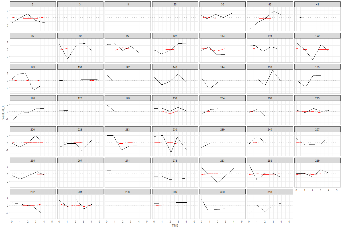
See the script Graph 1
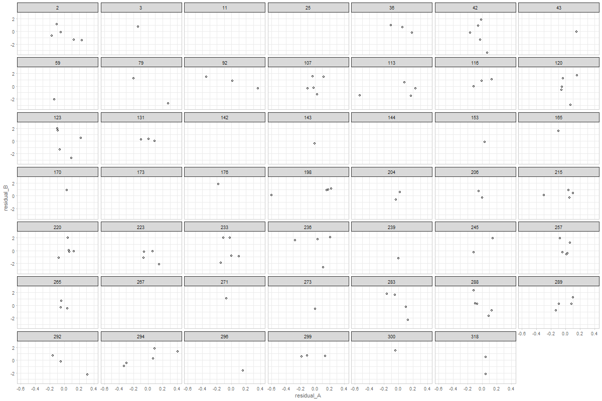
not really sure what this means. Could you please elaborate? Graph 2
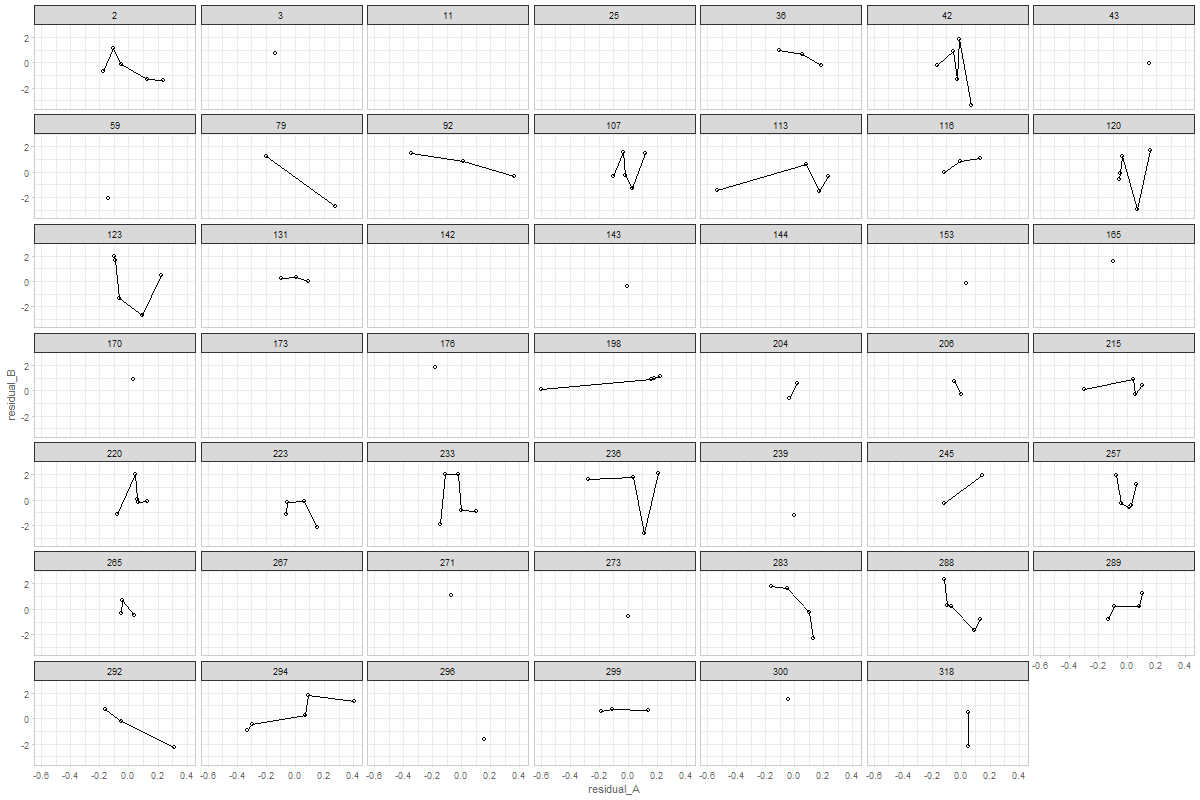
here's a version of this graph with connected dots. You can adjust or further develop graph in the |
|
@andkov - wow! That was fast! Thanks! Graph 1 is exactly what I meant. By more similar metric I meant that both would hover around zero, whereas their original raw metrics might be 0-44 versus 300-600. Too bad they don't all look like person 198!! I'm surprised that cognitive is black. I would have expected the physical measurements to be more variable. For Graph 2, I wondered about a single summary graph that contained all individuals' data. That was why I suggested joining points within person - to have a sense of which points went together. Looking at person 198 again, though, shouldn't all their points fall between -1 and 1? |
ah. of course. this explains why the black (cognitive, in this case boston story immediate) is all over the place, while red (physical, in this case fev) is relatively stable. Here's the descriptives for the observed measures: > summary(ds_wide$observed_A)
Min. 1st Qu. Median Mean 3rd Qu. Max. NA's
0.420 1.720 2.145 2.134 2.560 3.930 749
> summary(ds_wide$observed_B)
Min. 1st Qu. Median Mean 3rd Qu. Max. NA's
0.000 8.000 10.000 9.609 11.000 12.000 395 Redisualizing helps reducing the span, but it still remain substantially different: > summary(ds_wide$residual_A)
Min. 1st Qu. Median Mean 3rd Qu. Max. NA's
-1.0970 -0.0893 0.0033 -0.0001 0.1033 0.6330 749
> summary(ds_wide$residual_B)
Min. 1st Qu. Median Mean 3rd Qu. Max. NA's
-7.3840 -0.9522 0.0680 -0.0001 0.9649 3.6590 395 And of course with other measures, this would be even greater. I turn these residual scores into z-scores, which should help this issue |
|
Thanks @andkov - I'm not sure we want z-scores. Our model is not standardized, and seeing how much a variable jumps around should be informative. When I said "more similar metric" I was indicating that it would be easy to plot with the same axis (both would have scores around 0). My surprise about the cognitive residuals seeming larger than the physical was based on my memory of the observed raw trajectories. My sense had been that the physical measures jumped around quite a bit. Are you able to resolve the apparent inconsistencies between Graphs 1 & 2 for person 198? Is it just my misinterpretation that is confusing me? Thanks!! |
|
@andkov ...are you saying that the physical looks like smaller variability because the original range is wider? |
a slight diversion.I have been troubled by such patterns as > ds_wide %>%
+ dplyr::filter(id == 153) %>%
+ dplyr::select(id,observed_A, observed_B, predicted_A, predicted_B, residual_A, residual_B)
id observed_A observed_B predicted_A predicted_B residual_A residual_B
1 153 NA 8 NA 9.556000 NA -1.1525397
2 153 NA 10 NA 9.466136 NA 0.3954367
3 153 NA 8 NA 9.370914 NA -1.0154452
4 153 NA 12 NA 9.282460 NA 2.0129001
5 153 2.29 9 2.255416 9.184888 0.2008373 -0.1369478Even though there is only one observation in A, the model still estimates. I wonder if the peculiar patterns we see in correlations may be due to the fact that many factor scores are coming from cases like these. I've looked at this study (MAP) to get these counts: count_miss <- ds_wide %>%
dplyr::group_by(id) %>%
dplyr::mutate(
n_nonmiss_a = length(observed_A) - sum(is.na(observed_A)),
n_nonmiss_b = length(observed_B) - sum(is.na(observed_B))
) %>%
dplyr::ungroup() %>%
dplyr::distinct(id,n_nonmiss_a, n_nonmiss_b)
count_miss %>%
dplyr::group_by(n_nonmiss_a) %>%
dplyr::count() %>%
dplyr::mutate(
cumulative = cumsum(n)
)
# A tibble: 6 × 3
n_nonmiss_a n cumulative
<int> <int> <int>
1 0 26 26
2 1 74 100
3 2 54 154
4 3 53 207
5 4 55 262
6 5 59 321as you see out of > count_miss %>%
+ dplyr::group_by(n_nonmiss_b) %>%
+ dplyr::count() %>%
+ dplyr::mutate(
+ cumulative = cumsum(n)
+ )
# A tibble: 5 × 3
n_nonmiss_b n cumulative
<int> <int> <int>
1 1 42 42
2 2 39 81
3 3 34 115
4 4 42 157
5 5 164 321In fact, there are even cased in which we have 0 observed point on A, only 1 observed point in B and we still get an estimate for the factor score! > count_miss %>%
+ dplyr::group_by(n_nonmiss_a, n_nonmiss_b) %>%
+ dplyr::count() %>%
+ print(n=100)
Source: local data frame [21 x 3]
Groups: n_nonmiss_a [?]
n_nonmiss_a n_nonmiss_b n
<int> <int> <int>
1 0 1 9
2 0 2 6
3 0 3 5
4 0 4 3
5 0 5 3
6 1 1 33
7 1 2 19
8 1 3 4
9 1 4 3
10 1 5 15
11 2 2 14
12 2 3 14
13 2 4 10
14 2 5 16
15 3 3 11
16 3 4 16
17 3 5 26
18 4 4 9
19 4 5 46
20 5 4 1
21 5 5 58Which is, I guess, because of the FIML option? To clarify, i'm using the observation THAT HAS BEEN USED BY MPLUS during the estimation, recovering it from the output. |
|
@andkov - damn. I'm sure there are people who would be fine with this. I am not one of them. Thanks for checking it!!! In theory (at least with MAR), the S-S correlation should be the same with and without these people who have data on only one or the other variable. Might be worth checking, though. What happens if you restrict to only folk who have at least 2 of each variable? |
|
@ampiccinin , I can certainly do that. It will bring down the sample size, but not catastrophically. |
I wonder if it's just hard seeing it on this graph. Here's the data for person > ds_wide %>%
+ dplyr::filter(id == 198) %>%
+ dplyr::select(id,observed_A, observed_B, predicted_A, predicted_B, residual_A, residual_B)
id observed_A observed_B predicted_A predicted_B residual_A residual_B
1 198 2.480 12 2.319000 11.09000 0.161000 0.910000
2 198 2.420 12 2.237832 11.01248 0.182168 0.987520
3 198 1.550 11 2.147230 10.92595 -0.597230 0.074050
4 198 2.285 12 2.060188 10.84282 0.224812 1.157180
5 198 NA 11 NA 10.75417 NA 0.245835 |
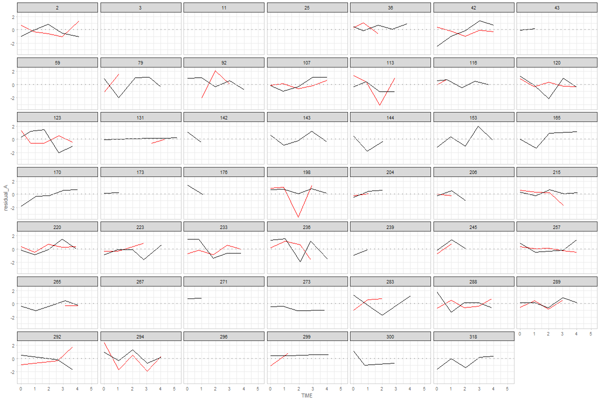
standardized residual, versions of graphs
yes, exactly.
IMHO, i don't see a problem with linear transformation of the residuals (dividing by respective sd) for the sake of residual diagnostics. No to do any computation on them, but just adjust to VIEW them better. I agree, the fluctuation on the raw scale should be informative, but if our objective is simply to visually compare residuals, it seems that such standardization is permissible. |
|
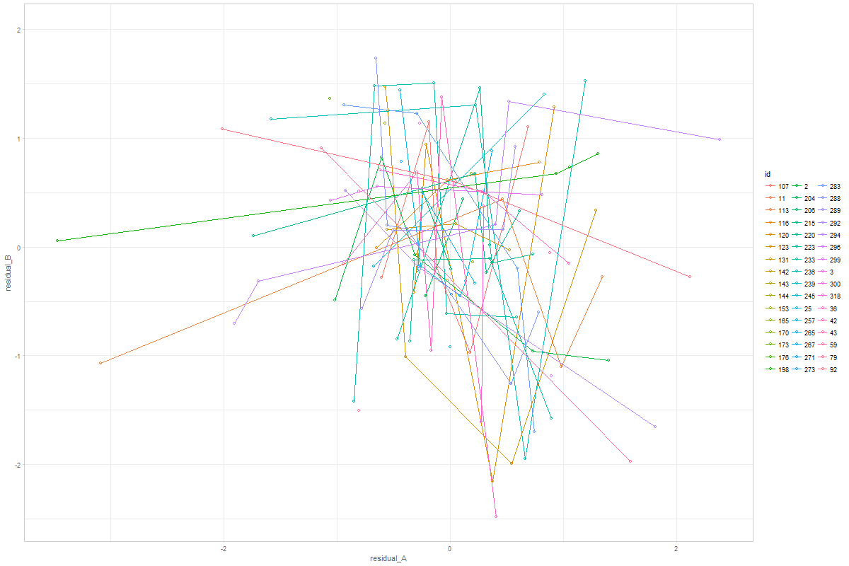
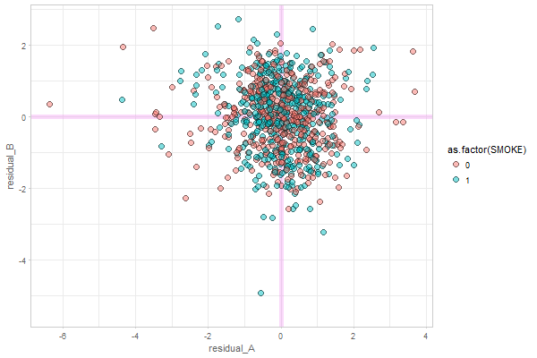
@ampiccinin , here are the modifications based on your comments: Graph 1Here, residual scores have been divided by respective sd of the process Graph 2Here, all individuals' residuals have been placed on the same XY canvass. Drawing the lines throw the points is, of course, possible, but i'm afraid not practical. After 10+ individuals it becomes a mess. Here's the same 48 persons, with color mapped onto id. A more illuminating display would be, IMHO, to get rid of the lines, and map the value of a covariate onto the color, like we did in enhanced anatomy plots (e.g.). Here's a sketch of such a draft using all individuals and mapping the binary |
The graphing itself is relatively easy, once the data is extracted and shaped to the needed form. It's the data wrangling that takes 80-90% of the time in a normal graphing project. In this case, however, I've spent so much time learning these structures and developing custom functions to process them (and failing most of the times) that it became possible to turn it around so fast. Portland is metaphor for the industrial age coming to data science: massive initial investment, but cheap, fast, and reliable production once the machinery is set up and calibrated (and engineers are trained!). You are starting to see that initial investment (giving me time and bringing @wibeasley along) paying off. I wish it were faster than that, but it seems that none of us had a clear idea of the magnitude of the engineering challenge the coordinated analysis presents on the scale you've envisioned. Well, retrospectively, I'd glad I was overly optimistic: not sure i'd have a heart to jump into something like that with a full disclosure, given the time lag in publications that it brings. :) The bottom line: here's to your patience and my perseverance! 👍 |
|
@andkov :) you are absolutely right -
...Presumably the example we are looking at does not show (statistically significant) coupling (right?) and that we would see something more of an elliptical cloud if there were. I find it interesting that there seem to be cases with a positive association, and others with negative (and a bunch with no association or [mainly] not enough data on both variables). I suspect we would be going down a rabbit hole to chase whether there was something different about the + and - coupling people, but maybe when the Portland papers are submitted, if we are bored and looking for something to do, we could play around with this (with a strict time limit so we don't end up in too long a tea party with the Mad Hatter). |
|
@knighttime @jru7sh - what do you think of the latest "Graph2" to represent the coupling? the only thing that bothers me ( @andkov ) is having multiple points per person in a single graph that does not differentiate among people...but I can live with this. Can we/would it be useful to - use this for Jamie's BSIT project? Is it easy enough to modify the syntax for her variables? |
yes. good point. will adopt in the next iteration.
yes, in terms of graphing, these functions are transferable (i'm assuming @knighttime is dealing with bivariate growth models). However, if there are multiple studies + multiple models it might take some time to set up the production line (i'm talking 2-3 hours on my part + some time by the analyst to learn the set up) |
If my understanding of "coupling" is correct (association between the residuals of two processes), then that's exactly my interpretation of these patterns ( latest version of graph 2) |
|
@andkov : For now, @knighttime 's purpose is plots for a single study. I hope we are then talking 2-3 minutes, rather than hours... |
|
@andkov - we could plot a significant association, such as OCTO female pulmonary block or mmse. ...but don't let me take you too far away from what you were otherwise planning to do today!! this can wait. |
That's not an unreasonable estimate. However, it all boils down to the options @knighttime used for modeling, whether it permits easy extraction. It's easy to remedy, but 2-3 minutes is the estimate if everything is set up as needed. |
|
@andkov My coupling model is using MAP. I understand the code for the graph but it is pulling the model info from the helper functions - those I can't figure out. Just looking at the code for the graph though, it looks like I can just substitute my own residual for cognition for "residual A" and residual for BSIT for "residual B" then it should work. is there a shorthand code to get that? resid(ds$cogn_ep) maybe? I will try it out tomorrow and see how it goes |
|
@knighttime @andkov - possibly important detail: Jamie's models are in R. Presumably she can save model implied residuals and use them in your syntax that grabs them from Mplus? (The fact that you are running the models in different software just struck me now) |
|
@ampiccinin @knighttime @knighttime, I think you are on the right track. But I doubt it would be as simple as that because the model shape is different (is it?). Best strategy is to study the data structure that goes into the graph and try to replicate that. Let me know if you get stuck. I'm pulling the models from Mplus outputs, you can disregard what happens before graphing |
but the flexibily of data selection is left to be desired. needs more
work
The `foresplot::forestplot` function is suboptimal solution. Can't
control graph size, font size, and many other thing. Choose ggplot based
graphics next time.
@ampiccinin @knighttime

Objective:
The text was updated successfully, but these errors were encountered: