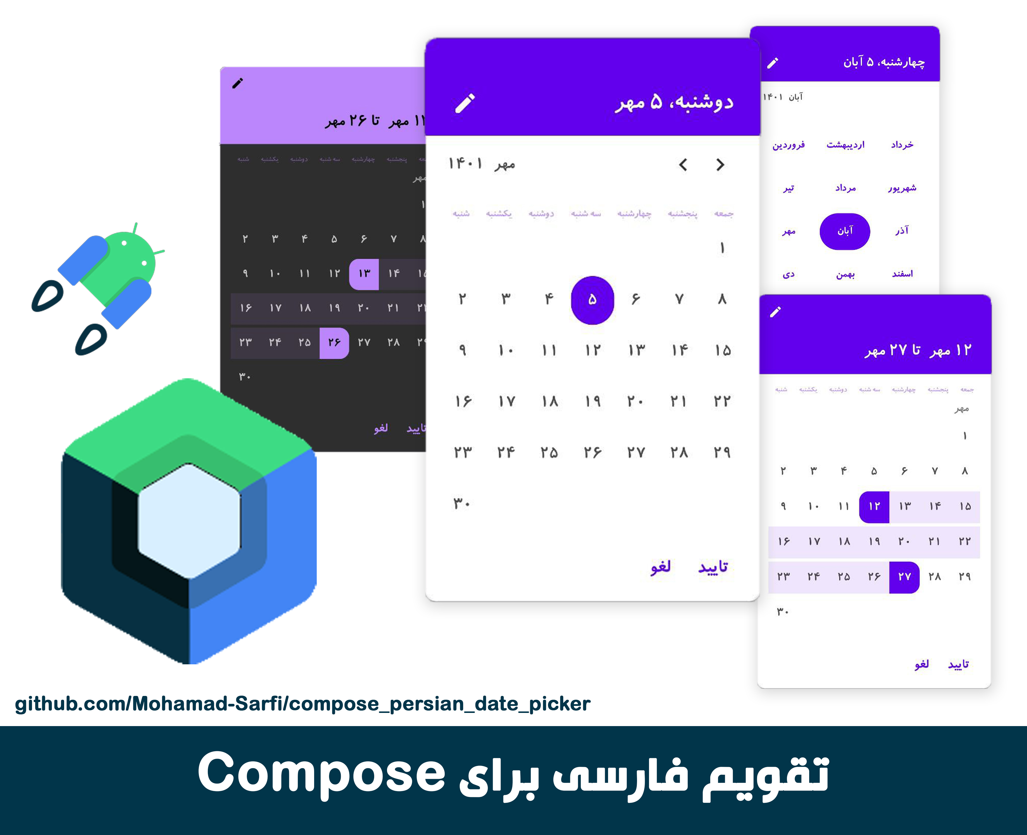
The design is based on Material guidlines. All the colors and fonts used in this composable are from Material theme of the app. The colors consist of "primary", "onPrimary", "primaryVariant", "backgound", "onBackground". The fonts are also predefined fonts in Material theme, namely body1-2, h5-h1 and subtitle1-2.
In order to customize the composable design you just need to modify your app's theme.
First add jitpack.io to setting.gradle
repositories {
        google()
        mavenCentral()
        maven { url "https://jitpack.io" }
    }
Then add following line to your module build.gradle file
dependencies{
  ...
  implementation 'com.github.Mohamad-Sarfi:compose_persian_date_picker:0.5.0'
}The composable function "PersianDatePicker" must be called from another @Composable function. First you have to declare a boolean state named "hideDatePicker" which its value will be set true in "onDismiss" lambda.
The picked date by user is return in "setDate" lambda. setDate has a Map<String, String> as parameter which has 3 keys, "day", "month" and "year". Each one can be accessed and stored the way shown below.
@Composable
fun MyCompose(){

  var hideDatePicker = mutableSateOf(true)

  Button(
    onClick = {hideDatePicker.value = false}
   ) {
    Text("انتخاب تاریخ")
   }

  if (!hideDatePicker){

    // *************************************************
    PersianDatePicker(
      onDismiss = { hideDatePicker.value = true },
      setDate = { date ->
          var day = date["day"]
          var month = date["month"]
          var year = date["year"]
        }
    )
    // *************************************************

  }

}
There are a couple of arbitrary parameters provieded as well in order to customize the composable:
@Composable
fun MyCompose(){

  var hideDatePicker = mutableSateOf(false)

  PersianDatePicker(
    minYear = 1350,
    maxYear = 1430,
    positiveButtonTxt= "تایید",
    negativeButtonTxt = "لغو,
    onDismiss = { hideDatePicker.value = true },
    setDate = { date ->
        var day = date["day"]
        var month = date["month"]
        var year = date["year"]
      }
    )
}| Parameter | Description |
|---|---|
onDismiss |
Needs to set the value of a mutable state to true to hide the dialog |
setDate |
returns a Map as the parameter of the lambda which consists of it["day"], it["month"], it["year"] |
minYear |
sets minimum value of the year, default value is 1350 |
maxYear |
sets maximum value of the year, default value is 1420 |
positiveButtonTxt |
sets the text for positive button, default value is تایید |
negativeButtonTxt |
sets the text for negative button, default value is لغو |
shortWeekDays |
decides if week days on top row are shown fully or their first letter is shown. Default value is false |
The second composable provided to you in this library is a "Range Date Picker" that lets you pick a date range within a "start date" and "end date".
The overall functionality is almost the same as the PersianDatePicker but the setDate lambda argument is a list of maps which index 0 is the starting date and index 1 is the end date.
@Composable
fun MyCompose(){

  var hideRangeDatePicker = mutableSateOf(true)

  Button(
    onClick = {hideDatePicker.value = false}
   ) {
    Text("انتخاب بازه زمانی")
   }

  if (!hideRangeDatePicker){

    // *************************************************
    PersianRangeDatePicker(
      onDismiss = { hideRangeDatePicker.value = true },
      setDate = { list ->
          var startDateMap = list[0] //mapOf("day" to day, "month" to month, "year" to year)
          var endDateMap = list[1] //mapOf("day" to day, "month" to month, "year" to year)
        }
    )
    // *************************************************

  }

}
If you face any issues or have feedbacks I'd be happy to hear from you [email protected]
