- Dimensionality Reduction and Data Visualization
1.1 PCA
1.2 t-SNE - When should we use PCA and what is the risk?
- Other practical issues with PCA
3.1 Scaling the data
3.2 Missing values
3.3 Impute / Estimate missing values - A biological application of clustering
4.1 Ancestry analysis
- References
The modern RNA sequencing technology offers millions of features (the read count of genes) to researchers, but such advance also brings “the curse of dimensionality”: when the dimension of data gets too high, all features would seem equally important -- the clustering result would seem to have come from a uniform distribution! Therefore, it is important to conduct dimensionality reduction prior to any clustering analysis. The reduced data space will also allow us to visualize data points in a 2-D or 3-D plot and maybe see some clusters forming by our own eyes. We can roughly divide the dimensionality reduction and visualization techniques into two categories: linear ones such as Principal Component Analysis (PCA) and non-linear ones like t-Distributed Stochastic Neighbor Embedding (t-SNE).
When we say that a dimensional reduction technique is linear, it means that during the transformation of data from a high-dimensional space to a low-dimensional one, the correspondence between the data “before” and “after” will remain. It is like a stretching and shifting of the original data while the non-linear techniques are more like performing genetic engineering on the data and turning into another dramatically different species.
The PCA is a very popular linear dimensional reduction approach. Essentially it will perform an orthogonal transformation to turn a set of samples (in the case of single-cell RNA-seq analysis, it would be a set of row vectors in which each vector contains the expression level of genes in one cell) into a set of scalar values. In common English, PCA will find the directions in which the data points differentiate from each other the most -- directions in the form of vector known as a principal component (PC) -- so we can use them to represent the high-dimensional data points.
Figure 1: What do principal components look like in a breast tumor dataset of 2 features [1]
After performing a PCA on the data points of a single-cell RNA-seq result, we will be able to extract the top PCs and use them to do the downstream clustering analysis. If we take the top two PCs and make a scatter plot using one PCA as the x coordinates and the other as the y, we can naively visualize the dataset and hopefully see some possible cluster patterns. Notice that since PCA is a linear transformation, the distance between data points actually do represent the similarity: if two data points are close to each other, they would have similar gene expression patterns and if they are far away from each other they would be less similar!
Figure 2: Scatter plot using the top 2 PCs of the Peripheral Blood Mononuclear Cell dataset [2]
Non-linear dimensionality reduction, however, does not retain that much correspondence from the high-dimensional space and the statistics behind it are often harder to explain. One example of such techniques is the t-SNE.
Starting with the original high-dimensional data points, t-SNE will first determine the similarity between each point to every other point. To do so, it will measure the distance between the point of interest (point A) and another point (point B) and then put that distance onto a normal curve centered on point A. Afterwards, the “similarity” would be computed by measuring the distance from point B to the normal curve. This process will be repeated until the pairwise “similarity” between all data points are calculated, then these similarities will be normalized for the difference in the standard deviation of each normal curve. By using a normal curve, the similarity between closely located data points is exaggerated and the dissimilarity between distant ones is also increased.
Figure 3: Calculating pairwise similarities in tSNE [3]
After the similarity calculation, t-SNE will put data points onto a 1-D number line in a random order. Finally, t-SNE will attempt to re-arrange these data points according to their pairwise similarities calculated earlier by moving points who have a high similarity closer to each other. This process is done step-by-step: points are moved only a little in one iteration, and the number of iterations will affect the final visualization result.
Figure 4: t-SNE result on the Microwell-seq “Mouse Cell Atlas” dataset [4]
As we can see, the t-SNE dimensionality reduction and visualization is far less intuitive than the PCA and its runtime is often much slower due to the iterative process. Then why do we use t-SNE instead of PCA? Due to its non-linearity, t-SNE can capture the non-linear dependencies while PCA cannot. However, this characteristic of t-SNE also makes the resulting low-dimensional data lose its connection to the original data space, so the distance between data points in t-SNE results does not have any implication about the similarity between them: if two data points are far away from each other, they do not necessarily differentiate more than any data point that is closer to them! Therefore, though t-SNE can indeed reduce the dimensionality of the data (by projecting high-dimensional data into a 2-d plot), it is mainly used for visualization instead of dimensionality reduction.
We can define a symmetric matrix A, A = XXᵀ where X is an m×n matrix of the independent variables, where m is the number of columns and n is the number of data points. The matrix A can be decomposed in the form of A=EDEᵀ where D is a diagonal matrix and E is a matrix of eigenvectors of A arranged in columns. The Principal Components(PCs) of X are the eigenvectors of XXᵀ which indicates the fact that the direction of the eigenvectors (Principal Components) are dependent on the variation of the independent variable(X). The PCs are ranked by their importance. So PC1 is more important than PC2, which in turn is more important than PC3 etc.The PCs (i.e. new plot axis) are ranked by the amount of variance in the original data (i.e. gene expression values) that they “capture”.
It is a common assumption that Principal Components of the independent variable having low eigenvalues will play no part in explaining the response variable. But sometimes the components with low eigenvalues can be as important as the components with high eigenvalues.[5] Here is an example showing the importance of components with low eigenvalues:

Figure 5: PC1 explains 95% of the coverage in X and PC2 explains 5% of the coverage


Figure 6 and 7:The figure above is the regression summary with Y and PC1, and the figure below is the regression summary with Y and PC2
We can see that even PC1 explains 95% of the variance in X, yet we cannot neglect PC2 when we do regression. Since the PC2 that explains only 5% of the variance in X explains 72% of the variance in Y. [5] PCA is solved through the Singular Value Decomposition, which finds linear subspaces that represent the data is squared sense. Scaling is important since Singular Value Decomposition approximates in the sum of squares sense. If one variable is on a different scale than another, it will dominate the PCA procedure, and the 2D plot will really just be visualizing that dimension.

Figure 8: Comparison of two 2D plots with and without scaling
There are two types of commonly used methods for deletion: Listwise deletion and pairwise deletion. Listwise deletion is perhaps the most commonly used method. In PCA it means all the datas with at least one missing value are all completely removed so that they do not go into data analysis. This is a simple method, and the default method in many software packages. There are some obvious drawbacks. First, it reduces the sample size, which reduces the stability of the result. Second, it can introduce biases if the data are not missing completely at random. Pairwise deletion solves part of the problems caused by Listwise deletion. It attempts to minimize the loss that occurs. To understand the way pairwise deletion works, we can think of a correlation matrix, which measures the strength of the relationship between two variables. The correlation coefficient takes the data pair into account if the data is available.(not missing) And this maximizes all available data. Though Pairwise deletion performs generally better than Listwise deletion, it also assumes the missing data are MCAR.
Missing data passive approach. Meulman and Takane and Oshima-Takane developed the missing data passive approach (MDP) in the context of homogeneity analysis, a form of categorical PCA. The idea behind this approach is that first a weight matrix is constructed which indicates whether a score is observed or missing. Next, these weights are used in a weighted homogeneity analysis. [6]
In class, we learned that the gene expression profile can be used as a basis for clustering cancer patients into more specific cancer subgroups. Another perhaps natural criterion to classify biological samples is to cluster them by ancestral history. Consider the human population as an example. Let us, for a moment, assume that human ancestry is closely associated with the geography of the world. Then one may roughly sort the human populations into several groups: European, Asian, American, African, and Australian. With this scheme of grouping, one may classify people with shared European ancestry into one group, people sharing Asian ancestry into another, etc.
How might we go about measuring the shared ancestry between two individuals? One idea involves sequencing the entire genome of each individual, and comparing the number of differences in the genomic sequence. Then one can develop a metric for clustering by counting the number of different bases in their genome between a pair of individuals, build a pairwise distance matrix, and then cluster individuals with low pairwise differences into the same group, while ensuring that the individuals across different groups have high pairwise differences. The above metric-based clustering could be straight-forward to implement, but the clustering result may not accurately reflect the actual partition of human populations into those ancestral groups.
One reason that the above metric may fail is that although two individuals in the same cluster may have a low number of different bases between their genomic sequence, their genomic differences may be located at different loci. As a consequence, individuals of different ancestries may be put into the same clusters by the above metric.
Before we examine an alternative clustering technique, let us briefly review the K-means clustering, a distance-based clustering technique.
In K-means clustering, K refers to the number of clusters predefined by the user. During every step of this iterative algorithm, there is one "centroid" for every cluster that get updated by taking the average of all members in the cluster (hence "K-means").
Let S denote the set of data points that we wish to cluster. We first predefine the number of clusters (K), and we initialize K "centroids," one for each cluster. These initial centroids could be selected among the given data points or artificially synthesized, and they serve as the "representatives" for their respective clusters. Then, for every data points in S, we compute the distance (Euclidean distance) from the point to each of the K centroids, and we assign this point to the cluster "represented" by the centroid closest to this point. Let us call this step the "assignment step". After each data points have been assigned a cluster, we update each of the K "centroids" by to the average of the data points in its represented cluster. Call this step the "update step". We now iteratively repeat the "assignment step" and the "update step" until the cluster assignments converge (the assignment for each datapoint does not change significantly) or until a preset number of iteration has been run (to avoid infinite loop).
We will now introduce an alternative clustering method.
A probabilistic, non-distance based clustering technique.
Similar to K-means clustering, we also have a set, S, of data points that we wish to cluster. We also predefine the number of clusters, say, K. In model-based clustering, we need to assume a model which we expect our datapoints to follow. In this algorithm, the datapoints are grouped together based on how well they fit with the assumed model. Recall that in class, our goal of metric-based clustering is to group the samples so that the similarity between individuals within the same group is high (smaller distance) while the similarity between individuals across different groups is low (larger distance). Analogously, the model-based clustering technique aims to group the samples so that individuals forming a group satisfy (as closely as possible) the characteristic properties of the group, as specified by the model. As an example, let us use the Hardy-Weinberg Principle as a model to cluster a theoretical population.
For example, Tishkoff et al. [8] uses Hardy-Weinberg Equilibrium as their key model in order to study the ancestry of African populations.
Suppose we focus our attention on a gene in a diploid organism (having two copies of the genome, like human) that has two alleles (alternative version of the gene). Then the Hardy-Weinberg principle asserts that the frequencies of the alleles in a population stay constant from one generation to the next if the population satisfies the following assumptions:
- All individuals, regardless of which alleles of the gene they have, share equal survival and reproductive rates.
- No new alleles are created (no mutation)
- No migration (in or out) occurs in the population
- The population is large (to reduce sampling error)
- Mating in the population is random.
Before we see how these assumptions are satisfied, let us explore the use of Hardy-Weinberg principle. Consider a gene that has two alleles, A, and a. Let p be the frequency of allele A, and q be the frequency of allele a. Then p + q = 1 and 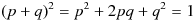 . In this case,
  represents the frequency of genotype AA,
  the frequency of genotype Aa, and
  the frequency of aa. By the Hardy-Weinberg principle, populations that satisfy the above 5 assumptions should maintain constant values of p and q. That is, populations in Hardy-Weinberg equilibrium have predictable allele frequencies. If a population has p = 0.7 and q = 0.3, then by randomly sampling from the population a large number of times, 70% of the alleles seen will be A, and allele a will be seen for 30% of the time. Moreover, among the randomly sampled individuals, 49% of them will have genotype AA, 42% of them with genotype Aa, and 9% with genotype aa.
If the gene has 3 alleles (such as the gene for ABO blood type), we can introduce an additional variable, r, to denote the frequency of the third allele. In this case, we have p + r + q = 1, and  . Each of p, r, and q denotes the allele frequencies, whereas the pairwise products of p, r, and q represent the frequency of each genotype.
From the above discussion, we know that if a population is stable enough (in Hardy-Weinberg equilibrium), the probability of sampling a particular allele or genotype from this population is the same frequency of the allele or genotype characteristic of the population. In practice, however, we do not know the allele frequencies of the population before hand, and we can only figure out the frequencies by taking samples from the population. Yet, each sample that we take from the population may not necessarily represent the population (that is, the allele frequencies we observe from the sample may not be the actual frequencies of the entire population). However, Pritchard et al. demonstrates that it is possible to obtain an accurate estimate of the allele frequencies by repeatedly sampling and estimating, via the Markov Chain Monte Carlo algorithm [7]. This is the basis for STRUCTURE, a software commonly used in population genetics [7].
STRUCTURE solves the following bioinformatics problem:
Given a list of observation (a group of people, presumably coming from one or more ancestral groups), figure out a way to assign each of these observations into groups, so that each assignment is the most likely assignment (among all the groups that a person could be assigned to, the assigned group is the group that the person most likely came from).
In our ancestry analysis, the list of observations is the group of people that we have, each with his or her own genotypes measured. Our goal is then to put these people into ancestral groups that they most likely have come from.
Because our ancestry analysis only takes place in a short period of time, mutation rates and migration can be neglected. Because the study spans across a time in less than one generation, the survival and reproductive rates, as well as random mating are not significant factors in our analysis. That is, because human evolution occurs at a slow pace (as opposed to organisms like bacteria or viruses), the human population is stable enough such that we can assert that the allele frequencies in each subpopulation are approximately constant in the timeframe we are interested in. The only assumption that remains is that the population has to be large. While the qualification of a "large" population can be subjective, if we restrict our attention to ancestral groups that have a long history, the population in these groups should be "large" enough. Nonetheless, care needs to be taken to sample as many people as possible in order to reduce sampling error.
Though migration may not be a huge factor during the span of the study, it could potentially lead to sampling errors (for example, the person sampled from a particular region could be a recent immigrant from else where). In addition, the analysis may be made more valid by avoiding the genes at or near "mutation hotspots" in the human genome.
These two clustering algorithms are similar in that they both require a pre-defined number of clusters, K. In each algorithm, there is a function that measures how well the current cluster assignment is. In the K-means algorithm, the function could be a simple euclidean distance between the data points and the centroids representative of each cluster. In the model-based algorithm, the function could be the likelihood of the current assignment for each data point. Both algorithms repeatedly try to assign each data point a cluster, and update their respective measuring functions.
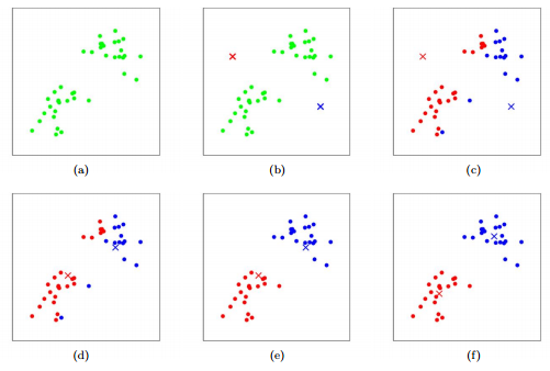
Figure 9 An illustration of K-means algorithm. Dots: data points. Cross: center. Red and blue colors: clustering outcome. (a) data. (b) initial cluster centers. (c) cluster assignment. (d) center update. (e) cluster update. (f) center update. From BENG183 Lecture "Intro to Machine Learning" Week2 [10].
The algorithms can stop when the cluster assignments converge (stabilize) or after a predefined number of iterations have been run. Ideally, the final cluster assignment outputted by each algorithm should be optimal in the sense that, for K-means algorithm, the intra-cluster distances is small, and the inter-cluster distances are high, and for the model-based algorithm, the intra-cluster allele frequency distribution resembles that of the predefined clusters. In other words, the amount of uncertainty in all cluster assignment should be minimized; that is, the final cluster assignment is the one with the most confidence (see Figure 10).
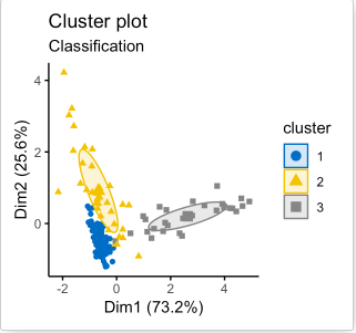
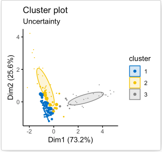
Figure 10. An example of cluster assignment using model-based algorithm [11]. A special feature for the model-based clustering method is that for every cluster assignment, each datapoint is associated with an uncertainty value (right figure). In the figure to the right, larger datapoints have higher uncertainties (lower confidence for them to be assigned to their current cluster), and smaller datapoints have lower uncertainties (higher confidence for the current cluster assignment).
As discussed in class, for K-means clustering, it is difficult to figure out the optimal number for K without trying multiple values of K. The same principle holds for the model-based clustering. However, in our ancestry analysis, it is possible to use the demographic information collected during the sampling step to facilitate the estimation for K. Nonetheless, care should be taken in interpreting the meaning of K. The value of K that yields the optimal cluster assignment may not actually correspond to K real populations!
Performance-wise, Pritchard et al. showed the model-based algorithm can correctly identify the number of subpopulation and give highly accurate cluster assignment (as high as 90%) when an artificial population sample with known substructure is used for testing [7,12]. On an arbitray population with unknown substructure, however, the accuracy of the mode-based algorithm could be improved by incorporating available information about the population. For example, in our ancestry analysis, we could use the self-reported demographic information collected during sampling to improve our initialization step in the algorithm. (Provided that no false information is given). Tishkoff et al. demonstrated that the model-based algorithm (via STRUCTURE) yielded meaningful cluster assignments that correspond to real populations [8]. The performances of model-based algorithm and of the K-means algorithm are heavily dependent on the model assumed and the metric developed respectively. As mentioned in our introduction to ancestry analysis, it can be difficult to develop a good metric for K-means clustering to decipher population structures, so the model-based clustering with simple population model like the Hardy-Weinberg equlibrium could be more suitable for population analysis [7].
Note that in our ancestry analysis, our model makes use of allele frequencies as a defining feature for each ancestral group. If there is a gene with the same allele frequencies in all populations, such a gene is not useful in distinguishing the different populations. Therefore, we must select genes that have varying allele frequencies distribution in different populations to aid our analysis. One common technique is to use Principal Component Analysis (PCA), which was introduced in an earlier section. The key idea is to use PCA to identify principle components that can best explain the variations among data points. In practice, we can genotype the individuals from all populations at various loci, perform PCA on the genotype vectors, and identify useful gene loci that can best help distinguish the population (gene markers). For example, Tishkoff et al uses PCA to identify the major factors that distinguish between African populations (see Figure 11), and use the appropriately selected genetic markers to perform the model-based clustering algorithm (via STRUCTURE, see Figure 12).
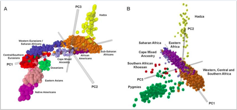
Figure 11 PCA analysis, based on genotypes of the individuals, from Tishkoff, et al. [8]
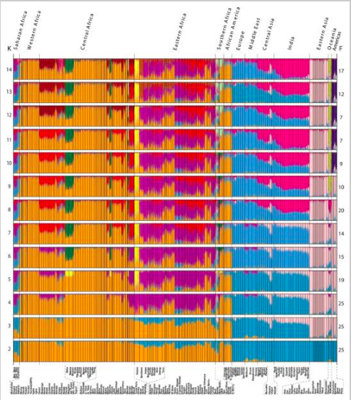
Figure 12 Clustering results of the African population analysis from Tishkoff, et al. [8]
- “What is principal component analysis?”, Ringnér, M., Nat Biotechnol 26, 303–304 (2008) doi:10.1038/nbt0308-303
- “Seurat - Guided Clustering Tutorial (Peripheral Blood Mononuclear Cells 3k Dataset)”, Butler et al., https://satijalab.org/seurat/v3.1/pbmc3k_tutorial.
- “t-Distributed Stochastic Neighbor Embedding (t-SNE)”, Siegel, https://siegel.work/blog/tSNE/.
- “Seurat - Guided Clustering of the Microwell-seq Mouse Cell Atlas”, Butler et al., https://satijalab.org/seurat/v3.1/mca.
- "Risks and Caution on applying PCA for supervised learning problems." Co-authors: Amlan Jyoti Das, Sai Yaswanth, September 2010(https://towardsdatascience.com/risks-and-caution-on-applying-pca-for-supervised-learning-problems-d7fac7820ec3)
- "Missing data in principal component analysis of questionnaire data: A comparison of methods." Joost R. Van Ginkel, Pieter M. Kroonenberg & Henk A.L. Kiers. Journal of Statistical Computation and Simulation, 17 Apr. 2014
- "Inference of Population Structure Using Multilocus Genotype Data." Pritchard, Jonathan K., et al. Genetics, Genetics Society of America, 1 June 2000 www.genetics.org/content/155/2/945
- "The Genetic Structure and History of Africans and African Americans." Tishkoff, Sarah A, et al. National Center of Biotechnology Information, U.S. National Library of Medicine National Institutes of Health, 30 Apr. 2009 www.ncbi.nlm.nih.gov/pmc/articles/PMC2947357
- Essential of Genetics (BICD 100 Textbook)
- "Intro to machine learning" Dr. Sheng Zhong. BENG183 Lecture Week2 of Fall quarter 2019, 10 October 2019.
- "Model Based Clustering Essentials." Datanovia, Image source to Figure 11
- "Empirical Evaluation of Genetic Clustering Methods Using Multilocus Genotypes from 20 Chicken Breeds." Rosenberg, N A, et al. Genetics, U.S. National Library of Medicine, Oct. 2001, www.ncbi.nlm.nih.gov/pmc/articles/PMC1461842