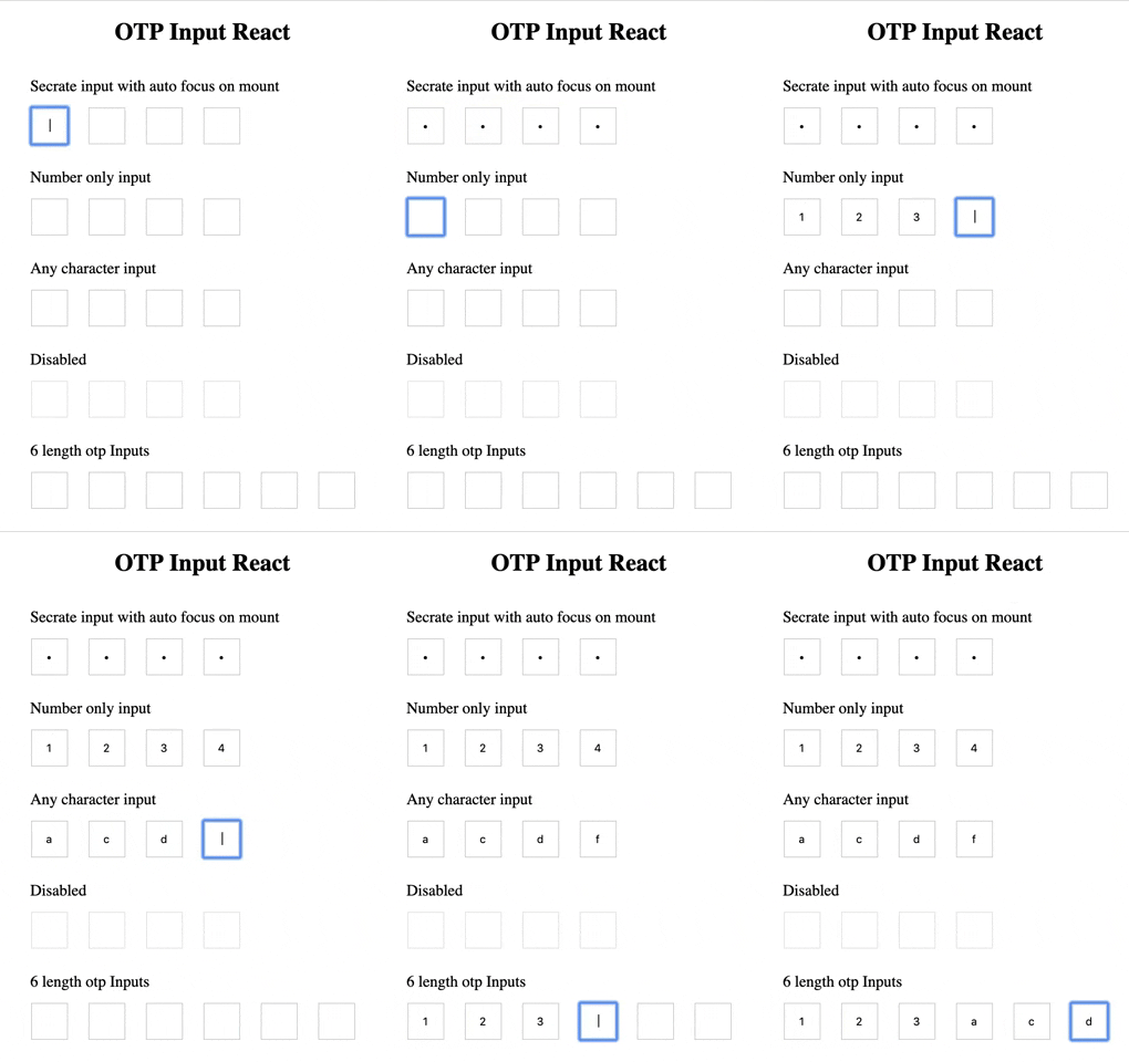
A fully customizable, one-time password input with resend OTP component for the web built with React functional component.
npm install --save otp-input-react
import OTPInput, { ResendOTP } from "otp-input-react";

function App() {
  const [OTP, setOTP] = useState("");
  return (
    <>
      <OTPInput value={OTP} onChange={setOTP} autoFocus OTPLength={4} otpType="number" disabled={false} secure />
      <ResendOTP onResendClick={() => console.log("Resend clicked")} />
    </>
  );
}| Name | Type | Required | Default | Description | Status |
|---|---|---|---|---|---|
| OTPLength | Number | false | 4 | Number of input boxes. | Working |
| onChange | Function | true | - | Returns OTP code typed in inputs. | Working |
| value | String / Number | true | '' | The value of the otp passed into the component. | Working |
| disabled | Boolean | false | false | Disables all the inputs. | Working |
| autoFocus | Boolean | false | false | Auto focuses input on initial page load. | Working |
| otpType | Enum: any|number|alpha|alphanumeric |
false | any | any - allows any value. number - allow only numbers. alpha - allows only a-zA-Z. alphanumeric - allows 0-9a-zA-z |
Working |
| secure | Boolean | false | false | Change input type to password. | Working |
| inputClassName | String | - | - | Class for root element. | Working |
| className | String | - | - | Class for root element. | Working |
| inputStyles | Object | - | - | Styles for input element. | Working |
| style | Object | - | - | Styles for root element. | Working |
| placeholder | Array<String> | false | - | Placeholder value of each input. | Working |
| Name | Type | Required | Default | Description | Status |
|---|---|---|---|---|---|
| maxTime | Number | false | 60 | Timer that user has to wait before resend otp gets active. | Working |
| onResendClick | Function | true | - | Function get triggers when user click on resend otp button. But when button is disabled(i.e. time is not completed) it won't get trigger | Working |
| onTimerComplete | Function | false | - | An optional callback when timer completes. | Working |
| timeInterval | Number | false | 1000 | You can change time interval. | Working |
| renderTime | Function - render props | false | - | You can use your own component for seconds. Function will get remainingTime as props you can use it to show timer. | Working |
| renderButton | Function - render props | false | - | You can use your own component for resend button. Function will get disabled and onClick function and remainingTime as props you can pass it to your component. |
Working |
| style | Object | false | - | For changing root component inline styles | Working |
| className | string | false | - | For adding class to root component. | Working |
const renderButton = (buttonProps) => {
  return <button {...buttonProps}>Resend</button>;
};
const renderTime = (remainingTime) => {
  return <span>{remainingTime} seconds remaining</span>;
};
<ResendOTP renderButton={renderButton} renderTime={renderTime} />;const renderButton = (buttonProps) => {
return (
<button {...buttonProps}>
{buttonProps.remainingTime !== 0 ? `Please wait for ${buttonProps.remainingTime} sec` : "Resend"}
</button>
);
};
const renderTime = () => React.Fragment;
<ResendOTP renderButton={renderButton} renderTime={renderTime} />;- Add other type input
- Change scaffolding
- Add CI
- Add OTP Timer with resend otp optional type
- Add Complete callback for otp
https://github.com/hotdang-ca - For adding alpha|alphanumeric type and updating docs
Feel Free to contributing or feature request
- Fork it ( https://github.com/shubhanus/otp-input-react/fork )
- Create your feature branch (
git checkout -b my-new-feature) - Commit your changes (
git commit -am 'Add some feature') - Push to the branch (
git push origin my-new-feature) - Create a new pull request.


