forked from libjohn/rfun_flipped
-
Notifications
You must be signed in to change notification settings - Fork 0
/
Copy pathggplot_quick.qmd
525 lines (377 loc) · 16.3 KB
/
ggplot_quick.qmd
1
2
3
4
5
6
7
8
9
10
11
12
13
14
15
16
17
18
19
20
21
22
23
24
25
26
27
28
29
30
31
32
33
34
35
36
37
38
39
40
41
42
43
44
45
46
47
48
49
50
51
52
53
54
55
56
57
58
59
60
61
62
63
64
65
66
67
68
69
70
71
72
73
74
75
76
77
78
79
80
81
82
83
84
85
86
87
88
89
90
91
92
93
94
95
96
97
98
99
100
101
102
103
104
105
106
107
108
109
110
111
112
113
114
115
116
117
118
119
120
121
122
123
124
125
126
127
128
129
130
131
132
133
134
135
136
137
138
139
140
141
142
143
144
145
146
147
148
149
150
151
152
153
154
155
156
157
158
159
160
161
162
163
164
165
166
167
168
169
170
171
172
173
174
175
176
177
178
179
180
181
182
183
184
185
186
187
188
189
190
191
192
193
194
195
196
197
198
199
200
201
202
203
204
205
206
207
208
209
210
211
212
213
214
215
216
217
218
219
220
221
222
223
224
225
226
227
228
229
230
231
232
233
234
235
236
237
238
239
240
241
242
243
244
245
246
247
248
249
250
251
252
253
254
255
256
257
258
259
260
261
262
263
264
265
266
267
268
269
270
271
272
273
274
275
276
277
278
279
280
281
282
283
284
285
286
287
288
289
290
291
292
293
294
295
296
297
298
299
300
301
302
303
304
305
306
307
308
309
310
311
312
313
314
315
316
317
318
319
320
321
322
323
324
325
326
327
328
329
330
331
332
333
334
335
336
337
338
339
340
341
342
343
344
345
346
347
348
349
350
351
352
353
354
355
356
357
358
359
360
361
362
363
364
365
366
367
368
369
370
371
372
373
374
375
376
377
378
379
380
381
382
383
384
385
386
387
388
389
390
391
392
393
394
395
396
397
398
399
400
401
402
403
404
405
406
407
408
409
410
411
412
413
414
415
416
417
418
419
420
421
422
423
424
425
426
427
428
429
430
431
432
433
434
435
436
437
438
439
440
441
442
443
444
445
446
447
448
449
450
451
452
453
454
455
456
457
458
459
460
461
462
463
464
465
466
467
468
469
470
471
472
473
474
475
476
477
478
479
480
481
482
483
484
485
486
487
488
489
490
491
492
493
494
495
496
497
498
499
500
501
502
503
504
505
506
507
508
509
510
511
512
513
514
515
516
517
518
519
520
521
522
523
524
525
---
title: "ggplot2 - quick and easy"
date-modified: 'today'
date-format: long
format:
html:
footer: "CC BY 4.0 John R Little"
license: CC BY-NC
---
```{r}
#| echo=FALSE
htmltools::img(src = knitr::image_uri("images/Rlogo.png"),
alt = 'Rfun logo',
style = 'position:absolute; top:0; right:0; padding:10px;')
```
<!-- CSS style -->
```{css, echo=FALSE}
.myccfoot {
font-size: 85%;
text-align: right;
}
```
This code can be found at https://github.com/libjohn/rfun_flipped
## Load library packages
I only need `ggplot2` but I like to load `tidyverse` because it includes 8 complimentary packages, including `ggplot2`.
```{r}
#| message: false
#| warning: false
# library(ggplot2)
library(tidyverse)
```
Get more information from:
- https://tidyverse.org
- https://ggplot2.tidyverse.org
## ggplot2 template code
The ggplot2 template is used to identify the dataframe, identify the x and y axis, and define visualized layers
> `ggplot(data = ---, mapping = aes(x = ---, y = ---)) + geom_----()`
Note: `----` is meant to imply text (function names, dataframe names, variable names) you supply.
It is helpful to see the argument mapping, above. In practice, rather than typing the formal arguments, code is typically shorthanded to this:
> `dataframe %>% ggplot(aes(xvar, yvar)) + geom_----()`
## Goal
Visualize a scatter plot showing the relationship of mass to height for *Star Wars* characters in the `dplyr::starwars` dataframe, excluding the heaviest character. Indicate a linear regression line.
```{r}
#| echo: false
#| message: false
#| warning: false
starwars %>%
filter(mass < 500) %>%
ggplot(aes(height, mass)) +
geom_point() +
geom_smooth(method = lm, se = FALSE)
```
## Import data
dplyr has an onboard dataset, `starwars`
```{r}
data(starwars)
starwars
```
## Steps to Visualization
### Draw the base layer
This feels like, and looks like, you drew an empty box.
```{r}
starwars %>%
ggplot()
```
*But wait, there's more....*
### Map the aesthetics to variables in the dataframe
Still doesn't look like much. You will initialize the plot scales and labels based on the values of the variables in the dataframe.
```{r}
starwars %>%
filter(mass < 500) %>%
ggplot(aes(height, mass))
```
In the above, I subset the data, removing any *Star Wars* characters weighing more than 500 Kg -- `dplyr::filter()`. Then I initialized the base layer with the `height` as the x axis and `mass` as the y axis. ggplot drew the scales for me.
### Visualize a layer
Since I have two numeric variables, `height` and `mass`, I'll start with a scatter plot. Scatter plots are generated by the `geom_point()` function.
```{r}
#| message: false
#| warning: false
starwars %>%
filter(mass < 500) %>%
ggplot(aes(height, mass)) +
geom_point()
```
### Global v local arguments
So far, the **aesthetics** are **mapped** in the `aes()` function within the initial `ggplot` function. As such, these values are mapped globally and all layers are affected by this mapping. See the `aes()` function, above. Arguments can also be mapped locally, within a geom function layer, as as `geom_point(aes(height, mass))`.
```{r}
#| message: false
#| warning: false
starwars %>%
filter(mass < 500) %>%
ggplot() +
geom_point(aes(height, mass))
```
### Mapping v Setting
Dataframe values can be *mapped* inside the aesthetic, `aes()`, to visualize variable dataframe values. Alternatively, data values can be *set* as an argument outside the `aes()` function but inside the geom\_ function. This is done to affect a visual quality that is manually assigned, as opposed to being derived from variable data values.
Aesthetic arguments include:
- color
- fill
- size
- linetype
- opacity
- shape
- *and more* see documentation for each geom\_
> Mapping: `color` is **mapped** *inside* `aes()` function. In this case, `color = starwars$gender`
```{r}
#| message: false
#| warning: false
starwars %>%
filter(mass < 500) %>%
ggplot() +
# geom_point(mapping = aes(x = height, y = mass, color = gender))
geom_point(aes(height, mass, color = gender))
```
Notice the legend was drawn automatically, above, by mapping an aesthetic
> Setting: The `color` argument can be **set** outside the `aes()` function, but within the `geom_` function. In this case with `color = "goldenrod"`
```{r}
#| message: false
#| warning: false
starwars %>%
filter(mass < 500) %>%
ggplot() +
geom_point(aes(height, mass), color = "goldenrod")
```
## Common geom\_ functions
| Type | Geom |
|------------------|----------------------------------|
| Bar graph: | `geom_bar()` `geom_col()` |
| Histogram: | `geom_histogram()` |
| Scatter plot: | `geom_point()` `geom_jitter()` |
| Line graph: | `geom_line()` |
| Box plot: | `geom_boxplot()` |
| Density: | `geom_density()` `geom_violin()` |
| Heat map: | `geom_heatmap()` |
| Mapping: | `geom_sf()` |
| Regression line: | `geom_smooth()` |
> A list of available geom\_ functions, or layers, can be found in the help or on the website: [https://ggplot2.tidyverse.org/reference/index.html#section-geoms](https://ggplot2.tidyverse.org/reference/index.html#section-geomshttps://ggplot2.tidyverse.org/reference/index.html#section-geoms)
### Boxplot
```{r}
#| message: false
#| warning: false
starwars %>%
mutate(species = fct_lump_min(species, 2)) %>%
ggplot(aes(species, height)) +
geom_boxplot()
```
### Line graph
```{r}
#| message: false
#| warning: false
babynames::babynames %>%
filter(name == "Watts") %>%
ggplot(aes(year, n)) +
# geom_point() +
geom_line()
```
### Overplotting
There are two simple approaches to visualizing overplotted data: `geom_jitter()` and decrease the opacity be setting the `alpha =` argument.
- Adjust **opacity**. The `alpha` argument within the geom function affects the opacity of the points. In this way, overplotted data will appear as darker points on the plot
```{r}
starwars %>%
filter(mass < 500) %>%
ggplot() +
geom_point(aes(height, mass), alpha = .3)
```
- **Jitter** the data with `geom_jitter()`
`geom_jitter` will not change the values of the data but it will offset data points, making it easier to perceive the overplotting.
```{r}
starwars %>%
filter(mass < 500) %>%
ggplot() +
geom_jitter(aes(height, mass))
```
### Multiple layers
Each layer, visualized by a geom\_ function, can support local arguments and draw from the global settings. Below we use the `geom_line()` function, followed by the `geom_point()` function.
babynames %>%
ggplot(aes(year, prop)) +
geom_line(aes(color = sex)) +
geom_point(alpha = 0.4, shape = "cross")

The full code for the above graph can be seen below.
library(babynames)
library(ggplot)
babynames %>%
filter(name == "John" & sex == "M" |
name == "Elizabeth" & sex == "F") %>%
ggplot(aes(year, prop)) +
geom_line(aes(color = sex)) +
geom_point(alpha = 0.4, shape = "cross") +
geom_text(data = . %>% filter(year == 1965), aes(label = name),
nudge_y = .009) +
labs(title = "Name Popularity") +
theme(legend.position = "none")
### Goal
Recall the goal mentioned in the beginning. We want a scatter plot and a regression line. The regression line is drawn with the `geom_smooth()` function.
```{r}
#| message: false
#| warning: false
starwars %>%
filter(mass < 500) %>%
ggplot(aes(height, mass)) +
geom_point() +
geom_smooth(method = lm, se = FALSE)
```
## Arrange order
Categorical values are most easily ordered with the `forcats` library. Part of the Tidyverse, the [forcats](https://forcats.tidyverse.org/) package is used to transform string data as a factor data type. Data types in R can be simple distinctions useful in efficient computation, such as calculating numeric outcomes versus manipulating character data (i.e. string or text data). R data types are rich and sometimes complex. Staying simple, text data consisting of categories, may be efficiently handled as a factor data type. For example, eye colors can be categorized. Brown, blue, and green are nominal categorical values for the factor variable `eye_color`. Among other things, treating `eye_color` as a factor data type enables visually ordering categorical values by frequency.
#### Before ordering
```{r}
msleep %>%
ggplot(aes(vore)) +
geom_bar()
```
### Ordering with forcats
Change the order of the bars by the frequency of observations using `forcats::fct_infreq()`
```{r}
msleep %>%
ggplot(aes(fct_infreq(vore))) +
geom_bar()
```
Notice below, we use the `fill =` argument to set the color of an individual bar. In the scatter plot examples, above, we used the `color =` argument. In many `geoms_` you can use both `color` and `fill` arguments. How do these arguments differ? Where can you look to find out more about `fill` and `color`?
```{r}
starwars %>%
ggplot(aes(fct_rev(fct_infreq(eye_color)))) +
geom_bar(fill = "grey70") +
geom_bar(data = starwars %>% filter(eye_color == "orange"), fill = "darkorange") +
coord_flip()
```
## Facet wrap
Faceting is great way to make subplots of the same dataframe. See both `facet_wrap()` and `facet_grid()`
```{r}
mpg %>%
ggplot(aes(displ, hwy)) +
geom_point() +
facet_wrap(~ class)
```
## Scales
Scales are used to affect the visual qualities of the data. I'll introduce scales to visualize discrete categories by associating each discrete value with a specific color. [Read more about scales](https://ggplot2.tidyverse.org/reference/index.html#section-scales).
Viridis scales apply color palettes to continuous, discrete, or binned data. For discrete data we can use the `scale_fill_viridis_d()` function.
> By using one the `scale_fill_` functions, we are able to affect the variable values associated in the `fill = conservation` argument.
```{r}
msleep %>%
ggplot(aes(fct_infreq(vore), sleep_total)) +
geom_col(aes(fill = conservation)) +
scale_fill_viridis_d(na.value = "grey80")
```
The color brewer palette is similar but has a wider array of palettes to choose from. Below we use `scale_fill_brewer()` and a default *qualitative* color palette by setting the `type =` argument to *qual* (for qualitative). Alternatively, or additionally, we could assign a `palette =` argument to choose a particular ColorBrewer palette, such as choosing the "Dark2" palette with the argument `palette = "Dark2"`
```{r}
msleep %>%
ggplot(aes(fct_infreq(vore), sleep_total)) +
geom_col(aes(fill = conservation)) +
scale_fill_brewer(type = "qual", na.value = "grey80")
```
Sometimes a manual scale is preferred. Below we use `scale_fill_manual()` to associate a defined set of color names with my `fill = conservation` argument
```{r}
mycolors <- c("firebrick", "forestgreen", "navy", "darkorange",
"goldenrod", "sienna")
msleep %>%
ggplot(aes(fct_infreq(vore), sleep_total)) +
geom_col(aes(fill = conservation)) +
scale_fill_manual(values = mycolors, na.value = "grey80")
```
To find available colors, I typically Google search "R color names." A more specific technique, within R, can be used to find the array of ColorBrewer palettes...
```{r}
#| fig-height: 8
RColorBrewer::display.brewer.all()
```
Scales are used to manipulate the visual properties of the data. Beyond using scales to modify colors, another example is logarithmic scales to account for data skew. In this way you can clarify the data pattern. For example, using the `ChickWeight` dataset, we visualize the weights of the chicks over time. Hint: You can visualize the data skew with a histogram, `geom_histogram()`.
```{r}
data("ChickWeight")
ChickWeight %>%
ggplot(aes(Time, weight, color = Diet)) +
geom_line(aes(group = Chick))
```
Using `scale_y_log10` we can alter the scale to highlight a more understandable data pattern
```{r}
chicken_plot <- ChickWeight %>%
ggplot(aes(Time, weight, color = Diet)) +
geom_line(aes(group = Chick)) +
scale_y_log10()
chicken_plot
```
## Labels
The `labs()` function is a specialized scales function, used to apply labels. For example, use the `labs()` function to add a title, subtitle, legend title, modify axis labels, and set a caption. See more on [scales](https://ggplot2.tidyverse.org/reference/index.html#section-scales).
```{r}
plot_sleep <- msleep %>%
mutate(vore = case_when(
vore == "herbi" ~ "Herbivore",
vore == "omni" ~ "Omnivore",
vore == "carni" ~ "Carnivore",
vore == "insecti" ~ "Insectivore"
)) %>%
ggplot(aes(fct_infreq(vore), sleep_total)) +
geom_col(aes(fill = conservation)) +
scale_fill_brewer(type = "qual", na.value = "grey80") +
labs(title = "Animal sleep times",
subtitle = "A practice dataset",
fill = "Conservation\nType",
x = "",
y = "Sleep time in hours",
caption = "Source: ggplot::msleep")
plot_sleep
```
## Themes
Themes are used to manipulate the stylistic characteristics of the non-data components of your plot, such as font faces, text sizes, and grid lines. **ProTip:** quickly manipulate a single plot with preset themes such as `theme_dark`, or use a specialized theme extension such as `theme_ipsum` from the `hrbrthemes` package.
- https://ggplot2.tidyverse.org/reference/ggtheme.html
- for example... `theme_dark()`, `theme_light()`, `theme_classic()`
- https://cinc.rud.is/web/packages/hrbrthemes/
- https://yutannihilation.github.io/allYourFigureAreBelongToUs/ggthemes/
See more on [themes](https://ggplot2.tidyverse.org/reference/index.html#section-themes)
### Example themes
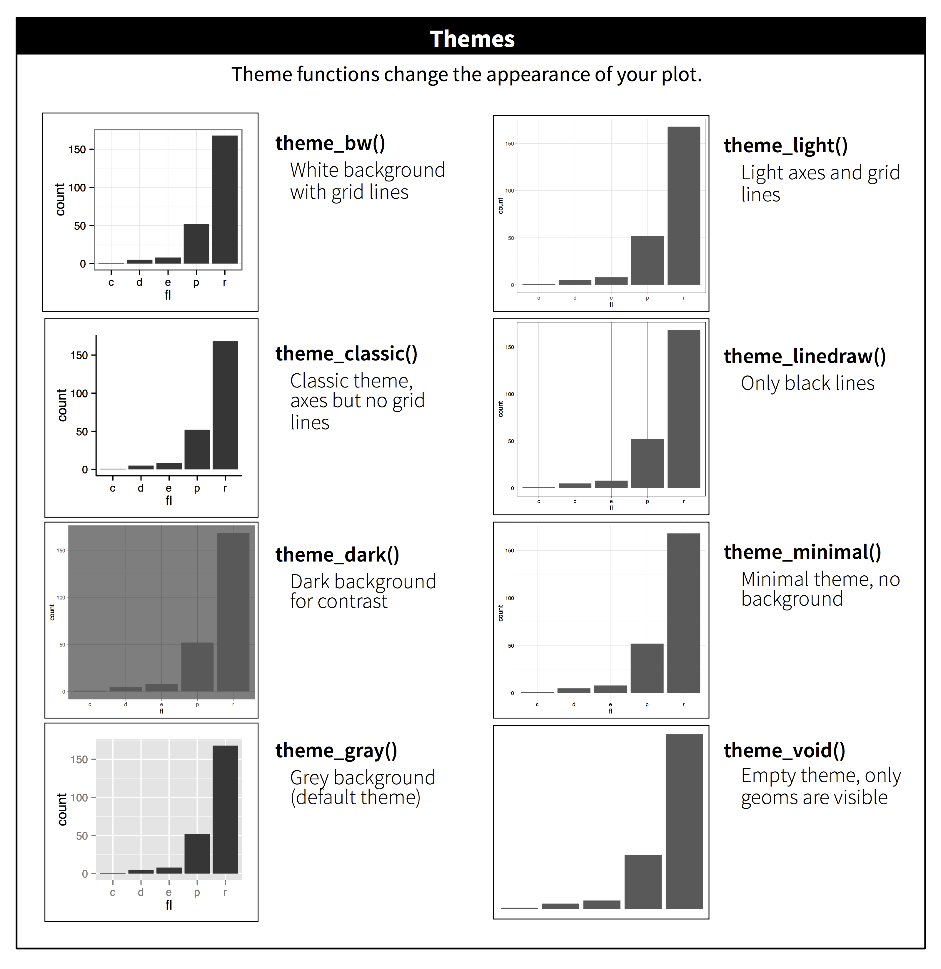{fig-alt="ggplot2 themes" width="683"}
### theme_dark()
```{r}
plot_sleep +
theme_dark()
```
### theme_classic
```{r}
plot_sleep +
theme_classic()
```
### hbrthemes
https://cinc.rud.is/web/packages/hrbrthemes/
```{r}
#| message: false
#| warning: false
plot_sleep +
hrbrthemes::theme_ipsum(grid = "Y") +
hrbrthemes::scale_fill_ipsum(na.value = "grey80",
labels = c("Critical", "Domesticated",
"Endangered", "Least Concern",
"Threatened", "Vulnerable")) +
theme(plot.title.position = "plot")
```
## Combine plots
The `patchwork` package makes it "ridiculously simple to combine separate ggplot objects into the same graphic." The `/`will separate plots vertically. The `|` will separate plots horizontally. See more about [patchwork](https://patchwork.data-imaginist.com/)
> Try also: (plot_sleep \| chicken_plot)
```{r}
# https://patchwork.data-imaginist.com/
library(patchwork)
(plot_sleep / chicken_plot)
```
## Interactive plots
Use the `ggplotly` function will transform your static ggplot object into an interactive plot. This interactive plot can be used in dashboards and web presentations.
See more at the [Plotly ggplot2 Library](https://plotly.com/ggplot2/) page, and the [*Interactive web-based data visualization with R, plotly, and shiny*](https://plotly-r.com/) book.
```{r}
#| message: false
#| warning: false
library(plotly)
ggplotly(plot_sleep)
```
## Annimate plots
Use the `gganimate` package to bring your plot to life through the wonders of animation. Learn more at the resource page for [gganimate](https://gganimate.com/)
For Example:
```{r example_gganimate}
#| message: false
#| warning: false
#| echo: false
library(htmltools)
img(src = knitr::include_graphics("images/gganmimate_example.gif"), alt = 'gganmimate example')
div(class="captxt", "Image source: https://gganimate.com/index.html#yet-another-example")
```
## Reinforce your learning
On your own...
Interactive Exercises from [RStudio Primers -- Visualization](https://rstudio.cloud/learn/primers/3)
[Angela Zoss code exercises](https://github.com/amzoss/ggplot2-S20)
## Resources
[Data Visualization: A Practical Introduction.](https://socviz.co/lookatdata.html) Kieran Healy
### books
[ggplot2: Elegant Graphics for Data Analysis.](https://ggplot2-book.org/) Hadley Wickham
[Data Visualization with R.](https://rkabacoff.github.io/datavis/) Rob Kabacoff
[Interactive web-based data visualization with R, plotly, and shiny.](https://plotly-r.com/) Carson Sievert
```{r}
#| echo: false
htmltools::tagList(rmarkdown::html_dependency_font_awesome())
htmltools::div(class = "myccfoot", htmlTemplate("template/footer.html"))
```