User Experience or UX has been known to make or break several careers. Polish your understanding of UX here.
 If you haven’t been immersed in iOS interface design, you might look at Apple’s icons and think that they’re just a rounded square or a ‘roundrect’. If you’ve been designing icons, you know that they’re something different and may have heard the word squircle used (mathematical intermediate of a square and a circle). And if you’re an Industrial Designer, you recognize this as a core signature of their hardware products.
 In this article, we talk about omnichannel analytics, why analytics are hard for notifications, and what we believe is needed to empower PMs.
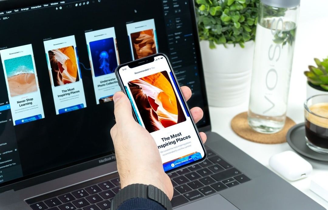 GUI design has become the best choice of user interface design. Nevertheless, in spite of the unpredictable popularity of GUI, few application programs have good interface design and live up to graphic user interface design principles. Additionally, it’s extremely difficult to use the expertise and existing documents to explain what an excellent and direct-viewing operation interface is.
 This article is Part 1 of the ongoing series From Zero to Product Manager. A set of articles that help you transition to a Product Management role. In this post I explain what a Product Manager (PM) is and how the role can differ across companies, I describe the best qualities of an excellent PM.
 Expectations, surprises, and lots of learning.
 Regardless of whether you're an accomplished website designer or developer or simply a beginner, a website architecture venture's extension can rapidly limit the of assets accessible, making it extreme to track down the correct website design for motivation for your assignment.
 This is the second chapter in the story of Branch, and describes how we built the next-gen solution for mobile attribution (we published Deep Linking is Not Enough, covering our rise to become the industry’s leading deep link and user experience platform, two years ago).
 I have handpicked some awesome UI and UX projects that might give you some inspiration to create your own projects
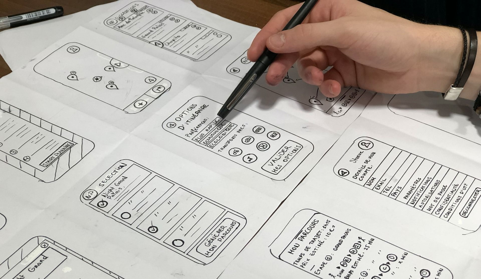
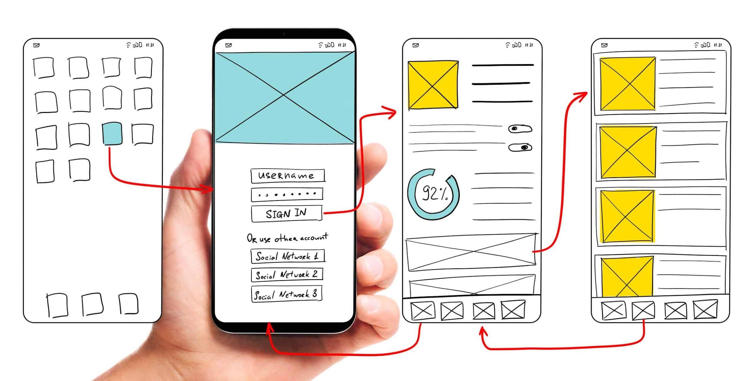
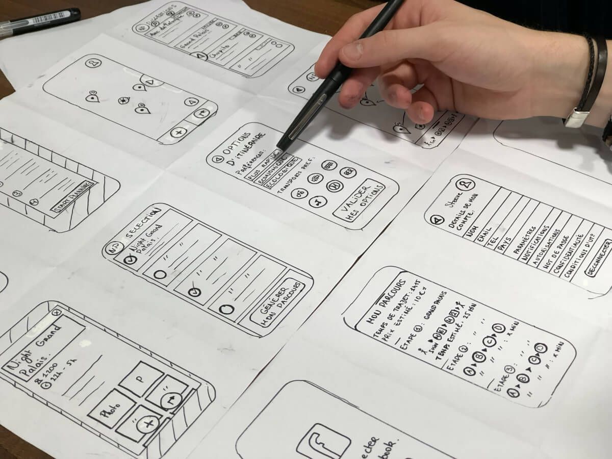
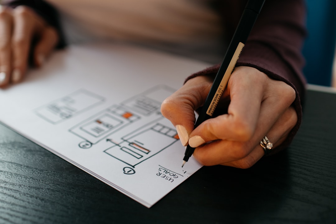
 Need help hacking your first wireframe? Here are a few first principles to remember.
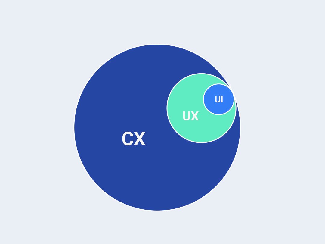
 You might have heard user experience (UX), user interface (UI) and customer experience (CX) being used interchangeably. Even some of the most seasoned and professional marketers and designers confuse these terms.
 The day has finally come,... to spread awareness regarding a concept called Mutation Observer. Yes, you should know about this. Simple but still a game changer when it comes to controlling how your webpage interacts with a user.
 A guide on how to write UX copy that accommodates every kind of user.

 I decided to design a Neuralink concept app after watching Elon Musk’s latest chat on Joe Rogan’s podcast. Context: Neuralink is one of the companies Elon Musk works on. They're developing skull implants that connect to the brain to restore certain body functions that were lost through injury or health complications.
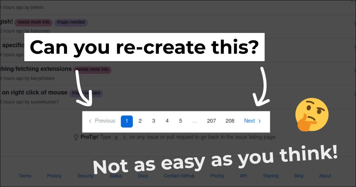 Are you a confident front-end developer? I challenge you to re-create this component from GitHub. It’s not as easy as you may think!

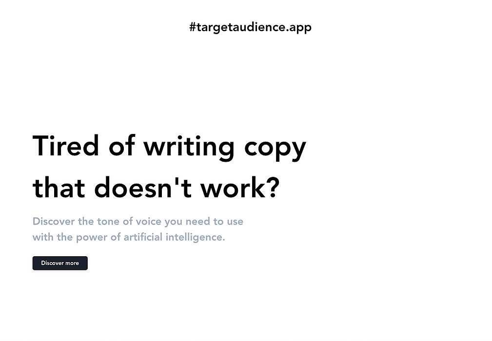 I’ve seen quite some landing pages come by on indiehackers.com by now and I noticed that I wanted to give/gave the same tips multiple times. So I thought it would be nice to write a small article about this. These are just tips from my point of view and things I like about a landing page personally.
 Today we are going to recreate the famous Instagram double-tap to like effect!
 The traditional comment box at the end of a blog post is not a sufficient way to facilitate reader and writer communication. It falls short in a number of ways:
 My story with CSS animations begins when I was trying to figure out how to become a unicorn in the programming world, the mixing between designing a User Interface (UI) for working in the back-end later it was quite impressive and hard for me, a person with a fully theoretical/academic knowledge foundation, but, at one moment, my fairy godmother appeared in front of my eyes, pure CSS animations brought my page to life and started to give me the magic that I was needing for... Creativity.
 We continue to share the internal processes of Overgear. This time we talked with CEO Tony Doronin who takes part in the recruiting process.
 Hey there 👋Thanks for checking my first Hackernoon article. My name is Vova and I'm a self-taught front-end engineer. I started learning front-end two years ago and was lucky to land my first job in a tech startup. Getting the first job is (very) challenging but the startup I applied to wanted to give equal chances to the professionals of all levels.
So the last 1.5 years I was playing with React, Redux, Webpack, fetch, Node.js, Express.js Backend, Webhooks.…You know, in a startup you are wearing different hats. I was making 20+ landing pages, setting up A/B tests, helping the marketing team to make automation and eventually doing some design tasks.
That's fun and I always enjoyed design tasks, even if they were small. So it became asking myself, what other people are using for making design tasks?
Here is what I got from a small Twitter research:

 UX really isn’t a one-angle solution. You may be a product manager or copywriter, either way - your microcopy needs to be on point.
 In this post, I want to talk about the user experience of an archaic technology that we got used to live with. We don’t even consider it archaic and we’re numb to all the little nuances it has: The mobile phone numbers.
 Google announces the roll out of page speed experience as part of their ranking factor. Here's how webmasters can test their sites.
 The React JS dev team announced some exciting changes several months ago - React would be getting a "Concurrent Mode". Essentially this would allow React to perform multiple UI renders concurrently. Of course, JavaScript is single threaded and true concurrency is an illusion, but the new features will allow web apps (and Native Apps once these features hit React Native) to be much more responsive and snappy than they are now with less effort and custom code from the developer to make this happen.
 One of the things that you end up developing in one point or in the other is a breadcrumbs navigation system. I've seen some posts across the web touting how to achieve it in React and Reach Router by providing complex looping mechanisms. In this post, I show you a simpler, non loop way that displays breadcrumbs in Reach-Router.
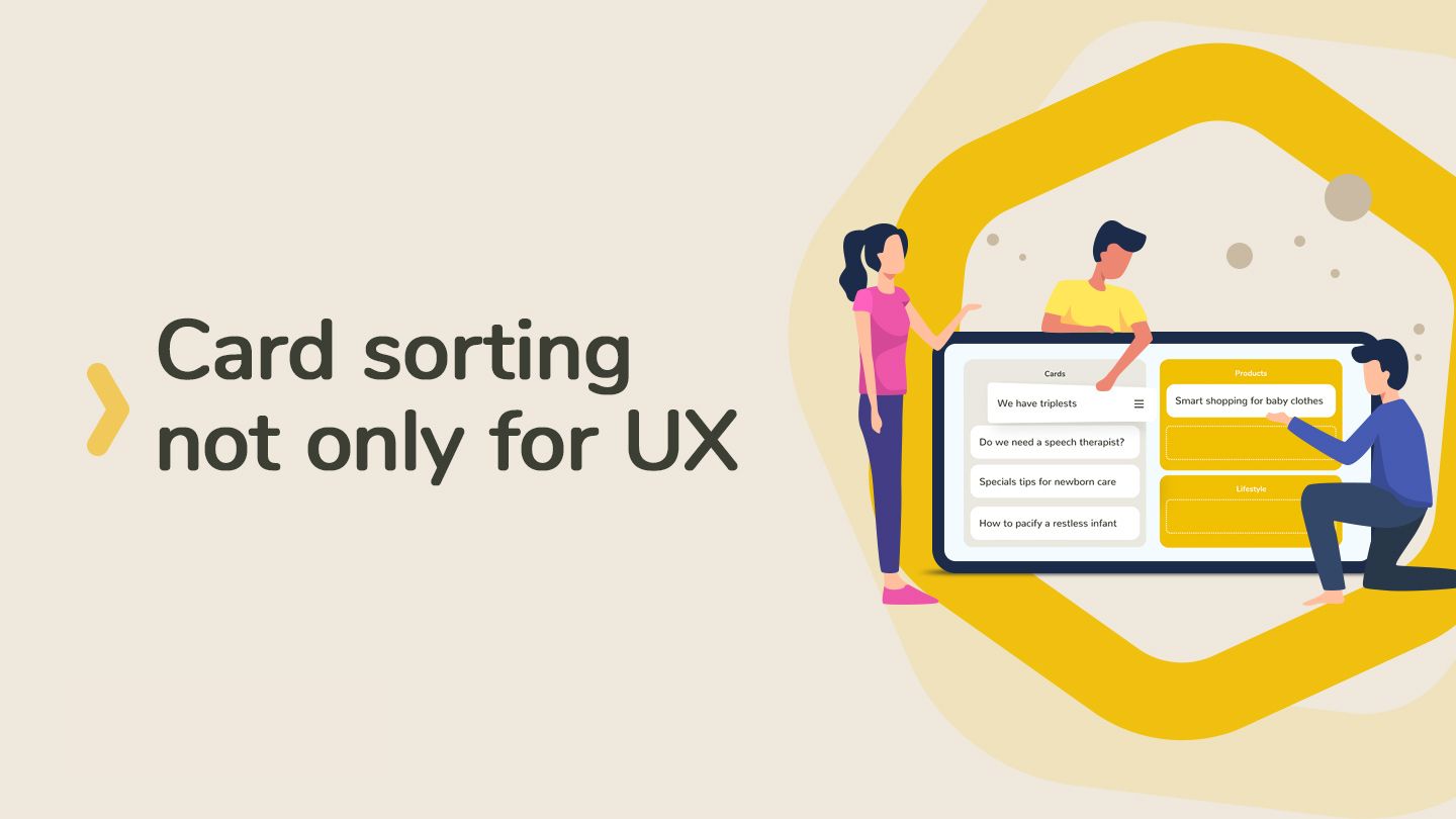
 Card sorting isn't only useful for information architecture. Ancient Greeks provided the foundation for this method, which is nowadays used in different fields.
 Over the course of my career, I have had the pleasure of building multiple products from scratch, and have collected some strategies that help the process of building a new product and lead to a highly productive and streamlined experience for all stakeholders involved. Story mapping is one of those.
 “Good design is actually a lot harder to notice than poor design, in part because good designs fit our needs so well that the design is invisible,” ― Don Norman
 A lot of remote teams start using Slack as a watering hole for getting everyone together to discuss what's going on and what'll happen next. Having all of these discussions happening in the #general channel is way too noisy. So teams start creating a bunch of random channels devoted to a specific purpose. Here are some of the channels we have at Hacker Noon.

 The Divine Alchemy of Mastery in Digital Design
 Are your sales coming too slowly? Maybe you’re spending some money on Marketing, just to realize that you are not getting a return on your investment… Ugh, that feeling of powerlessness is painful. Right?
 A few months after launching my SaaS I realised I have a problem.

 How can a developer make UX an integral part of the development cycle? Read 9 Must-Know UX Design Tips for Developers.
 I’m Mark Nadal & I want to tell you stories of an awe-inspiring future.
 Do you know what metrics you should track to see how well your website is performing? Read this post to learn what you should monitor.

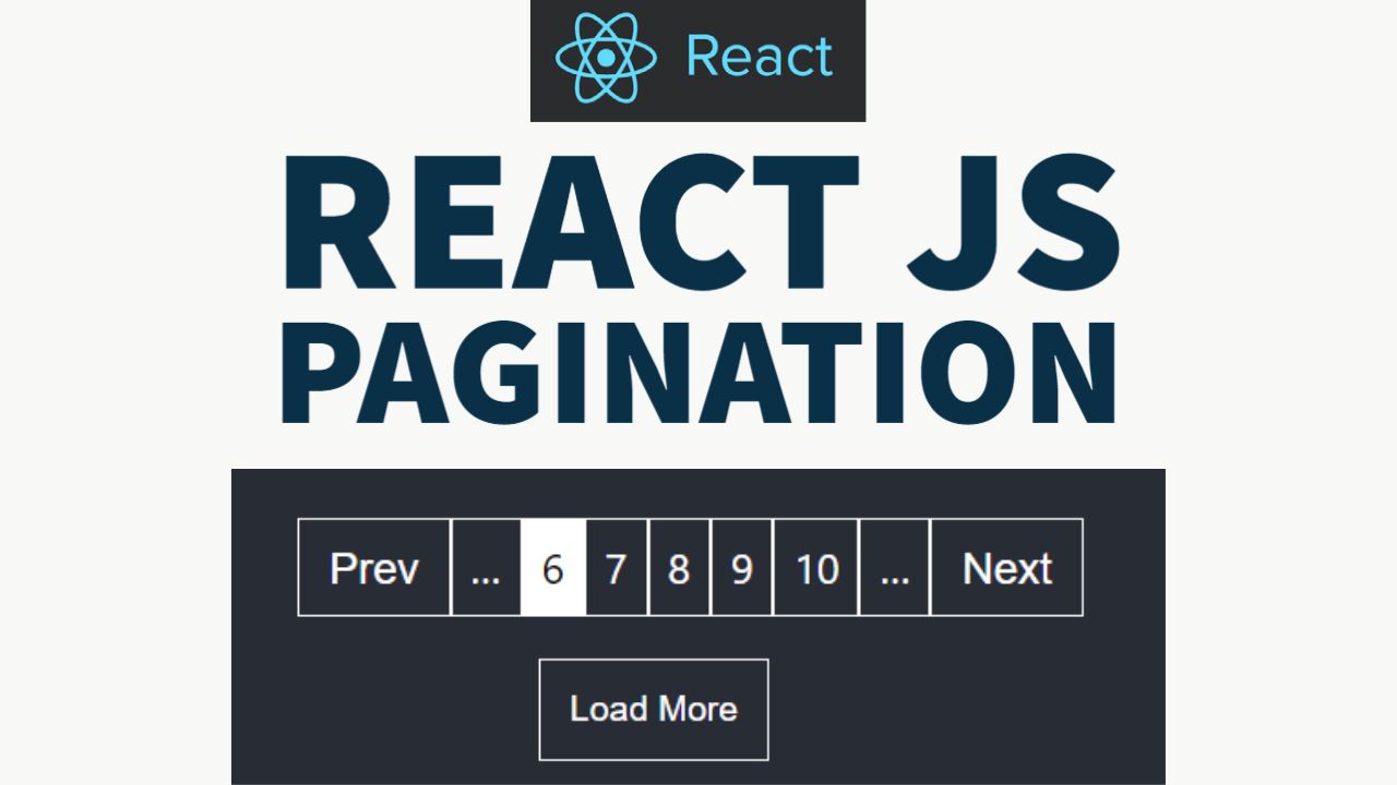
 Create pagination component from scratch in ReactJS. Pagination component are of two types, one loads items vertically and one display items with page numbers
 Photo Credits: Edward Tin
 By Adam Fard, founder of adamfard.com a UX Design Agency
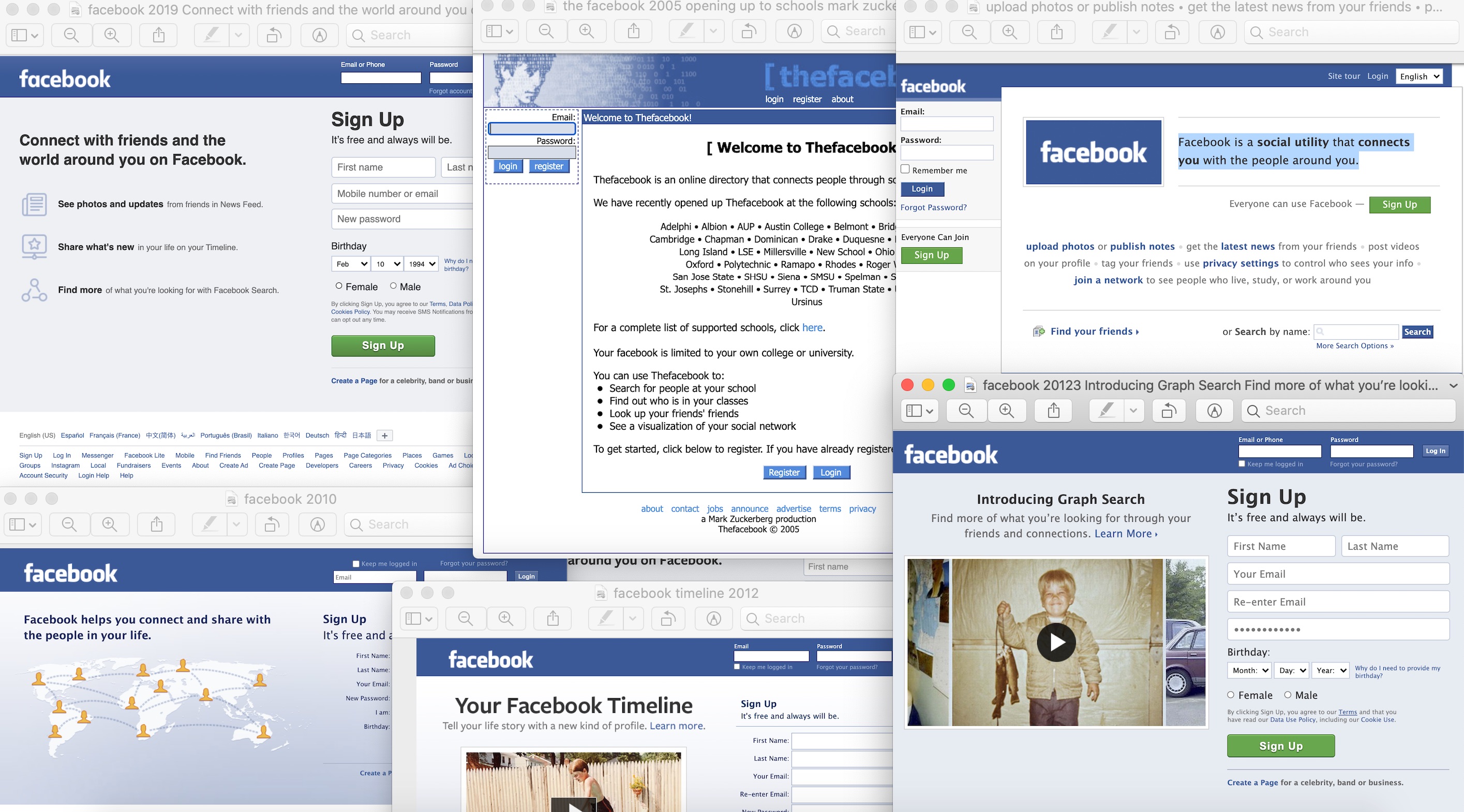
 2004 Feb 12. TheFacebook.com
 I've got some bad news...
 How I used Figma to run a comprehensive workshop with my team. Here are my thoughts on what works, what doesn’t, and how to go about building the remote workshop tools of the future.
 Productivity software is indispensable for all of us. Dedicated tools for creating spreadsheets, writing down notes, managing our to-dos etc. ensure that we are productive in our professions. Incumbent vendors (e.g. Microsoft, Google) have dominated this space for many years — yet, there is a chance for new players to enter the stage. New challengers such as the E-Mail client Superhuman or the note-taking tool Roam Research can compete by developing highly opinionated products which deliberately omit flexibility. Instead, the software is stringently crafted around a very particular way of approaching a process, which is inherently seen as superior by the firm.
 ZKP can be used for much more than just privacy. ZKPs are so versatile that it may redefine how blockchains work.

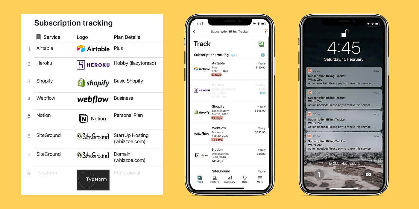 Simple app to manage your online subscriptions in one place.
 Bitcoin is an extension of ourselves, it’s our money — the people’s money. We can choose to transact with whomever, wherever, whenever, and for whatever we want — because Bitcoin does not discriminate.
 We love creating artworks. We've been doing it since the early ages be it the cave paintings in Altamira or Ajanta, we have an innate desire to express and depict the world as we see it. Illustrations, on the other hand, are more than just expressions, they serve as a way to communicate to a much larger audience using a familiar visual language. In a digital age, illustrations are a powerful tool to visually express a piece of text, to empathize with the user, to simplify complex processes and even to bring delight.
 This post is a continuation of our series based on a video series explaining how to build Slack Apps that integrate with Salesforce APIs.
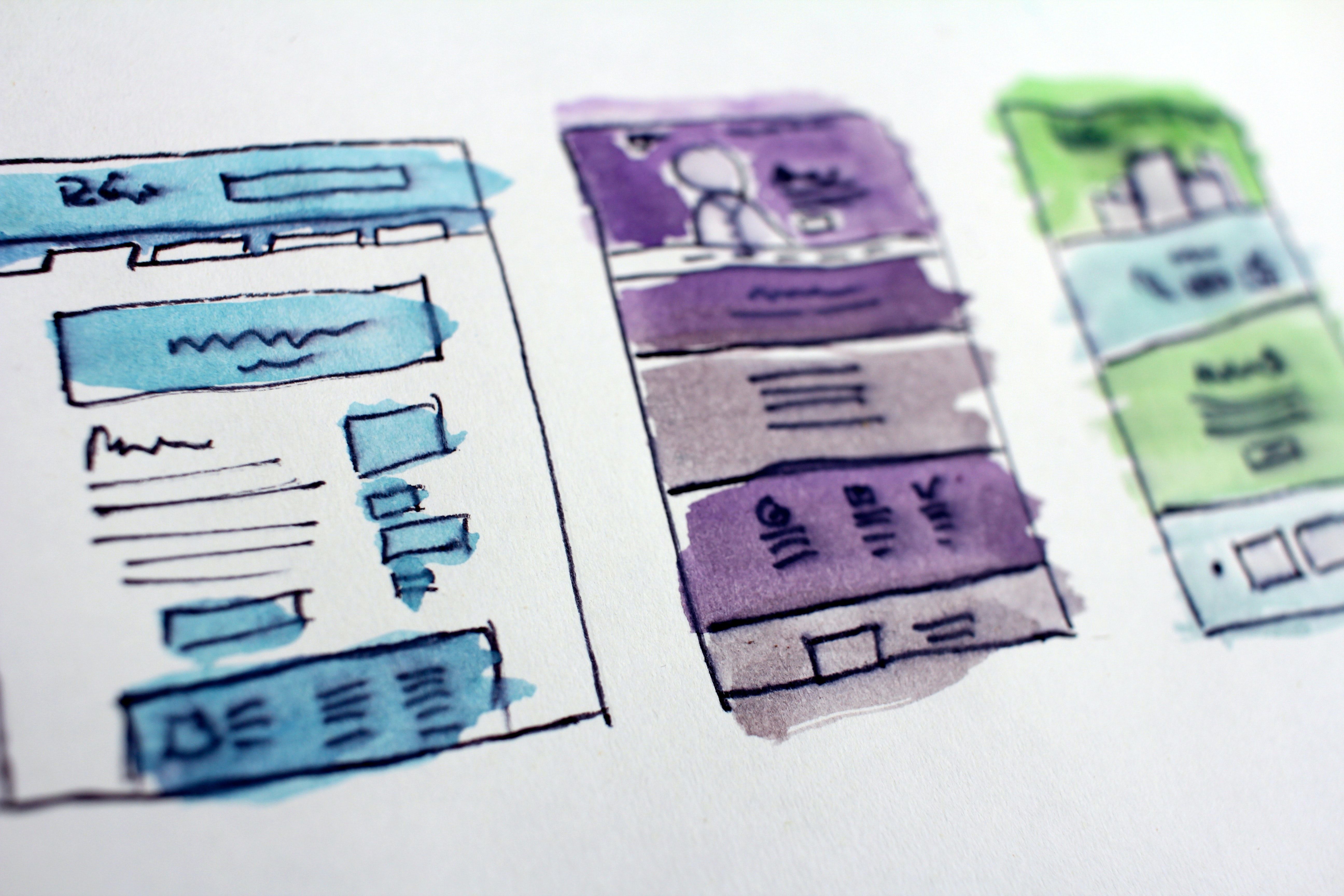 The evolution of UX personas: From qualitative to data-driven profiles.
 With the new EyeDropper API in Chromium, websites can let visitors pick colors from anywhere on their screen
 First, we need to talk about user research conducted with interviews.
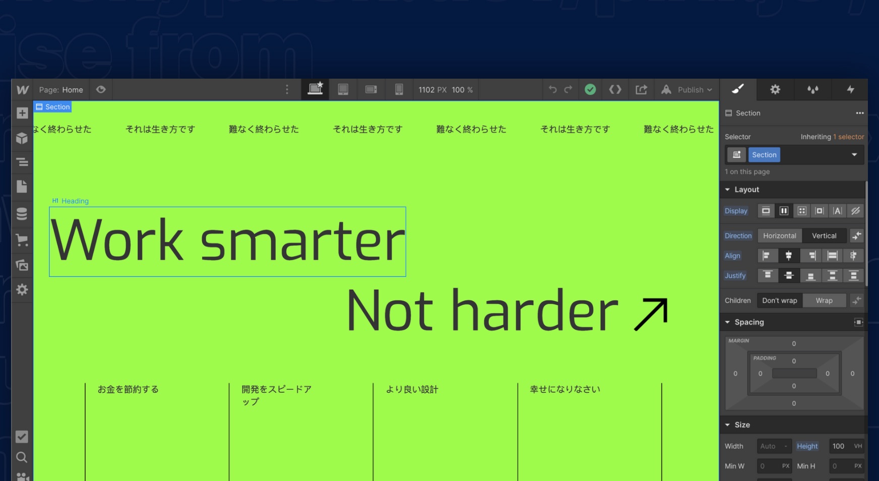
 We’re here to give control back to our clients. That’s why we use Webflow to create a smarter and better website design that puts you in the driver’s seat.
 A brief introduction to mobile app design with some simple tips to consider while designing for a mobile app.
 UX design is an important part of video games as it helps users form first impressions of the game and motivates them to try it out.
 Using a design tool isn’t a skill. It’s just good practice to display them in your portfolio to depict how strong you’re with the tool.
 Here are 5 tips you should keep in mind when implementing dark mode in your apps.
 The main criteria that really matter in UX are whether it fixes your users’ problems. Here are the three most important points of view in efficient UX.
 Your company’s brand is an essential yet intangible asset that narrates how your audience views your organization. It’s no longer sufficient to merely develop your branding. To be sustainable, you must also future-proof your brand, ensuring that you evolve with industry trends and stay relevant to a digital audience.
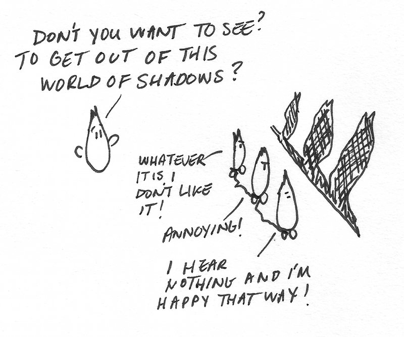 If there’s one thing we can all agree about the tech industry is that it moves pretty fast. That’s why we constantly hear about new job titles such as DevOps engineer, Brand Evangelist and even Chief Happiness Officer. I’d like to propose adding one more role to this mess — behold, the Chief Reality Officer!
 The software market is suffocated with new mobile and web apps monthly. That’s why the focus has moved on ensuring a client-centered and visible UI/UX design.
 Product designers and researchers are the voices of the users. Check out the 5 fun and inclusive ways to help product teams build more user empathy.
 Nowadays, businesses just can’t do without relying on the web and various kinds of digital technologies.
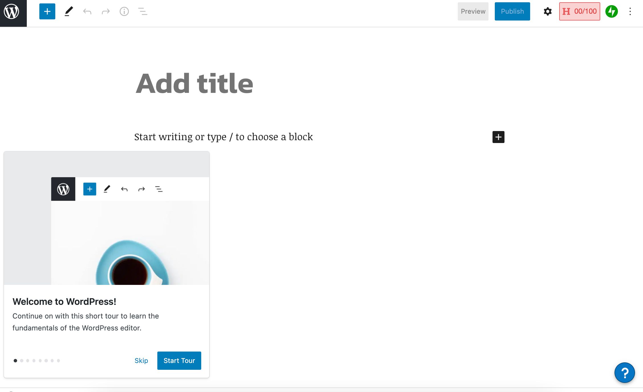 Ran into WordPress's onboarding flow for new writers today... Here's the eight slides they prioritize.
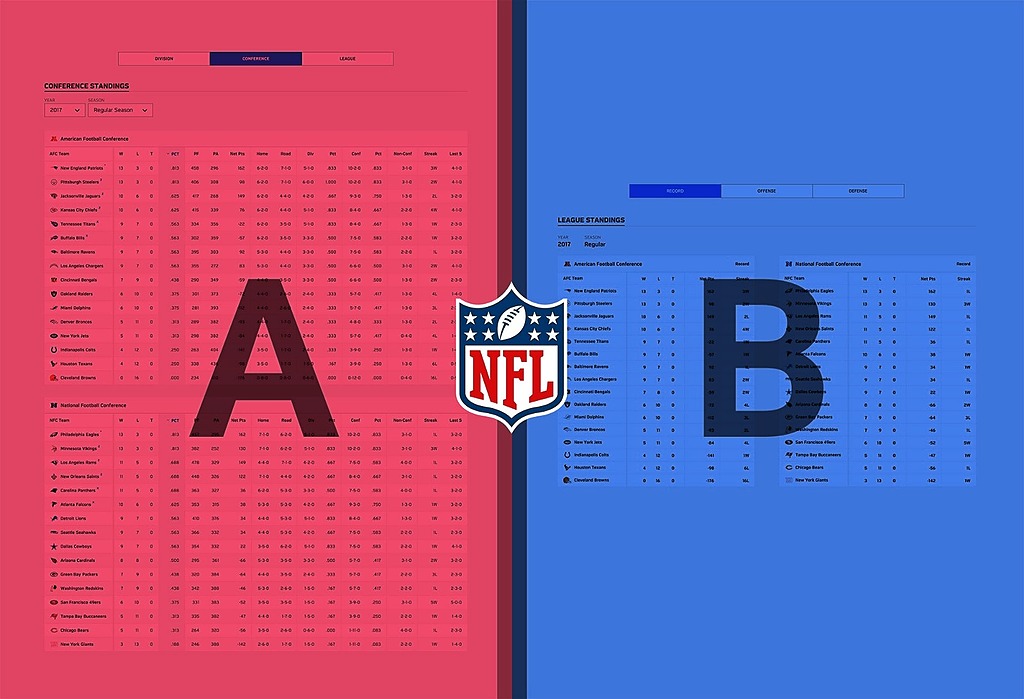 I’m one of an estimated 49% to 70% of Americans who counts themselves a fan of the NFL. I’m sure they’re busy preparing for the upcoming 2018 season. Engaging ~200 million US fans can’t be easy.
 My first experience using various apps to meet people.
 If you don’t need a UX designer for several projects over the long term, it’s sometimes better to hire an out-of-office freelancer than an in-house designer.
 The world of DeFi is destined for a boom. But can it really generate adoption in the hundreds of millions with current UX and literacy issues?
 An accessibility audit is the process of performing manual and automated tests on your website to find out the improvement areas. There are 6 different types.
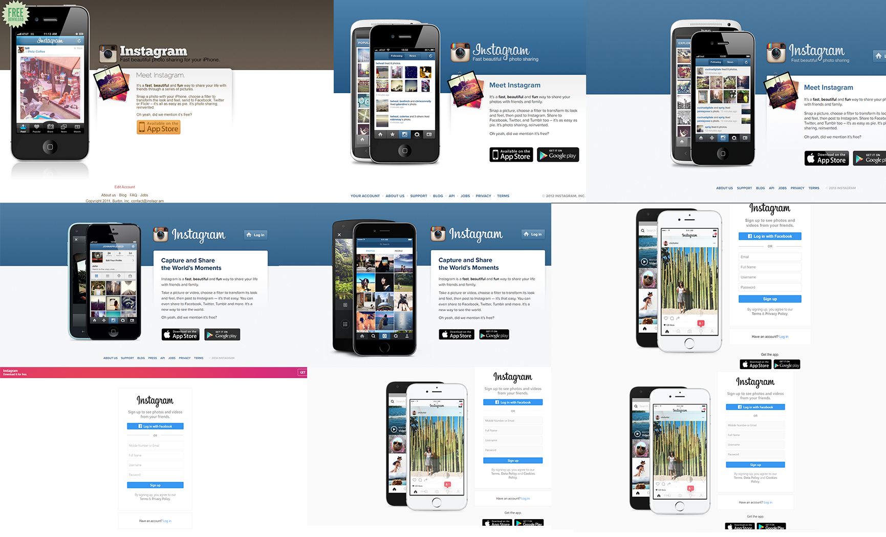
 Instagram or Insta is one of the world’s most used photo and video sharing social networks. It is owned by Facebook and was launched in 2010 on iOS and the Android version was launched two years later along with a trimmed down desktop version. Today, let us see how the homepage of Instagram has evolved over the years.
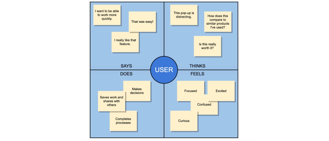
 Empathy map, personas and mobile ethnography research for UX Designers.
 Software Development is a route that’s proved to be very popular in the last couple of years in tech. From HTML & CSS webinars to Ruby on Rails meet ups, you can’t escape the hype. But what if coding isn’t for you? What if you want to solve problems in Tech without writing code, is there a career out there for you?
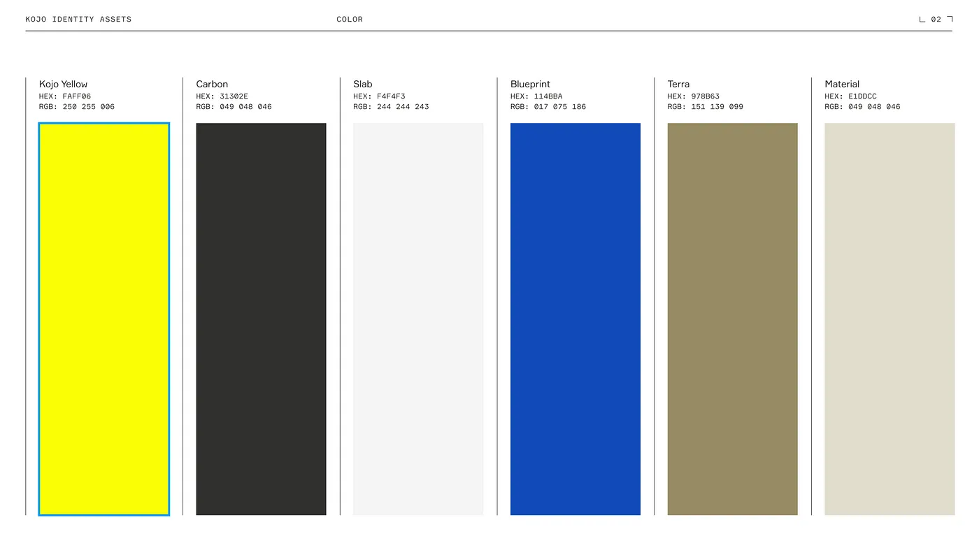 An engineer's journey to solving tech debt while rebranding a mobile application from Agora to Kojo.
 Color is one of the most important tools for creating user interfaces that don't suck, so stop doing it wrong.
 Just some of the things that could be easily fixed to make the Google Cloud Platform and Workspace easier to use.
 The idea that the internet reached 4.5B people in 2019 is insane. According to internetworldstats.com, 58.8% of the world population is online. But how much of the internet is actually for everyone? A study from Perrill (formerly first scribe), shows that only 1% of websites and web apps are ADA compliant. Investing in UI/UX is a great deal for anybody building a website/app, but always think of all users, not just the majority of users.
 With more consumers shopping online this year than ever before, the pandemic has redefined holiday commerce. In 2019, shoppers spent more online in the weeks leading up to Christmas, increasing eCommerce sales by nearly 20 percent over the prior year. This number is expected to surge this year as the pandemic drives most shoppers to stay home. In total, it’s estimated that holiday shoppers will spend nearly $180B online this holiday season, an all-time high.
 In an ideal world, the goal of any business starting up is to make money. In most cases, the profitability of a product is closely tied to how you as a product manager choose to price your product. Apart from building a product that provides real value to its customers, profitable monetization is the second most important aspect of running a successful business.
 Rewards programs are centered around one unifying factor: customer satisfaction. Here is how to design your program to meet that requirement with ease.
 6 tips for new grad and junior UX designers from a Staff Product Designer at Meta and Google.
 5 tips on how to run result-focused design sprints from a designer at Meta & Google. Take your design sprints to another level.
 The solution is to redesign the product in such a way that it prevents errors from occurring in the first place.
 I have compiled eight chrome extensions to help get the job done faster and more productive.
 User experience, or UX, refers to how easily users interact with a product or service. In blockchain technology, a positive user experience can be critical for its adoption because it can determine how readily people are willing to use the technology.
 A “ready” UX designer is a rare encounter in the wild. Designers usually do know how to make things pretty – but when it comes to the product logic and interactions design, few feel at ease. The inevitable solution is to hire people with a relevant background and upgrade them to real UXers: host lectures, give homework, provide practice opportunities.
 Over the years, I've found a collection of highly-efficient UX research methods that I rely on when I have little time or money.
 A few weeks ago I stumbled upon Uxcel, an app that teaches you UX/UI. It looked really clean, so I decided to give it a go.
 5 UX portfolio tips from Meta & ex-Google designer. Upgrade your design portfolio and get the job you want.
 At Hacker Noon, we try to recognize our best and brightest contributors through our annual Noonie awards. One such impressive writer is Samuel Gregory from the United Kingdom. Samuel is a 2020 Noonie nominee in the Back to the Internet category.
 Language Models are far from being sentient but they can be used to conduct qualitative UX Research especially when it comes to handling big qual data.
 When it comes to design, it has long been said that simplicity is key. And although I always understood the basis for this saying, I never fully appreciated what it really meant.

 Improve your ranking by both search engines and humans by not forcing the client to download unnecessary imagery.
 After many years, I went from pure icons to adding descriptive text.
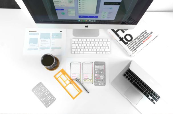 There have been a number of misconceptions and myths about UX. And these things lead to inaccurate assumptions which affect design and usability choices.
 An interview with Jordan Bowman, Product Designer and Co-Creator of UX Tools; and 6x 2021 Noonies Nominee for Design Thinking, Product Design, UI; UX and more.
 It shows me that #OwnYourData is not just about privacy or autonomy, but also about the cool cybernetic possibilities of a future we haven't imagined yet.
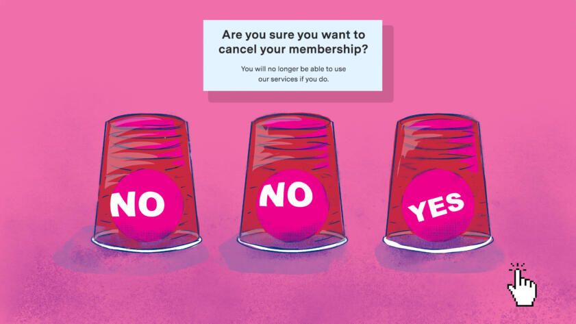
 Exposing dark patterns in digital publishing
 Yagmur Erten is a user researcher with a background in behavioral psychology and business management.
 To prepare for brainstorming, it is necessary to gather a team, acquaint all the participants with the rules of brainstorming, and also prepare questions.
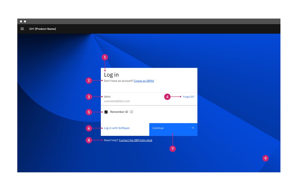
 Creating login fields that work with password managers isn't as easy as it seems.
 How to build a tech stack if you run an early-stage startup.
 In a nutshell, accessibility in user experience gauges whether users with various abilities can easily interact with the product or service.
 Have you ever delivered research insights to your team but never heard back?
 The biggest reason to focus on mobile notifications is because it will improve UX for anyone using mobile apps - which at this point, is everyone.
 This is a true story of something I witnessed a couple of years ago during my early days in tech. Was it a bad idea? A bad execution? or just an unlucky day?
 Product Managers (PM) are responsible for the growth of the product from the very first day. If the product succeeds, the whole product team gets the credit but if it fails, the PM takes complete responsibility for its failure. In this drive to make their product successful, PMs need to spend a lot of time with their product to make it simple and valuable for their users.
 "I am not a fan of Bitcoin and other Cryptocurrencies, which are not money, and whose value is highly volatile and based on thin air. Unregulated Crypto Assets can facilitate unlawful behavior, including drug trade and other illegal activity."
 This post focuses on how SaaS metrics relate to customer onboarding, company growth, and the generation of sustainable income needed and sufficient to not only stay afloat in the turbulent sea of web marketing but thrive.
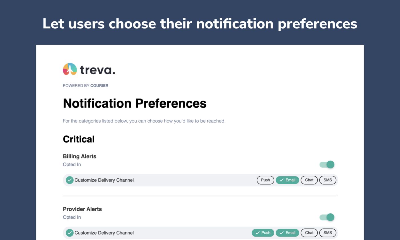
 In this article, we’ll cover what notification preferences are and which ones you should include in your app. Read tips for advanced options you could build.
 The social restrictions of the pandemic have made the job of website and app developers—and user experience (UX) designers—a lot more difficult.
 A UX case study on OpenSea—analysing the experience of creating and selling NFTs.
 Tailored notifications are essential for a positive user experience. Learn how automation tools make it easy to customize user notifications.
 Get valuable insights on designing user-friendly in-app chat UIs. Learn the dos and don'ts, best practices, and tips on simplifying, enhancing UX with color and
 Normal Nielsen's 10 heuristics can be abstract and hard to apply. Here is how we applied the “Match Between System and the Real World” principle.
 Companies advertising online have developed a series of unethical practices that some describe as Dark Patterns, which can mislead consumers on the internet.
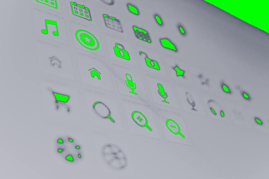 When it comes to user convenience, understanding consumer habits is as important as the market your app operates in. The ability to combine simple gestures with user-friendly interface results in a solution that appears simple and comprehensive. Mirroring of the physical actions into digital ones is one of the ways to do it.
 Improve your traffic by focusing on the quality of your user's experiences. The following instructions are the initial stage of that journey.
 Notification preferences are important, especially if you’re building an application that sends dozens of notifications. With Courier Preferences, you can build
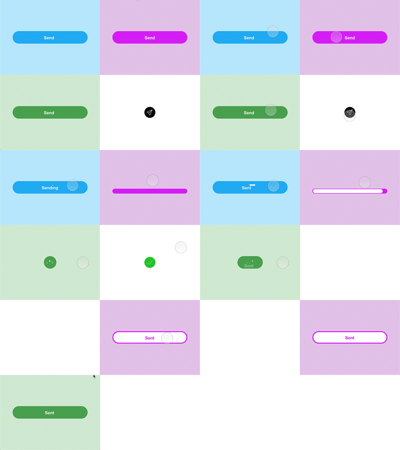
 It's always said that the little things make more significant differences! The case with user experience is also not different. Every user comes across with microinteractions in our daily lives in some form or the other. It may be in the form of time on the phone's alarm to notifications for new emails in your inbox!
 Every Computer Science major has had this debate with their mates. Usually, such conversations constitute both Native and Hybrid app developers bringing very strong points on the table, until all of them just give up on convincing the other, and just go ahead with the app development themselves.
 Know when it's time to drop the jargon. Immutable records won't make your Web3 project stand out. Here's how to implement user research to make your DAO pop.
 Taking the first step towards something new is never easy.
 There is a direct connection between all the unnecessary notifications you get on your phone and the sub-prime financial crisis of 2008: lack of accountability
 As a business owner, what can be worse than having a visitor leave your site due to an issue you could have eliminated or controlled? Multiple factors hamper user experience, but what about the ones that you can control? Wouldn't it be great to have a simple, intuitive website where users will not find it complex to perform a certain activity or give a thought before proceeding?
 I've recently rebranded and redesigned the look and feel of my website. As a part of that redesign, I've implemented both a light and a dark theme. Here's how.
 The advancement in technology has given rise to a variety of browsing platforms. It is imperative to ensure proper support to the website for fitting in the browsers. Due to this, progressive enhancement is getting higher popularity among web designers and developers to provide a wide range of browsers accessibility.
 The “new normal” lifestyle of these days requires various remote solutions developed with IT technologies. Telemedicine apps are leading the trend.
 It's impossible to buid a well-converting edtech product without investing in the LX. Use these 5 insights to make your project life-changing.
 How do you know if your users understand the interface of your product, or if it's easy for them to achieve desired tasks? Usability testing is the answer.
 In this article, we'll discuss some tips on how to create a great user experience with React.
 This article takes a deep dive into the top UI/UX practices that will help your mobile app succeed in App and Play stores.
 One way to help your web3 project grow and thrive is by incorporating game mechanics, which are the principles and rules that govern a game.
 To design a great UI, one must be aware of the concepts of UX design too. It helps the designer adopt an empathetic approach.
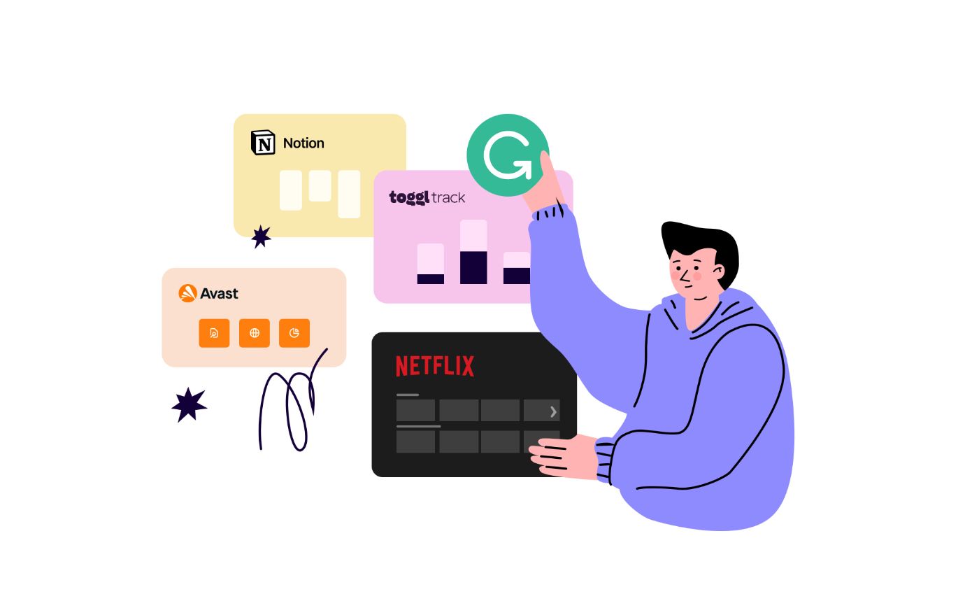 User onboarding is the process of introducing new users to a product and helping them understand how to use it effectively.
 Over 4,000 designers responded to Taylor Palmer's annual UX Tools survey. Here are some takeaways from the results.
 The rise of customer-centricity has led to the emergence of several novel concepts in the field of marketing. Interestingly, the hottest ones seem to have the word “experience” in them, with user experience and customer experience being the most familiar examples. In the era when customers often engage with the service through a website or an app, the line between UX and CX is understandably blurry. However, while certainly related and mutually dependent, they still require somewhat different approaches and sets of tools.
 The sales funnel attracts consumers to business products or services, and it also convinces them to buy the respective product or service.
 Product Managers (PM) are responsible for the growth of the product from the very first day. If the product succeeds, the whole product team gets the credit but if it fails, the PM takes complete responsibility for its failure. In this drive to make their product successful, PMs need to spend a lot of time with their product to make it simple and valuable for their users.
 The best logos come across as simple and effortless. This is a difficult concept to wrap your head around when creating your first logo. In fact the number one issue I have had with most of my clients is their urge to overdo the design. Look at the logos of the world’s most successful brands like Nike, Twitter, or Apple. They are extremely simple and recognizable which is why I spend a good part of my time stressing this point to my clients.
 As a developer, I make APIs for another system to consume so that multiple systems can talk to each other. Where is this design thingy coming from? Isn't design for UI? How is this applicable when building APIs? And what would be the benefits? I assume these would be some of the questions when looking at the title of this post.
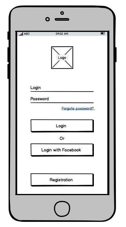
 Login and signup processes are one of the most underrated tasks when building and upgrading a website or platform... or multiple ones. However, on this kind of development tasks, implications go far beyond asking for an email and a password: security issues, user experience, customer profiling, different tech stacks compatibility and adaptation...
 The purpose of every product is to be fully functional without forcing users to invest too much time and energy in the process. This is exactly why UX and agile methodologies play such an important role in the 21st century business – everybody wants to design a product that maximizes functionality while minimizing consumers’ efforts.
 An optimized user experience can help turn your visitors into customers. This article will help you make a note of the UX aspects you can't afford to miss.
 The JTBD framework introduced me to the idea that customers don’t “buy” products. Instead they “hire” products or services to help them overcome an obstacle and better their lives. Products that deliver on this promise of upgrading the customers’ lives are loved whereas the ones failing to do so are dumped.
 10 years. For 10 years I have been working with data. I still remember those first days when we didn’t even have that much data to work with, then Google Analytics came in and changed the way we track users. I remember the rise of apps and the attribution tools that followed to help us understand how the user found us. Compared to 10 years ago, we have become even more clueless about our users, and the worst part is that we still make decisions based on emotions – despite having so much data to support us.
 Learn how to leverage form tools and make your website more user friendly
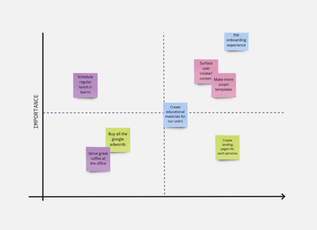 How to define user behaviour using methods like Grouping, 2x2 Matrix, and Venn Diagram.
 The best logos come across as simple and effortless. This is a difficult concept to wrap your head around when creating your first logo. In fact the number one issue I have had with most of my clients is their urge to overdo the design. Look at the logos of the world’s most successful brands like Nike, Twitter, or Apple. They are extremely simple and recognizable which is why I spend a good part of my time stressing this point to my clients.
 Have you ever high-fived the universe? If not, let me introduce you to surfing.
 The importance of user experience is more emphasized than ever. As a result, the number and variety of dashboard tools is on the rise. These tools are used as an essential piece in any good customer experience strategy.
 It's safe to say all products are after the best User Experience.
 Accessibility Testing is gaining popularity as devs becoming more concerned about the accessibility of their products and services. Learn some basics and tools.
 What interactivity means and why you need it to make immersive products. We’ll also cover what constitutes immersion, and why “user” is an objectifying term.
 There are too many examples when an app brings more annoyance than value. We’ve picked four of them and figured out the design sins they committed.
 Writing for the user experience (UX) is the activity of creating text or content that is read by customers and that appears inside the design of digital goods. UX writing assists customers in understanding how to use and interact with software products, such as websites, desktop and mobile applications, games, etc. The basic purpose of user experience (UX) writing is to assist users through completing activities in any digital product. For want of a better term, user experience writers are interaction designers.
 The UX industry puts a lot of emphasis on processes. But is that the best way to think fundamentally about design?
 The design of the dating app should turn the e-space of online dating into a comfort zone for billions of users seeking for a soulmate.
 I recently joined Jina AI, a startup focusing on neural search. One of the things that got me interested was their documentation — while not perfect, it’s straightforward, practical and easy-to-read. I wish that were just as true of every tech product out there.
 Are you looking for a way to secure more sales and build customer loyalty? If so, you’re in the right place.
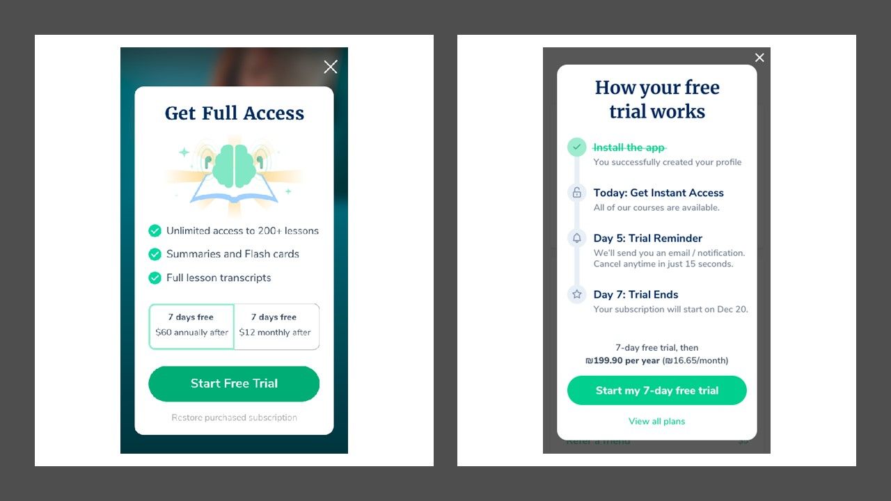 3 ways we increased conversion from free to paid by 760%
 The 2020 #Noonies are here,and they are both much greener and much bigger than last year. Among the 2,000+ deserving humans nominated across 5 categories for over 200 award titles, we discovered Amanda McGlothlin from the United States, who’s has been nominated for a 2020 #Noonie in the Future Heroes and Technology categories. Without further ado, we present to you, our big techy world, from the perspective of Amanda .
 Some of the most common approaches to solve a problem are situational or context-specific. For example, in the field of structural engineering, most of the challenges are solved by applying time tested rules in the field of civil engineering. For a problem that is considered less severe, a common approach is a trial by error. Mission-critical requirements and issues are solved by using a well-defined set of steps and strategies. The first reaction to solve any problem is to compartmentalize the problem into something which was solved earlier. The mind likes the comfort of the known after all. This is our primordial nature. These approaches have served us since time immemorial and will continue to do so. A common thread running through all these problems is they are well known, and they have been faced before plus they are well documented
 A Click Is Still a Click — Interaction Techniques in UX. How different interaction types influence user experience.
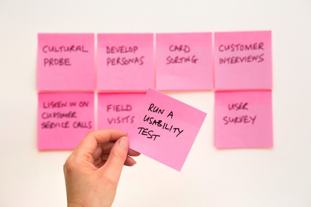
 Are you intimidated by usability testing? Don’t know where to start? Feel like it’s too time consuming or expensive? Usability testing doesn’t need to be a fully-fledged psych experiment with a formal lab, big team, and lots of time and money. In the real world, it can (and often should) be much lighter and faster than that.
 UXtweak is user experience (UX) research platform providing tools for usability testing, IA research and behavior analysis. Read its origin story and more!
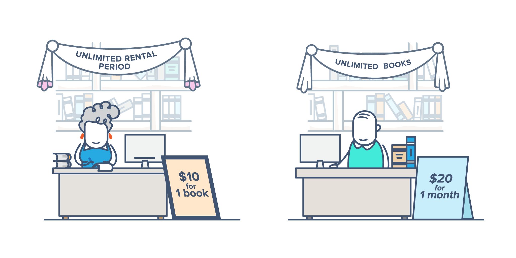
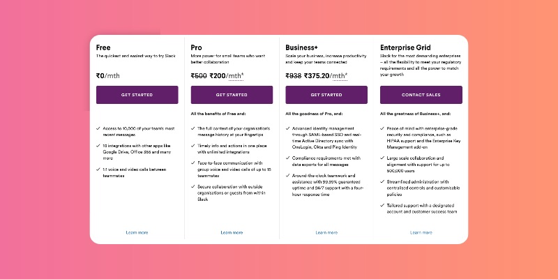
 There are many pricing models that you can use to increase your conversions, here is a list of 5 pricing models you should be using.
 16 sites that offer free illustrations
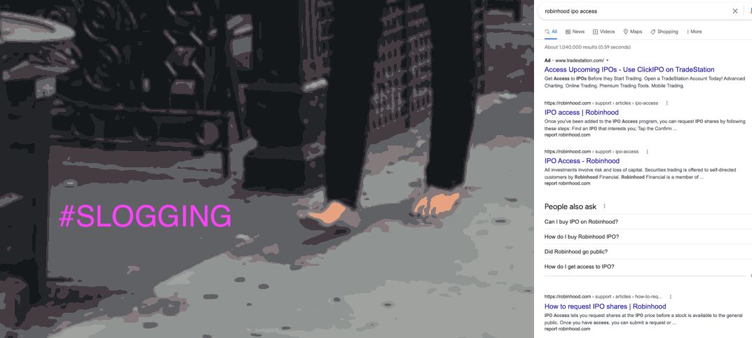
 Slogging #only-at-hackernoon: we discuss Adam Neumann shoelss in NYC, Robinhood's IPO play play and what makes good UX in Fintech?
 The largest tech company in the world recently launched new software.
 Image courtesy of Pexels
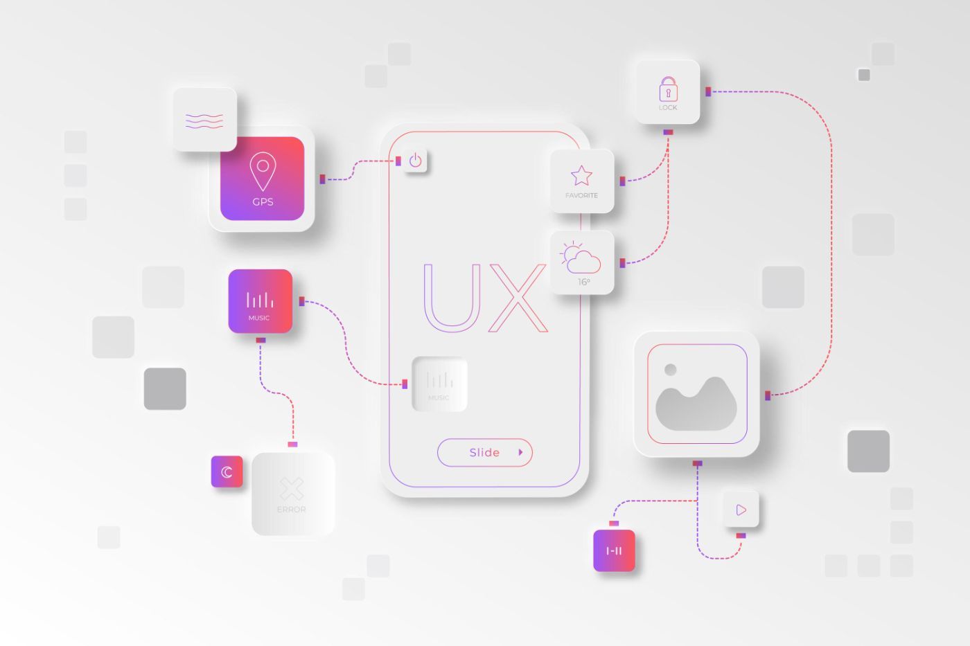 Here we share the list of top 10 UX research tools. This guide will help you better understand the perspective and attitude of a user.
 JSWorld Conference is the number one JavaScript Conference in the world, and I share a summary of all the talks with you. Part III
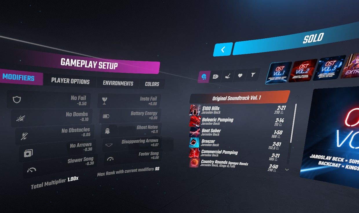 For the last couple of weeks, users have been praising the game’s new multiplayer feature. Me, I can’t stop looking at the gorgeous interface.

 Quite often, beginning designers contact me on Instagram asking:
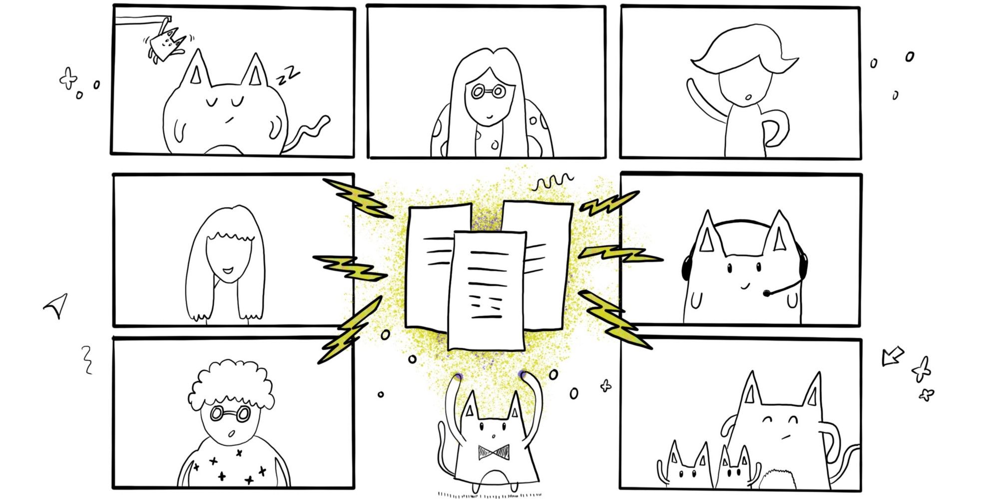 How Amazonian thinking and communication tools are turning me into a remote work optimist.
 User personas can be problematic. Is there a way to turn them into a useful resource? Update them regularly, involve your team in the creation process and more.
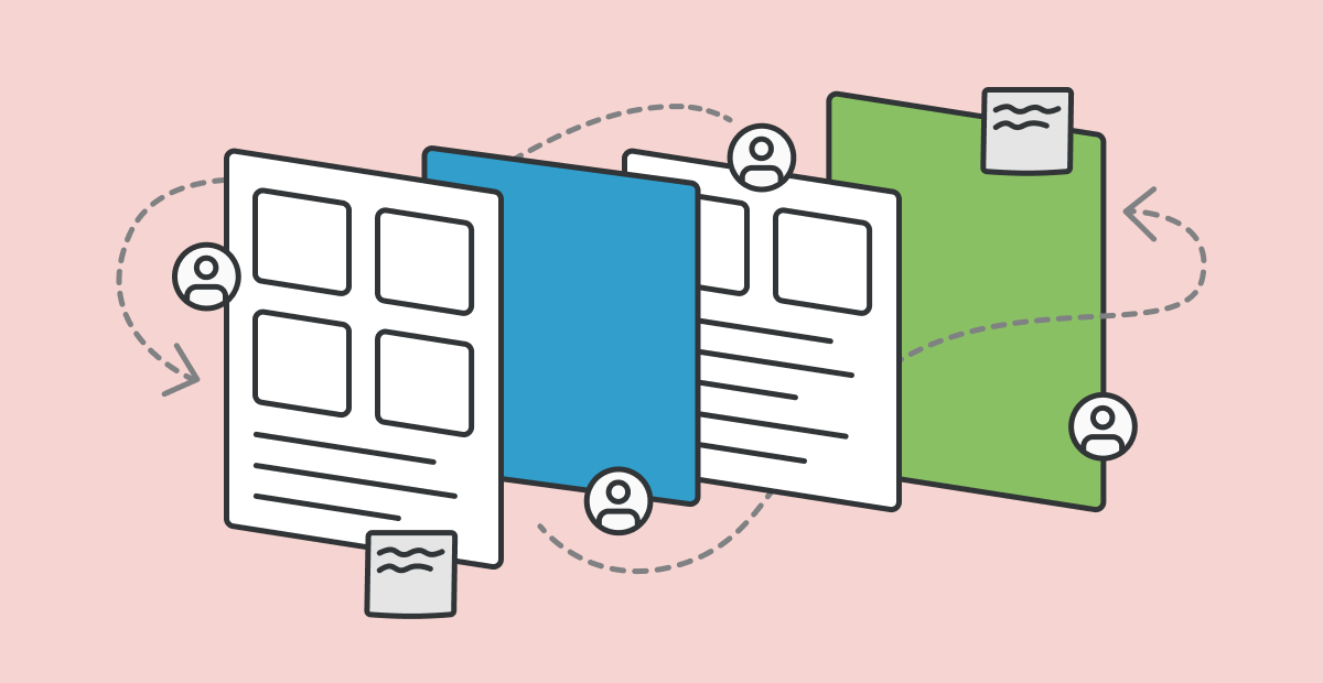
 To build an awesome and successful digital product you need to do a lot of things. Such as planning, market research, build a prototype, design it, code it, ship it etc. For this whole process, you need to go through lots of handoffs and team communications. One of the more painful handoffs is the Design-to-Development Handoff.
 Website layouts change all the time, and there are more ways than ever to style a layout, with many frameworks available to help simplify the code, whilst keeping sites looking fancy.
 There are no guarantees the future will hold the same values as us, so what right do we have to encode ours upon them?
 This article is Part 3 of the ongoing series From Zero to Product Manager. A set of articles that help you transition to a Product Management role. In this post, I provide tips to look for jobs and prepare for your interview.
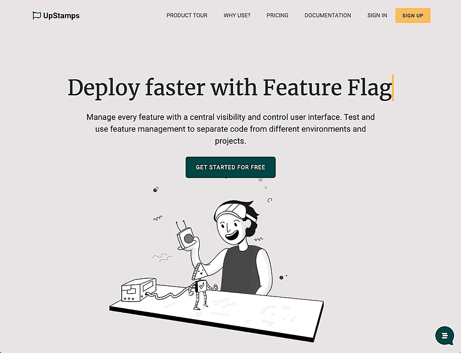 While I was talking with Vitor Amaral, creator of UpStamps, I was inspired by the design he uses for his homepage. It’s a clean homepage with awesome vectors that animate(!). Reading through the copy I noticed some things that could be improved which would increase his conversion. So let’s start!
 Design development doesn’t begin with a designer sketching anymore. It begins with understanding - step-by-step - how your users will navigate your app.
 We like to apply labels to users: they’re irrational, lazy, unpredictable, rushed, and so on.
 What is an Online Focus Group?
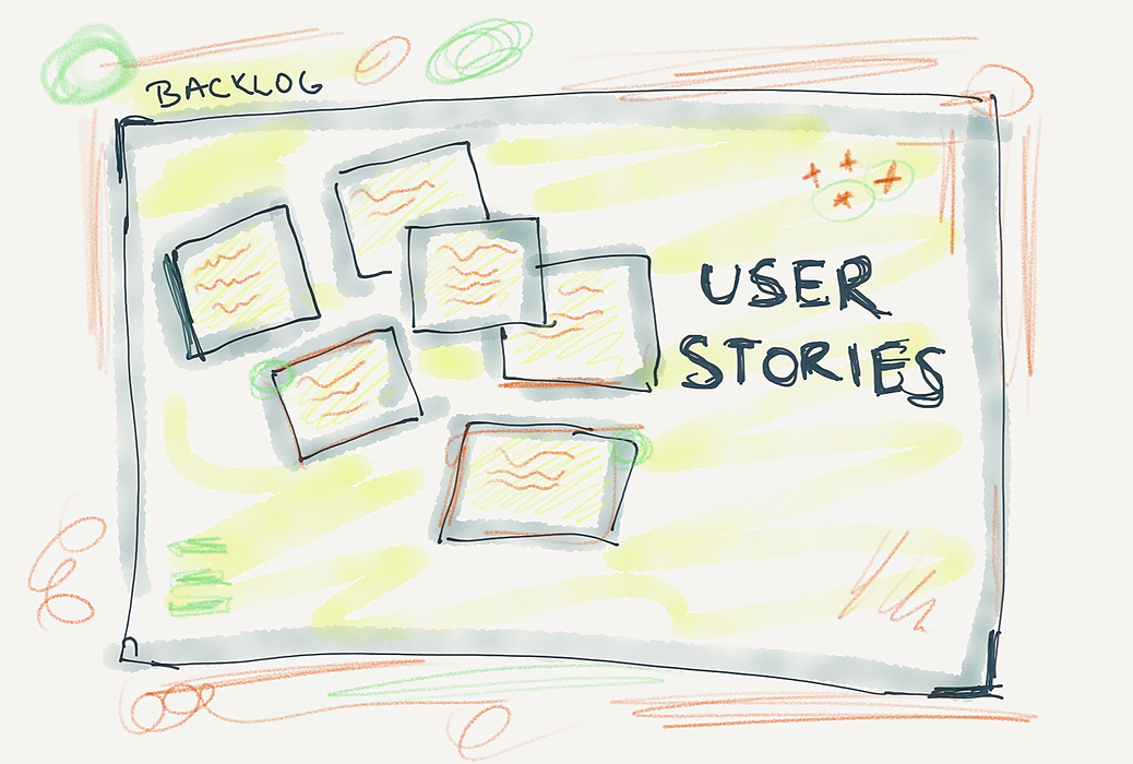
 The purpose of a user story is to describe the desired functionality of a specific part of the software.
 I want to share some alternatives to finding jobs that you can use if you are currently looking for a job as a junior designer.
 UX design is the key to battling a growing number of competitors in a post-covid e-commerce environment. Here are 5 strategies for ultimate success.
 Recently I was introduced to Reacts' createPortal API, which was nothing short of amazing.
 A lot of newbies to web development, don’t get it from the first time working with CSS grid. And that is the reason why I decided to write this article, besides that, I also want to give a brief intro to CSS grid and try to explain to people who are new to CSS, how to work with this amazing feature in the simplest way possible.
 In this article, we’ll dive deep into what you should do and shouldn’t when it comes to user segmentation.
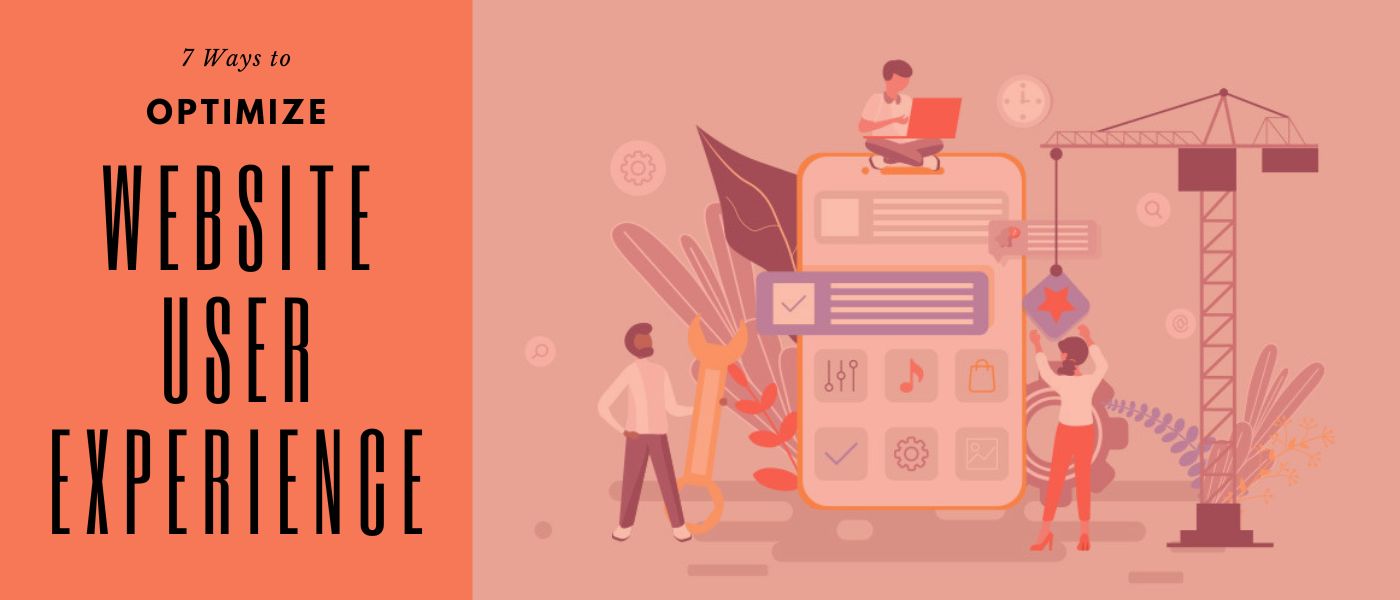
 These are 7 crucial key points to improve the UX design of your digital product. To improve UX, you need to know what the “weak spots” of the interface are.
 In a world that’s set to continue its transition online, optimizing your company’s website has never been more vital.
 By Adam Fard, founder of adamfard.com a UX Design Agency
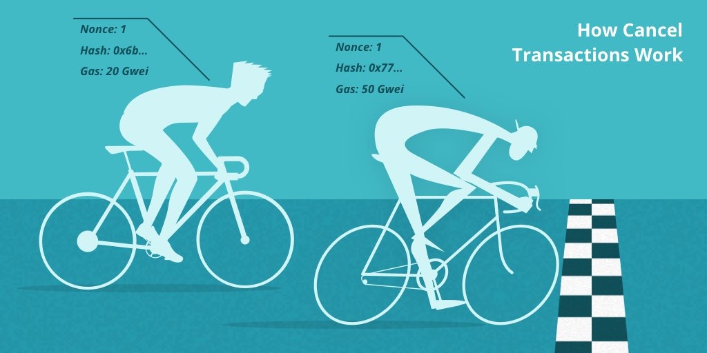 Is your Dapp displaying incorrect information to users? It probably is — through no fault of your own.
 They may say, "The harder the journey, the better the destination." But, you don't want to lose another user just because the UX of your application is giving them a hard time. Maybe focussing on the journey is more important. That is why it is also said that the journey is more important than the destination. The more eventful and detailed your UX journey is, the more the number of users will start using your product.
 UX design principles help build durable solutions through new design patterns, interaction models, and standards.
 Five pillars of web design
 “Straight-ahead” jazz revolutionized mid-century American culture with a relentlessly fresh and forward-thinking approach to bebop,
 Visual hierarchy is one of the most important principles behind effective web design. I say this because the goal of a web page is to communicate, and that is essentially the same goal of good visual design.
 If you are constructing a building, a blueprint of the building is mandatory before laying the foundation. It forms the basis for estimating the resources required, the number of construction workers, the time it will take to complete the construction and a direction that will guide the civil engineers. The same methodology also applies to digital products.
 User experience workshops are a crucial phase of a well-thought-out product. There is a wide variety of cases where such workshops can help solve pressing problems, critical for a project's success. They can range from tackling intricate design or UX issues to receiving constructive feedback on your designs.
 Event-Driven Architecture with Real-time UI
 It's been over 6 months since I joined KritiLabs. The learning that I have had been very steep and intense, considering its a career shift for me from a services based pre-sales to a product based pre-sales and product management.
 You don’t have to work in the design industry for very long to come across the word intuitive.
 Apple unveiled the latest version of its iOS operating system, iOS 14, at the WWDC keynote in June 2020.
 Learn how to plan and execute a website redesign, whether you use a CMS like Drupal or you build a site from scratch.
 In the first seconds of use, one application might seem more convenient because it’s easy to navigate and zoom, as well as to satisfy the user’s needs and solve their problem quickly. While comparing to another application that might look fancy and colorful but at the same time will confuse or even worse — distract the user. And of course, it will bring zero-value to them.
 To create a quality solution, it is essential to first understand how a child's mind works and how it differs from "adult" logic before designing anything,
 The set of behaviors visitors to a site exhibit constitute the UX. Based on this, design teams create products and sites that provide a meaningful user experience.
 Everything boils down to customer experience today. Whether it is a mobile application or a website, there is absolutely no way you can turn a blind eye to UX and UI.
 This is the story about how an abstract game theory model lead to a revolution in transplantology and thousands of lives saved.
 We all love beautiful pictures
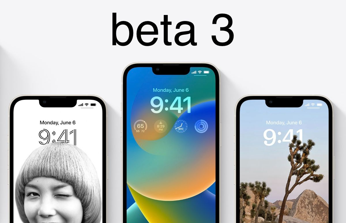
 Apple has its own way of gaining eyeballs, and this time it's the beta release of iOS 16. While the recently launched iOS version is gaining all the attention, reactions are mixed, with some still wondering whether iOS 16 is worth getting or not. To address the same, I wanted to share an in-depth analysis of newly introduced features and usability.
 What is heuristic evaluation exactly and does your product really need it? Let’s find out.
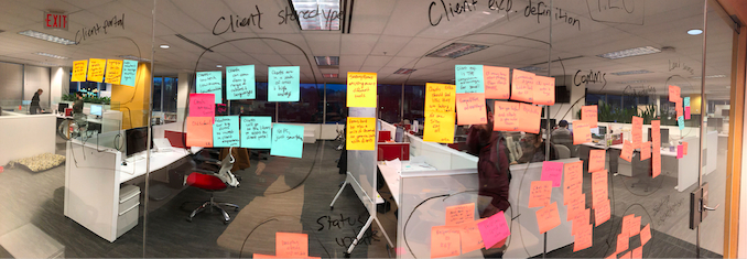 This article is about my experience conducting two kinds of user research: generative studies, and evaluative studies—and how, regardless of the methodology you choose to carry out the critical process of understanding your users, you should be involving the whole team in your efforts.
 Trello recently launched new features and a business version. This could only mean one thing. It's time for a design review.
 The ability to create and think in user flows is one of the most important skills in a UX designer's toolkit.
 Design systems are interdisciplinary by nature. They are built and consumed by designers and developers, therefore it is important for common terminologies to exist to support the communication between these two disciplines and other related actors.
 Web design is an essential part of our life. We have watched what is taking place in the web design world since 2000. There is drastic evolution in the web design process; millions of web pages are designed with active participation. You might have noticed differences in the average website these days. Some changes have been measured during the last years; the change occurring is known as web 3.0, a new web design era.
 Building a successful search takes more than technical smarts, but if done right is one of the most rewarding products you could work on.
 Sometimes, designers get confused on which design styles to apply to their work. It all depends on what the work is for and who the target audience is.
 Modern education is becoming more and more digitized: while even ten years ago notebooks and printed materials were necessary for studying, all you need today is alaptop and an Internet connection. Various classroom management systems are now used for the education of all levels, from primary schools to corporate training. It is a sure way to make the learning process more efficient — for example, taking quizzes and tests online helps automate grading and provide immediate access to the student’s performance.
 UX analytics is crucial for developing your product. It provides necessary business information about how exactly your customers use the released application.
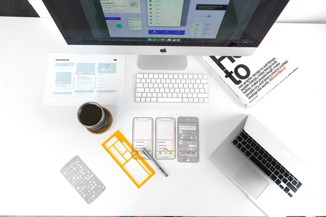 Web design and UX design seem to be synonymous. While each design process and body of knowledge does share overlap with the other, they also differ in specific ways. This article will break down what web design and UX design are, five similarities and five differences between the two, and which is better for an agency, depending on the business case.
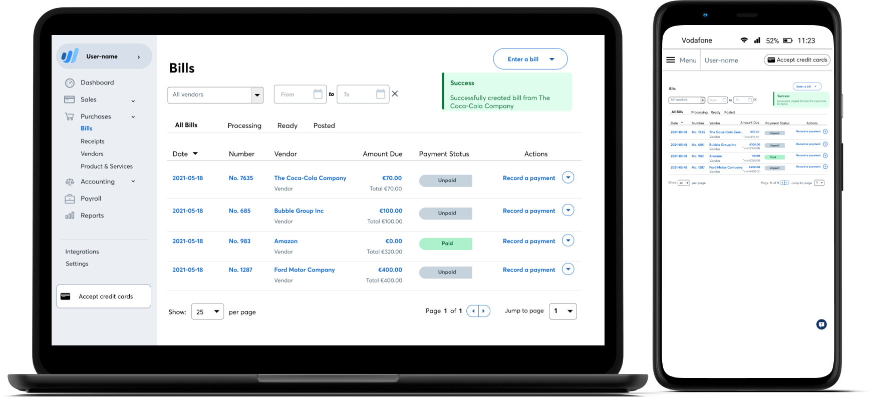 How I designed a suggestion for bill upload feature for Wave accounting software that solves UX issues of inefficiency, less accuracy, and file storage limits.
 What is mixed methods research? A definition and examples of the fastest growing area of user research.
 Joe Natoli is a UX consultant, author and speaker. Everything he does is born from nearly three decades of consulting
 Learn how to design applications that people will enjoy using with the help of the 5 principles of UX design psychology.
If you haven’t been immersed in iOS interface design, you might look at Apple’s icons and think that they’re just a rounded square or a ‘roundrect’. If you’ve been designing icons, you know that they’re something different and may have heard the word squircle used (mathematical intermediate of a square and a circle). And if you’re an Industrial Designer, you recognize this as a core signature of their hardware products.


