Tweak layout of Alarm Panel card editor #11177
Replies: 6 comments
-
|
There hasn't been any activity on this issue recently. Due to the high number of incoming GitHub notifications, we have to clean some of the old issues, as many of them have already been resolved with the latest updates. |
Beta Was this translation helpful? Give feedback.
-
|
I think instead of the switches we should implement Chips. Reasoning being if in the future there are more or the platform exposes custom states. Then there could be a lot of switches displayed. This way everything is hidden until queried for. We just have to wait for MWC to implement them :) or implement them ourselves like Bram did the data table |
Beta Was this translation helpful? Give feedback.
-
|
That would be filter chips then right? Btw, we do have a chips component https://github.com/home-assistant/frontend/blob/dev/src/components/ha-chips.ts |
Beta Was this translation helpful? Give feedback.
-
|
Some quick mockups. Just realized I forgot the theme dropdown, but whatever, this should give a general idea. Toggle switches Chips Multiselect checkboxes I lean towards preferring toggle switches overall. They look the cleanest IMO and will be the most familiar for users as they're used in all of the other card editors. They can line up nicely and have adequate spacing, and they will probably scale down nicest on mobile. Chips also look nice but they're not quite as clean IMO. The different colors sticks out a bit too much for my personal taste. And I don't think it's as immediately obvious how chips are supposed to be interacted with, so you'd need heading text unlike with the toggles. My main thing though, it feels a little weird having oval-shaped filled buttons and rectangular-shaped outlined buttons right next to each other. The styles clash too much. But perhaps that's being too nitpicky on my part. I'd be fine with chips, they're just not my personal preference. Multiselect is my least favorite, doesn't feel like the most efficient use of space. There's lots of empty unused space on the right side if you display them vertically. They could be displayed horizontally I suppose, but that feels a bit weird with checkboxes. |
Beta Was this translation helpful? Give feedback.
-
Beta Was this translation helpful? Give feedback.
-
|
We should do the switch version Sean started with, as it only has 4 options |
Beta Was this translation helpful? Give feedback.


-
Home Assistant release with the issue:
0.98.5
Description of problem:
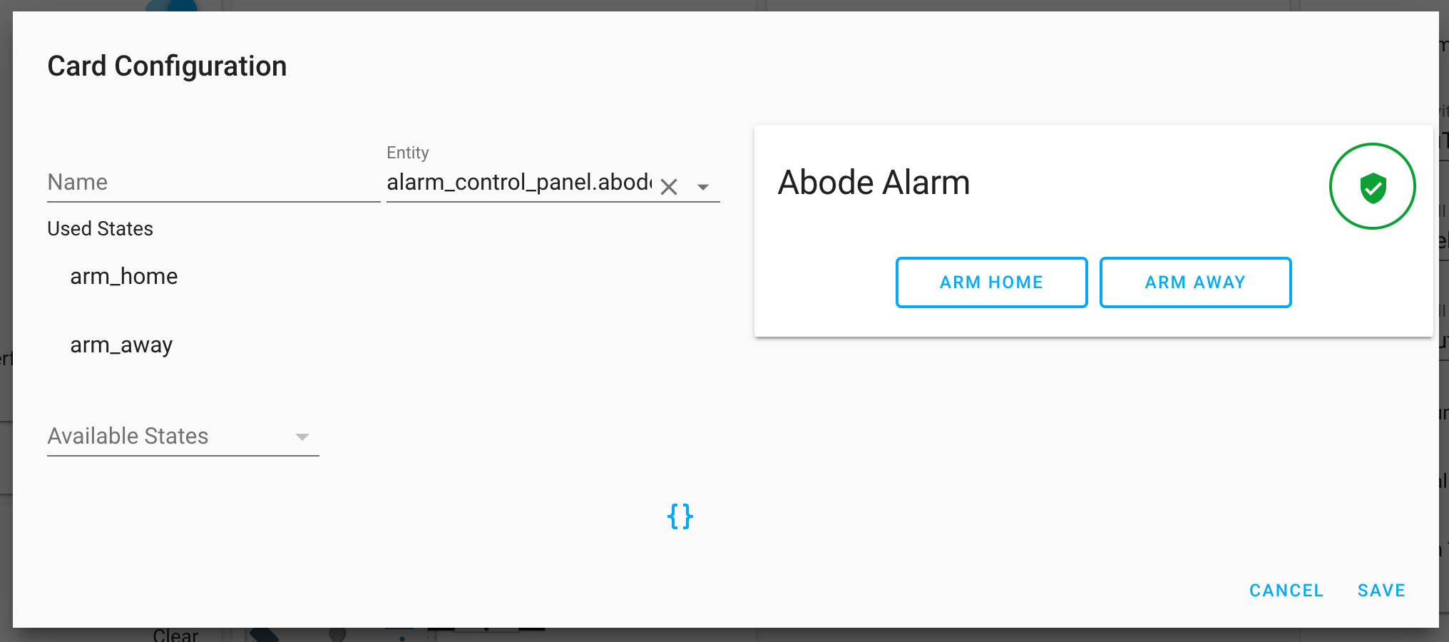
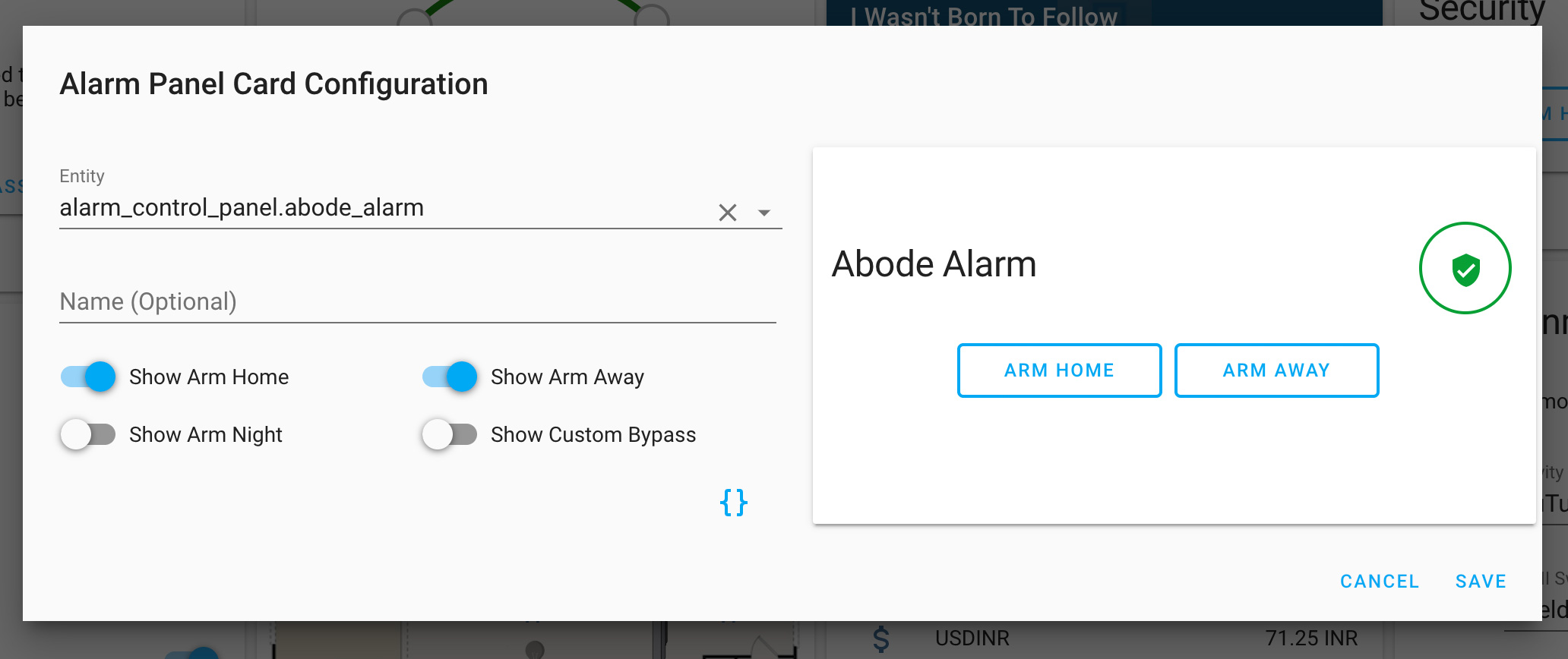
While reporting the preview bug in #3662 I played around with this card editor a bunch. And I think that it could use a few layout and usability tweaks. It's mostly three minor suggestions:
The "Entity" dropdown should be on its own line. This is the only required part, yet it's currently displaying an optional field before it on the same line. Because it has such small width and because the
alarm_control_paneldomain is pretty lengthy, it's a very poor experience on mobile and even desktop.With the "Name" textfield moved underneath, the placeholder text should also indicate that it is an optional field.
Switch to toggles instead of a dropdown. There's only four choices, and it already shows two by default, so having a dropdown for two items seems unnecessary. And since a dropdown is collapsed by default those extra options are also not immediately visible to the user. And a dropdown also requires extra clicks/taps compared to the toggles.
Here is a before and after mockup.
Current design:

Proposed design:

Now that you can compare both images, to recap, benefits of proposed design:
Beta Was this translation helpful? Give feedback.
All reactions