CS 349 - User interfaces, LEC 001
5-30-2016
Elvin Yung
-
Usefulness is the ability of an interface to support different tasks and practical use cases.
-
Usability is how effectively and efficiently users can achieve tasks with it.
-
The goal is to make interfaces both useful and usable.
-
Over time, devices have become more and more capable, but humans have stayed at roughly the same level of capability.
-
As technology becomes more useful, the interface becomes more and more complicated. It becomes a challenge to make them usable.
A few takeaways from The Design of Everyday Things by Don Norman (cofounder of the Nielsen Norman group, previously VP at Apple ATC):
- Form the correct mental models.
- Frequently-used functionalities should have explicit controls.
- Appearance should reflect/suggest use
- Rarely-used functions shouldn't have the same level of support/emphasis as more frequently-used ones.
- Give feedback of operations in progress (i.e. it should be easy to figure out what it's doing)
6-1-2016
- Your understanding of the system is driven by the mental model - how the user thinks it works.
- This is in contrast to the system model - how it actually works.
- These two things can have huge discrepancies.
The mental model of an interface is described by statements of this form:
If I do this, then the system will do that.
Often the mental model is very different from the system model.
For example, with refrigerators:
- Users are inclined to believe that there are two independent temperature controls controlling two different cooling units.
- In fact, there's just one cooling unit - how you manipulate one control actually affects the temperature.
- There's a third model - how the developer thinks the system works.
- The developer and the user communicate through the system.
- Therefore, ideally, all three models should be the same.
To use a tool, users consider:
- The goal
- What is done in the world
- The world itself
- The check of the world
Essentially, you're doing something, and then checking it. Doing something is called execution. Checking it is called evaluation.
- The gulf of execution represents the difficulty in translating user intention into system action.
- The gulf of evaluation represents problems in checking the state of the system.
Obviously, we want to minimize these gulfs.
- Perceived affordance is what the user thinks you can do with an object ("affordance"), based on how it looks.
- e.g. Push and pull handles on a door, buttons that are slightly beveled to make it look like you can click it.
- A mapping is the relationship between two things, that usually indicate some sort of intuitive effect.
- Usually, they can be separated into three categories: layout, behavior, and meaning (or convention).
- Interface elements should be consistent.
- The user should be able to expect the same behavior across the system.
- e.g. I should be able to right click for a context menu, mouse hover for a tooltip, etc.
- In general, interfaces have constrains of these type: physical, semantic, cultural, and logical.
- Physical: Greyed out buttons means that the action is disabled.
- Semantic:
- Cultural: e.g. the checkmark on the Dropbox folder icon
- Logical: In a language that reads from left to right, the back button faces left, and the right button faces right.
- Controls that are relevant should be more visible.
- Every user action should result in some sort of feedback.
- If something will take a long time to do, the UI should indicate progress. s* This shouldn't be excessive - for example, you shouldn't have a dialog box pop up for every action the user performs.
- In a GUI, widgets should effectively communicate state.
- Example of good feedback: search/replace in Sublime text
- Example of bad feedback: creating a symlink in Unix.
- In a GUI, simplify interaction by borrowing concepts from another domain.
- e.g. the desktop metaphor in GUI windowing systems.
- Common language: e.g. window, recycle bin/trash, folders, files
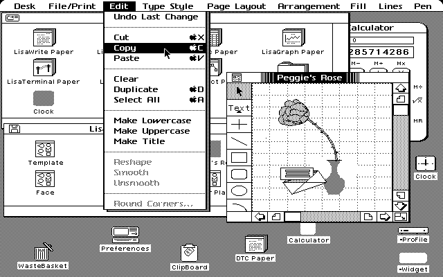
- One of the earliest examples of a GUI with a desktop metaphor is the Apple Lisa.
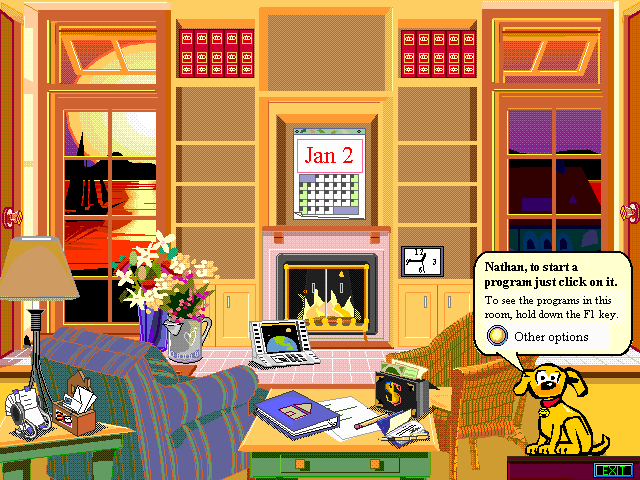
- Metaphors can go too far. e.g. Microsoft Bob
- An interesting example: General Magic's Magic Cap OS, which used the desktop metaphor for an early touchscreen interface.
- The designers of a system sometimes publish a style guide, which dictates how they want the look and feel of the system to be like.
- If you use a GUI builder, it will often apply the design guidelines for you.
- Early example of a design style guide: The Macintosh User Interface Guidelines


