According to the HTTPArchive, >50% of all data on mobile websites are images, and the number of KB is grew by 5% year over year (March, 2017- March 2018).
Research shows that webpages and apps that are slow to load frustrate users.
This page is also available as a GitBook.
In this exercise, we will use Cloudinary, a cloud based image delivery service, to optimize a simple webpage and improve its load time while still serving beautiful images that will delight everyone who visits.
index.html is a pretend "summer vacation blog post" with 15 images. The images were just uploaded straight from Google Photos, and as a result, the page weighs over 10 MB. The first load of the page (when the images are not cached) is extremely slow. Try it! (See what I mean?)
To speed up this webpage, we need to load everything faster. Simply put, these images need to get smaller, so they download faster. To benchmark these tests, we'll use 2 tools:- Website Speed Test to test the performance of the images on the page.
- WebPageTest to measure the load time of the page.
(note that these two tools are synced, if you run a WebPageTest run, you can access the Website Speed Test results from the "Image Analysis" link at the top of the page.
Here are links to the initial results (unoptimized):
WebsiteSpeedTest
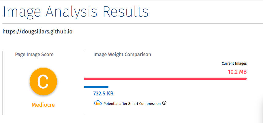
The initial page scores "mediocre" in WebSite Speed Test, but we can see that the page has 10MB of images, and Cloudinary can reduce the files to 732 KB - a data savings of 92%!
WebPageTest
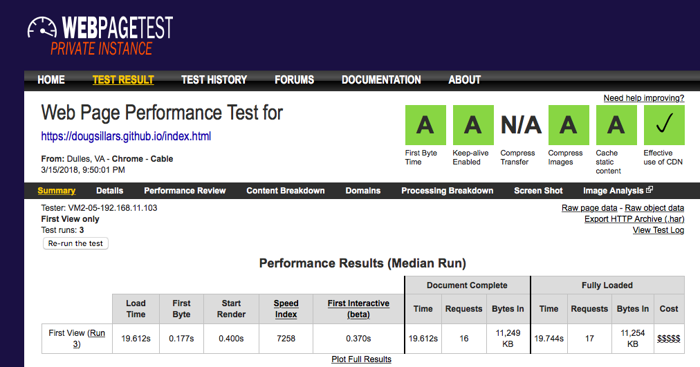
Shows that the load time was 19.6s, and the SpeedIndex (a measurement of speed to paint the screen was 7258.
So, what steps can we take to make this page faster? As I discussed in my Lunch and Learn, there are several steps we can take. So, clone this page and begin Optimizing!
The images on this page are all JPG images. JPG is a lossy image format, meaning that as you lower the image quality, pixels are removed from the image - lowering the visual quality of the image. Google recommends that all images on the web use at least 85% quality to reduce file size.
You can adjust quality of images with any image processing tool. However, to simplify this exercise, we will use Cloudinary's tooling to change the quality on the fly. This is easily done by adjusting parameters in the url: Here is the full quality image:
and here is the image at quality = 50:
If you look at the 2 URLs carefully, there is one small change made to the 2nd. By simply adding the 'q_50' parameter, Cloudinary generates an image at quality 50. You can manually tweak the quality for each image by modifying this value. However, manually tweaking the image quality for lots of images is not scalable. Luckily, tools like SSIM allow algorithms to find the perfect balance between pixel savings and image quality. Cloudinary uses a version of SSIM when the 'q_auto' parameter is used.
There are formats that have better compression algorithms than others. JPEG and PNG are older formats, and formats like Webp or JPEG2000 use newer compression algorithms that save even more data without any loss of quality. Since WebSite Speed Test and WebPageTest use desktop Chrome by default, we try to use Webp on our site during testing.
Rather than creating new images in each format and comparing them, we can again leverage the Cloudinary toolchain, and add the "f_auto" parameter to the url - and Cloudinary will pick the best format (based on compatibility, size and quality) to deliver to the device.
http://res.cloudinary.com/hackchallenge/image/upload/w_2500,q_auto,f_auto/v1521063280/MyVacation/IMG_20160526_135242148_HDR.jpgAs you have been following along, you've probably noticed the 'w_2500' parameter. This parameter tells Cloudinary to resize the image to 2500 pixels wide. Now, even on a laptop, an image that only uses 25-30% of the screen does not need to be 2500 pixels wide.
When a device has a large image, it will resize the image, shedding unnecessary pixels from the image before it appears on the screen. In some ways, this is double taxation - it costs time to download the large image, and then additional time for the device to resize the file. (This is further compounded on low end mobile devices, where the low powered processor takes longer, and draws more power to resize the image)
To resize these images, you can adjust the width parameter in the url. Open the image in a new tab, and adjust the number - and you'll see that a smaller (or larger) image is delivered to the browser:
http://res.cloudinary.com/hackchallenge/image/upload/w_2500,q_auto,f_auto/v1521063280/MyVacation/IMG_20160526_135242148_HDR.jpg
The internet is not just viewed on a single browser. Optimizing the image for one user isn't enough. Let's make sure that the images we serve are optimized for every screen size.
We've seen how to each image individually for the width, but we can also do so programmatically. By enclosing the img tag in a picture tag, we can adjust the image that is delivered based on the viewport size:
<picture>
	<img src="http://res.cloudinary.com/hackchallenge/image/upload/w_2500/v1521063217/MyVacation/IMG_20160619_173136306.jpg"
	srcset="http://res.cloudinary.com/hackchallenge/image/upload/w_500/v1521063217/MyVacation/IMG_20160619_173136306.jpg 500w,
		http://res.cloudinary.com/hackchallenge/image/upload/w_1000/v1521063217/MyVacation/IMG_20160619_173136306.jpg 1000w,
		http://res.cloudinary.com/hackchallenge/image/upload/w_1500/v1521063217/MyVacation/IMG_20160619_173136306.jpg 1500w"

	sizes = "100vw"/>
</picture>
Test this out on the picture page. Resize the screen, and the check the url of the image! (If you have cloned this repo, and the images do not load, you'll see a security error in the URL bar. Allow unsafe scripts for this image to load).
The srcset paramater lists 3 additional images for loading that are 500, 1000 and 1500 pixels wide (you can verify this in the url, and also the parameter after the url).
In this case, I have provided just 3 additional responsive images. For smaller screens, the smaller image will load - and this is great. But there was no science behind my selections - I just winged it. Jason Grigsby has suggested images that are 20KB apart to minimize pixel loss, and to maximize image caching. (This is part 9 of a 10 part series, and I recommend the entire set of posts). To calculate the dimensions of these different images, there are a number of different tools. In this exercise, we'll use Responsive Breakpoints, a service from Cloudinary.
The site allows you to pick the pixel range of the enw images, the size jump (in KB) and the max number of images. Once you upload an image, it gives you the breakpoints:
You also get the code you need to display the different image sizes. You can see the results on the <a href="responsive.html>responsive images page. Open this page, and change the size of your browser window. So that you can see that the images are changing, I made every other image load with sepia effects (another modification possible with Cloudinary).

sizes ="(min-width: 500px) 32vw, 100vw"
In this case, if the screen is greater than 500 pixels wide, the image will take up just 1/3 of the screen, and below 500px, it will use 100% of the screen. This is a great way to build multiple layouts for different device screen sizes.
Also note that you have to specify the viewport in the HTML, and remove the width tags
<meta name="viewport" content="width=device-width" />
<head>
  <meta name="viewport" content="width=device-width" />
  <meta http-equiv="Accept-CH" content="DPR, Viewport-Width, Width">
</head>
For each request, Chrome will append a header with the device width. Using the 'w_auto' parameter will allow Cloudinary to build the image optimized to the nearest 100 pixels of the screen width.
<img src="http://res.cloudinary.com/hackchallenge/image/upload/w_auto/v1521063217/MyVacation/IMG_20160619_173136306.jpg"/>
In the last few sections, we have resized the images to balance the size and quality of the images, and to fit the painted area of the screen. In this section, we are going to create placeholder images for each file. You may have seen this in apps like Facebook, Pinterest or Google Image search where a placeholder image appears nearly immediately, and then the final image loads in later.
I have created SVG images to load in the background before the larger image can be downloaded. This is great on slower connections, as the screen is populated with color indicating an image is coming. I used SQIP to create these thumbnails.
SVG files are vector graphics, and are stored as XML, so they can be added right to the HTML of your document. For example, here is the original image, and the SVG created from it:
Using this code, we use the SVG as a background image. Since the code is right ni the HTML, it loads immediately while the larger image continues to load:
 <img width = "100%" src = "http://res.cloudinary.com/hackchallenge/image/upload/w_4000,q_auto,f_auto/v1521063217/MyVacation/IMG_20160619_173136306.jpg"
	style="background-size: cover; background-image: url(data:image/svg+xml;base64,PHN2ZyB4bWxucz0iaHR0cDovL3d3dy53My5vcmcvMjAwMC9zdmciIHZpZXdCb3g9IjAgMCAzNjE2IDY2NCI+PGZpbHRlciBpZD0iYiI+PGZlR2F1c3NpYW5CbHVyIHN0ZERldmlhdGlvbj0iMTIiIC8+PC9maWx0ZXI+PHBhdGggZmlsbD0iIzgyOTk3NiIgZD0iTTAgMGgzNjE2djY2M0gweiIvPjxnIGZpbHRlcj0idXJsKCNiKSIgdHJhbnNmb3JtPSJ0cmFuc2xhdGUoNyA3KSBzY2FsZSgxNC4xMjUpIiBmaWxsLW9wYWNpdHk9Ii41Ij48ZWxsaXBzZSBmaWxsPSIjYzBkNWRkIiByeD0iMSIgcnk9IjEiIHRyYW5zZm9ybT0ibWF0cml4KC0yMC41Nzg1NSAtOTkuOTUxNSAyMC42NTg5NiAtNC4yNTMzOCAxMjUuMyAyOC4yKSIvPjxlbGxpcHNlIGZpbGw9IiMzZjUzMzAiIHJ4PSIxIiByeT0iMSIgdHJhbnNmb3JtPSJtYXRyaXgoMTMuMzM4MTggLTE1LjM2NTc5IDI3LjI0ODkzIDIzLjY1MzI2IDU2LjggMjEuNCkiLz48ZWxsaXBzZSBmaWxsPSIjNDg2MjE5IiByeD0iMSIgcnk9IjEiIHRyYW5zZm9ybT0icm90YXRlKC02NS42IDExMS4yIC0xNTQuMikgc2NhbGUoMTMuNzY5MTkgMzEuNzUwMDkpIi8+PGVsbGlwc2UgZmlsbD0iI2I2Y2ViNCIgY3g9IjE4NCIgY3k9IjQ1IiByeD0iNjUiIHJ5PSIyMCIvPjxwYXRoIGZpbGw9IiMyYTQzMmEiIGQ9Ik0xNjQgMS45bC0xNS4yIDQzLjMgMS0yMi4zIDU5LjgtMTMuNXoiLz48cGF0aCBmaWxsPSIjYjNjMTk0IiBkPSJNOC4xIDYybDY3LjMtNDItNTkuNSAxMS42TC0xMi4zIDYyeiIvPjxwYXRoIGZpbGw9IiM0ODRlM2IiIGQ9Ik0yNyA1aDYydjIySDI3eiIvPjxwYXRoIGZpbGw9IiNkNWQ0YTIiIGQ9Ik0yMDkgMjJsLTMyLTExLTMwIDMweiIvPjwvZz48L3N2Zz4=);"
	/>
Here are the SVG images with names for referencing an external file, or the code to use inside the html.
When considering inlining images into html, you should consider tings like cache life of the htm vs. the image.
"The fastest code is the code that never runs" "the fastest request is the request never made"
When it comes to loading a webpage - the fewer the number of requests, the faster the page will load. So, how can we reduce the number of requests. There are a number of libraries that help you lazy load images.
The idea behind lazy loading is to only load the images that appear on the screen (or are about to appear on the screen as the user scrolls). If the user never scrolls to the bottom 1/2 of your webpage - those images will never load - reducing bytes, and the amount of time it takes the page to load.
In this example, I have used lazysizes to help me load my images. Lazyizes allows you to use responsive images, and also a preview image with lazy loading your images.
The result is the preview image loads for all images, but only the images in the viewport are downloaded - and they use the responsive image logic to select the correct image.
This is essentially the 'Holy Grail' of image optimization - we can only load the images required, have a preview image while the image loads, and use responsive delivery to ensure that the image is properly sized and formatted for he device. You can see how this works with 2 test pages: lazyload with external svg references and lazyload with inline svg references.
Ok! Now you have all the code you need to update the webpage in this gist. Optimize all you can, and test with Website Speed Test and WebPageTest.Big hint: Simply use Client Hints (as described above), and add the following parameters to your images "q_auto,f_auto,w_auto", and your images will be pretty well optimized. Add a lazy Loading Library, and you'll be set!
When you are completed, you can submit your results into this form:
To run the required tests, your site must be hosted and accessible from the internet. You can use GitHub Pages. 1. Visit pages.github.com2. set up a repository named .github.io
3. once this is created, you are given the option to import from another repository.
Enter:"https://github.com/dougsillars/dougsillars.github.io", and you've essentially cloned this repository into your own GitHub Pages repository. 5. In your new repo settings - allow publishing to GitHub Pages.


