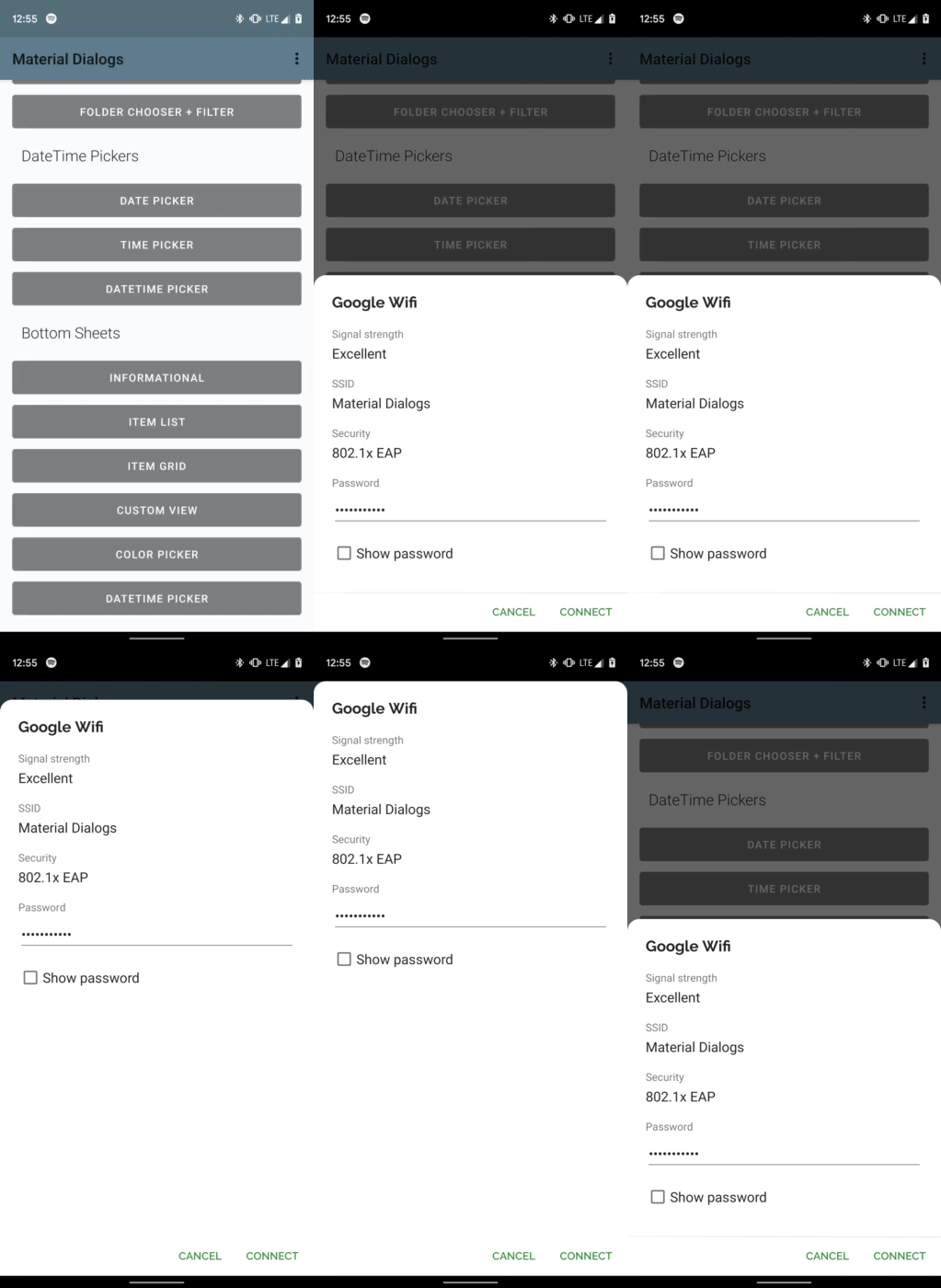
The bottomsheets module contains extensions to turn modal dialogs into bottom sheets, among
other functionality like showing a grid of items.
dependencies {
  ...
  implementation 'com.afollestad.material-dialogs:bottomsheets:3.0.0-rc1'
}Making a dialog a bottom sheet is as simple as passing a constructed instance of BottomSheet
as the second parameter to MaterialDialog's constructor.
MaterialDialog(this, BottomSheet()).show {
  ...
}There are two layout modes:
MATCH_PARENT- the default. The bottom sheet can be expanded to fill the height of the screen. When opened, the bottom sheet will be at its peek height.WRAP_CONTENT- the bottom sheet can only be expanded as far as the height of the view it contains. If the view it contains is as tall or taller than the screen, it's limited to the screen height, in which case the content should be in aScrollViewas well.
The layout mode is set in the constructor of the BottomSheet behavior, you don't need to
explicitly set it at all if you wish to use MATCH_PARENT:
MaterialDialog(this, BottomSheet(WRAP_CONTENT)).show {
  ...
}If you've used Android bottom sheets before, peek height should be a familiar concept. The peek height is the height of the bottom sheet when it's not fully expanded. It's a point between expanded and hidden.
The default peek height is 60% of the screen height. You can set a custom peek height if you wish:
val dialog = MaterialDialog(this, BottomSheet()).show {
  setPeekHeight(res = R.dimen.my_default_peek_height)
}

// You can continue to make calls to this method, and changes are still animated
dialog.setPeekHeight(res = R.dimen.another_peek_height)
Changes to the peek height are animated for you. If you're using the WRAP_CONTENT layout mode,
the peek height is limited to the max height of your bottom sheet.
Since it's common to show a grid of items in a bottom sheet, this module contains a method to do that.
val items = listOf(
    BasicGridItem(R.drawable.some_icon, "One"),
    BasicGridItem(R.drawable.another_icon, "Two"),
    BasicGridItem(R.drawable.hello_world, "Three"),
    BasicGridItem(R.drawable.material_dialogs, "Four")
)

MaterialDialog(this, BottomSheet()).show {
  ...
  gridItems(items) { _, index, item ->
    toast("Selected item ${item.title} at index $index")
  }
}
Note that gridItems can take a list of anything that inherits from the GridItem interface,
if you wish to pass a custom item type. You just need to override the title value along with the
populateIcon(ImageView) function.
There a few extra parameters that you can provide, most of which are equivelent to what you can
provide to listItems. customGridWidth is an optional integer resource that allows you to set a
width for the grid - you can have different widths for different resource configurations (tablet,
landscape, etc.)
fun gridItems(
  items: List<IT : GridItem>,
  @IntegerRes customGridWidth: Int? = null,
  disabledIndices: IntArray? = null,
  waitForPositiveButton: Boolean = true,
  selection: GridItemListener<IT> = null
): MaterialDialogThis is taken from the core module documentation. I'm reiterating it here to make sure people know that it is possible, since it's more common to use rounding with bottom sheets than regular modal dialogs.
Corner radius can be globally changed with an attribute in your app theme. It defaults to 2dp:
<style name="AppTheme.Custom" parent="Theme.AppCompat">
  ...
  <item name="md_corner_radius">16dp</item>
</style>
The above effects all dialogs in your app, even the normal modal ones. There is also a programmatic setter for this value which you can use per-dialog:
MaterialDialog(this, BottomSheet()).show {
  // literal, internally converts to dp so 16dp
  cornerRadius(16f)
  // Using a dimen instead is encouraged as it's easier to have all instances changeable from one place
  cornerRadius(res = R.dimen.my_corner_radius)
}
