Skip to content
New issue

Have a question about this project? Sign up for a free GitHub account to open an issue and contact its maintainers and the community.

By clicking “Sign up for GitHub”, you agree to our terms of service and privacy statement. We’ll occasionally send you account related emails.

Already on GitHub? Sign in to your account

GUI Audit #16

Closed
ghost opened this issue Nov 24, 2013 · 2 comments
Closed

GUI Audit #16

ghost opened this issue Nov 24, 2013 · 2 comments

Comments

@ghost
Copy link

ghost commented Nov 24, 2013

http://imgur.com/a/YV8Wj

As a summary, the four main pictures of what to work on:
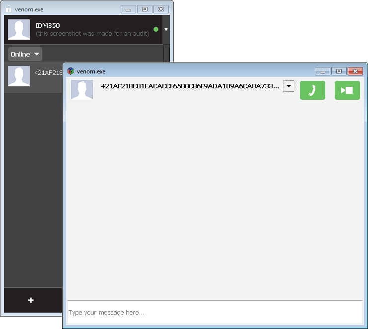
Separate windows
Responsible for #14:
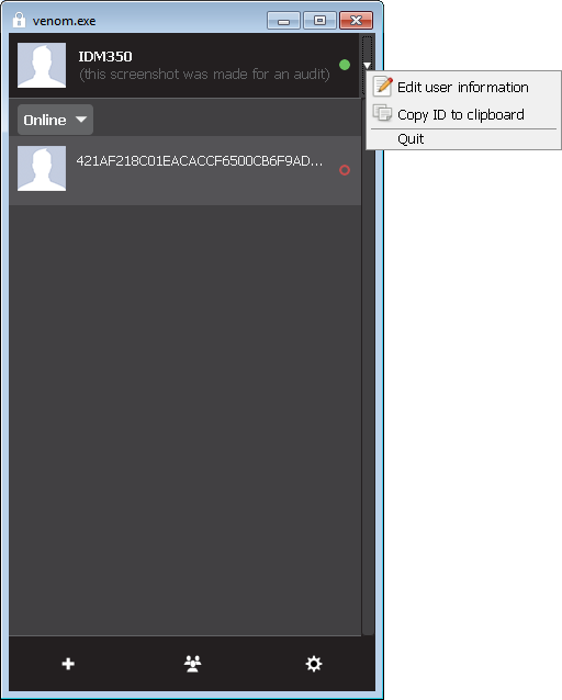
Out-of-style menu
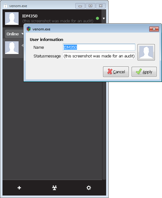
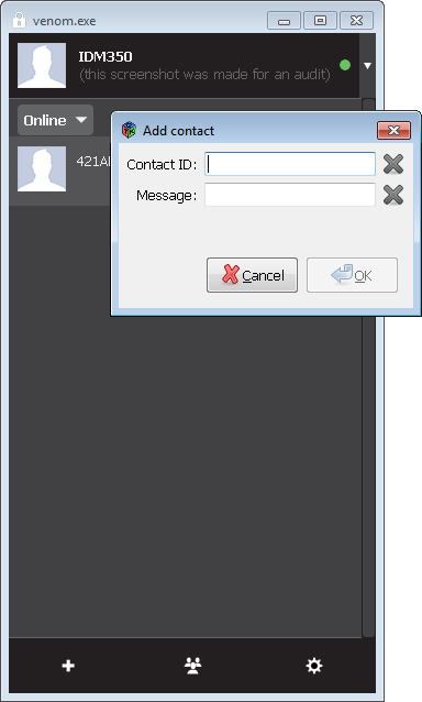
Detracting Dialog #1Detracting Dialog #2

@naxuroqa
Copy link
Owner

Separate windows
The expected UI (shown at the http://tox.im/ front page) has one window with both the contact list and the conversation, not the separate windows like in this screenshot. Maybe the entire content of the main window should be a Gtk.Paned containing the contact/group list (or settings tabs) on the left and the active conversation (or settings page) on the right.

As of f1f8aa1 there is only one window for contacts and conversations.

Out-of-style menu
This menu is the only element of the main window which goes beyond the window borders (probably the source of the http://github.com/naxuroqa/Venom/issues/14 problem) and does not use the main window's styles (such as the black background)

The source of #14 is most likely a bug in gtk3 on windows. The official release of gtk3 for windows was only about a month ago (see http://www.tarnyko.net/en/?q=node/43 ).
Since the current mockup does not include menus of any kind, they are currently not styled.
As soon as there is any consensus on how they should look like, I will style them accordingly.

Detracting Dialog #1
Since the expected UI is shown at http://tox.im/ in one screenshot of one window, all elements should be required to fit (but not necessarily always be) in one window, and that probably means no separate dialogs. It would be better if the user could just click on their avatar, nickname, or custom status message to change it (although they would look weird if they were all text boxes, so try to do that without creating a text box wonder).

The current mockup does not give any assumptions on separate dialogs at all (or did I miss this somewhere?).
Currently I try to avoid custom widgets for anything a stock widget can do as well, but in the future a widget for this behavior will most likely be implemented.

Detracting Dialog #2
Since the expected UI is shown at http://tox.im/ in one screenshot of one window, all elements should be required to fit (but not necessarily always be) in one window, and that probably means no separate dialogs. It would be better if an editable entry with an OK/Cancel button below it appears at the end of the contact list when the user clicks the "+" button.

Sending and receiving friend requests: I don't see, how an entry and a textview would fit into the contact list (the entry must be wide enough to see the ID at least partially; The textbox has to be big enough for at least a small personal multi-line message).
See nurupo/ProjectTox-Qt-GUI#60 (comment)
You are free to prove me wrong (code, mockup)

For now, I am more comfortable with nurupo's aforementioned solution (show it on the right side instead of conversation widget).

I am glad you took the time to audit venom, but it would have been great if you tested a recent version ( there where >100 commits since the version you tested).

@naxuroqa
Copy link
Owner

naxuroqa commented Feb 9, 2014

Closing this because it's outdated

@naxuroqa naxuroqa closed this as completed Feb 9, 2014
Sign up for free to join this conversation on GitHub. Already have an account? Sign in to comment
Labels
None yet
Projects
None yet
Development

No branches or pull requests

1 participant