The roadmap is a living document, and it is likely that priorities will change, but the list below should give some indication of our plans for the next major release, and for the future.
We work on the problems that resonate the most with our users. Please upvote 👍 the issues you are the most interested in on GitHub. Thank you for participating in our developer survey.
Here are our top priorities, ordered by importance:
- 1.0 - More components. 🧰 People want more components. This is challenging for us to handle, as building and maintaining a professional component takes an incredible amount of time.
Everybody underestimates it. As we have a relatively small core team, we are going to try the following strategy:
- Identify frequently needed components. We have different resources we can leverage for this: the developer survey answers, GitHub issue upvotes, Algolia search volume, Google search volume, documentation usage volume, npm downloads, etc.
- Prioritize the creation of frequently needed components.
- Encourage the usage of third-party components if they already exist and are well maintained. We can create a search experience for this.
- Offer an option to the highly used and well maintained components to move to the official organization: mui-org/x on GitHub, @material-ui/x on npm and x.material-ui.com for the documentation.
- 0.5 - Better customization. 💅 We want to make our component customization intuitive, no matter if you are using global CSS or styled-components:
- Improve the documentation.
- Better support for styled-components.
- Work on the core solution.
- Provide more examples like this.
- 0.3 - Better documentation. 📚 It's a wide topic. We don't know exactly what people want. We will focus our effort in the following areas:
- Beginner tutorials & Video lessons.
- Page Layout Examples. They get people started really quickly, we need more of them!
- Page documentation rating 🥇🥈🥉. We will integrate a rating module in all our documentation pages. This way, we can collect high-quality data points and prioritize the pages that need the most to be improved.
- Localisation. Not everybody can read & understand English. The documentation pages are synced with Crowdin. They should always be up-to-date.
- 0.3 - TypeScript. 📏 There are two dimensions to this problem:
- The documentation. We want to provide a TypeScript variant to most of our demos, which should make it straightforward to use Material-UI with TypeScript. You can help us out in #14897.
- The definitions. We are continuously improving them. We are aware that correctly typing withStyles() is cumbersome, so we encourage you to use makeStyles() instead. It should be much better with this Hook API. The codebase is written in JavaScript, we don't plan on migrating it to TypeScript in the near future. Maybe for v5, we will see.
- 0.2 - Performance. 🚀 React abstraction has a cost. The more components you render, the slower your page will be. You will notice stark differences when rendering a large table or list.
Performance is all about doing less work. We can leverage the following:
-
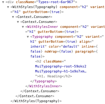
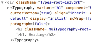
Make the core faster. Using our table components is x3 slower than using native table elements. What's the difference? a Material-UI table component creates many intermediary components, slowing the rendering. We are working on removing these intermediary components by migrating the codebase from class based components to hook based components. This will yield a theoretical +30% performance gain, as well as making the DX much better. Here is the React Dev Tools output for the same node:
Before (v3)
After (v4)
-
Avoid re-rendering. It's the responsibility of the user to prune the React rendering tree efficiently, as most of our APIs are too low level to implement efficient memoization (React.useMemo, React.PureComponent, React.memo). If you find a good opportunity for it, let us know, and we will be happy to work with you on the problem.
-
Avoid rendering. We are documenting how to implement virtualization for the Table components. It's important to consider it above 100 items.
-
- 0.2 - Bundle size. 📦 You can keep track of our progress following bundlephobia.com report.
It's a continuous effort – v4 is 15% smaller so far, while adding new features.
We are eager to find new bundle size reduction opportunities.
- JSS. Can we reduce the overhead of this module?
- Migrating from class components to hooks helps.
- Popper.js is working on a smaller v2 version.
- We can replace react-event-listener with the hook API.
- react-transition-group will remove react-lifecycles-compat.
- 0.2 - Material Design Update. 🎀 The material design specification is evolving, so should we. We have a few open issues about it.
- 0.1 - Accessibility. ♿️ We have relatively few accessibility issues, but we are eager to address them all.

