Replies: 7 comments 21 replies
-
|
Hey @fkiraly happy to see you here! Give me some time to take a look at this one as I'm not super familiar with that class of forecasters from sktime.
If I understood correctly, this is completely fine when it comes to interacting with ridgeplot, since we also accept x-y traces as input -- bypassing the KDE step altogether |
Beta Was this translation helpful? Give feedback.
-
Most popular forecasters have a probabilistic prediction mode, and they can be filtered by the tag Check it out in the forecasting tutorial, the main tutorial of
Yes - in the conceptual space of |
Beta Was this translation helpful? Give feedback.
-
|
any opinions yet? |
Beta Was this translation helpful? Give feedback.
-
|
? |
Beta Was this translation helpful? Give feedback.
-
|
Hey @fkiraly. I've been trying to make some time to look into this issue but unfortunately haven't been able to make the time yet. Is this something that is high on your priority list or something that is currently blocking your work? If so, I can try prioritising it. If not, let me know as well and I will take a look at it with more time later on. Thanks! |
Beta Was this translation helpful? Give feedback.
-
|
no urgency, just sth that imo would be very nice - whenever you find time. If in the meanwhile I can help with sth |
Beta Was this translation helpful? Give feedback.
-
|
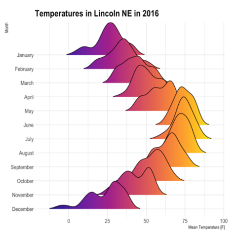
@fkiraly Just trying to get some early feedback from you. I just tried to map this output from sktime's 
into a ridgeline plot of PDFs (for the same forecast horizon): 
👆 this is what I was able to hack together while trying to figure out how the Let me know if this is anything like what you had envisioned, otherwise, could you share a more concrete example I can play around with. A sketch would help. |
Beta Was this translation helpful? Give feedback.
-
I would love to be able to do that as well but unfortunately Plotly does not have an option for filling curves with color gradients. See plotly/plotly.py#3026 and plotly/plotly.js#1918 |
Beta Was this translation helpful? Give feedback.
-
Sounds good but maybe we can leave this as an exploration option for later on? Keeping my free time in mind, I think it would be best to start with a narrower scope. I'll try refining my current implementation and example and:
|
Beta Was this translation helpful? Give feedback.
-
yes, that looks brilliant! |
Beta Was this translation helpful? Give feedback.
-
Sure - just noting, that the |
Beta Was this translation helpful? Give feedback.
-
This is actually possible now thanks to the new I'm adding this feature in #244 |
Beta Was this translation helpful? Give feedback.
-
A few examples and references that use this method to visualise probabilistic forecastsThis includes both univariable and panel series examples. Granted that this is not a very significant sample but just for reference:

👉 https://seita.nl/2019/10/22/how-to-plot-probabilistic-forecasts/ 
👉 https://link.springer.com/article/10.1007/s11222-023-10212-8 
People seemed to have liked this way of visualising probabilistic forecasts. Here the non-OP top comment: 

👉 https://wilkelab.org/ggridges/articles/introduction.html#varying-fill-colors-along-the-x-axis |
Beta Was this translation helpful? Give feedback.
-
Agreed! |
Beta Was this translation helpful? Give feedback.
-
I'm not that well-experienced in plotting, so I can't say what is easy or not. I agree with your general rationale - which I seem to be reading between your lines - that we should prioritize low-hanging fruit, of which there are plenty. (example 5 is R, that's why they can do it?) |
Beta Was this translation helpful? Give feedback.
-
|
(random idea - not sure if it works in plotly: (a) filling with single colour or "transparent" placeholder; (b) layering with a large rectangle that has a gradient, where the colour in (a) acts as a "hole" in the plot) |
Beta Was this translation helpful? Give feedback.
-
Yes example 5 uses ggridges |
Beta Was this translation helpful? Give feedback.
-
|
This is now possible thanks to the new I'm adding this feature in #244 |
Beta Was this translation helpful? Give feedback.
-
|
Some design questions:
|
Beta Was this translation helpful? Give feedback.
-
|
what's next, @tpvasconcelos? |
Beta Was this translation helpful? Give feedback.
-
|
@tpvasconcelos, here's a PR with a plotting interface, for probabiliy distributions in I was thinking about - and have designed it in that way - to allow different backends for plotting. So, if used in a time series context, the distributions could automatically be switched to temporal plotting mode, why the panel mode makes more sense for tabular datasets where distributions are in no particular order. |
Beta Was this translation helpful? Give feedback.
-
|
@fkiraly sorry for the radio silence. I lost the code I wrote to produce this initial draft
which took me some time to get working. I will try to take a look at this again. I think that now that we have the gradient fill that you liked, the plots could look much nicer too :) |

Beta Was this translation helpful? Give feedback.
-
For a while I have now been thinking about what a good plotting modality would be for fully distributional predictions, i.e., the output of
predict_probainsktimeorskpro.The challnge is that you have a (marginal) distribution for each entry in a
pandas-like table, which seems hard to visualize. I've experimented with panels (matplotlib.subplots) but I wasn't quit happy with the result.Now, by accident (just curious clicking), I've discovered
ridgeplot.What would you think of using the look & feel of
ridgeplotas a plotting function inBaseDistribution? Where rows are the rows of the data-frame like stucture, and mayb there are also columns (but I am happy with the single-variable case too)The main difference is that the distribution does not need to be estimated via KDE, you already have it in a form where you can access
pdf,cdf, etc, completely, and you have the quantile function too which helps with selecting x-axis range.Plotting
cdfand other distribution defining functions would also be neat, of coursepdf(if exists), orcdf(for survival) are already great.Imagined usage, sth like
Dependencies-wise, one could imagine
ridgeplotas a plotting softdep likematplotliborseaborn, ofskproand therefore indirectly ofsktime.What do you think?
Beta Was this translation helpful? Give feedback.
All reactions