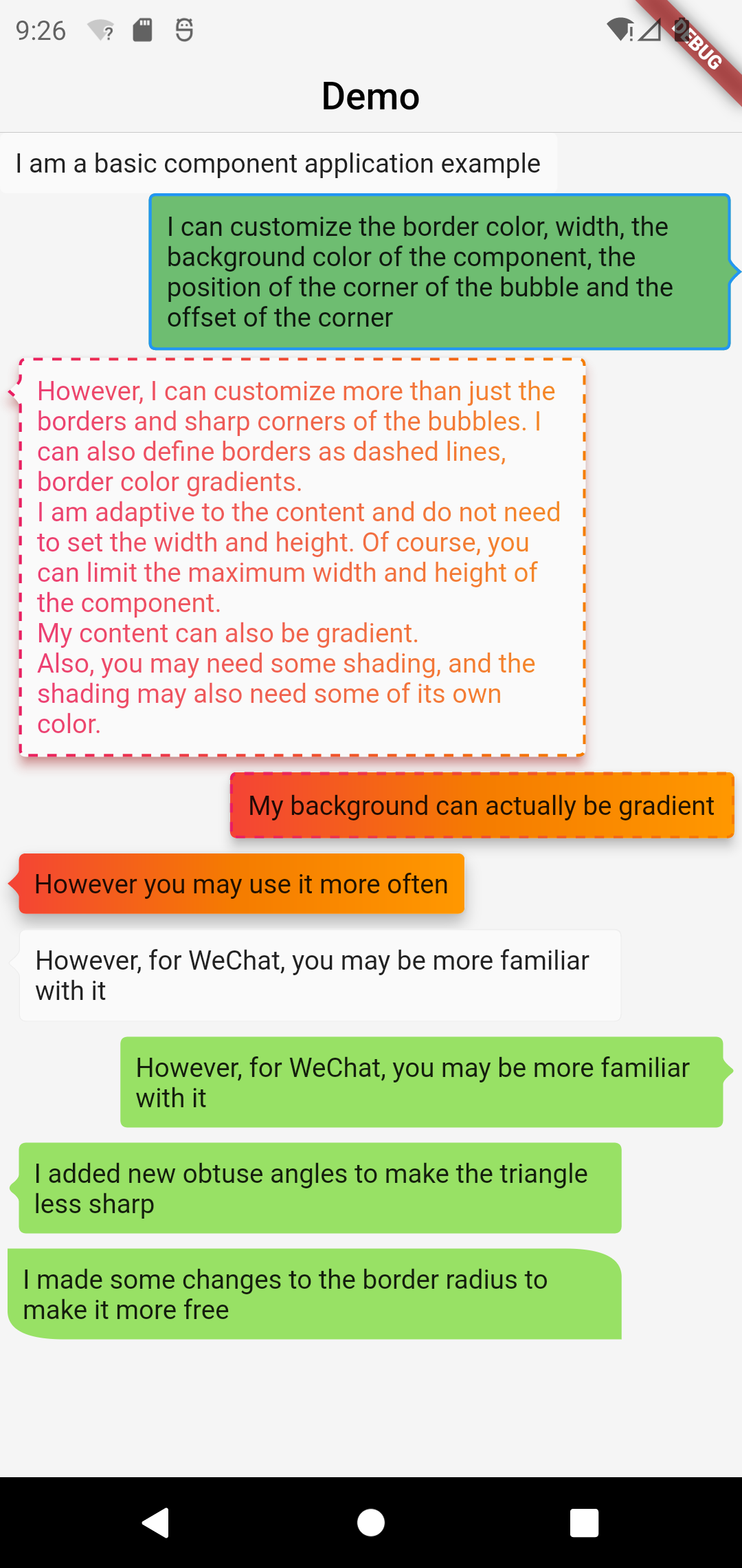
A powerful bubble box, which implements basic bubble, border, dotted line, gradient color, angle, adaptive width and height, bubble direction, offset, etc.
This project was wrote with pure dart code,which means it's support both iOS As well as Android, web, windows, linux, etc.
Modified a lot of APIs, please pay attention to upgrade
BubbleBox(
    maxWidth: MediaQuery.of(context).size.width * 0.8,
    child: Text('I am a basic component application example'),
)BubbleBox(
maxWidth: MediaQuery.of(context).size.width * 0.8,
shape: BubbleShapeBorder(
border: BubbleBoxBorder(
color: Colors.blue,
width: 3,
),
position: const BubblePosition.center(0),
direction: BubbleDirection.right,
),
backgroundColor: Colors.green.withOpacity(0.8),
child: Text('I can customize the color and width of the border, the background color of the component, the position of the sharp corner of the bubble and the offset of the sharp corner'),
)BubbleBox(
maxWidth: MediaQuery.of(context).size.width * 0.8,
gradient: LinearGradient(
colors: [
Colors.pink,
Colors.orange[700],
],
),
blendMode: BlendMode.srcATop,
shape: BubbleShapeBorder(
border: BubbleBoxBorder(
gradient: LinearGradient(
colors: [
Colors.pink,
Colors.orange[700],
],
),
width: 3,
style: BubbleBoxBorderStyle.dashed,
),
direction: BubbleDirection.left,
position: const BubblePosition.start(12),
),
margin: EdgeInsets.all(4),
elevation: 5,
shadowColor: Colors.redAccent,
child: Text(
'However, I can not only customize the border and sharp corners of the bubble. I can also define the border as a dashed line and a gradient of border color. \nI am adaptive to the content, there is no need to set the width and height. Of course, you can limit the maximum width and height of the component. \nMy content can also be faded. \nIn addition, you may need some shadows, and the shadows may also need some of their own colors.'),
)BubbleBox(
maxWidth: MediaQuery.of(context).size.width * 0.85,
elevation: 5,
gradient: LinearGradient(colors: [
Colors.red,
Colors.orange[700],
Colors.orange[500],
]),
shape: BubbleShapeBorder(
border: BubbleBoxBorder(
gradient: LinearGradient(
colors: [
Colors.pink,
Colors.orange[700],
],
),
color: Colors.blue,
width: 3,
style: BubbleBoxBorderStyle.dashed,
),
direction: BubbleDirection.none,
position: const BubblePosition.start(12),
),
margin: EdgeInsets.all(4),
child: Text(
'my background can actually fade',
),
),BubbleBox(
maxWidth: MediaQuery.of(context).size.width * 0.85,
shape: BubbleShapeBorder(
direction: BubbleDirection.left,
position: const BubblePosition.start(12),
arrowQuadraticBezierLength: 2,
),
backgroundColor: Color(0xff98E165),
margin: EdgeInsets.all(4),
child: Text(
'We added new obtuse angles so that the triangles are no longer so sharp',
),
),BubbleBox(
maxWidth: MediaQuery.of(context).size.width * 0.85,
backgroundColor: Color(0xff98E165),
margin: EdgeInsets.all(4),
shape: BubbleShapeBorder(
radius: BorderRadius.only(
topRight: Radius.elliptical(30, 15),
bottomLeft: Radius.elliptical(30, 15)),
),
child: Text(
'We have made some modifications to the border radius to make it more free',
),
),
