-
Notifications
You must be signed in to change notification settings - Fork 106
New issue
Have a question about this project? Sign up for a free GitHub account to open an issue and contact its maintainers and the community.
By clicking “Sign up for GitHub”, you agree to our terms of service and privacy statement. We’ll occasionally send you account related emails.
Already on GitHub? Sign in to your account
Zooming in/out #2
Comments
|
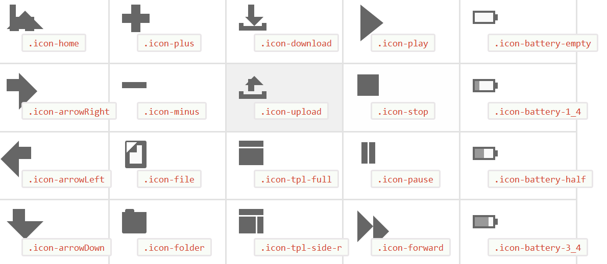
Wow, you really misshaped them. I've tried to get that level of distortion in Chrome (Linux) but couldn't find it. Only views icons were playing along. It is not so much inherent css problem but more of zoom-in / zoom-out and general web problem. The only zoom safe elements on web are fonts (only the good ones) and svg (and we all are waiting for the day when it will be fully supported web wide). Even image, when you zoom it in or out enough, looses its sharpness. It doesn't loose its shape because it's made of one rectangle. Most of these icons are made of 3 separate shapes which creates shape of the icon when in the right relationship to each other. Now, this relationship is made relative (em's) in order to easily change the size of the icon so that you can control which size would be served to which device (or device / window size). When you zoom-in or zoom-out, you can easily distort this relationship between shapes because everything on the page will depend on how well browser will translate relative values to pixels. You can see this very easily with setting widths of elements in percents. If this value, translated to pixels, gives anything but the integer you'll see browsers render it differently (some are capable to do this and some tend to change the value in order to get integer). Therefore, when you zoom your page in such manner that browser can not handle value of relationship between shapes very well, you loose proportion and shape in whole. This is why, in this set, you can control size on several ways in order to make sure that this relationship is preserved. And this is why developers come to use media queries so widely. If we were making websites responsive to every possible screen size, we all would loose our minds (or jobs). I hope this explanation helps and thank you for your interest and feedback. Milana |
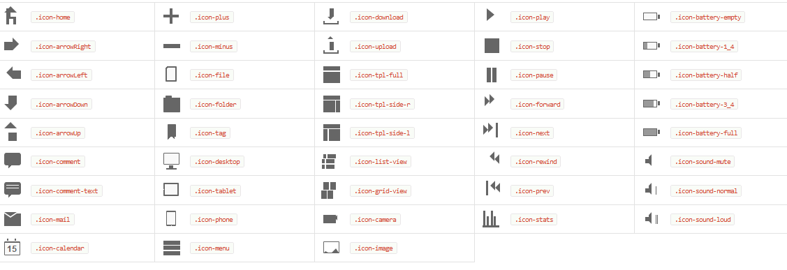
Maybe this is just an inherent css promblem but i thought you should know. These are great icons but if you zoom in or out(im in chrome) then, especially for the more complicated elements, its all out of synx:
zoom out:

zoom in:

The text was updated successfully, but these errors were encountered: