A very useful widget for searching through single or multiple options from a drop-down list.
This plugin has been successfully tested on iOS, Android & web.
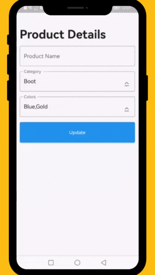
The following examples are extracted from the example project available in the repository. More examples are available in this project.
          // ####### Data Sample (API Response)
          // Data value Api
          final Map<int, String> _listCategories = {1:'Boot', 2: 'Casual', 3: 'Flat', 4: 'Flip',  5: 'Lace up', 6: 'Loafer', 7: 'Slip-on', 8: 'Moccasins'};
          // Default value
          final List<int> _selectedCategory = [1];
          // Data value Api
          final Map<int, String> _listColors = {1:'Black', 2: 'Blue', 3: 'Brown', 4: 'Gold',  5: 'Green', 6: 'Grey', 7: 'Orange', 8: 'Pink', 9: 'Purple', 10: 'Red'};
          // Default value
          final List<int> _selectedColors = [2,4];

          // ####### Category Select List
          DropDownTextField(
            textEditingController: _categoryTextEditingController,
            title: 'Category',
            hint: 'Select Category',
            options: _listCategories,
            selectedOptions: _selectedCategory,
            onChanged: (selectedIds) {
              // setState(() => selectedIds);
            },
          ),

          // ####### Colors Select List
          DropDownTextField(
            textEditingController: _colorsTextEditingController,
            title: 'Colors',
            hint: 'Select Colors',
            options: _listColors,
            selectedOptions: _selectedColors,
            onChanged: (selectedIds) {
              // setState(() => selectedIds);
            },
            multiple: true,
          ),
This property takes List as a parameter and it is useful to display items in drop down list.
This property takes int value as a parameter. This is use to set the initial segment from [segmentNames].
This property takes Color value as a parameter. You can change the background color of animated segment.
This gives the bottom sheet title.
You can set your custom submit button when the multiple selection is enabled.
This will give the call back to the selected items from list.
This will set the background color to the Dropdown Searchable.
This property takes TextFormField value as a parameter. [searchWidget] is use to show the text box for the searching. If you are passing your own widget then you must have to add [TextEditingController] for the [TextFormField].
This property takes bool value as a parameter. [isSearchVisible] is use to manage the search widget visibility. by default it is [True] so widget will be visible.
Dropdown Searchable list is MIT-licensed.
I would be happy if you send us feedback on your projects where you use our component. Just email [email protected] and let me know if you have any questions or suggestions about my work.