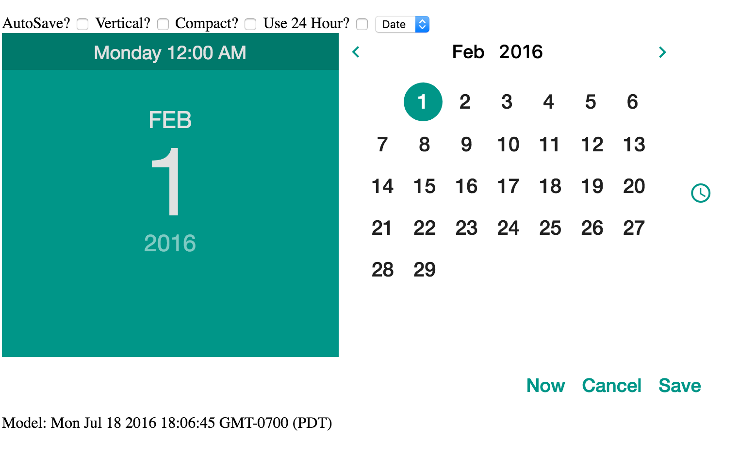
This project is a simple port of the sc-date-time component written by Simeon Cheeseman (http://simeonc.github.io/sc-date-time) to fit the Angular2 Framework.
Currently only the Material design template has been ported over (the Bootstrap template is still pending).
I'm working on a dedicated hosted demo but in the mean time, below is a screenshot and instructions for running the demo yoourself.
- Clone the repo
- Run npm install
- Run ng serve
npm install --save ng2-date-time
- autosave: If this attribute is present the cancel and save buttons are removed and their respective events do not fire. The model is updated as the picker changes. Default value is set via the
scDateTimeConfig.autosaveproperty. - onCancel: Function passed in is called if the cancel button is pressed.
onCancel="cancelFn()" - onSave: Function passed in is called when the date is saved via the OK button, date value is available as $value.
onSave="saveFn($value)" - defaultMode: A string of value 'date'/'time', which side of the slider that should be shown initially, overridden by display-mode. Default value is set via the
scDateTimeConfig.defaultModeproperty. - defaultDate: A date-time string that the selects the date should the model be null. Defaults to today (new Date()). Default can be overridden globally via
scDateTimeConfig.defaultDateproperty. - displayMode: Options are "full"; display time and date selectors and no display, "time"; show only the time input, "date"; show only the date input. Default value is set via the
scDateTimeConfig.displayModeproperty. - orientation: If this string value is 'true' then the picker will be in vertical mode. Otherwise it will change to vertical mode if the screen width is less than 51rem as that is the size of the editor. Default value is set via the
scDateTimeConfig.defaultOrientationproperty. - hours24: If this value is truthy then display 24 hours in time, else use 12 hour time. Default value is set via the
scDateTimeConfig.displayTwentyfourproperty. - compact: If this string value is 'true' then the picker will be in a compact mode, this hides the large title display to the left. Note that displayMode="full" ignores this setting. Default value is set via the
scDateTimeConfig.compactproperty. - minDate: A date string that represents the minimum selectable date/time
- maxDate: A date string that represents the maximum selectable date/time
- weekdays: Optionally bind an array of strings, this defaults to the englist S, M, T, W etc. Intended for full multilanguage support on directive level.
