See our site here!! 👀
Unlock have a real problem with their helpline has seen an increase in calls relating to questions that can be answered through their online "information hub". They needed to find a way to reduce the number of calls related to simple questions to free up the time of the volunteers and focus on more challenging discussions.
In our Design Workshop we spent a few hours trying to figure out what the main problem was that could help reduce the number of calls coming through to the volunteers. With two of the main discussions being around travel to the U.S and helping to create disclosure letters to future employers.
We then considered possible solutions for each of the problems and came up with quick storyboards which we voted on. After some deliberation it was decided that the key problem we wanted to solve was:
How do we lower calls related to travel abroad to help reduce pressure on the helpline
Create a chat bot that users can click on and interactive with to answer their common questions related to travel to the U.S.
This additional feature to the current Unlock info hub will enable users to easily discover whether they are elibgible to travel to the U.S. on an ESTA or a Visa. It also provides them with examples of conviction as well as alternative options on how to travel.
We also wanted to provide helpful links throughout the process to aid with navigation of the hub.
The aims of the solution
- Allow the user to answer their own questions related to travel in the U.S 🇺🇸
- Reduce calls related to travel going through to the helpline ☎️
User Stories We began by aligning on the main user stories that were key to the success of the prototype. There were:
- "As a user I want to know whether I can travel to the U.S.A
- "As a user I want clear communication on the process of travelling"
- "As a user I want to know the consequences of not following the process
- "As a user I want to answer specific questions that are asked to me"
- "As a user I want to be provided with alternative if I can't travel as intended"
- "As a user I want to have links to alternative information and documents"
- "As a user I want to be reassured that I am talking to someone who understands my problem
Prototype We then built prototypes in Sketch to help map the user journey more thoroughly.
User is greeted by a relatable person and provided with option on what they may need help with
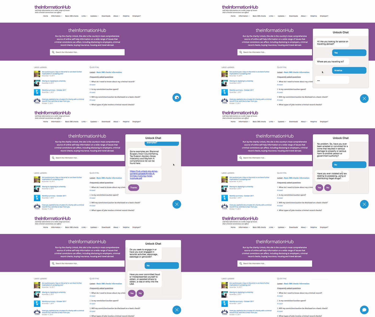
User is then greeted in a chat and asked specific questions which they can answer through buttons
If user selected "Travel" it would look something like this:
If user selects an answer that the chat has no information on it will direct them to a relevant page on the hub:
Flow Chart
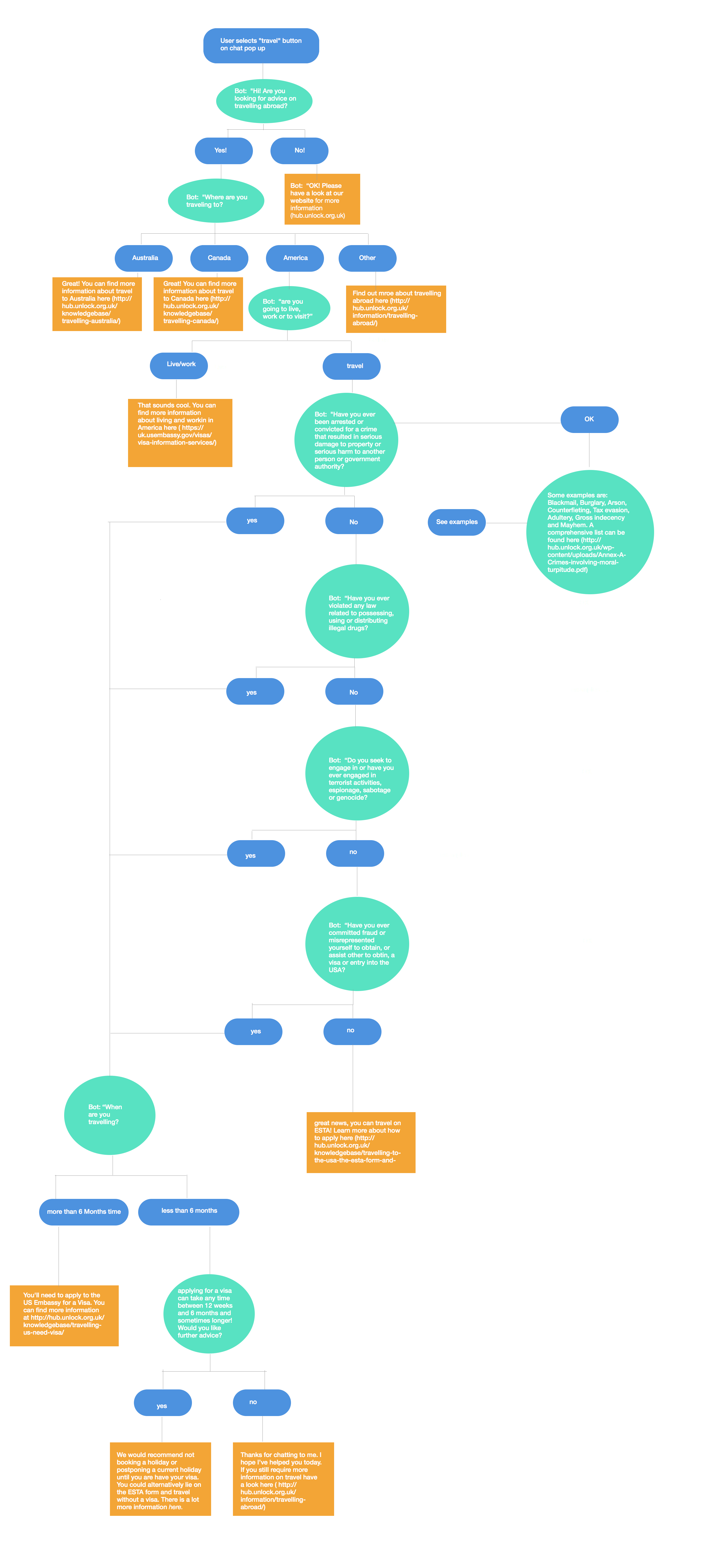
For the prototype we focused only on the journey for a user to ask about travel and in particular travelling to the U.S. As such we developed a flow chart to direct our thinking to how a converstation could play out.
- User comes to the hub
- User clicks on the chat icon in the lower right hand corner
- User is greeted by "Lucy" who shares her story and allows user to select what they would like information on
- User is taken to chat screen and greeted
- User follows a series of questions to determine their eligibility for travel to the U.S
- Whenever user flow ends they are provided with links to further information
See our final product here!👀
User testing allows you to get feedback from your primary users to check that the product being built fits their needs. This is very important to build a successful product.
The three key points for testing are:
- Have a script which has tasks for them to complete
- Ask for people to give you a commentry of what they are doing, but don't response to them
- Document their response
Here are some useful resources to look at when completing your user testing sessions:
Recommended areas to user test:
- Whether a user can find answers to a particular question they have i.e. "can you find out whether you can travel to the U.S on an ESTA having commited Arson"
- See whether the navigation of the app is clear to the user
If this design is to move forward for a build sprint it is important to concentrate on key features that both solves the initital problem and takes implements feedback from user testing.
Recommended first features from developers point of view:
- Add flows for other destinations
- Add flows for disclosure form or other common helpline queries
- Improve responsiveness
- Add 'return home' functionality


