Create new logo/logotype #88
Comments
|
|

|
I had some ideas in my head to get down. |
|
|

|
Putting the header in here for now. The happy face cycle diagram can't be made until we have some screenshots to use. |
|
Leaving the hero screenshot here for context, but note this ticket is strictly for the logo. |
|
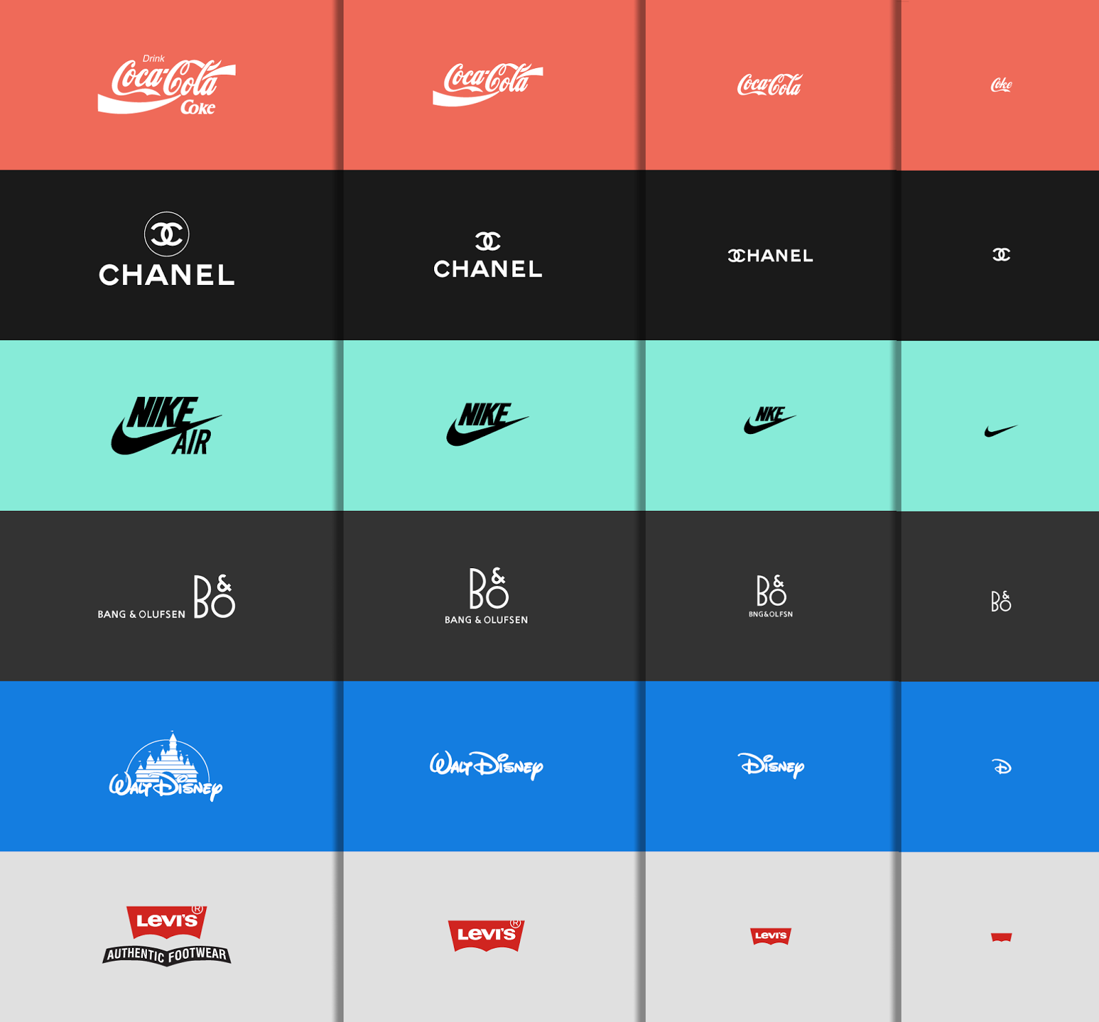
Only major requirement: logo should be responsive, and have several states of scale. Examples: |
|
branch: issue_88-new_logo_slash_logotype I exported the logo we all liked well enough to replace the existing one. There are four brand elements:
Now, that being said, each of those elements were exported at varying sizes. Illustrator automates that process nicely. So each of the above brand elements were rendered at 1x, 0.75x, and 0.5x "magnifications." Not sure if that's helpful or redundant, but seeing as it could be easily done I figured better to have them and not need them, for responsive purposes. Cool! |
|
@arbitrarynoun is this ready for review? |
|
@johnhutch yeah, I suppose it is. Forgot to move the board, but mentioned it in the Slack. |
|
@arbitrarynoun, this failed the single test in: I'm assuming you have to update the test to look in the correct element. It's set to be 'header' right now and maybe it has to be 'header .logo' now? You may have to update the expect content to more than just the brand. |
|
@arbitrarynoun I pushed your branch to heroku. Check this out live and make sure it looks good. I see one problem, the old foodweek text isn't hidden. Possibly a merge problem? |
|
@jon-athan-hall I think this issue may resolve once Issue #89 pushes. |
|
This is blocked by #89. Please re-review on prod after #89 pushes. The problem is that #88 was pushed with code that has the logo as an image, not as a replacement for the h1 tag. This is changed in #89 where the Hero is built out more fully. When #89 is in production, this should resolve automatically. Review at that time. |
|
Prod looks good. Closing ticket. |
branch: issue_88-new_logo_slash_logotype Edit June 27, 2017
The logo is on the right track, but feels unfinished, the logotype (FOODweek) appears to have lost some font styling, and the whole section takes up a lot of unnecessary white space.
This could potentially be compressed a bit, with the logo and logotype occupying the same horizontal space, with room for a video demo or something of the sort.
We know we have something very useful. It's not obvious to a brand new user exactly what this thing does and how it works, and they won't want to sign up to find out. We need to make them want to use this thing. We need to show them how useful it is. Those two needs may be mutually exclusive or counter to one another.
Once this has been shifted around a bit, we MAY need to reconsider the layout of the rest of the header area, perhaps floating it up the side of the logotype or something.
The text was updated successfully, but these errors were encountered: