
ContainedTabBarView encapsulates TabController, TabBar and TabBarView into a single, easy to use Widget and lets you customize its appearance without worrying about internal workings of "TabBar ecosystem".
To use this package
- add
contained_tab_bar_viewas a dependency in your pubspec.yaml file:.
dependencies:
  flutter:
    sdk: flutter
  ...
contained_tab_bar_view: 0.7.0- get the package
flutter pub get- import the package
import 'package:contained_tab_bar_view/contained_tab_bar_view.dart';All of the below examples can be found under example, each written as a simple StatelessWidget.
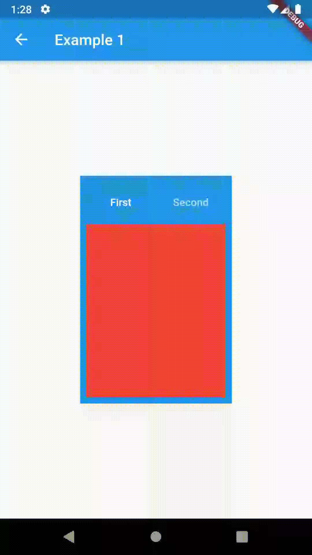
Basic usage includes putting a ContainedTabBarView into a Container whose constraints will it obey. Putting a ContainedTabBarView directly into a body of a Scaffold will, expectedly, draw it full-screen.
// Example 1
import 'package:contained_tab_bar_view/contained_tab_bar_view.dart';

...

Container(
  padding: const EdgeInsets.all(8.0),
  color: Colors.blue,
  width: 200,
  height: 300,
  child: ContainedTabBarView(
    tabs: [
      Text('First'),
      Text('Second')
    ],
    views: [
      Container(color: Colors.red),
      Container(color: Colors.green)
    ],
    onChange: (index) => print(index),
  ),
)
All the properties that can be set for a TabBar are accessible for setting via tabBarProperties. Also, there are many more for the customization of TabBar's appearance. To create your own ("container-based") indicator, you can use ContainerTabIndicator decoration (see examples 4 and 6) which is a part of this package, but also a separate package whose documentation can be found here. Of course, you can use any other tab bar indicator of your liking.
| Property | Type | Default value | Description |
|---|---|---|---|
| width | double |
/ | The widht of TabBar. If not set, it's full available width. |
| height | double |
kToolbarHeight |
The height of TabBar. The TabBarView takes the availbale height minus this value. |
| background | Container |
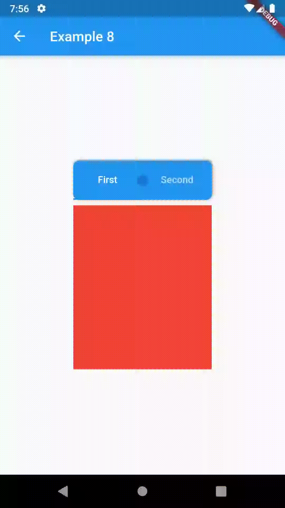
/ | Container that is behind the tabs. See example 8. |
| position | TabBarPosition |
TabBarPosition.top |
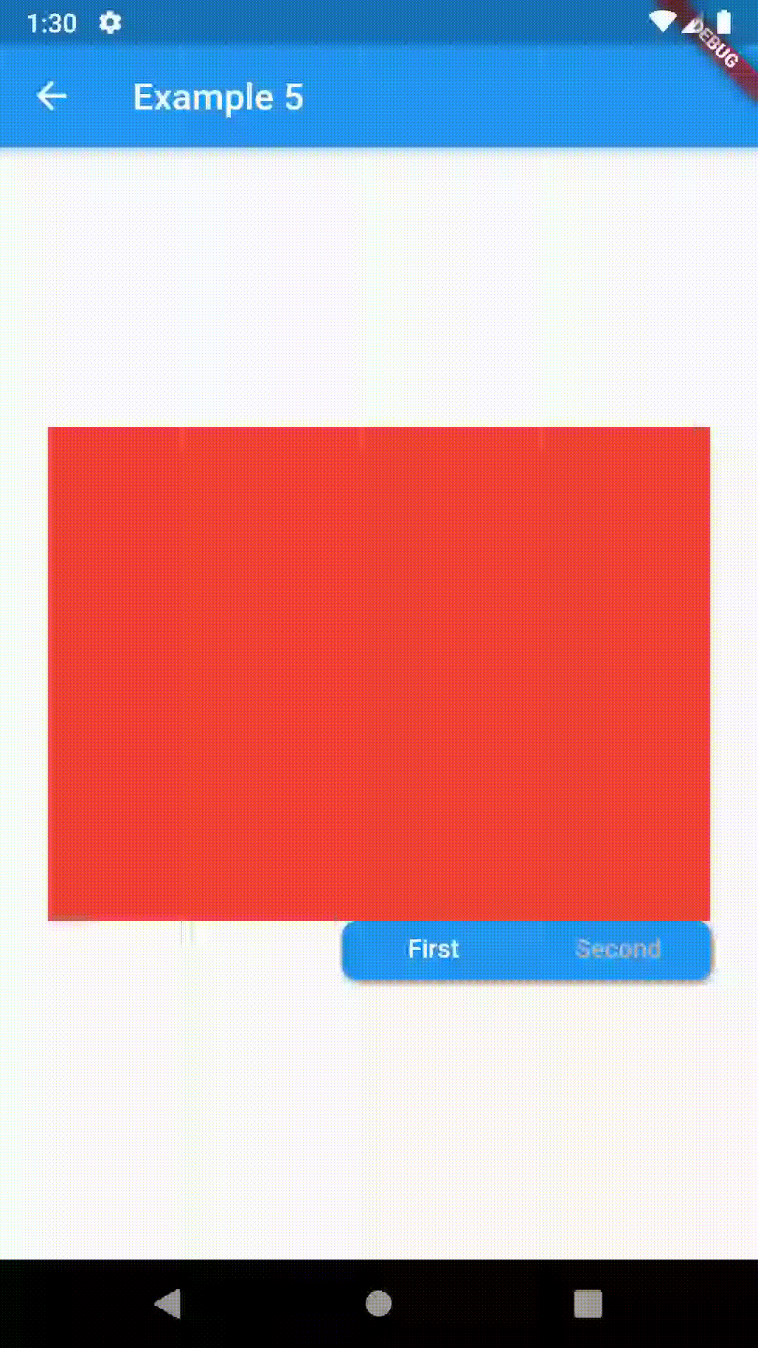
Position of TabBar in respect to it's TabBarView. See example 5. |
| alignment | TabBarAlignment |
TabBarAlignment.center |
Alignment of TabBar (if it's width is not full available) within TabBar-TabBarView Flex. See example 5. |
| outerPadding | EdgeInsets |
const EdgeInsets.all(0.0) |
Padding around TabBar. See example 8. |
| indicator | Decoration |
/ | The decoration for the active tab. You can use ContainerTabIndicator for various customization. See example 4. Also, see TabBar documentation |
| indicatorColor | Color |
/ | see TabBar documentation |
| IndicatorPadding | EdgeInsetsGeometry |
const EdgeInsets.all(0.0) |
see TabBar documentation |
| indicatorSize | TabBarIndicatorSize |
/ | see TabBar documentation |
| indicatirWeight | double |
2.0 |
see TabBar documentation |
| isScrollable | bool |
false |
see TabBar documentation |
| labelColor | Color |
/ | see TabBar documentation |
| labelPadding | EdgeInsetsGeometry |
const EdgeInsets.all(0.0) |
see TabBar documentation |
| labelStyle | TextStyle |
/ | see TabBar documentation |
| unselectedLabelColor | Color |
/ | see TabBar documentation |
| unselectedLabelStyle | TextStyle |
/ | see TabBar documentation |
All the properties that can be set for a TabBarView are accessible for setting via tabBarViewProperties.
| Property | Type | Default value | Description |
|---|---|---|---|
| dragStartBehavior | DragStartBehavior |
DragStartBehavior.start |
See TabBarView documentation |
| physics | ScrollPhysics |
(platform specific) | See TabBarView documentation |
For example, if you want to disable swiping behavior on the TabBarView, set the option like this:
ContainedTabBarView(
  ...
  tabBarViewProperties: TabBarViewProperties(
    physics: NeverScrollableScrollPhysics(),
  ),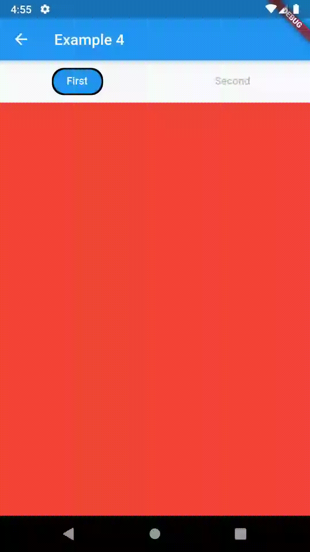
)enum TabBarPosition { top, bottom, left, right }enum TabBarAlignment { start, center, end }// Example 5
ContainedTabBarView(
tabs: [
Text('First'),
Text('Second'),
],
tabBarProperties: TabBarProperties(
width: 200,
height: 32,
position: TabBarPosition.bottom,
alignment: TabBarAlignment.end,
background: Container(
decoration: BoxDecoration(
color: Colors.blue,
borderRadius: BorderRadius.all(Radius.circular(8.0)),
boxShadow: [
BoxShadow(
color: Colors.black.withOpacity(0.4),
spreadRadius: 0.5,
blurRadius: 2,
offset: Offset(1, -1),
),
],
),
),
indicatorColor: Colors.transparent,
labelColor: Colors.white,
unselectedLabelColor: Colors.grey[400],
),
views: [
Container(color: Colors.red),
Container(color: Colors.green),
],
)
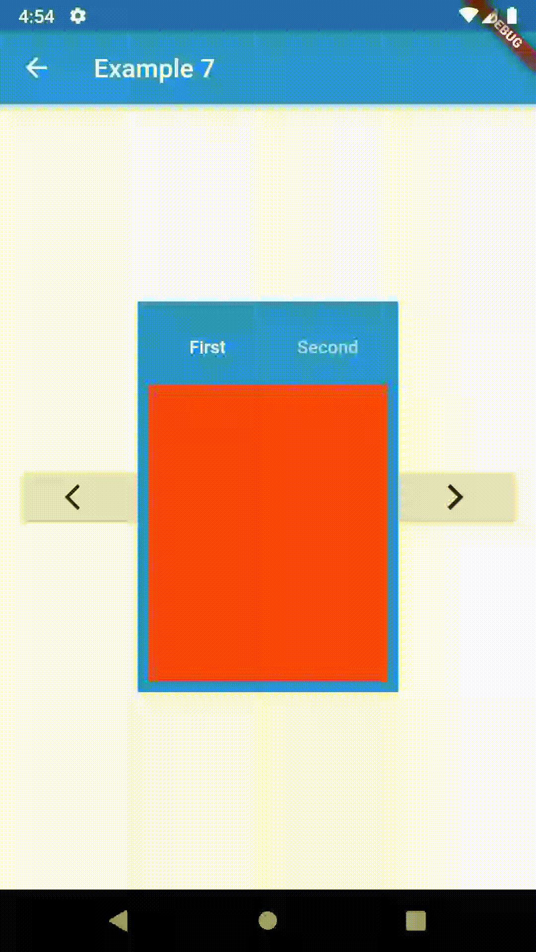
To control the state, i.e. move to another tab, from outside of ContainedTabBarView create it with a GlobalKey and then use methods exposed from state; animateTo(), next() and previous().
// Example 7
class Example7 extends StatelessWidget {
  @override
  Widget build(BuildContext context) {
    GlobalKey<ContainedTabBarViewState> _key = GlobalKey();
    ContainedTabBarView containedTabBarView = ContainedTabBarView(
      key: _key,
      tabs: [
        Text('First'),
        Text('Second')
      ],
      views: [
        Container(color: Colors.red),
        Container(color: Colors.green)
      ],
    );

    return Scaffold(
      appBar: AppBar(
        title: Text('Example 7'),
      ),
      body: Row(
        mainAxisAlignment: MainAxisAlignment.center,
        children: [
          RaisedButton(
            child: Icon(Icons.arrow_back_ios),
            onPressed: () => _key.currentState.previous(),
          ),
          Center(
            child: Container(
              padding: const EdgeInsets.all(8.0),
              color: Colors.blue,
              width: 200,
              height: 300,
              child: containedTabBarView,
            )
          ),
          RaisedButton(
            child: Icon(Icons.arrow_forward_ios),
            onPressed: () => _key.currentState.next(),
          ),
        ]
      ),
    );
  }
}
This package is still in early stages. If you notice any bugs, please file an issue. If you are willing to fix or enhance things yourself, you are very welcome to make a pull request.