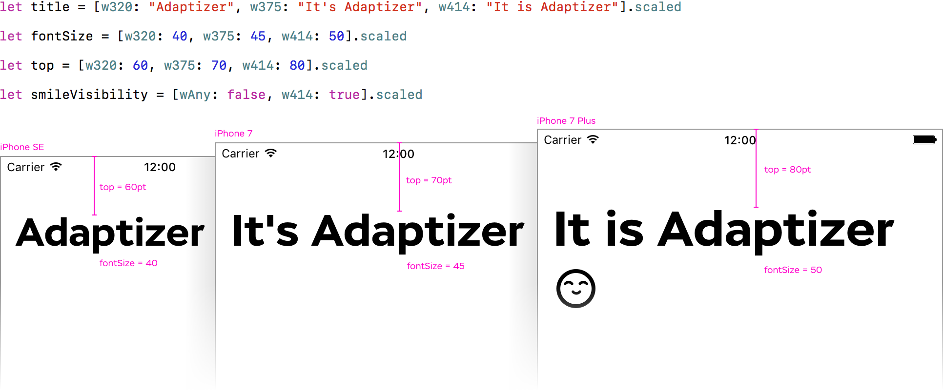
Class helping to build flexible, adaptive iOS interfaces with extremely easy API:
Why? Sometimes, UI designers need to adjust size or text to a particular screen size, like the adaptive design on the web.
The big picture of various screen sizes:
All screen width in points:
// w320  >  wC  iPhone  iPad
// w375  >  wC  iPhone  iPad
// w414  >  wC  iPhone
// w438  >  wC          iPad
// w504  >  wC          iPad
// w507  >  wC          iPad
// w551  >  wC          iPad
// w568  >  wC  iPhone
// w639  >  wC          iPad
// w667  >  wC  iPhone
// -------------------------
// w678  >  wR          iPad
// w694  >  wR          iPad
// w736  >  wR  iPhone
// w768  >  wR          iPad
// w782  >  wR          iPad
// w834  >  wR          iPad
// w981  >  wR          iPad
// w1024 >  wR          iPad
// w1112 >  wR          iPad
// w1366 >  wR          iPad
Adaptizer supports three ways to refer a particular screen size:
- Exact screen width in points:
w320,w375,w414and so on, regardless of the device type - Size class + Device type:
wC.phone,wR.pad - Size class, regardless of the device type:
wC.all,wR.all
Drag Adaptizer.swift into your project.
You can give a list of exact values for various screen width, and Adaptizer returns one for the current screen.
1.1 Create a Dictionary of break points
Add only screen widths you care about: [w320: 80, w375: 100, w414: 120].
Keys are in ScreenIdentifier type. All of them starts with w. Values – any you want to scale: CGFloat/Float/Double/Int for font sizes, constraints constant and so on; String for adjusting text; Boolfor hiding elements and so on.
Use .defaultto set a default value for screen widths you haven't specified: [w320.default: 80, w375: 100, w414: 120].
Also, you can use wAny to set a default value: [wAny: 50, w414: 100].
If you haven't set the default value in your dictionary, the first dictionary value is used.
1.2 Get a value for particular screen width
Simply add .scaled to a dictionary: [w320.default: 80, w375: 100, w414: 120].scaled.
Adaptizer returns one of the values provided in the dictionary in the very same type. If you need a CGFloat call .cgFloat for more convenience type conversion.
Conflicts are solved towards more specific instruction. F.x. you set [w320: 80, wC.phone: 100, wC.all: 120]. For screen width of 320 points, all three instructions applicable, but w320 is the only one exact, so it is used, the others are ignored. For screen width of 375 points on an iPhone, second and third instructions are applicable, but wC.phone is more specific instruction, so it is used.
You can give a list of multipliers to adjust one provided original value to various screen width.
2.1 Create a Dictionary of break points
A dictionary is created the very same way as described in 1.1. The only one difference is that the values are not exact values, but multipliers of Double type.
2.2 Set scalingRule
This dictionary of multipliers is used as a scaling rule. To set the rule, add .scalingRule() to the dictionary: [w320: 0.8, w375: 1.0, w414: 1.2].scalingRule()
2.3 Scale an original value
Add .scaled to a value of Int, Float, Double or CGFloat type: 20.scaled. The result is scaled original value of the same type. Call .cgFloat to convert it into CGFloat for further using.
To keep pixel-perfect, the result is rounded by default. If you don't want the result to be rounded, say it be setting the rule: .scalingRule(rounding: false)
Mikhail Rubanov and Ruslan Shevchuk for consultations and ideas.

