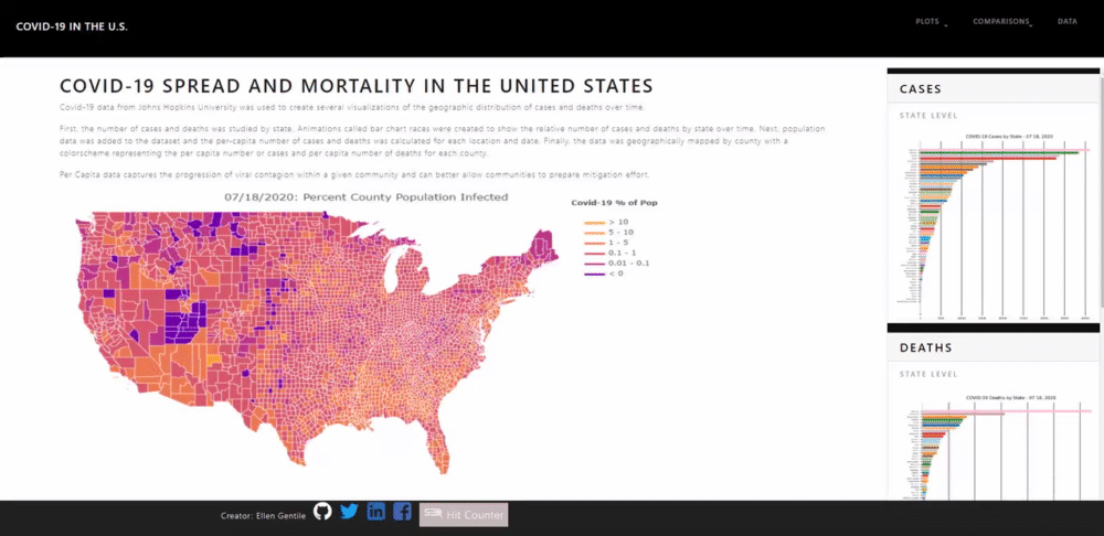
Covid-10 county level data from the New York Times was merged with county population data. Daily total number of cases and deaths per capita by country were programmatically determined using python and pandas in a jupyter notebook. Several visualizations were then created using Pandas and Plotly. A web page dashboard displaying the visualizations was created using html, CSS and Bootstrap.
A webpage dashboard was created demonstrating the progression of Covid-19 throughout the United States since January 2020. The home page contains a navigation bar with drop down menus for additional details. The main page also contains a sidebar that has card style image/ description links to pages with more specific details:
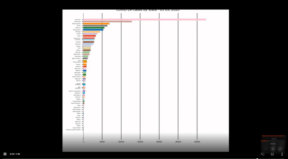
Bar chart races were created for both cases by state and deaths by state:
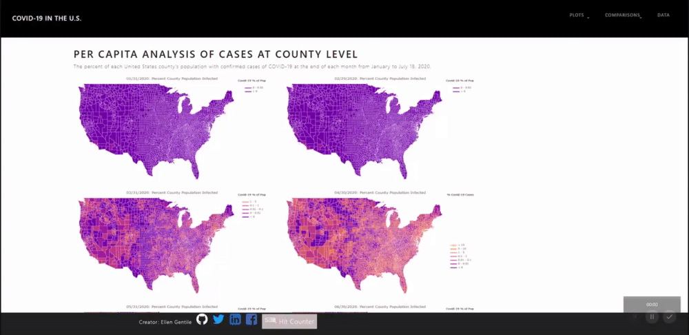
A number of chloropleth plots were created to show the per capita case and death rates for every county in the U.S. at the end of each month: