A swipe item for react-native. Support both iOS and Android.
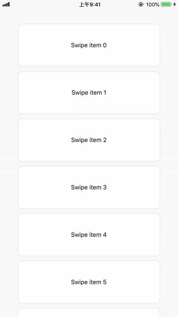
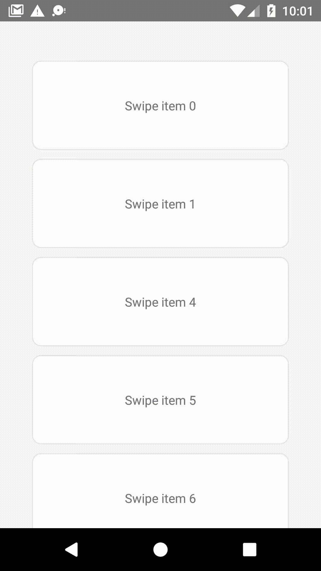
See react-native-swipe-item-demo.
npm i --save react-native-swipe-item
You can use the SwipeButtonsContainer to wrap buttons that you want to show when users swipe the item, and pass it to props.
import { SwipeItem, SwipeButtonsContainer } from 'react-native-swipe-item';

export default function SwipeButtonCustom() {

    const leftButton = (
        <SwipeButtonsContainer
            style={{
                alignSelf: 'center',
                aspectRatio: 1,
                flexDirection: 'column',
                padding: 10,
            }}

        >
            <TouchableOpacity
                onPress={() => console.log('left button clicked')}
            >
                <Text>Click me !</Text>
            </TouchableOpacity>
        </SwipeButtonsContainer>
    );

    return (
        <SwipeItem
            style={styles.button}
            swipeContainerStyle={styles.swipeContentContainerStyle}
            leftButtons={leftButton}
        >
            <Text>
                Swipe me!
            </Text>
        </SwipeItem>
    );
}

const styles = StyleSheet.create({
    button: {
        width: '80%',
        height: 100,
        alignSelf: 'center',
        marginVertical: 5,
    },
    swipeContentContainerStyle: {
        justifyContent: 'center',
        alignItems: 'center',
        backgroundColor: '#ffffff',
        borderRadius: 10,
        borderColor: '#e3e3e3',
        borderWidth: 1,
    }
});These styles will be applied to the swipe item layout.
| TYPE | REQUIRED |
|---|---|
| style | No |
These styles will be applied to the swipe item container which user swipe.
Example:
return (
        <SwipeItem swipeContainerStyle={styles.swipeContentContainerStyle} >
        </SwipeItem>
    );
}

const styles = StyleSheet.create({
    swipeContentContainerStyle: {
        justifyContent: 'center',
        alignItems: 'center',
        backgroundColor: '#ffffff',
        borderRadius: 10,
        borderColor: '#e3e3e3',
        borderWidth: 1,
    }
});| TYPE | REQUIRED |
|---|---|
| style | No |
Buttons that want to show on the left when the item swiped to right.
| TYPE | REQUIRED |
|---|---|
SwipeButtonsContainer |
No |
Buttons that want to show on the right when the item swiped to left.
| TYPE | REQUIRED |
|---|---|
SwipeButtonsContainer |
No |
The component for the swipe item.
- Before RN 0.57.0, the child view would be clipped by parent view when the child view layout out of the parent. Recommend to use ViewOverflow plugin to solve this problem.
Example:
import ViewOverflow from 'react-native-view-overflow';
...
...
export default function SwipeButtonCustom() {
    return (
        <SwipeItem
            style={styles.button}
            swipeContainerStyle={styles.swipeContentContainerStyle}
            containerView={ViewOverflow}
        >
            <Text>
                Swipe me!
            </Text>
        </SwipeItem>
    );
}
...| TYPE | REQUIRED | PLATFORM |
|---|---|---|
ViewOverflow |
Yes | Android |
This prop will be called when the item started swipe from the origin position, and the SwipeItem reference passed as an argument.
This prop will be called when left buttons showed, and the SwipeItem reference passed as an argument.
This prop will be called when right buttons showed, and the SwipeItem reference passed as an argument.
This prop will be called when the item moved to the origin, and the SwipeItem reference passed as an argument.
Close the swipe item.
MIT