UI builder framework for FHEM — http://fhem.de/fhem.html with a clear intention: Keep it short and simple!
Version 3
FTUI 3 uses Web Components technologies in pure ES2020 javascript.
Caution!
- This version is not compatible with older fhem-tablet-ui versions.
- This version is under construction.

- copy the folder www/ftui to your FHEM www (e.g.: /opt/fhem/www/ftui)
wget https://github.com/knowthelist/ftui/tarball/master -O /tmp/ftui.tar
cd /tmp && tar xvzf /tmp/ftui.tar
mv /tmp/knowthelist-ftui-*/www/ftui /opt/fhem/www
- change the example page 'index.html' according your needs
- to open your new page call http://<fhem-url>:8083/fhem/ftui/index.html
call
update all https://raw.githubusercontent.com/knowthelist/ftui/master/controls_ftui.txt
on the FHEM command field of FHEMWEB
Clone the git project in your home directory and link the www/ftui folder into FHEM's www
cd
git clone https://github.com/knowthelist/ftui.git
ln -s $HOME/ftui/www/ftui /opt/fhem/www/ftui_dev
You can also host FTUI on your own web server running in a docker container instead of via FHEMWEB.
- Pull the docker image:
docker pull knowthelist/ftui
- Place your index.html somewhere where you can use it as a volume for docker.
- Put the fhemweb_url into the head of the index.html:
<meta name="fhemweb_url" content="http://<your_fhem_url>:8083/fhem/">
- Run the container:
docker run -d -p 8080:80 -v <path>/index.html:/usr/share/nginx/html/index.html --name ftui3 knowthelist/ftui
- Open your FHEM Tablet-UI on any browser in your network:
<docker_host>:8080
Just add some of the FTUI web components to your HTML code
<ftui-button (value)="dummy1">on/off</ftui-button><ftui-label [text]="dummy1"></ftui-label><ftui-icon
[name]="dummy1 | map('on: lightbulb-on, off: lightbulb')"
[color]="ftuitest | step('0: success, 50: warning, 80: danger')">
</ftui-icon>- no binding - fix value
<ftui-label color="danger">demo</ftui-label>- Property binding:
To bind a FHEM reading to a property of an element. Changes of the reading changes the property
<ftui-label get-color="dummy1:color">demo</ftui-label>short format The short format uses square brackets.
<ftui-label [color]="dummy1:color">demo</ftui-label>The FHEM reading is given as follow:
[attribute]="DEVICE:READING:PROPERTY"
DEVICE is the name of the FHEM device e.g. lamp1 or AgroWeather READING is the name of the reading e.g. state or temperature (default: STATE) PROPERTY is the property of the reading. Possible are: value, time, update, invalid (default: value)
value - the value of the reading in fHEM time - the timestamp of the reading in FHEM update - update timestamp in FTUIN invalid - is true if the reading doesn't exist in FHEM (anymore)
Example to show the timestamp of a reading
<ftui-label [text]="AgroWeather:state:time | toDate() | format('mm:ss')"></ftui-label>- Attribute binding:
Attribute binding helps you to set values for attributes directly.
<ftui-label [attr.data-my]="dummy1:status">demo</ftui-label>on attribute changes set the FHEM reading
<ftui-button set-value="dummy1"></ftui-button>short format
<ftui-button (value)="dummy1"></ftui-button><ftui-button getset-value="dummy1"></ftui-button>short syntax ("banana in a box")
<ftui-button [(value)]="dummy1"></ftui-button>The device name 'local' is a reserved name for binding which keeps local on client and is not synced with FHEM
  <link href="themes/mobile-dark-theme.css" rel="stylesheet"
ftui-binding [disabled]="local:dark">- local:dark FTUI sets this to true if the OS switches to dark mode
Some components provide events on attribute change. The $event object provides the parameter 'detail' that containing the changed property.
<ftui-colorpicker @color-change="console.log($event.detail.hexString)"></ftui-colorpicker><ftui-dropdown [list]="ftuitest:list" [(value)]="ftuitest" @value-change="console.log($event.detail)"></ftui-dropdown>This can be used to communicate between components.
Binding values can be pushed through piped functions to change the value. Following pipe functions are currently available:
- part(number)
- toDate(string)
- toBool(string|number)
- toInt(number)
- format(string)
- round(number)
- add(number)
- multiply(number)
- divide(number)
- replace(find, replace)
- map('in1:out1,in2:out2,...')
- step('1:ok,6:warning,10:alert')
- scale(minIn, maxIn, minOut, maxOut)
Example for input (FHEM reading -> function() -> HTML attribute):
<ftui-label [text]="AgroWeather:state | part(4) | toInt() | multiply(2) | round(1) "></ftui-label>Example for output (HTML attribute -> function() -> FHEM reading):
<ftui-colorpicker (hex)="replace('#','') | HUEDevice6:rgb"></ftui-colorpicker>There are fixed theme colors that are defined as color names.
Main colors:
- primary
- secondary
- light
- medium
- dark
Result colors:
- success
- warning
- danger
Spectrum colors:
- red
- orange
- yellow
- green
- blue
- violet
State colors:
- ok
- warning
- error
Others colors:
- white
- black
- gray
- brown
- grid
- translucent
Layout
- Tab
- Grid
- Circlemenu
- Row
- Column
- Cell
- View, ViewStage, ViewSection, ViewItem
- Swiper
Elements
- Label
- Icon
- Button
- SegmentedButton
- Knob
- Slider
- Checkbox
- Weather
- Dropdown
- Colorpicker
- Image
- Badge
- Clock
- Chart
- Medialist
Miscellaneous
... to be continued
All components has following attributes
- hidden
- disabled
- readonly
- margin
- padding
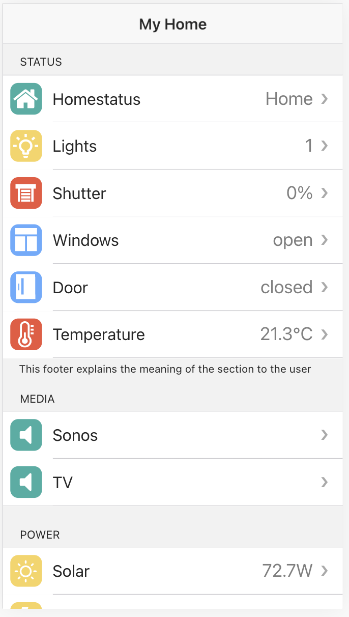
A user interface for mobile phones can be implemented with ftui-view.
| Attribute | Description | Type | Default |
|---|---|---|---|
| color | The color to use from color palette. | "primary" | "secondary" | "success" | "warning" | "danger" | "light" | "medium" | "dark" |
"primary" |
| fill | . | "clear" | "outline" | "solid" |
"solid" |
| size | . | "small" | "normal" | "large" |
"normal" |
| shape | . | "round" | "normal" | "circle" |
"normal" |
| value | . | String | "off" |
| states | . | String list comma separated | "on,off" |
| Attribute | Description | Type | Default | Example |
|---|---|---|---|---|
| text | The text to show. | String | "" |
|
| color | The color to use from color palette. | "primary" | "secondary" | "success" | "warning" | "danger" | "light" | "medium" | "dark" |
"" |
|
| unit | The unit which should be displayed after the value. | String | "" |
|
| interval | Reloading every x secondes. | Number | 0 |
|
| size | Size of font. | Number|String | 0 |
3 |
If size is specified as number only it get mapped to following values
| size | font-size |
|---|---|
| -4 | 0.125em |
| -3 | 0.25em |
| -2 | 0.5em |
| -1 | 0.75em |
| 0 | 1em |
| 1 | 1.25em |
| 2 | 1.5em |
| 3 | 1.75em |
| 4 | 2em |
| 5 | 2.5em |
| 6 | 3em |
| 7 | 3.5em |
| 8 | 4em |
| 9 | 5em |
| 10 | 10em |
| 11 | 11em |
| 12 | 12em |
size property can also specified as %, px or em as a string. e.g. size="80%" or size="12px"
| Attribute | Description | Type | Default |
|---|---|---|---|
| base | Front part of the URL. | String | "" |
| src | Image part of the URL or full URL. | String | "" |
| width | Force a certain image width. | Number | "auto" | "auto" |
| height | Force a certain image height. | Number | "auto" | "auto" |
| interval | Reloading every x secondes. | Number | 0 |
| refresh | Changes of this attribute triggers a reload. | String list comma separated | "" |
| nocache | Bypass cache on next reload. | Boolean | false |
Badges can be used as a notification that contain a number or other characters. They show that there are additional items associated with an element and indicate how many items there are. The element disappears if the value is 0 or empty.
| Attribute | Description | Type | Default |
|---|---|---|---|
| color | The color to use from color palette. | "primary" | "secondary" | "success" | "warning" | "danger" | "light" | "medium" | "dark" |
"primary" |
| text | Text to display inside. | String | "" |
Speak uses the browser's Web Speech API to synthesize text to speech.
| Attribute | Description | Type | Default |
|---|---|---|---|
| lang | Language of the utterance. | "en-US" | "de-DE" |
the user-agent default |
| pitch | Pitch at which the utterance will be spoken at. | Float | 0.9 |
| rate | Speed at which the utterance will be spoken at. | Float | 1.0 |
| volume | Volume that the utterance will be spoken at. | Float | 1.0 |
| text | Text that will be synthesized when the utterance is spoken. | String | "" |
... to be continued
Colorpicker allows to change a color value in many different ways. Work with colors in hex and HSL
| Attribute | Description | Type | Default |
|---|---|---|---|
| hex | The color value in RBG hex in this format: #ffffff | String | "" |
| hue | The hue value of the color form 0 to 360. | Number | "" |
| saturation | The saturation value of the color form 0 to 100. | Number | "" |
| brightness | The brightness value of the color form 0 to 100. | Number | "" |
... to be continued
The Chart component uses Chart.js to render charts.
Chart Types are:
- Line chart
- Bar chart
- Radar chart
- Doughnut and Pie chart
- Polar chart
- Bubble chart
- Area chart or mixed types
style variables:
--chart-legend-font-size --chart-legend-color --chart-title-color --chart-title-font-style --chart-text-color --chart-grid-line-color --chart-tick-font-size --chart-font-style --chart-font-family
Main component: ftui-chart
| Attribute | Description | Type | Default |
|---|---|---|---|
| title | String | "" |
|
| type | String | "line" |
|
| width | String | "" |
|
| height | String | "" |
|
| unit | String | "day" |
|
| offset | Number | 0 |
|
| prefetch | Number | 0 |
|
| extend | Boolean | false |
|
| noscale | Boolean | false |
|
| no-y | Boolean | false |
|
| no-y1 | Boolean | false |
|
| no-x | Boolean | false |
|
| y-min | Number | 0 |
|
| y1-min | Number | 0 |
|
| y-max | Number | 0 |
|
| y1-max | Number | 0 |
|
| y-label | String | "" |
|
| y1-label | String | "" |
Child component: **ftui-chart-data**
| Attribute | Description | Type | Default |
|---|---|---|---|
| label | String | "" |
|
| type | String | "line" |
|
| fill | Boolean | false |
|
| hidden | Boolean | false |
|
| point-background-color | Color | primaryColor |
|
| background-color | Color | "" |
|
| border-color | Color | primaryColor |
|
| border-width | Number | 1.2, |
|
| point-radius | Number | 2 |
|
| title | String | "-" |
|
| log | String | "-" |
|
| file | String | "-" |
|
| spec | String | "4:.*" |
|
| unit | String | "°C" |
|
| start-date | Date | "" |
|
| end-date | Date | "" |
|
| prefetch | Number | 0 |
|
| extend | Boolean | false |
|
| update | String | "" |
|
| tension | Number | 0.0 |
|
| stepped | Boolean | false |
|
| offset | Number | 0 |
|
| y-axis-id | Number | 0 |
Child component: ftui-chart-control
| Attribute | Description | Type | Default |
|---|---|---|---|
| unit | String | "" |
|
| units | Strings | "" |
|
| start-date | Date | "" |
|
| end-date | Date | "" |
Example for DbLog
<ftui-chart>
  <ftui-chart-data fill
    log="DBLogDEVICE"
    file="history"
    spec="DEVICE:READING"
    [update]="DEVICE:state:time">
  </ftui-chart-data>
</ftui-chart>Here is the updated "Icon" section in the README.md file:
The Icon component supports the following properties:
type: The type of icon to display.path: The path to the icon file.size: The size of the icon.name: The name of the icon.color: The color of the icon.rgb: The RGB value of the icon color.height: The height of the icon.width: The width of the icon.top: The top margin of the icon.left: The left margin of the icon.bottom: The bottom margin of the icon.right: The right margin of the icon.rotate: The rotation of the icon, in degrees. Defaults to 0.
Here is an example of how to use the Icon component:
<ftui-icon type="svg" path="icons" name="example-icon" size="24" color="#000" rgb="0,0,0" height="24" width="24" top="10" left="10" bottom="10" right="10" rotate="45"></ftui-icon>If size is specified as number only it get mapped to following values
| size | font-size |
|---|---|
| -4 | 0.125em |
| -3 | 0.25em |
| -2 | 0.5em |
| -1 | 0.75em |
| 0 | 1em |
| 1 | 1.25em |
| 2 | 1.5em |
| 3 | 1.75em |
| 4 | 2em |
| 5 | 2.5em |
| 6 | 3em |
| 7 | 3.5em |
| 8 | 4em |
| 9 | 5em |
| 10 | 10em |
| 11 | 11em |
| 12 | 12em |
size property can also specified as %, px or em as a string. e.g. size="80%" or size="12px"
<ftui-row>
    <ftui-column>
      <ftui-cell>
        <ftui-icon name="umbrella"></ftui-icon>
        <ftui-label>Monday</ftui-label>
      </ftui-cell>
    </ftui-column>
</ftui-row>
Alignment and margins can be changed by the attributes
- align-item (top, bottom, left, right, center, around, stretch)
- margin
- padding
You can thank the creator of this versatile UI:
![[paypal]](https://www.paypalobjects.com/de_DE/DE/i/btn/btn_donateCC_LG.gif)
Many many thanks to all donators!
This project is licensed under MIT.