Frontloops is a front-end challenge site by Dimitry Belyaev, a Sr. FE Dev at Booking.com. As part of the challenge you get an image/video file of the final design then off you code.
I've decided to hone my FE skills a bit whilst also practicing some UX Design by tweaking the designs as well if and when needed.
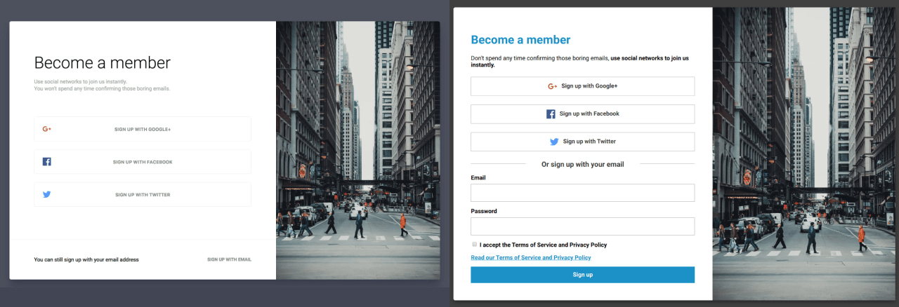
- Sign up Oauth + email
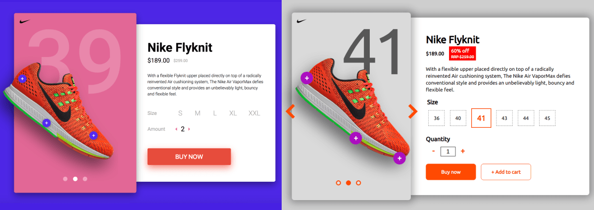
- Selling a shoe
- Digital wallet
- Blocked on Messenger
- Order thank you page
- Account settings
- Folders
- Payment method picker
- Boarding pass
- Blog post
- A pink article
- Plan Picker
Original vs my design:
🤖 The code
- Got rid of the allcaps buttons for readability.
- positioned social icons next to the button text.
- Added a heading for the email sign up along with a form for quick sign up.
- Added the TOS link because I just love the law.
- Following accessibility best practices the Read our Terms and Service and Privacy Policy link is not inside the checkbox.
As you can see from the above design solution I'm not a fan of almost explicitly hiding features. On the original design the email sign up is so different in layout/design that it's easy to miss. But to be true to business needs I did code another version. And because I'm missing including Javascript in these designs I've added a few lines of JS to deal with switching display:none on the sign up form to block and it even transforms 🧙♂️

🧐 See this alternate sign up page in action
🤖 The code
Original vs my design:
🤖 The code
- Generally don't really like carousels for a lot of reasons, chief of which is that it's a pain to make them accessible. Thankfully the Vanilla-Accessibility (Van11y) project exists which had made this much, much less complicated
- The background number reflects the size of shoe selected 😎 (seriously, go ahead and try it)
- On the subject of size: the original design had some confusing sizing. I went with the...more traditional one
- There were way too many grey elements (Size, Amount and actual selectable sizes) which just screams inactive/disabled
- Made the discount more significant with a background matching the shoe's colour along with a percentage signifier (which is a random number, didn't do the math)
- Added an + Add to cart button because people might want to buy two different sizes 🙄
- Design-wise, I've toned down the colours around the shoe to make it pop more.
Original vs my design:

🤖 The code
- The active card got a more signified design.
- As there are two screens, to avoid confusion, the active card number is also displayed under the 'Current Balance' title on the right.
- I've added a few filters just for fun. And they actually work! Once again, I was missing a little JavaScript magic so I went ahead and done that.
- Took off the confusing circle border from the + and - icons on incomes and expenditures because they looked like a button.
- Kept a visible scrollbar on both sides as an affordance to signify more content available if scrolled. Did make it a bit fancier looking though.
- Added a - (minus) sign before money going out so colour is not the only visual feedback on the nature of a balance item.
Original vs my design:

🤖 The code
- Added a
blockedstatus indicator icon next to the contact's name. - Full width system message.
- Link to more info on being blocked (with accessible text added on at the end to complete the text to: "Learn more about the blocked status.")
- Disabled the
input fieldandsend buttonas well.
Original vs my design:

🤖 The code
Information enrichment:
- 'my account' label for the account icon, because icon+label is superior to icon or label only.
- Thank you heading text for the skimmers as a quick feedback that all is well.
- Headers for the order summary 'table' (i.e. Product name, Quantitiy).
- Quantity column... 🙄
- Individual price displayed under the product's name.
- A CTA to get in touch, just in case something went wrong or the user has a question about the order.
Wanted to add:
- Thumbnail image of the product
Layout/accessibility:
- Moved the background image bicycle so it doesn't overlap with the order details. It's positioned that it also never interferes with the
contactsection. - Didn't use a table for the summary due to accessibility concerns (not just the lack of a consistent way to be read by screen readers but how unpredictable tables are when it comes to sizing on smaller screens).
- Each order item also has an accessibility text paragraph that collates all the information in the table/line into one single, uninterrupted paragraph.
<!-- This garble below is hidden for screen readers to avoid confusion -->
<div class="row" aria-hidden="true">
  <p class="col-6">
    <span class="product-name">Castelli Arenberg Gel Gloves</span>
    <span class="product-price">£39</span>
  </p>
  <p class="align--centre col-2">1</p>
  <p class="align--right col-2">£39</p>
</div>

<!-- Instead, screen readers will read this line -->
<p class="a11ytxt">1, Castelli Arenberg Gel Gloves, £39</p>Desgins side-by-side

🤖 The code
This was a great opportunity to improve upon a good looking form with terrible UX design. I wrote an article about the nuances of human-centred form design through making a stunningly designed (not by me) sign in/up form accessible/user-friendly, if you are interested in more detail.
Bottom line is:
- fields should really have 4 borders
- placeholder texts can be confusing to users so best to ditch them. If you want to give instructions you can do so in a paragraph under your label for instance.
Additional stuff (just the usual):
- grey's, not okay for button colours as it just makes them look disabled
- STOP SHOUTING AT USERS and help them read your stuff faster.
Original design:

My design:

🤖 The code
- Just played around with the design a bit creating
:hover,:focusand:activestates. - The small triangle arrow on folders that have subfolders is animated/rotated on folder opening/closing.
- Added some depth for the sub-folders with an inset dropshadow.
Original vs my design:

🤖 The code
- unchecked inputs' labels are still black; design suggested grey but that could potentially confuse users thinking the option is disabled
- made the container narrower so the checkmark is closer to the label instead of miles away on the right
- design called for all text to be uppercase which is hell on readability
- checked label gets physically larger to give better feedback on it being selected
Original vs my design:

🤖 The code
- Information hierarchy: seat, boarding time and airports get priority.
- Passenger name positioned to allow for longer names.
- Broke
departureintodateandboardingtime. - Headings are not uppercase, instead the information is (as most already is such as gate, flight number, seat).
Broken up to sections as you travel through the airport: airport names, flight number, gate and QR code to check-in then your class and seat for boarding.
The original design:

My design:

🤖 The code
The first design that I haven't meddled with at all (other than change the colour of the comment count which was way too light of a grey to pass WCAG guidelines).
The original design:

My design:

🤖 The code
- Once again, getting rid of the greys. Very unfortunate colour choice for a navigation.
- Added indication of which page is active with an underline similar to the decorative line next to the article's title.
- Made 'Tourism' a link to what I assume is a category on the website anyhow.
Original design:

My design:

🤖 The code
- changed uppercase text to normal for readability
- added an h1 to explain the selection
- slightly larger text (suggested base font-size was 14px 🔬 which is waaaay too tiny)
- more contrasting font colour for the description