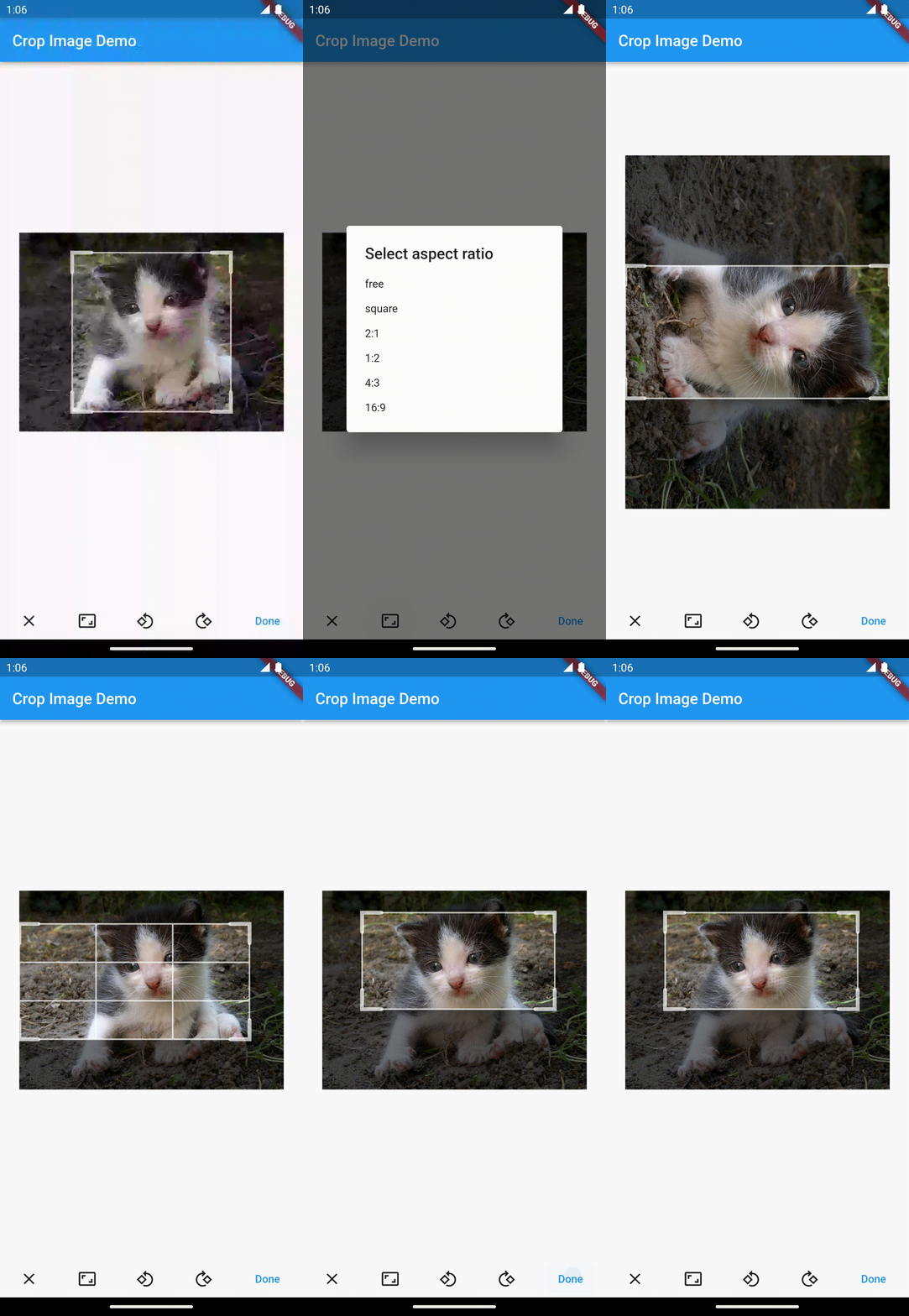
An image cropper widget. It provides the usual user experience of classic mobile and desktop image croppers but, as it's written completely in Dart, it doesn't depend on any mobile package. Consequently, it runs on all platforms supported by Flutter: mobile, web and desktop alike.
The appearance of the crop rectangle can be customized.
final controller = CropController(
  /// If not specified, [aspectRatio] will not be enforced.
  aspectRatio: 1,
  /// Specify in percentages (1 means full width and height). Defaults to the full image.
  defaultCrop: Rect.fromLTRB(0.1, 0.1, 0.9, 0.9),
);

CropImage(
  /// Only needed if you expect to make use of its functionality like setting initial values of
  /// [aspectRatio] and [defaultCrop].
  controller: controller,
  /// The image to be cropped. Use [Image.file] or [Image.network] or any other [Image].
  image: Image.asset('...'),
  /// The crop grid color of the outer lines. Defaults to 70% white.
  gridColor: Colors.white,
  /// The crop grid color of the inner lines. Defaults to [gridColor].
  gridInnerColor: Colors.white,
  /// The crop grid color of the corner lines. Defaults to [gridColor].
  gridCornerColor: Colors.white,
  /// The size of the corner of the crop grid. Defaults to 25.
  gridCornerSize: 50,
  /// The width of the crop grid thin lines. Defaults to 2.
  gridThinWidth: 3,
  /// The width of the crop grid thick lines. Defaults to 5.
  gridThickWidth: 6,
  /// The crop grid scrim (outside area overlay) color. Defaults to 54% black.
  scrimColor: Colors.grey.withOpacity(0.5),
  /// True: Always show third lines of the crop grid.
  /// False: third lines are only displayed while the user manipulates the grid (default).
  alwaysShowThirdLines: true,
  /// Event called when the user changes the crop rectangle.
  /// The passed [Rect] is normalized between 0 and 1.
  onCrop: (rect) => print(rect),
  /// The minimum pixel size the crop rectangle can be shrunk to. Defaults to 100.
  minimumImageSize: 50,
  /// The maximum pixel size the crop rectangle can be grown to. Defaults to infinity.
  maximumImageSize: 2000;
);Using a controller is optional, if you don't provide your own, the widget will create one and use it internally.
Without a controller, you can handle the onCrop event and keep track of the changing crop selection of the user.
When using a controller, you don't need to use onCrop, you can simply read out the crop values any time,
also converted to pixels rather than percentage.
Initial values for aspectRatio and defaultCrop can be provided on the controller.
final controller = CropController(
  aspectRatio: 16.0 / 9.0,
  defaultCrop: Rect.fromLTRB(0.05, 0.05, 0.95, 0.95),
);
The controller also allows you to change both the aspectRatio and the crop rectangle programmatically:
controller.aspectRatio = 16.0 / 9.0;
controller.crop = Rect.fromLTRB(0.05, 0.05, 0.95, 0.95);
Note that if an aspectRatio was specified, all crop rectangles will be adjusted automatically to fit the
required aspect ratio.
You can constrain the crop rectangle to a fixed size by setting both minimumImageSize and maximumImageSize
to the same value (the width) and using the aspectRatio of the controller to force the other dimension (width / height).
Doing so disables the display of the corners.
You can set the rotation of the crop rectangle to a specific orientation using the provided CropRotation values:
controller.rotation = CropRotation.right;or rotating it (repeatedly) with:
controller.rotateLeft();
controller.rotateRight();The final crop rectangle decided by the user can be used in various ways. The base output of the widget
is the crop rectangle in relative terms, all four values of the Rect normalized to between 0 and 1
(1 meaning full width and height), so basically in percentage. The controller also has a cropSize property
that maps the crop rectangle to the actual pixels of the bitmap.
Rect finalCropRelative = controller.crop;
Rect finalCropPixels = controller.cropSize;
The widget does not crop the original bitmap directly but its CropController provides two convenience functions
to do so if required:
ui.Image bitmap = await controller.croppedBitmap();
Image image = await controller.croppedImage();
If you want to create an Image with additional settings (eg. different Image.fit), replicate the functionality of
croppedImage() for yourself. You can use the UiImageProvider image provider exposed from the package.
If you want to save the cropped ui.Image to a file, this operation is not specific to this plugin. Use the existing functions
of ui.Image and File:
data = await bitmap.toByteData(format: ImageByteFormat.png);
bytes = data!.buffer.asUint8List();
file.writeAsBytes(bytes, flush);croppedBitmap() – and consequently, croppedImage() – result in an exception on Flutter Web with the HTML web renderer.
The culprit is Picture.toImage() that doesn't work with it (see flutter/engine#20750).
Consider using CanvasKit for the web renderer (which is much better than HTML, anyway).
