Form Editing
- Text areas
- Radio buttons
- Option checkboxes
- Optional selection panels within pages
- Sideboxes
- Array
- Previous Answer
- Custom form
Currently, the markup for the form contained in a slide is contained within the slide body itself.
Slide content allows the use of placeholders for generating some form elements.
[--answer--]
Renders a single textarea for long text answers.
[--multiple-answer-0--] ... [--multiple-answer-9--]
Example: slide 1.3 in original Alidade content (sort of)
These placeholders can be used to render multiple textareas in a single slide. Note that the counters must be sequential. The counters can start at 0 or 1.
Example: slide 2.6 in original Alidade content
Radio buttons are added with the [--radio] macro.
There are three parameters:
- field name
- symbolic name
- display title
[--radio|<name>|<value>|<title>--]
<div class="row">
    <div class="col-md-4">
[--radio|share_personal_data|yes|Yes--]
    </div>
    <div class="col-md-4">
[--radio|share_personal_data|no|No--]
    </div>
</div>
<div class="row">
    <div class="col-md-4">
[--radio|share_outside_eu|yes|Yes--]
    </div>
    <div class="col-md-4">
[--radio|share_outside_eu|no|No--]
    </div>
</div>
The first parameter (share_outside_eu) is a field name. Radio buttons are grouped into sets which share the same field name. Only one option can be chosen from a set with a given name.
The second parameter (yes/no) is the value saved to the database. Every radio button value within a given set should have a unique name.
The third parameter is the label shown alongside the radio button.
The column widths are standard bootstrap. col-md-x should total 12 for each row.
Example: slide 4.1
[--check|<name>|<title>--]
<p>I am looking for advice on:</p>
<ul>
    <li>
       [--check|advise|Advising on how to choose or use a tool--]
    </li>
    <li>
       [--check|building|Building a tool--]
    </li>
    <li>
       [--check|adapting|Help adapting an existing tool--]
    </li>
</ul>
Checkboxes that are not directly related must be given a unique name. If you are using a set of checkboxes as a multi-select option (i.e. "check all that apply"), then use a single name followed by square brackets.
<p>I will be collecting data on:</p>
<ul>
    <li>
       [--check|topic[]|Some stuff--]
    </li>
    <li>
       [--check|topic[]|Physical Characteristics--]
    </li>
    <li>
       [--check|topic[]|Behaviour--]
    </li>
</ul>
Similar to slide 1.3 in the original alidade content, single-option buttons can be used to show or hide information regions (and form elements) in a slide.
[--choicebutton|<name>|<title>--]
Creates a button with the internal identifier name and the title title. Multiple buttons can be placed on the same line in the text editor to show a row of buttons.
[--choicepanel|<name>--]
(some content)
[--endchoicepanel--]
Slide content enclosed within a [--choicepanel--] will only be shown when a button with the same name identifier is selected. The choice of button is persisted when the user moves between slides, and the corresponding content is shown when they revisit a slide.
[--choicebutton|panel1|Option 1--][--choicebutton|panel2|Option 2--]

[--choicepanel|panel1--]
You chose option 1
[--endchoicepanel--]
[--choicepanel|panel2--]
You chose option 2
[--endchoicepanel--]
In order to use choicepanels inside other choicepanels, the endchoicepanel placeholder needs to be supplied with a name that matches the opening placeholder, e.g:
[--choicepanel|mainchoice1--]
  [--choicepanel|subchoice1--]
  [--endchoicepanel|subchoice1--]    // note the name
[--endchoicepanel|mainchoice1--]
Choice panel names must be unique within a slide. If a nested choicepanel is used on a slide, then all choicepanels must supply the panel name in that slide.
[--array|<name>--]
Renders a list of text boxes, with a hover toolbar to add/remove/reorder entries.
[--box|<type>--]content[--endbox--]
You can create boxes that can go pretty much everywhere you want. Supported values for type
Light blue — [--box|questions--]content[--endbox--]
Grey — [--box|example--]content[--endbox--]
Green — [--box|casestudy--]content[--endbox--]
Purple — [--box|research--]content[--endbox--]
Orange — [--box|tips--]content[--endbox--]
Sideboxes we have so far:
- Example
- Context
The slide presentation code has been overhauled to give a bit more control over the page layout of sideboxes.
Sideboxes are now presented aligned with the paragraph that precedes them. Paragraph/form content should now be entered in the slide editor before its corresponding sidebox, so that a new row can be created for each content-sidebox pairing.
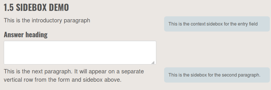
Example
<p>
This is the introductory paragraph
</p>
<h3>Answer heading</h3>
<p>
[--answer--]
</p>
[--box|context--]
This is the context sidebox for the entry field
[--endbox--]
<p>
This is the next paragraph.  It will appear on a separate vertical row from the form and sidebox above.
</p>
[--box|context--]
This is the sidebox for the second paragraph.
[--endbox--]
To insert a box containing the answer to a previous question
[--prev|<step>.<slide>|<field>--]
Example:
[--prev|1.1|answer--]
Can display the message "Previous content not found" if the user has not completed this slide yet.
[--customform|<id>--]
Outputs a custom form, generated by code in lib/forms.php
Example for slide 2.2 (which uses answers from 2.1):
[--customform|2.2--]
Custom form 2.2 uses the answers from slide 2.1, and repeats an array field for each of the items entered in 2.1.
Additional forms can be added to the codebase by opening a github issue describing the mechanics for the form, and placed into slides using this placeholder tag.