In the realm of modern web development, creating a cohesive and visually appealing user interface is essential. To streamline this process, we have developed a comprehensive design system using React and Storybook. This design system is a powerful toolkit that simplifies UI development, fosters consistency, and enhances collaboration among developers and designers. In this article, we will delve into the key aspects of our React Design System and provide instructions on how to use it.
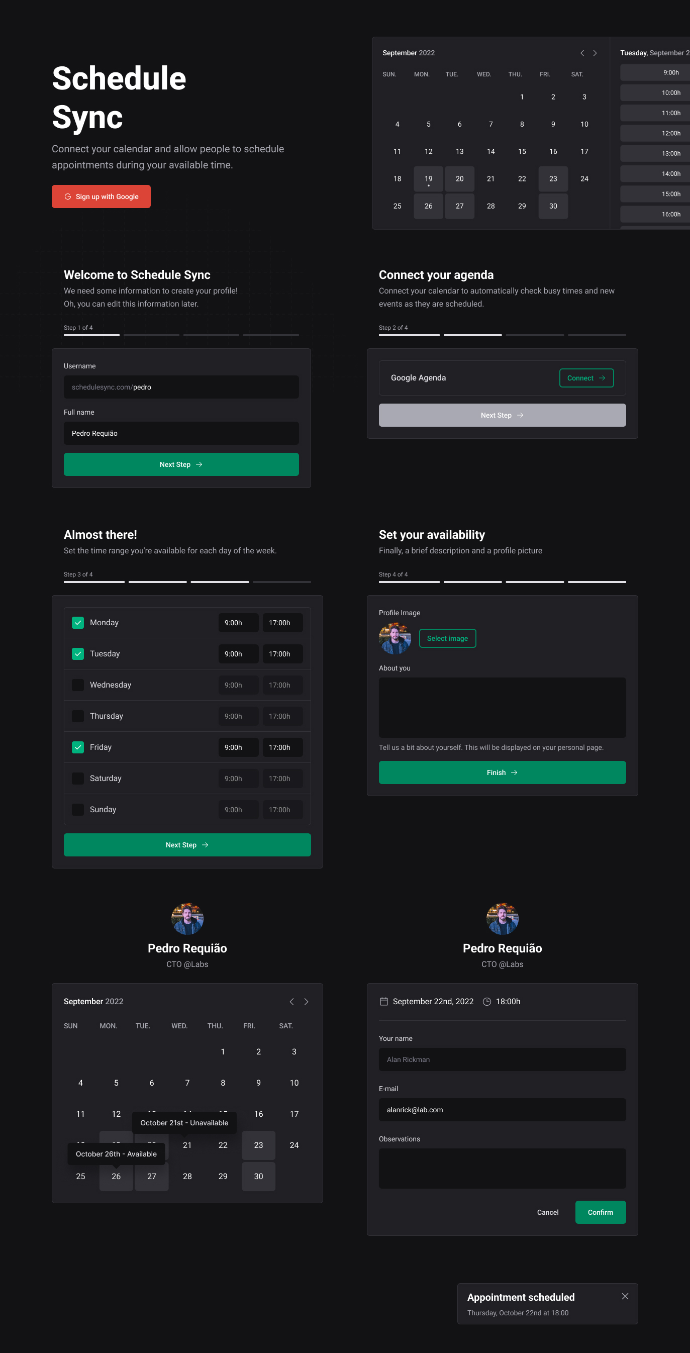
Components at the Heart of It: Our React Design System is built around a vast collection of reusable components. These components encapsulate various UI elements like buttons, forms, navigation bars, and more. Each component is meticulously crafted with a focus on flexibility, accessibility, and responsiveness, making it easy for developers to adapt them to different projects.
Storybook Integration: One of the standout features of our design system is its integration with Storybook. Storybook is a widely-used tool for developing UI components in isolation. By using Storybook in conjunction with React, we ensure that each component can be thoroughly tested and fine-tuned independently.
To utilize our React Design System, follow these simple steps:Begin by cloning our design system's repository to your local machine:
git clone https://github.com/pedro4r/jupiter-ui
Navigate to the cloned directory and install the necessary dependencies using npm:
npm install
After the installation is complete, start the development environment with:
npm run dev
This command will launch the Storybook environment, allowing you to view and interact with our design system's components. Benefits of Using Our Design System:
✅ Consistency:
By adhering to our design system's guidelines, you can ensure a consistent and harmonious look and feel throughout your application.
✅ Productivity:
Save time by reusing pre-built components, reducing the need to reinvent the wheel for each project.
✅ Collaboration:
Developers and designers can work seamlessly together, as the design system serves as a common language for both.
✅ Maintainability:
Keep your codebase organized and maintainable by centralizing UI components in one place.
- Text Editor
- Heading
- Box
- Button
- TextInput
- TextArea
- Checkbox
- Avatar
- MultiStep
- Alter Dialog
- Tooltip
- Toast