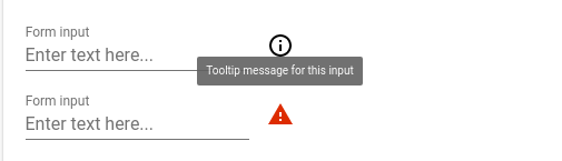
Tooltip element associated with form elements (or any other element), an icon is used to trigger tooltip open.
Check demo for more details (npm i, polymer serve).
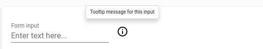
<etools-info-tooltip theme="light">
<paper-input slot="field" label="Form input" placeholder="Enter text here..."></paper-input>
<span slot="message">Tooltip message for this input</span>
</etools-info-tooltip>
<etools-info-tooltip icon="report-problem" important-warning>
<paper-input slot="field" label="Form input" placeholder="Enter text here..."></paper-input>
<span slot="message">Tooltip message for this input</span>
</etools-info-tooltip>
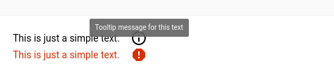
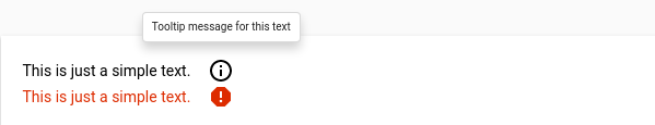
<etools-info-tooltip theme="light">
<span slot="field">This is just a simple text.</span>
<span slot="message">Tooltip message for this text</span>
</etools-info-tooltip>
<etools-info-tooltip icon="report" important-warning>
<span slot="field">This is just a simple text.</span>
<span slot="message">Tooltip message <br />for this text</span>
</etools-info-tooltip>Properties:
- icon - String, default:
info-outline, only default set of icons can be used - position - String, default:
top - importantWarning - Boolean, default:
false - theme - String, default:
dark(onlydarkandlightallowed)
You can use importantWarning property and icon property to make the field style look like a warning
(using --error-color var) on the UI.
You can use paper-tooltip and element variables and mixins to change tooltip style.
| Custom property | Description | Default |
|---|---|---|
--paper-tooltip-background |
Tooltip background | #ffffff |
--paper-tooltip-opacity |
Tooltip opacity | 1 |
--paper-tooltip-text-color |
Tooltip text color | var(--primary-text-color, rgba(0, 0, 0, 0.87) |
--paper-tooltip |
Tooltip mixin | {} |
(Deprecated)--etools-tooltip-trigger-icon |
Mixin applied to the icon that triggers tooltip open | {} |
--tooltip-box-style |
Mixin | |
--light-tooltip-style |
Mixin |
CSS Shadow Parts
| Part | Description | Default |
|---|---|---|
eit-trigger-icon |
Styles applied to the icon that triggers tooltip open | `` |
Attributes:
icon-firstattribute can be used to place the icon in front of the elementright-alignedattribute will align the content to the right
Info icon element, on click will trigger tooltip open.
<info-icon-tooltip tooltipText="Tooltip message for info icon" position="top" offset="25"> </info-icon-tooltip>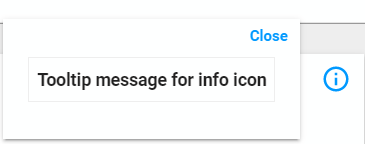
Properties:
- tooltipText - String, default:
- position - String, default:
right - offset - Number, default:
14
You can use info-icon-tooltip and element variables and mixins to change tooltip style.
| Custom property | Description | Default |
|---|---|---|
---iit-font-size |
Tooltip font size | 14px |
--iit-margin |
Icon margin | 0 |
--iit-icon-size |
Icon size (width and height) | 24px |
CSS Shadow Parts
| Part | Description | Default |
|---|---|---|
etools-iit-icon |
Styles applied to the icon that triggers tooltip open | `` |
etools-iit-content |
Styles applied to the tooltip content | `` |
$ npm i --save @unicef-polymer/etools-info-tooltipInstall local npm packages (run npm install)
Then just run the linting task
$ npm run lintInstall needed dependencies by running: $ npm install.
By default iron-component-page will look for a file called analysis.json. If the JSON descriptor file - analysis.json is not up-to-date, re-generate it using
polymer analyze > analysis.jsonIf the generated analysis.json is empty , try specifing the file or the entrypoint in polymer.json.
Make sure you have the Polymer CLI installed. Then run $ polymer serve to serve your element application locally.
TODO: improve and add more tests
$ polymer test
Package will be automatically published after tag push (git tag 1.2.3 , git push --tags). Tag name must correspond to SemVer (Semantic Versioning) rules.
Examples:
| Version match | Result |
|---|---|
1.2.3 |
match |
1.2.3-pre |
match |
1.2.3+build |
match |
1.2.3-pre+build |
match |
v1.2.3-pre+build |
match |
1.2 |
no match |
You can see more details here