-
Notifications
You must be signed in to change notification settings - Fork 36
Home
Krzysztof Łaputa edited this page Dec 18, 2019
·
4 revisions
KeeTheme supports the 3 main color formats
-
RGB used like:
Item = (0,0,255). Equivalent to the color blue. -
HEX used like:
Item = #00FF00. Equivalent to the color green. -
Shortened Hex used like
Item = #F00. Equivalent to the color red. if left blank likeBackColor =the color will default to transparent.
The following items will only work if left empty or supplied with one of their subsequent enums.
-
BorderStyle =Uses the default value which is either it's parent's value or theFixed3Dvalue. -
BorderStyle = NoneDisplays no border -
BorderStyle = FixedSingleDisplays a thin line on the border -
BorderStyle = Fixed3DDisplays a thicker line on the border
FlatStyle =FlatStyle = FlatFlatStyle = PopupFlatStyle = StandardFlatStyle = System
-
BackgroundImageAlignment =Uses the default valueTopLeft -
BackgroundImageAlignment = TopLeftAligns the image so it positioned in the Top Left corner of the area it's in. -
BackgroundImageAlignment = TopCenterAligns the image so it positioned in the Middle of the Top area it's in. -
BackgroundImageAlignment = TopRightAligns the image so it positioned in the Top Right corner of the area it's in. -
BackgroundImageAlignment = MiddleLeftAligns the image so it positioned in the Middle of the Left area it's in. -
BackgroundImageAlignment = MiddleCenterAligns the image so it positioned in the Middle area it's in. -
BackgroundImageAlignment = MiddleRightAligns the image so it positioned in the Middle of the Right area it's in. -
BackgroundImageAlignment = BottomLeftAligns the image so it positioned in the Bottom Left corner of the area it's in. -
BackgroundImageAlignment = BottomCenterAligns the image so it positioned in the Middle of the Bottom area it's in. -
BackgroundImageAlignment = BottomRightAligns the image so it positioned in the Bottom Right corner of the area it's in.
-
BackgroundImage: <filename><filename> is replaced by the path to your image.
Example: If you had an image namedIcon.pnglocated inside your/KeePass Password Safe/plugins/folder, you'd useBackgroundImage: Icon.png -
Name = <string><string> is replaced with a row of characters on the same line.
Example: If you would like to name your themeMy Super Awesome Themeyou would useName = My Super Awesome Theme
KeeTheme allows the use variables to store colors in the [Palette] section. Any items stored here can be used as a value anywhere else.
Example:* If you would like to re-use the same color as your background, you can do the following:
[Palette]
SomeVariableName = (0,200,10)
MyNameHere = #FF00FF


[Control]
BackColor = MyNameHere
ForeColor = SomeVariableName
Now lets go into the details of each item one at a time.
Note: Any images displayed here will be taken of KeyPass un-themed with only the property it describes changed.
| Usage | Description | Image (if supplied) |
|---|---|---|
| Name = <string> | This names your theme so when you click `Tools` in the top the name of your theme is displayed in the list |  |
Your variables go here. None are required for the plugin to work properly.
| Usage | Description | Image (if supplied) |
|---|---|---|
| ControlNormalColor = <color> | The default color of the groups list. When unlocked |  |
| ControlDisabledColor = <color> | The default color of the groups list.When locked |  |
| Usage | Description | Image (if supplied) |
|---|---|---|
| BackColor = <color> | The default color of the majority of backgrounds. |  |
| ForeColor = <color> | The default color of the majority of text. |  |
| Usage | Description | Image (if supplied) |
|---|---|---|
| BackColor = <color> | The default color of the majority of backgrounds thats included in a form. |  |
| ForeColor = <color> | The default color of the majority of text thats included in a form. |  |
| Usage | Description | Image (if supplied) |
|---|---|---|
| BackColor = <color> | Un-Used | |
| ForeColor = <color> | Un-Used | |
| BorderColor = <color> | The border color of buttons if their FlatStyle is set to Flat. Otherwise Un-Used |  |
| FlatStyle = <FlatStyle> | The style of buttons. Note: Styles may appear different depending on your OS. |  |
| Usage | Description | Image (if supplied) |
|---|---|---|
| BackColor = <color> | The background color of the TreeView that lists all your groups. |  |
| ForeColor = <color> | The text color of the TreeView that lists all your groups. |  |
| SelectionColor = <color> | The text color of the selected group in your TreeView. |  |
| BorderColor = <color> | Un-Used | |
| BorderStyle = <<BorderStyle> | Un-Used |
| Usage | Description | Image (if supplied) |
|---|---|---|
| BackColor = <<<color> | Un-Used | |
| ForeColor = <<<color> | Un-Used | |
| SelectionColor = <color> | The text color of the RichTextBox and the Notes form in the Edit Entry |  |
| BorderStyle = <<BorderStyle> | The style of the border in the RichTextBox |  |
| Usage | Description | Image (if supplied) |
|---|---|---|
| BackColor = <color> | UnUsed | |
| ForeColor = <color> | Un-Used | |
| LinkColor = <color> | The default color of the majority of any link thats built into KeePass. | 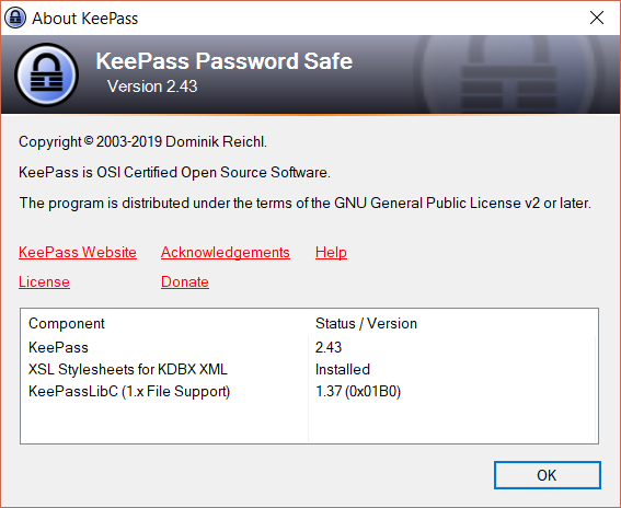 |
| Usage | Description | Image (if supplied) |
|---|---|---|
| BackColor = <color> | The background color of the list of your entrees. NOTE:If you don't set both OddRowColor and EvenRowColor to a color, but you do set BackColor; KeeTheme defaults both to black (visible in image) |
 |
| ForeColor = <color> | Un-Used | |
| BorderStyle = <BorderStyle> | The style of the border of the box surrounding the List of your entrees. |  |
| OddRowColor = <color> | The background color of every odd row. NOTE: The row counting algorithm starts at 0 so the first row counts as even. |
 |
| EvenRowColor = <color> | The background color of every even row. NOTE: The row counting algorithm starts at 0 so the first row counts as even. |
 |
| ColumnBorderColor = <color> | The color of the line dividing each column. |  |
| HeaderBackColor = <color> | The background color of the headers of each column. |  |
| HeaderForeColor = <color> | The text color of the headers of each column. |  |
| HeaderColumnBorderColor = <color> | The border color of the headers of each column. |  |
| BackgroundImageAlignment = <BackgroundImageAlignment> | Determines where the image(if supplied) is aligned to. |  |
| BackgroundImage = <BackgroundImage> | Places a image behind all the your entrees. |  |
| GroupForeColor = <color> | Un-Used | |
| GroupBackColor = <color> | Un-Used | |
| GroupHighlightColor = <color> | Un-Used |
| Usage | Description | Image (if supplied) |
|---|---|---|
| BackColor = <color> | The background color of the Repeat password form.(when passwords match) |  |
| ForeColor = <color> | Un-Used |
| Usage | Description | Image (if supplied) |
|---|---|---|
| BackColor = <color> | The background color of the Toolbars and the Footer. |  |
| ForeColor = <color> | The text color of the Toolbars and the Footer. | 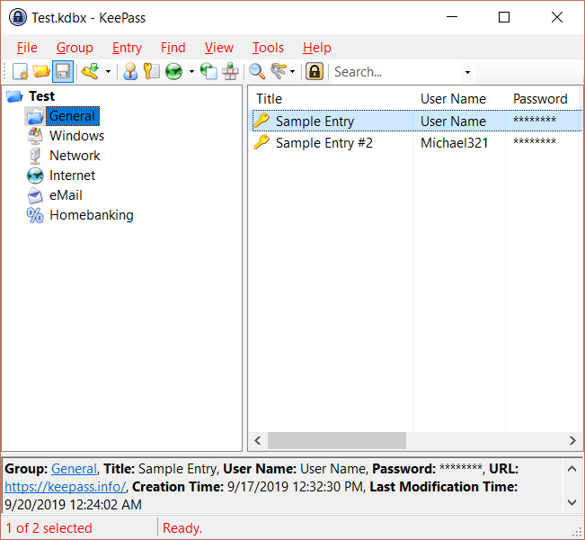 |
| HighlightColor = <color> | The background color of the highlighted toolbar. |  |
| Usage | Description | Image (if supplied) |
|---|---|---|
| ButtonSelectedHighlight = <color> | Un-Used | |
| ButtonSelectedHighlightBorder = <color> | The border color of the Search bar when you hover over it. |  |
| ButtonPressedHighlight = <color> | Un-Used | |
| ButtonPressedHighlightBorder = <color> | Un-Used | |
| ButtonCheckedHighlight = <color> | Un-Used | |
| ButtonCheckedHighlightBorder = <color> | Un-Used | |
| ButtonPressedBorder = <color> | The border color of a ToolBar's button when you press it. | 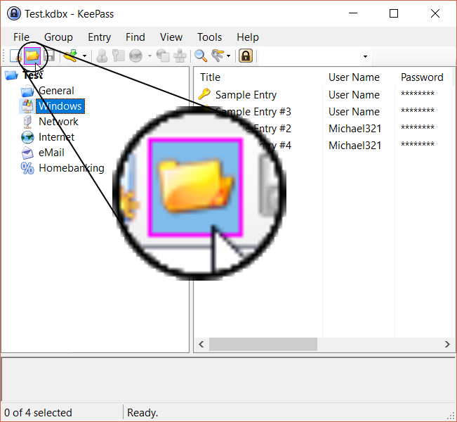 |
| ButtonSelectedBorder = <color> | Un-Used | |
| ButtonCheckedGradientBegin = <color> ButtonCheckedGradientMiddle = <color> ButtonCheckedGradientEnd = = <color> |
Un-Used | |
| ButtonSelectedGradientBegin = <color> ButtonSelectedGradientMiddle = <color> ButtonSelectedGradientEnd = <color> |
Colors a toolbar's button using a gradient between the 3 colors, when your cursor hovers over one. NOTE: The item ButtonSelectedGradientMiddle is Un-Used at the moment. |
 |
| ButtonPressedGradientBegin = <color> ButtonPressedGradientMiddle = <color> ButtonPressedGradientEnd = <color> |
Colors a toolbar's button using a gradient between the 3 colors, when your cursor presses one. NOTE: The item ButtonPressedGradientMiddle is Un-Used at the moment. |
 |
| CheckBackground | The background color for any check boxes in the toolbar and their options. | 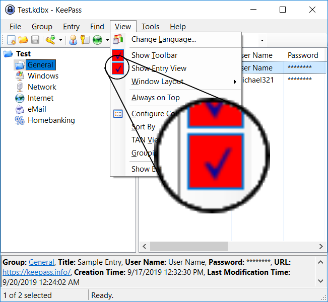 |
| CheckSelectedBackground | The background color for any check boxes in the toolbar and their options. |  |
| CheckPressedBackground | Un-Used | |
| GripDark | The color of the line of dots on the left of the toolbar. | 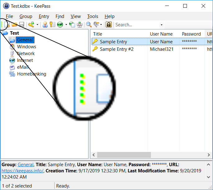 |
| ImageMarginGradientBegin = <color> ImageMarginGradientMiddle = <color> ImageMarginGradientEnd = <color> |
Colors the spacing when inside a options list of a button. |  |
| ImageMarginRevealedGradientBegin = <color> ImageMarginRevealedGradientMiddle = <color> ImageMarginRevealedGradientEnd = <color> |
Un-Used | |
| MenuStripGradientBegin = <color> MenuStripGradientEnd = <color> |
Un-Used | |
| MenuItemSelected = <color> | The color of an item in a option list while your cursor hovers over it. |  |
| MenuItemBorder = <color> | The border color of an item in a option list when hovered. |  |
| MenuBorder = <color> | The border color of the option's list |  |
| MenuItemSelectedGradientBegin = <color> MenuItemSelectedGradientEnd = <color> |
A gradient background color of an option button when hovered. |  |
| MenuItemPressedGradientBegin = <color> MenuItemPressedGradientMiddle = <color> MenuItemPressedGradientEnd = <color> |
A gradient background color of an option button when clicked. NOTE: The item MenuItemPressedGradientMiddle is Un-Used at the moment. |
 |
| RaftingContainerGradientBegin = <color> RaftingContainerGradientEnd = <color> |
Un-Used | |
| SeparatorDark = <color> SeparatorLight = <color> |
The line colors of the separators in the toolbar. |  |
| SeparatorDark = <color> SeparatorLight = <color> |
Un-Used. | |
| ToolStripBorder = <color> | The border color of the toolbar. |  |
| ToolStripDropDownBackground = <color> | The border color of the dropdown menu of a toolbar's option. |  |
| ToolStripGradientBegin = <color> ToolStripGradientMiddle = <color> ToolStripGradientEnd = <color> |
A gradient of colors to make the background color of the toolbar. |  |
| ToolStripContentPanelGradientBegin = <color> ToolStripContentPanelGradientEnd = <color> |
Un-Used | |
| ToolStripPanelGradientBegin = <color> ToolStripPanelGradientEnd = <color> |
Un-Used | |
| OverflowButtonGradientBegin = <color> OverflowButtonGradientMiddle = <color> OverflowButtonGradientEnd = <color> |
A gradient of colors to make the background color of the overflow button. |  |