-
Notifications
You must be signed in to change notification settings - Fork 4.2k
[Term Entry] SwiftUI Concept: Buttons #5809
New issue
Have a question about this project? Sign up for a free GitHub account to open an issue and contact its maintainers and the community.
By clicking “Sign up for GitHub”, you agree to our terms of service and privacy statement. We’ll occasionally send you account related emails.
Already on GitHub? Sign in to your account
Merged
dakshdeepHERE
merged 11 commits into
Codecademy:main
from
botaturganova:concepts-buttons
Jan 26, 2025
Merged
Changes from all commits
Commits
Show all changes
11 commits
Select commit
Hold shift + click to select a range
8f2942a
Create buttons.md
botaturganova 7c98563
Update buttons.md
botaturganova 4d0286f
Merge branch 'main' into concepts-buttons
PragatiVerma18 b402398
Merge branch 'main' into concepts-buttons
PragatiVerma18 6f66349
Merge branch 'main' into concepts-buttons
PragatiVerma18 1208d39
Minor Fixes
PragatiVerma18 f16fae2
Merge branch 'main' into concepts-buttons
PragatiVerma18 cc0abad
Add output images
PragatiVerma18 d720227
Merge branch 'main' into concepts-buttons
PragatiVerma18 3e6e7f8
Update buttons.md
PragatiVerma18 ab9657f
Merge branch 'main' into concepts-buttons
dakshdeepHERE File filter
Filter by extension
Conversations
Failed to load comments.
Loading
Jump to
Jump to file
Failed to load files.
Loading
Diff view
Diff view
There are no files selected for viewing
This file contains hidden or bidirectional Unicode text that may be interpreted or compiled differently than what appears below. To review, open the file in an editor that reveals hidden Unicode characters.
Learn more about bidirectional Unicode characters
| Original file line number | Diff line number | Diff line change |
|---|---|---|
| @@ -0,0 +1,201 @@ | ||
| --- | ||
| Title: 'Buttons' | ||
| Description: 'A button is a SwiftUI view that triggers an action when tapped, enabling interactive elements in the app.' | ||
| Subjects: | ||
| - 'Mobile Development' | ||
| - 'iOS' | ||
| Tags: | ||
| - 'SwiftUI' | ||
| - 'Buttons' | ||
| CatalogContent: | ||
| - 'learn-swift' | ||
| - 'paths/build-ios-apps-with-swiftui' | ||
| --- | ||
|
|
||
| **`Button`** is a view in SwiftUI that triggers an action when tapped. It is one of the essential components for creating interactive apps, allowing users to perform actions. | ||
|
|
||
| ## Creating Buttons | ||
|
|
||
| Buttons are created by specifying an action (code to execute when the button is tapped) and a label (the content of the button that is displayed to users). For example, here's a basic button that prints a message when tapped.: | ||
|
|
||
| ```swift | ||
| Button(action: { | ||
| print("Button tapped!") | ||
| }) { | ||
| Text("Tap Me") | ||
| } | ||
| ``` | ||
|
|
||
| > **Note**: Buttons in SwiftUI can use any SwiftUI view as a label, not just `Text`. This allows for highly customizable and complex button content, such as combining icons, shapes, or even animations. | ||
|
|
||
| ## Basic Button | ||
|
|
||
| A simple button in SwiftUI is created using the `Button` view. You can pass a closure (action) to the button that will be executed when the button is tapped: | ||
|
|
||
| ```swift | ||
| Button("Tap Me") { | ||
| print("Button tapped!") | ||
| } | ||
| ``` | ||
|
|
||
| ## Button Actions | ||
|
|
||
| You can define any action inside the button’s closure. For instance, navigating to a new view, changing a state, or interacting with a model can be done in the action block: | ||
|
|
||
| ```swift | ||
| Button("Navigate") { | ||
| // Navigate to a new view | ||
| // Navigation logic goes here | ||
| } | ||
| ``` | ||
|
|
||
| ## Button Modifiers | ||
|
|
||
| SwiftUI offers various modifiers to style and configure buttons: | ||
|
|
||
| - `.font()` to change the font of the button label. | ||
| - `.foregroundColor()` to set the text color. | ||
| - `.background()` to set the button's background color. | ||
| - `.cornerRadius()` to round the button's corners. | ||
|
|
||
| ```swift | ||
| Button("Styled Button") { | ||
| print("Styled button tapped!") | ||
| } | ||
| .font(.headline) | ||
| .foregroundColor(.white) | ||
| .padding() | ||
| .background(Color.blue) | ||
| .cornerRadius(10) | ||
| ``` | ||
|
|
||
| > **Note**: By chaining multiple modifiers, buttons can be customized with greater flexibility, allowing you to change font styles, colors, backgrounds, and more. | ||
|
|
||
| ## Disabled Buttons | ||
|
|
||
| Disabled buttons are useful when an action is unavailable based on user interaction or certain conditions. For instance, a 'submit' button could be disabled until required fields are filled. | ||
|
|
||
| Disabled buttons are non-interactive and appear grayed out to indicate their inactive state. Buttons can be disabled by using the `.disabled()` modifier as follows: | ||
|
|
||
| ```swift | ||
| Button("Disabled Button") { | ||
| // Action here | ||
| } | ||
| .disabled(true) | ||
| ``` | ||
|
|
||
| ## Buttons with Custom Content | ||
|
|
||
| You can also create buttons with custom content, such as text, images, or other SwiftUI views. The content inside the button can be customized as needed: | ||
|
|
||
| ```swift | ||
| Button(action: { | ||
| print("Custom button tapped!") | ||
| }) { | ||
| HStack { | ||
| Image(systemName: "star.fill") | ||
| .foregroundColor(.yellow) | ||
| Text("Star Button") | ||
| .font(.title) | ||
| } | ||
| } | ||
| ``` | ||
|
|
||
| The output will look like this: | ||
|
|
||
| 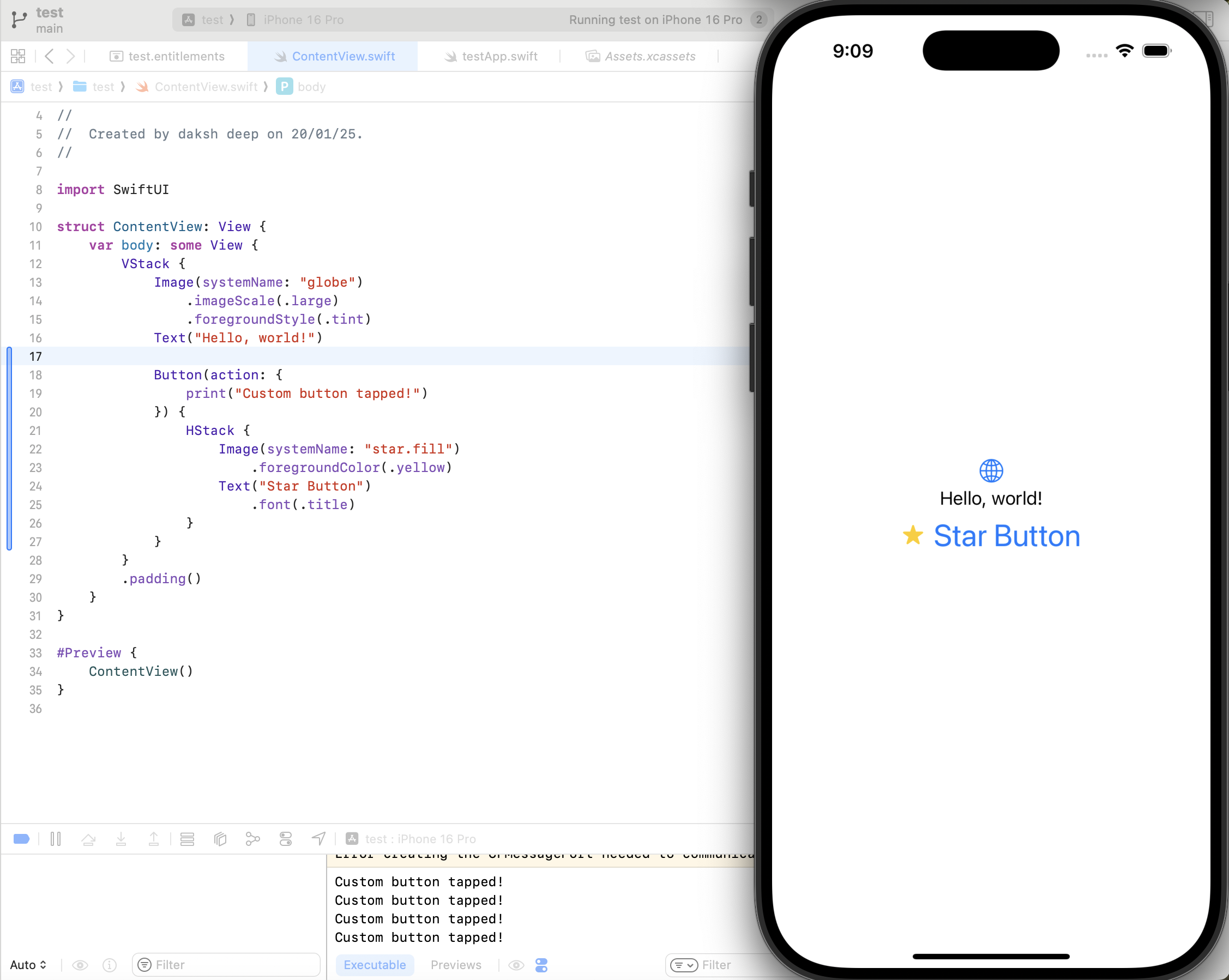 | ||
|
|
||
| In this example: | ||
|
|
||
| The button displays an image and text. | ||
| The `HStack` is used to arrange the image and text side by side (horizontally). | ||
|
|
||
| ## Customizing Buttons | ||
|
|
||
| Buttons can be styled and customized using SwiftUI modifiers to change their appearance such as fonts, colors, backgrounds, and more. Below is an example where various modifiers change the button's appearance: | ||
|
|
||
| ```swift | ||
| Button(action: { | ||
| print("Custom button tapped!") | ||
| }) { | ||
| Text("Click Me") | ||
| .font(.title) | ||
| .foregroundColor(.white) | ||
| .padding() | ||
| .background(Color.blue) | ||
| .cornerRadius(10) | ||
| } | ||
| ``` | ||
PragatiVerma18 marked this conversation as resolved.
Show resolved
Hide resolved
|
||
|
|
||
| The output will look like this: | ||
|
|
||
| 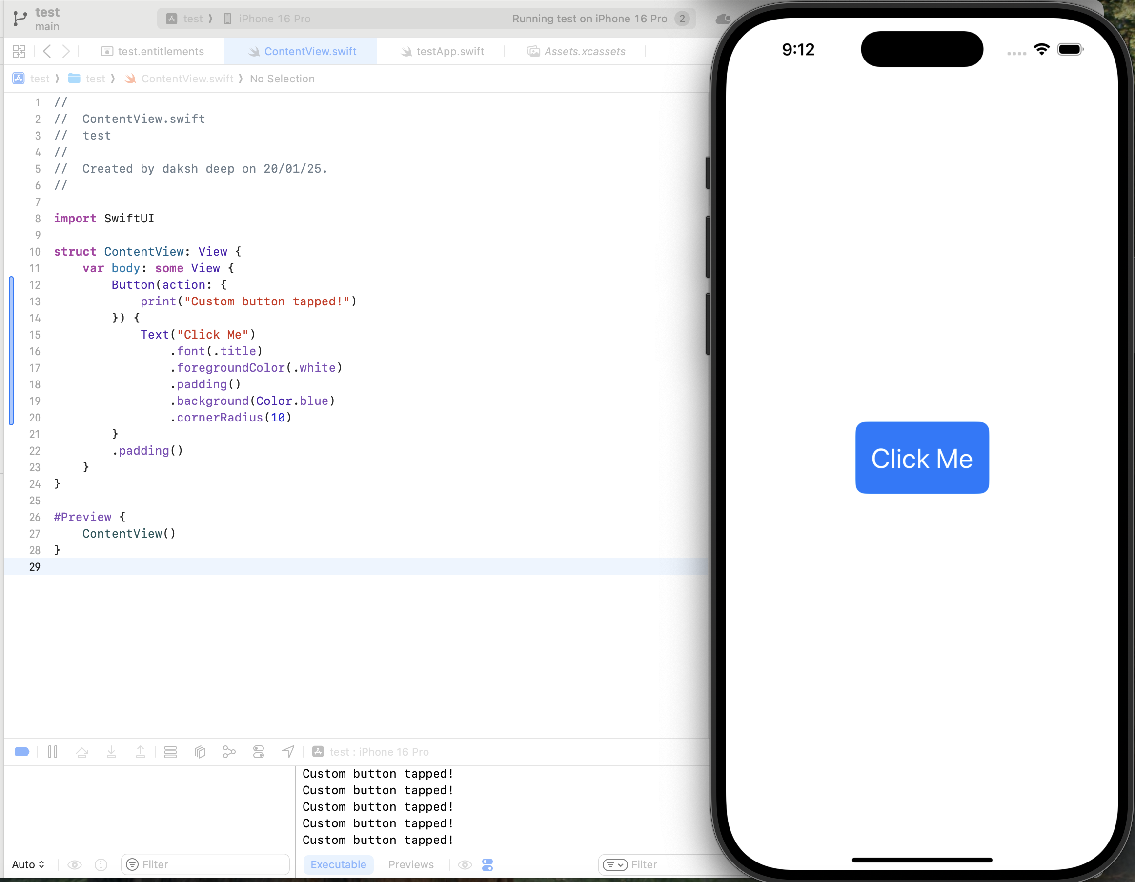 | ||
|
|
||
| ## Button Styles | ||
|
|
||
| SwiftUI provides several built-in button styles that can change the appearance of buttons globally: | ||
|
|
||
| - **`DefaultButtonStyle`**: The standard button appearance, which adapts its look based on the platform and context. | ||
| - **`PlainButtonStyle`**: Removes visual styling, leaving only the label content. | ||
| - **`BorderedButtonStyle`**: Adds a border to the button (available in iOS 15+). | ||
| - **`BorderlessButtonStyle`**: Removes borders, often used in toolbars or lists (available in iOS 15+). | ||
|
|
||
| You can apply these styles using the `.buttonStyle()` modifier: | ||
|
|
||
| ```swift | ||
| Button("Styled Button") { | ||
| print("Styled button tapped!") | ||
| } | ||
| .buttonStyle(BorderedButtonStyle()) | ||
| ``` | ||
|
|
||
| ## Example | ||
|
|
||
| Here’s an example of a `VStack` containing buttons with different styles and labels: | ||
|
|
||
| ```swift | ||
| import SwiftUI | ||
|
|
||
| struct ButtonExampleView: View { | ||
| var body: some View { | ||
| VStack(spacing: 20) { | ||
| Button("Simple Button") { | ||
| print("Simple button tapped!") | ||
| } | ||
|
|
||
| Button(action: { | ||
| print("Custom button tapped!") | ||
| }) { | ||
| Text("Custom Button") | ||
| .font(.headline) | ||
| .foregroundColor(.white) | ||
| .padding() | ||
| .background(Color.green) | ||
| .cornerRadius(8) | ||
| } | ||
|
|
||
| Button(action: { | ||
| print("Image button tapped!") | ||
| }) { | ||
| HStack { | ||
| Image(systemName: "star.fill") | ||
| .foregroundColor(.yellow) | ||
| Text("Image Button") | ||
| .font(.body) | ||
| } | ||
| } | ||
| } | ||
| .padding() | ||
| } | ||
| } | ||
| ``` | ||
|
|
||
| The output will look like this: | ||
|
|
||
| 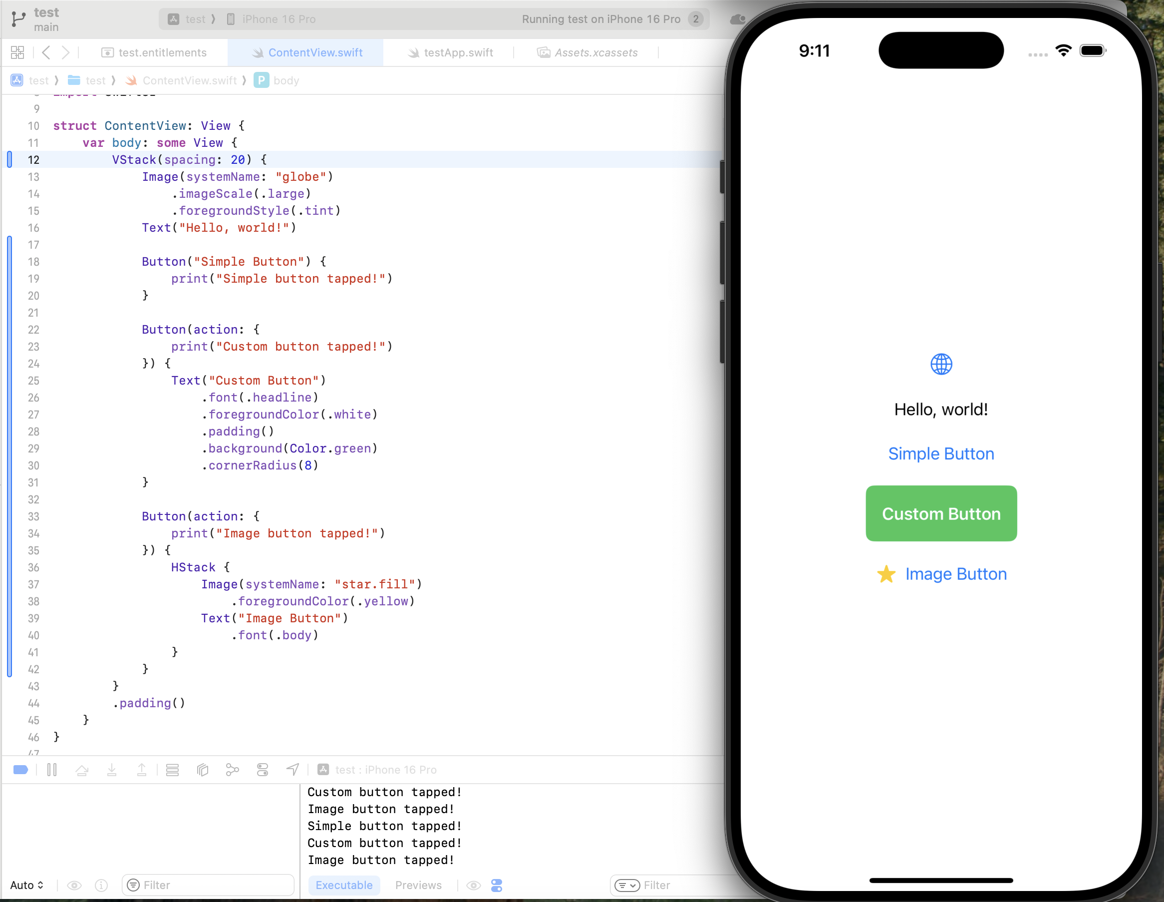 | ||
|
|
||
| Explanation: | ||
|
|
||
| - The **first button** is a simple text button. | ||
| - The **second button** uses custom styling with a green background and rounded corners. | ||
| - The **third button** combines an image and text within an `HStack`. | ||
Loading
Sorry, something went wrong. Reload?
Sorry, we cannot display this file.
Sorry, this file is invalid so it cannot be displayed.
Loading
Sorry, something went wrong. Reload?
Sorry, we cannot display this file.
Sorry, this file is invalid so it cannot be displayed.
Loading
Sorry, something went wrong. Reload?
Sorry, we cannot display this file.
Sorry, this file is invalid so it cannot be displayed.
Oops, something went wrong.
Add this suggestion to a batch that can be applied as a single commit.
This suggestion is invalid because no changes were made to the code.
Suggestions cannot be applied while the pull request is closed.
Suggestions cannot be applied while viewing a subset of changes.
Only one suggestion per line can be applied in a batch.
Add this suggestion to a batch that can be applied as a single commit.
Applying suggestions on deleted lines is not supported.
You must change the existing code in this line in order to create a valid suggestion.
Outdated suggestions cannot be applied.
This suggestion has been applied or marked resolved.
Suggestions cannot be applied from pending reviews.
Suggestions cannot be applied on multi-line comments.
Suggestions cannot be applied while the pull request is queued to merge.
Suggestion cannot be applied right now. Please check back later.
Uh oh!
There was an error while loading. Please reload this page.