Tutorial: Working with Galleries
#Working with Galleries
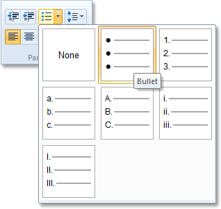
The ribbons that are used by many Microsoft Office applications use galleries for easier visual selection of items. The WordPad application (and thus the TextPad sample application) contains a single gallery for selecting a paragraph list style:
##TUICommandCollection
Galleries are represented by a TUICommandCollection object (as are Combo Boxes and the Quick Access Toolbar). This class has the following additional properties:
-
Categories: the items in a gallery can be organized into categories. If you want to use categories, then you need to populate this collection with objects of type TUIGalleryCollectionItem(or derived). You need to set these properties for each category:
- LabelText: the caption of the category.
- CategoryId: a numeric identifier for the category. Items with this CategoryId will be placed in this category.
-
Items: a collection of the items in the gallery. Again, each item should be an object of type TUIGalleryCollectionItem (or derived), and has the following properties:
- LabelText: the caption of the item (if captions are shown) or the tooltip that is displayed when the user hovers the mouse over the item.
- CategoryId: the ID of the category into which to place this item, or -1 (default) if no categories are used or if the item does not belong in a category.
- Image: the image to use for the item (or nil if no image is used).
- Command: if the gallery is authored to contain commands (instead of items), you need to create a TUICommand object and assign it to this property.
- SelectedItem: the index of the currently selected item. For Split Button Galleries, the index will be -1 if the button (top) part of the split button was clicked. For Combo Boxes, the index will be -1 if no item is selected, or text is entered in the Combo Box.
- Text (only used for Combo Boxes): the text entered into the Combo Box.
- RepresentativeString (only used for Combo Boxes): this string is used by the Ribbon Framework to query the width of the Combo Box. Set this to the longest string you forecast. The string is never displayed, so it could contain any characters you want. It is just used to calculate the width of the control: the longer the string, the wider the control.
- Checked (only for Split-Button Galleries): whether the button is checked or not.
There is a single OnSelect event that is fired when the user selects an item in the gallery. ##Gallery Resources
The WordPad template (and TextPad sample) comes with images for the gallery items. You will find these in the "Ribbon\Res\Galleries" subdirectory. WordPad is High-DPI aware, so it provided multiple versions of each image:
 |
 |
 |
|---|---|---|
| ListNumbered_096.bmp | ListNumbered_120.bmp | ListNumbered_144.bmp |
The "_096" version will be used for standard resolutions (up to 96 dpi). The "_120" version will be used for 97-120 dpi displays. And the "_144" version will be used when the display resolution is set to more than 120 dpi.
You will need to create a resource file for these images. The TextPad sample uses the following resource script file (Galleries.rc):
###Galleries.rc Resource Script
01	LIST_NONE_096 BITMAP "Ribbon\\Res\\Galleries\\ListNone_096.bmp"
02	LIST_NONE_120 BITMAP "Ribbon\\Res\\Galleries\\ListNone_120.bmp"
03	LIST_NONE_144 BITMAP "Ribbon\\Res\\Galleries\\ListNone_144.bmp"
04	LIST_BULLETS_096 BITMAP "Ribbon\\Res\\Galleries\\ListBullets_096.bmp"
05	LIST_BULLETS_120 BITMAP "Ribbon\\Res\\Galleries\\ListBullets_120.bmp"
06	LIST_BULLETS_144 BITMAP "Ribbon\\Res\\Galleries\\ListBullets_144.bmp"
07	LIST_NUMBERED_096 BITMAP "Ribbon\\Res\\Galleries\\ListNumbered_096.bmp"
08	LIST_NUMBERED_120 BITMAP "Ribbon\\Res\\Galleries\\ListNumbered_120.bmp"
09	LIST_NUMBERED_144 BITMAP "Ribbon\\Res\\Galleries\\ListNumbered_144.bmp"
10	LIST_ROMANLOWER_096 BITMAP "Ribbon\\Res\\Galleries\\ListRomanLower_096.bmp"
11	LIST_ROMANLOWER_120 BITMAP "Ribbon\\Res\\Galleries\\ListRomanLower_120.bmp"
12	LIST_ROMANLOWER_144 BITMAP "Ribbon\\Res\\Galleries\\ListRomanLower_144.bmp"
13	LIST_ROMANUPPER_096 BITMAP "Ribbon\\Res\\Galleries\\ListRomanUpper_096.bmp"
14	LIST_ROMANUPPER_120 BITMAP "Ribbon\\Res\\Galleries\\ListRomanUpper_120.bmp"
15	LIST_ROMANUPPER_144 BITMAP "Ribbon\\Res\\Galleries\\ListRomanUpper_144.bmp"
16	LIST_LOWERCASE_096 BITMAP "Ribbon\\Res\\Galleries\\ListLowerCase_096.bmp"
17	LIST_LOWERCASE_120 BITMAP "Ribbon\\Res\\Galleries\\ListLowerCase_120.bmp"
18	LIST_LOWERCASE_144 BITMAP "Ribbon\\Res\\Galleries\\ListLowerCase_144.bmp"
19	LIST_UPPERCASE_096 BITMAP "Ribbon\\Res\\Galleries\\ListUpperCase_096.bmp"
20	LIST_UPPERCASE_120 BITMAP "Ribbon\\Res\\Galleries\\ListUpperCase_120.bmp"
21	LIST_UPPERCASE_144 BITMAP "Ribbon\\Res\\Galleries\\ListUpperCase_144.bmp"
You need to add this file to your Delphi project (using "Project | Add To Project..."). However, when you build the Delphi project now, you will get the following error message:
[BRCC32 Error] Galleries.rc(1): Invalid bitmap format
The Resource Compiler that Delphi uses by default can not handle 32-bit Bitmap files. Fortunately, when can let Delphi use the Microsoft Resource Compiler, which does not have any problems with this:
- Go to "Project | Options...".
- Select the "Resource Compiler" node.
- Set "Resource compiler to use" to "Windows SDK Resource Compiler".
Now the project will build without problems.
##Populating the Gallery
With the resources linked to the project, we can populate the List Style Gallery resource like this: ###Populating the List Style Gallery
01	procedure TFormMain.PopulateListGallery;
02	const
03	  RESOURCE_NAMES: array [0..6] of String = ('NONE', 'BULLETS', 'NUMBERED',
04	    'LOWERCASE', 'UPPERCASE', 'ROMANLOWER', 'ROMANUPPER');
05	  LABELS: array [0..6] of String = ('None', 'Bullet', 'Numbering',
06	    'Alphabet - Lower case', 'Alphabet - Upper case',
07	    'Roman Numeral - Lower case', 'Roman Numeral - Upper case');
08	var
09	  I, Dpi: Integer;
10	  ResourceName: String;
11	  Item: TUIGalleryCollectionItem;
12	begin
13	  Dpi := Screen.PixelsPerInch;
14	  if (Dpi> 120) then
15	    Dpi := 144
16	  else if (Dpi > 96) then
17	    Dpi := 120
18	  else
19	    Dpi := 96;
20
21	  for I := 0 to 6 do
22	  begin
23	    ResourceName := Format('LIST_%s_%.3d', [RESOURCE_NAMES[I], Dpi]);
24	    Item := TUIGalleryCollectionItem.Create;
25	    Item.LabelText := LABELS[I];
26	    Item.Image := TUIImage.Create(HInstance, ResourceName);
27	    FCmdList.Items.Add(Item);
28	  end;
29	end;
We use Screen.PixelsPerInch to query the display resolution. We will use this to select the correct version of the image resource to load (for example "LIST_BULLETS_120" when the resolution is between 96 and 120 dpi).
As you can see, we create a TUIGalleryCollectionItem object for each item. We set its Image property by creating a TUIImage object using the application instance and the resource name. Note that the Image property is of type IUIImage (which is implemented by TUIImage). So you don't need to take care of destroying the image.
Also, as soon as you add the item to the Items collection, the collection becomes owner of the item. So you shouldn't free the items yourself.
##Dynamic dropdown menus
Drop down list are usually filled with content at design time. However, you might want to add the list items dynamically, at runtime. The ribbon framework offers a special type of action and a set of operations, that you can call for that. The following steps describe how to create such an action and how to add items to the drop down list at runtime:
- Create a new Standard action of type TRibbonCollectionAction.
- Add a command that connects to this action, in your ribbon markup xml file.
- Add a gallery item, such as drop down gallery, or split button gallery, to your layout and use the previously created command for this view item.
- You can now add items to this drop down menu dynamically, simply by adding actions to the TRibbonCollectionAction, which we defined previously.
Example:
01	procedure TFormMain.CreateDynamicRibbonDropDown;
02	var
03		myCustomAction: TAction;
04	begin
04		myCustomAction := TAction.Create(Self);
05		myCustomAction.OnExecute := MyCustomActionExecute;
06		myCustomAction.OnUpdate  := MyCustomActionActionUpdate;
07		myCustomAction.Caption := 'This is a custom action';
08		myCustomAction.Hint := 'This is a hint';
09		DynamicDropDownAction.Add(myCustomAction, ‘Custom Actions’);
10	end;
The first parameter of TRibbonCollectionAction.Add() assigns the action. It automatically uses the caption, the hint, and the icon that is assigned to this action and adds it to the ribbon gallery item. The second, optional parameter, allows you to define a category for your action. Multiple actions can be grouped into separate categories, which will use the caption that is defined via this parameter.
It is also possible to combine a collection type ribbon with a Delphi TPopupMenu. Items that exist in the popup list will automatically be populated to the ribbon collection.
To achieve this, you can use the class TRibbonPopupMenuAction. TRibbonPopupMenuAction is a subclass of TRibbonCollectionAction and will automatically handle the creation of the collection items. All you need to do is to assign the “Menu” property of the action.
All changes to the menu, such as the addition or removal of menu items, will be populated to the ribbon collection automatically.
###Good Luck!
This concludes the tutorial. Check out the TextPad sample application if you need some more implementation details. It is not a complete WordPad clone but it will provide some insights into how the Ribbon is used.
Now, start creating your own Ribbon applications. Good luck!