-
Notifications
You must be signed in to change notification settings - Fork 415
basics
Let’s start with a brief overview of the ideas within Codename One. We’ll dig deeper into these ideas as we move forward.
Every button, label or element you see on the screen in a Codename One application is a Component. This is a highly simplified version of this class hierarchy:
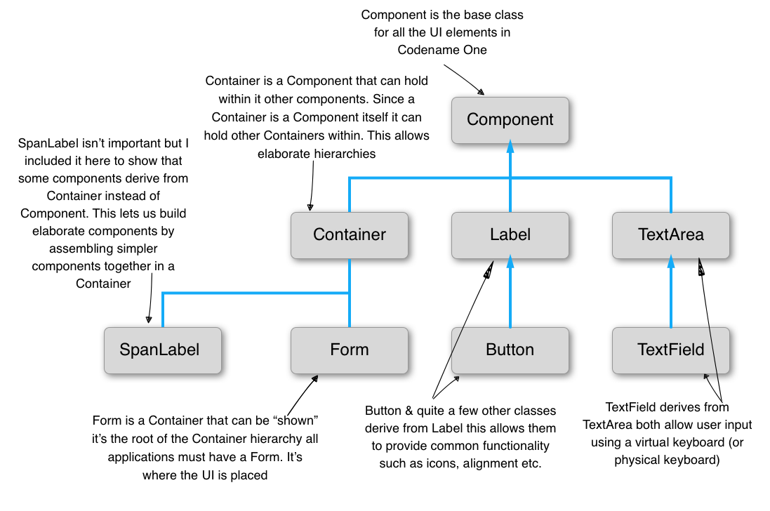
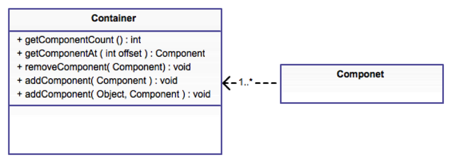
The Form is a special case Component. It’s the root component that you can show to the user. Container is a Component type that can hold other components within it. This lets us create elaborate hierarchies by nesting Container instances.
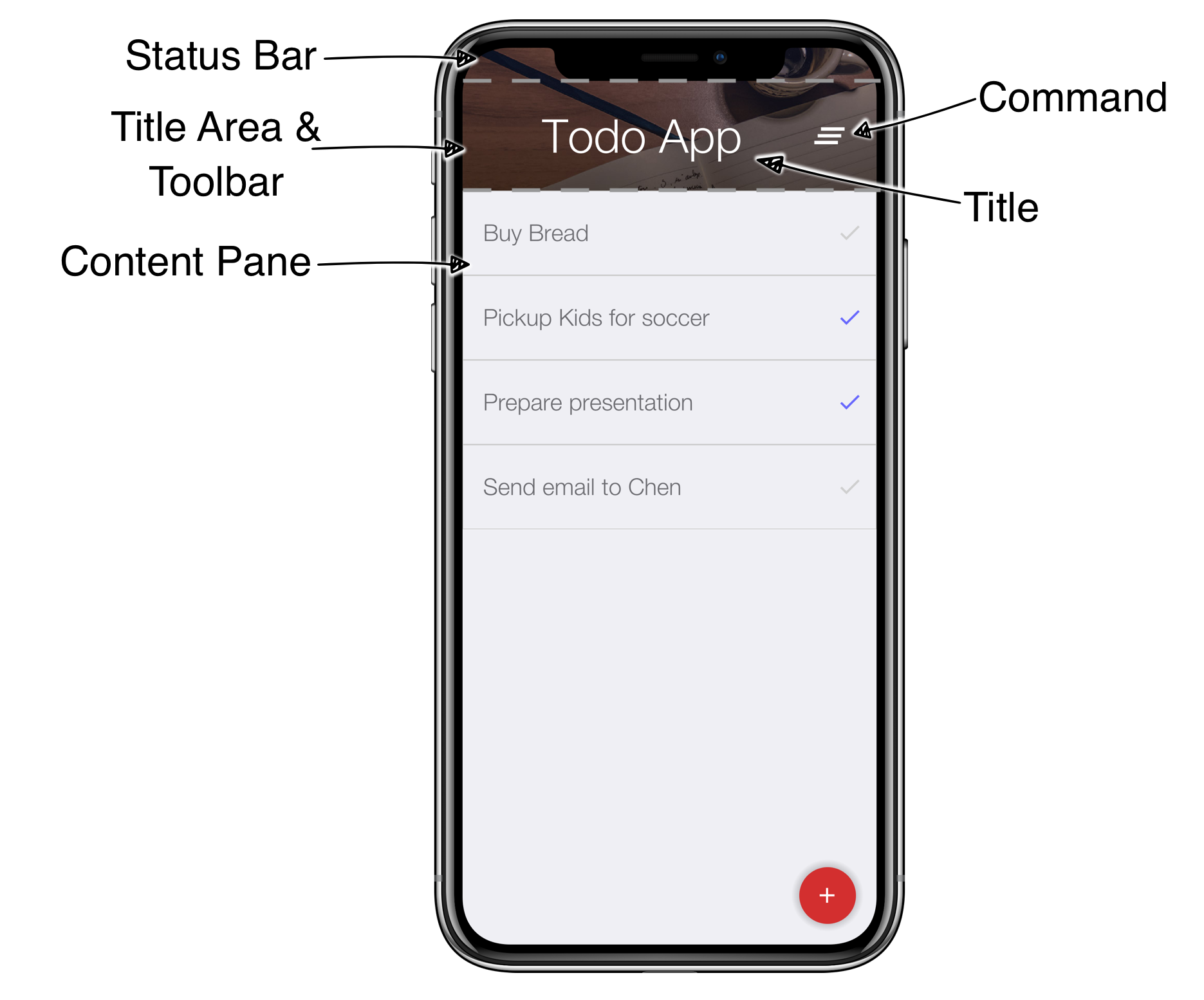
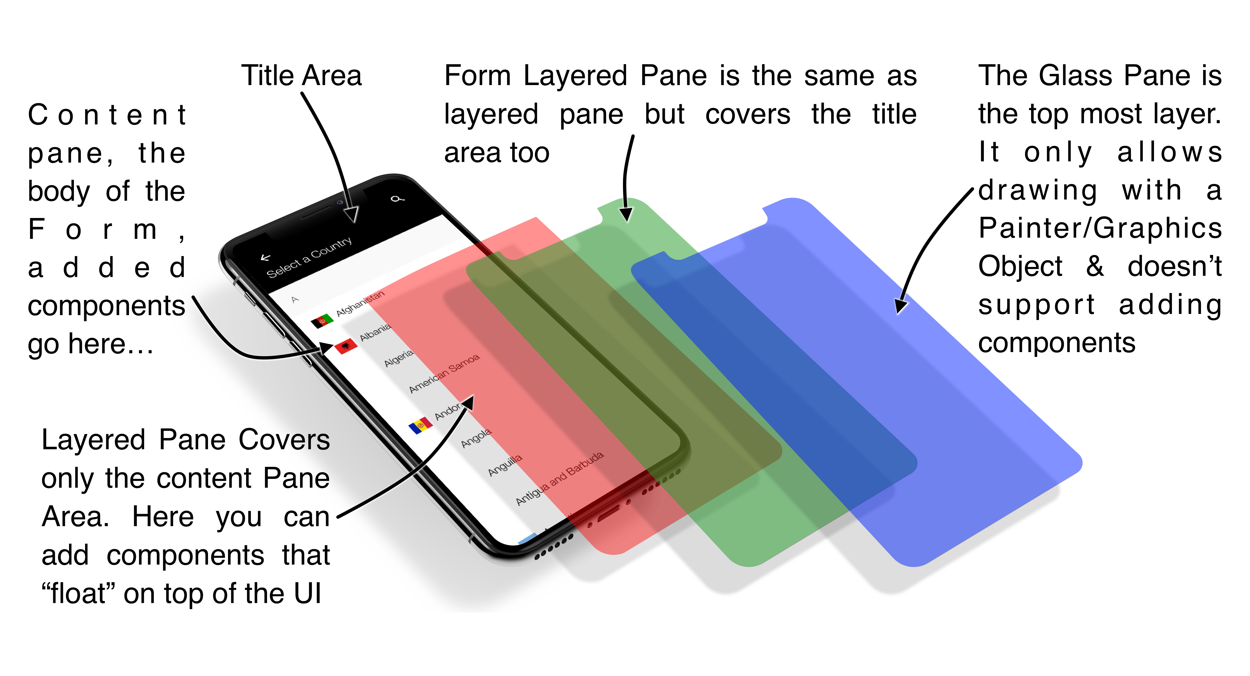
A Codename One application is effectively a series of forms, only one Form can be shown at a time. The Form includes everything we see on the screen. Under the hood the Form is comprised of a few separate pieces:
-
Content Pane - this is literally the body of the
Form. When weaddaComponentinto theFormit goes into the content pane. Notice that Content Pane is scrollable by default on the Y axis! -
Title Area - we can’t add directly into this area. The title area is managed by the
Toolbarclass.Toolbaris a special component that resides in the top portion of the form and abstracts the title design. The title area is broken down into two parts:-
Title of the
Formand its commands (the buttons on the right/left of the title) -
Status Bar - on iOS the area on the top includes a special space so the notch, battery, clock etc. can fit. Without this the battery indicator/clock or notch would be on top of the title
-
Now that we understand this let’s look at the new project we created and open the Java file TodoApp.java. In it we should see the lines that setup the UI in the start() method:
A layout manager is an algorithm that decides the size and location of the components within a Container. Every Container has a layout manager associated with it. The default layout manager is FlowLayout.
To understand layouts we need to understand a basic concept about Component. Each component has a “preferred size”. This is the size in which a component “wants” to appear. E.g. for a Label the preferred size will be the exact size that fits the label text, icon and padding of the component.
The Component class contains many useful methods. One of the most important ones is calcPreferredSize() which is invoked to recalculate the size a component “wants” when something changes
|
Note
|
By default Codename One invokes the getPreferredSize() method and not calcPreferredSize() directly.getPreferredSize() invokes calcPreferredSize() and
caches the value
|
The preferred size is decided by the component based on internal constraints such as the font size, border sizes, padding etc.
When a layout manager positions and sizes the component, it MIGHT take the preferred size into account. Notice that it MIGHT ignore it entirely!
E.g. FlowLayout always gives components their exact preferred size, yet BorderLayout resizes the center component by default (and the other components are resized on one of their axis).
You can define a group of components to have the same preferred width or height by using the setSameWidth
and setSameHeight methods e.g.:
Component.setSameWidth(cmp1, cmp2, cmp3, cmp4);
Component.setSameHeight(cmp5, cmp6, cmp7);
Codename One has a setPreferredSize method that allows developers to explicitly request the size of the component. However, this caused quite a lot of problems. E.g. the preferred size should change with device orientation or similar operations. The API also triggered frequent inadvertent hardcoding of UI values such as forcing pixel sizes for components. As a result the method was deprecated.
We recommend developers use setSameWidth, setSameHeight when sizing alignment is needed. setHidden when hiding is needed. As a last resort we recommend overriding calcPreferredSize.
A layout manager places a component based on its own logic and the preferred size (sometimes referred to as “natural size”). A FlowLayout will just traverse the components based on the order they were added and size/place them one after the other. When it reaches the end of the row it will go to the new row.
|
Tip
|
Use
FlowLayout Only for Simple ThingsFlowLayout is great for simple things but has issues when components change their sizes dynamically (like a text field). In those cases it can make bad decisions about line breaks and take up too much space
|


Scrolling doesn’t work well for all types of layouts as the positioning algorithm within the layout might break. Scrolling on the Y axis works great for BoxLayout Y which is why I picked it for the TodoForm:
| Layout | Scrollable |
|---|---|
Flow Layout |
Possible on Y axis only |
Border Layout |
Scrolling is blocked |
Box Layout Y |
Scrollable only on the Y axis |
Box Layout X |
Scrollable only on the X axis |
Grid Layout |
Scrollable |
LayeredLayout |
Not scrollable (usually) |
Only one element can be scrollable within the hierarchy, otherwise if you drag your finger over the Form Codename One won’t know which element you are trying to scroll. By default form’s content pane is scrollable on the Y axis unless you explicitly disable it (setting the layout to BorderLayout implicitly disables scrolling).
It’s important to notice that it’s OK to have non-scrollable layouts, e.g. BorderLayout, as items within a scrollable container type. E.g. in the TodoApp we added TodoItem which uses BorderLayout into a scrollable BoxLayout Form.
Layouts can be divided into two distinct groups:
-
Constraint Based -
BorderLayout(and a few others such asGridBagLayout,MigLayoutandTableLayout) -
Regular - All of the other layout managers
When we add a Component to a Container with a regular layout we do so with a simple add method:
Container cnt = new Container(BoxLayout.y());
cnt.add(new Label("Just Added"));
This works great for regular layouts but might not for constraint based layouts. A constraint based layout accepts another argument. E.g. BorderLayout needs a location for the Component:
cnt.add(NORTH, new Label("Just Added"));This line assumes you have an import static com.codename1.ui.CN.*; in the top of the file. In BorderLayout (which is a constraint based layout) placing an item in the NORTH places it in the top of the Container.
|
Tip
|
The CN class is a class that contains multiple static helper methods and functions. It’s specifically designed for static import in this way to help keep our code terse
|
The CN class is a thin wrapper around features in Display, NetworkManager, Storage, FileSystemStorage etc. It also adds common methods and constants from several other classes so Codename One code feels more terse e.g. we can do:
import static com.codename1.ui.CN.*;|
Tip
|
That’s optional, if you don’t like static imports you can just write CN. for every element
|
From that point on you can write code that looks like this:
callSerially(() -> runThisOnTheEDT());Instead of:
Display.getInstance().callSerially(() -> runThisOnTheEDT());The same applies for most network manager calls e.g.:
addToQueue(myConnectionRequest);Instead of:
NetworkManager.getInstance().addToQueue(myConnectionRequest);Some things were changed so we won’t have too many conflicts e.g. Log.p or Log.e would have been problematic so we now have:
log("my log message");
log(myException);
Instead of Display.getInstance().getCurrent() we now have getCurrentForm() since getCurrent() is too generic. For most methods you should just be able to remove the NetworkManager or Display access and it should "just work".
The motivation for this is three fold:
-
Terse code
-
Small performance gain
-
Cleaner API without some of the baggage in
DisplayorNetworkManager
Some of our samples in this guide might rely on that static import being in place. This helps us keep the code terse and readable in the code listings.
Almost every layout allows us to add a component using several variants of the add method:
Container cnt = new Container(BoxLayout.y());
cnt.add(new Label("Just Added")); // (1)
cnt.addAll(new Label("Adding Multiple"), // (2)
    new Label("Second One"));

cnt.add(new Label("Chaining")). // (3)
add(new Label("Value"));-
Regular add
-
addAllaccepts several components and adds them in a batch -
addreturns the parentContainerinstance so we can chain calls like that
In the race to make code “tighter” we can make this even shorter. Almost all layout managers have their own custom terse syntax style e.g.:
Container boxY = BoxLayout.encloseY(cmp1, cmp2); // (1)
Container boxX = BoxLayout.encloseX(cmp3, cmp4);
Container flowCenter = FlowLayout. // (2)
encloseCenter(cmp5, cmp6);-
Most layouts have a version of enclose to encapsulate components within
-
FlowLayouthas variants that support aligning the components on various axis
To sum this up, we can use layout managers and nesting to create elaborate UI’s that implicitly adapt to different screen sizes and device orientation.
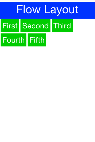
Flow layout lets the components “flow” horizontally and break a line when reaching the edge of the container. It’s the default layout manager for containers. Because it’s so flexible it’s also problematic as it can result in incorrect preferred size values for the parent Container. This can create a reflow issue, as a result we recommend using flow layout only for trivial cases. Avoid it for things such as text input etc. As the size of the text input can vary in runtime.
Form hi = new Form("Flow Layout", new FlowLayout());
hi.add(new Label("First")).
    add(new Label("Second")).
    add(new Label("Third")).
    add(new Label("Fourth")).
    add(new Label("Fifth"));
hi.show();
Flow layout also supports terse syntax shorthand such as:
Container flowLayout = FlowLayout.encloseIn(
        new Label("First"),
        new Label("Second"),
        new Label("Third"),
        new Label("Fourth"),
        new Label("Fifth")));
Flow layout can be aligned to the left (the default), to the center, or to the right. It can also be vertically aligned to the top (the default), middle (center), or bottom.
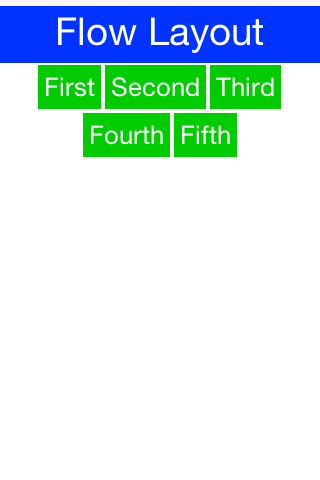
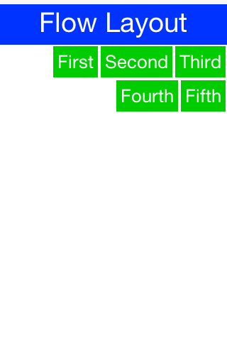
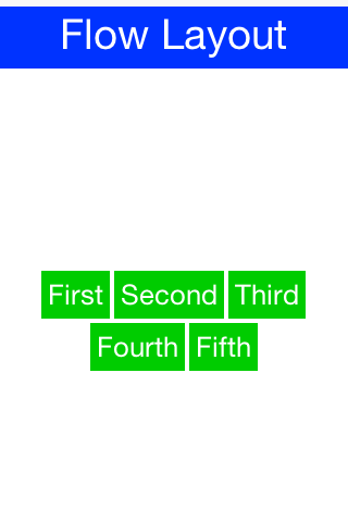
Components within the flow layout get their natural preferred size by default and are not stretched in any axis.
|
Tip
|
The natural sizing behavior is often used to prevent other layout managers from stretching components. E.g. if we have a border layout element in the south and we want it to keep its natural size instead of adding the element to the south directly we can wrap it using parent.add(BorderLayout.SOUTH, FlowLayout.encloseCenter(dontGrowThisComponent)).
|
BoxLayout places elements in a row (X_AXIS) or column (Y_AXIS) according to box orientation. Box is a very simple and predictable layout that serves as the "workhorse" of component lists in Codename One.
You can create a box layout Y using something like this:
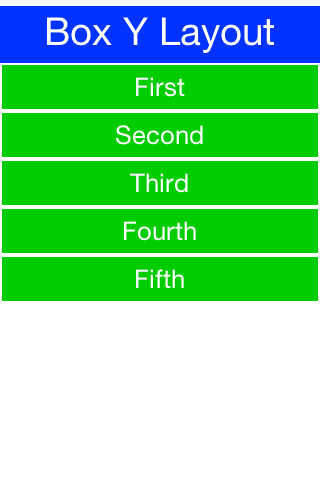
Form hi = new Form("Box Y Layout", new BoxLayout(BoxLayout.Y_AXIS));
hi.add(new Label("First")).
    add(new Label("Second")).
    add(new Label("Third")).
    add(new Label("Fourth")).
    add(new Label("Fifth"));
Which results in this
Box layout also supports a shorter terse notation which we use here to demonstrate the X axis box.
Container box = BoxLayout.encloseX(new Label("First"),
        new Label("Second"),
        new Label("Third"),
        new Label("Fourth"),
        new Label("Fifth")));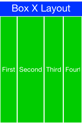
The box layout keeps the preferred size of its destination orientation and scales elements on the other axis. Specifically X_AXIS will keep the preferred width of the component while growing all the components vertically to match in size. Its Y_AXIS counterpart keeps the preferred height
while growing the components horizontally.
This behavior is very useful since it allows elements to align as they would all have the same size.
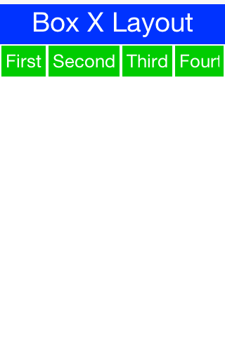
In some cases the growing behavior in the X axis is undesired, for these cases we can use the X_AXIS_NO_GROW variant.
|
Tip
|
FlowLayout vs. BoxLayout.X_AXIS
BoxLayout over FlowLayout as it acts more consistently in all situations. Another advantage of BoxLayout is the fact that it grows and thus aligns nicely
|
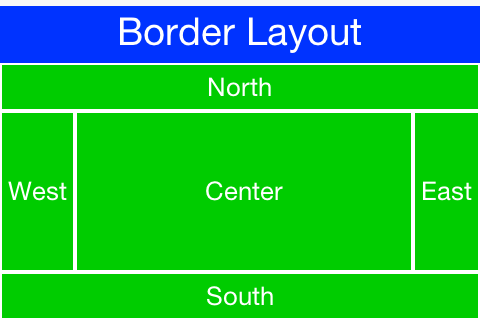
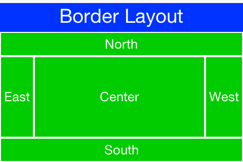
Border layout is quite unique. BorderLayout is a constraint-based layout that can place up to five components in one of the five positions: NORTH, SOUTH,
EAST, WEST or CENTER.
Form hi = new Form("Border Layout", new BorderLayout());
hi.add(BorderLayout.CENTER, new Label("Center")).
    add(BorderLayout.SOUTH, new Label("South")).
    add(BorderLayout.NORTH, new Label("North")).
    add(BorderLayout.EAST, new Label("East")).
    add(BorderLayout.WEST, new Label("West"));
hi.show();|
Tip
|
The Constraints are Included in the
You can use the static import of the CN classCN class and then the syntax can be add(SOUTH, new Label("South"))
|
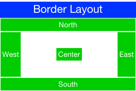
The layout always stretches the NORTH/SOUTH components on the X-axis to completely fill the container and the EAST/WEST components on the Y-axis. The center component is stretched to fill the remaining area by default. However, the setCenterBehavior allows us to manipulate the behavior of the center component so it is placed in the center without stretching.
E.g.:
Form hi = new Form("Border Layout", new BorderLayout());
((BorderLayout)hi.getLayout()).setCenterBehavior(BorderLayout.CENTER_BEHAVIOR_CENTER);
hi.add(BorderLayout.CENTER, new Label("Center")).
    add(BorderLayout.SOUTH, new Label("South")).
    add(BorderLayout.NORTH, new Label("North")).
    add(BorderLayout.EAST, new Label("East")).
    add(BorderLayout.WEST, new Label("West"));
hi.show();
Results in:
|
Note
|
Scrolling is Disabled in Border Layout
Because of its scaling behavior scrolling a border
layout makes no sense. Container implicitly blocks scrolling on a border layout, but it can scroll its parents/children
|
In the case of RTL the EAST and WEST values are implicitly reversed as shown in this image:
RTL (Right To Left) or Bidi (bi-directional) are common terms used for languages such as Hebrew, Arabic etc. These languages are written from the right to left direction hence all the UI needs to be “reversed”. Bidi denotes the fact that while the language is written from right to left, the numbers are still written in the other direction hence two directions…
|
Important
|
Preferred Size Still Matters
The preferred size of the center component doesn’t matter in border layout but the preferred size of the sides is. E.g. If you place an very large component in the SOUTH it will take up the entire screen and won’t leave room for anything
|
GridLayout accepts a predefined grid (rows/columns) and grants all components within it equal size based on the dimensions of the largest components.
|
Tip
|
The main use case for this layout is a grid of icons e.g. like one would see in the iPhone home screen |
If the number of rows * columns is smaller than the number of components added a new row is implicitly added to the grid.
However, if the number of components is smaller than available cells (won’t fill the last row) blank spaces will
be left in place.
In this example we can see that a 2x2 grid is used to add 5 elements, this results in an additional row that’s implicitly added turning the grid to a 3x2 grid implicitly and leaving one blank cell.
Form hi = new Form("Grid Layout 2x2", new GridLayout(2, 2));
hi.add(new Label("First")).
    add(new Label("Second")).
    add(new Label("Third")).
    add(new Label("Fourth")).
    add(new Label("Fifth"));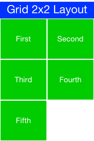
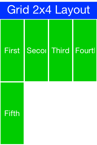
When we use a 2x4 size ratio we would see elements getting cropped as we do here. The grid layout uses the grid size first and doesn’t pay too much attention to the preferred size of the components it holds.
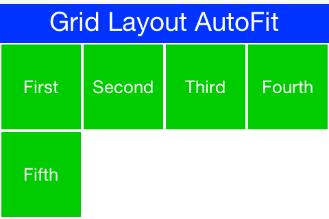
Grid also has an autoFit attribute that can be used to automatically calculate the column count based on available space and preferred width. This is really useful for working with UI’s where the device orientation might change.
There is also a terse syntax for working with a grid that has two versions, one that uses the "auto fit" option and another that accepts the number of columns. Here’s a sample of the terse syntax coupled with auto fit followed by screenshots of the same code in two orientations:
GridLayout.encloseIn(new Label("First"),
    new Label("Second"),
    new Label("Third"),
    new Label("Fourth"),
    new Label("Fifth")));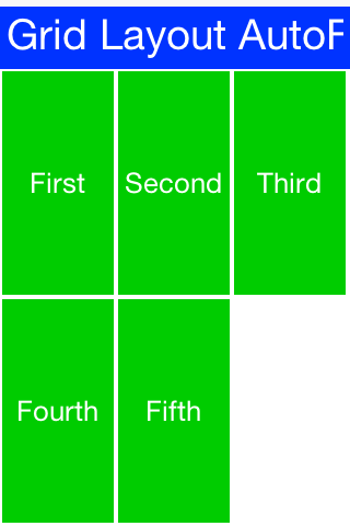
The TableLayout is a very elaborate constraint based layout manager that can arrange elements in rows/columns while defining constraints to control complex behavior such as spanning, alignment/weight etc.
|
Note
|
Note the Different Package for
The TableLayout
TableLayout is in the com.codename1.ui.table package and not in the layouts package.This is due to the fact that TableLayout was originally designed for the Table class.
|
Despite being constraint based the TableLayout isn’t strict about constraints and will implicitly add a constraint when one is missing. This is unlike the BorderLayout which will throw an exception in this case.
|
Warning
|
Unlike GridLayout TableLayout won’t implicitly add a row if the row/column count is incorrect
|
Form hi = new Form("Table Layout 2x2", new TableLayout(2, 2));
hi.add(new Label("First")).
    add(new Label("Second")).
    add(new Label("Third")).
    add(new Label("Fourth")).
    add(new Label("Fifth"));
hi.show();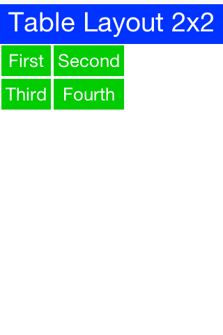
TableLayout supports the ability to grow the last column which can be enabled using the setGrowHorizontally method. You can also use a shortened terse syntax to construct a TableLayout however since the TableLayout is a constraint based layout you won’t be able to utilize its full power with this syntax.
The default usage of the encloseIn method below uses the setGrowHorizontally flag.
Container tl = TableLayout.encloseIn(2, new Label("First"),
                new Label("Second"),
                new Label("Third"),
                new Label("Fourth"),
                new Label("Fifth")));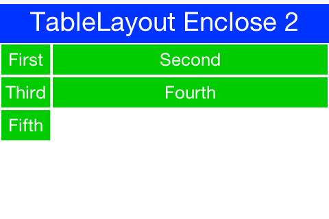
TableLayout.encloseIn() with default behavior of growing the last columnTableLayout is a beast, to truly appreciate it we need to use the constraint syntax which allows us to span, align and set width/height for the rows and columns.
TableLayout works with a Constraint instance that can communicate our intentions into the layout manager. Such constraints can include more than one attribute e.g. span and height.
|
Warning
|
TableLayout constraints can’t be reused for more than one component
|
The constraint class supports the following attributes
|
The column for the table cell. This defaults to -1 which will just place the component in the next available cell |
|
Similar to column, defaults to -1 as well |
|
The column width in percentages, -1 will use the preferred size. -2 for width will take up the rest of the available space |
|
Similar to width but doesn’t support the -2 value |
|
The cells that should be occupied horizontally defaults to 1 and can’t exceed the column count - current offset. |
|
Similar to spanHorizontal with the same limitations |
|
The horizontal alignment of the content within the cell, defaults to the special case -1 value to take up all the cell space can be either |
|
Similar to horizontalAlign can be one of |
|
Tip
|
You only need to set width/height to one cell in a column/row
|
The table layout constraint sample tries to demonstrate some of the unique things you can do with constraints.
TableLayout tl = new TableLayout(2, 3); // (1)
Form hi = new Form("Table Layout Cons", tl);
hi.setScrollable(false); // (2)
hi.add(tl.createConstraint(). // (3)
            widthPercentage(20),
                new Label("AAA")).

        add(tl.createConstraint(). // (4)
            horizontalSpan(2).
            heightPercentage(80).
            verticalAlign(Component.CENTER).
            horizontalAlign(Component.CENTER),
                new Label("Span H")).

        add(new Label("BBB")).

        add(tl.createConstraint().
            widthPercentage(60).
            heightPercentage(20),
                new Label("CCC")).

        add(tl.createConstraint().
            widthPercentage(20),
new Label("DDD"));-
We need the
TableLayoutinstance to create constraints. A constraint must be created for every component and must be used with the same layout as the parent container -
To get the look in the screenshot we need to turn scrolling off so the height constraint doesn’t take up available height. Otherwise it will miscalculate available height due to scrolling. You can scroll a
TableLayoutbut sizing will be different -
We create the constraint and instantly apply width to it. This is a shorthand syntax for the code block below
-
We can chain constraint creation using a call like this so multiple constraints apply to a single cell. Notice that we don’t span and set width on the same axis (horizontal span + width), doing something like that would create confusing behavior
Here is the full code mentioned in item 3:
TableLayout.Constraint cn = tl.createConstraint();
cn.setWidthPercentage(20);
hi.add(cn, new Label("AAA")).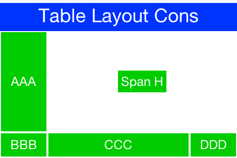
TextModeLayout is a unique layout manager. It acts like TableLayout on Android and like BoxLayout.Y_AXIS in other platforms. Internally it delegates to one of these two layout managers so in a sense it doesn’t have as much functionality of its own.
E.g. this is a sample usage of TextModeLayout:
TextModeLayout tl = new TextModeLayout(3, 2);
Form f = new Form("Pixel Perfect", tl);
TextComponent title = new TextComponent().label("Title");
TextComponent price = new TextComponent().label("Price");
TextComponent location = new TextComponent().label("Location");
TextComponent description = new TextComponent().label("Description").multiline(true);

f.add(tl.createConstraint().horizontalSpan(2), title);
f.add(tl.createConstraint().widthPercentage(30), price);
f.add(tl.createConstraint().widthPercentage(70), location);
f.add(tl.createConstraint().horizontalSpan(2), description);
f.setEditOnShow(title.getField());
f.show();As you can see from the code and samples above there is a lot going on under the hood. On Android we want a layout that’s similar to TableLayout so we can “pack” the entries. On iOS we want a box layout Y type of layout but we also want the labels/text to align properly…
The TextModeLayout isn’t really a layout as much as it is a delegate. When running in the Android mode (which we refer to as the “on top” mode) the layout is almost an exact synonym of TableLayout and in fact delegates to an underlying TableLayout. In fact there is a public final table instance within the layout that you can refer to directly…
There is one small difference between the TextModeLayout and the underlying TableLayout and that’s our choice to default to align entries to TOP with this mode.
|
Tip
|
Aligning to TOP is important for error handling for TextComponent in Android otherwise the entries “jump”
|
When working in the non-android environment we use a BoxLayout on the Y axis as the delegate. There’s one thing we do here that’s different from a default box layout: grouping. Grouping allows the labels to align by setting them to the same width, internally it invokes Component.setSameWidth(). Since text components hide the labels there is a special group method there that can be used. However, this is implicit with the TextModeLayout which is pretty cool.
TextModeLayout was created specifically for the TextComponent and InputComponent so check out the section about them in the components chapter.
When used without constraints, the LayeredLayout places the components in order one on top of the other and sizes them all to the size of the largest component. This is useful when trying to create an overlay on top of an existing component. E.g. an “x” button to allow removing the component.
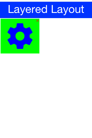
The code to generate this UI is slightly complex and contains very few relevant pieces. The only truly relevant piece is this block:
hi.add(LayeredLayout.encloseIn(settingsLabel,
        FlowLayout.encloseRight(close)));
We are doing three distinct things here:
-
We are adding a layered layout to the form
-
We are creating a layered layout and placing two components within. This would be the equivalent of just creating a
LayeredLayoutContainerand invokingaddtwice -
We use
FlowLayoutto position theXclose button in the right position
|
Note
|
When used without constraints, the layered layout sizes all components to the exact same size one on top of the other. It usually requires that we use another container within; in order to position the components correctly |
This is the full source of the example for completeness:
Form hi = new Form("Layered Layout");
int w = Math.min(Display.getInstance().getDisplayWidth(), Display.getInstance().getDisplayHeight());
Button settingsLabel = new Button("");
Style settingsStyle = settingsLabel.getAllStyles();
settingsStyle.setFgColor(0xff);
settingsStyle.setBorder(null);
settingsStyle.setBgColor(0xff00);
settingsStyle.setBgTransparency(255);
settingsStyle.setFont(settingsLabel.getUnselectedStyle().getFont().derive(w / 3, Font.STYLE_PLAIN));
FontImage.setMaterialIcon(settingsLabel, FontImage.MATERIAL_SETTINGS);
Button close = new Button("");
close.setUIID("Container");
close.getAllStyles().setFgColor(0xff0000);
FontImage.setMaterialIcon(close, FontImage.MATERIAL_CLOSE);
hi.add(LayeredLayout.encloseIn(settingsLabel,
        FlowLayout.encloseRight(close)));
Forms have a built in layered layout that you can access via getLayeredPane(), this allows you to overlay elements on top of the content pane.
The layered pane is used internally by components such as InteractionDialog, AutoComplete etc.
|
Tip
|
Codename One also includes a GlassPane that resides on top of the layered pane. Its useful if you just want to "draw" on top of elements but is harder to use than layered pane |
As of Codename One 3.7, LayeredLayout supports insets for its children. This effectively allows you to position child components precisely where you want them, relative to their container or siblings. This functionality forms the under-pinnings of the GUI Builder’s Auto-Layout mode.
As an example, suppose you wanted to position a button in the lower right corner of its container. This can be achieved with LayeredLayout as follows:
Container cnt = new Container(new LayeredLayout());
Button btn = new Button("Submit");
LayeredLayout ll = (LayeredLayout)cnt.getLayout();
cnt.add(btn);
ll.setInsets(btn, "auto 0 0 auto");
The result is:
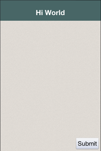
The only thing new here is this line:
ll.setInsets(btn, "auto 0 0 auto");This is called after btn has already been added to the container. It says that we want its insets to be "auto" on the top and left, and 0 on the right and bottom. This insets string follows the CSS notation of top right bottom left (i.e. start on top and go clockwise), and the values of each inset may be provided in pixels (px), millimetres (mm), percent (%), or the special "auto" value. Like CSS, you can also specify the insets using a 1, 2, or 3 values. E.g.
-
"1mm"- Sets 1mm insets on all sides. -
"1mm 2mm"- Sets 1mm insets on top and bottom; 2mm on left and right. -
"1mm 10% 2mm"- Sets 1mm on top, 10% on left and right, and 2mm on bottom. -
"1mm 2mm 1px 50%"- Sets 1mm on top, 2mm on right, 1px on bottom, and 50% on left.
The special "auto" inset indicates that it is a flexible inset. If all insets are set to "auto", then the component will be centered both horizontally and vertically inside its "bounding box".
|
Note
|
The "inset bounding box" is the containing box from which a component’s insets are measured. If the component’s insets are not linked to any other components, then its inset bounding box will be the inner bounds (i.e. taking padding into account) of the component’s parent container. |
If one inset is fixed (i.e. defined in px, mm, or %), and the opposite inset is "auto", then the "auto" inset will simply allow the component to be its preferred size. So if you want to position a component to be centered vertically, and 5mm from the left edge, you could do:
ll.setInsets(btn, "auto auto auto 5mm");Resulting in:
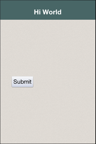
Move it to the right edge with:
ll.setInsets(btn, "auto 5mm auto auto");Percent (%) insets are calculated with respect to the inset bounding box. A 50% inset is measured as 50% of the length of the bounding box on the inset’s axis. E.g. A 50% inset on top would be 50% of the height of the inset bounding box. A 50% inset on the right would be 50% of the width of the inset bounding box.
A component’s position in a layered layout is determined as follows: (Assume that cmp is the component that we are positioning, and cnt is the container (In pseudo-code):
x = cnt.paddingLeft + cmp.calculatedInsetLeft + cmp.marginLeft
y = cnt.paddingTop + cmp.calculatedInsetTop + cmp.marginTop
w = cnt.width - cnt.verticalScroll.width - cnt.paddingRight - cmp.calculatedInsetRight - cmp.marginRight - x
h = cnt.height - cnt.horizontalScroll.height - cnt.paddingBottom - cmp.calculatedInsetBottom - cmp.marginBottom - y|
Important
|
The calculatedInsetXXX values here will be the same as the corresponding provided inset if the inset has no reference component. If it does have a reference component, then the calculated inset will depend on the position of the reference component.
|
If no inset is specified, then it is assumed to be 0. This ensures compatibility with designs that were created before layered layout supported insets.
If all you need to do is position a component relative to its parent container’s bounds, then mere insets provide you with sufficient vocabulary to achieve this. But most UIs are more complex than this and require another concept: reference components. In many cases you will want to position a component relative to another child of the same container. This is also supported.
For example, suppose I want to place a text field in the center of the form (both horizontally and vertically), and have a button placed beside it to the right. Positioning the text field is trivial (setInset(textField, "auto")), but there is no inset that we can provide that would position the button to the right of the text field. To accomplish our goal, we need to set the text field as a reference component of the button’s left inset - so that the button’s left inset is "linked" to the text field. Here is the syntax:
Container cnt = new Container(new LayeredLayout());
LayeredLayout ll = (LayeredLayout)cnt.getLayout();
Button btn = new Button("Submit");
TextField tf = new TextField();
cnt.add(tf).add(btn);
ll.setInsets(tf, "auto")
  .setInsets(btn, "auto auto auto 0")
  .setReferenceComponentLeft(btn, tf, 1f);
This would result in:
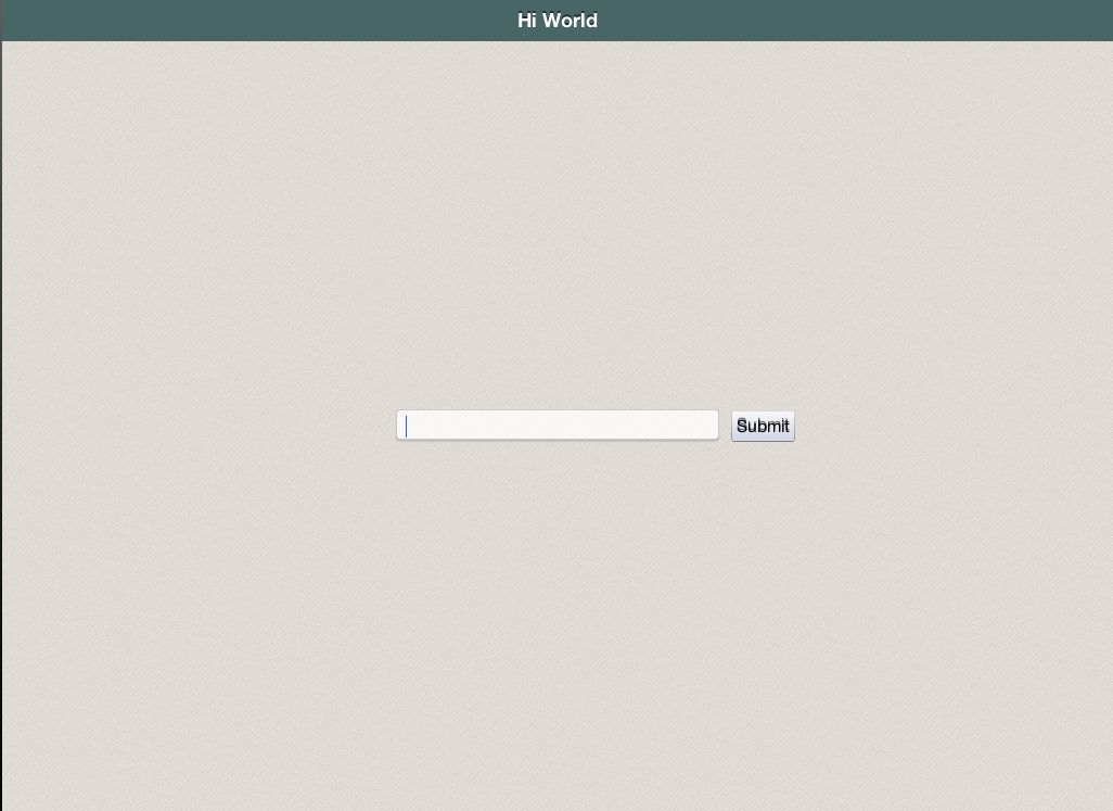
The two active lines here are the last two:
  .setInsets(btn, "auto auto auto 0") //(1)
.setReferenceComponentLeft(btn, tf, 1f); //(2)-
Sets the left inset on
btnto 0. -
Links
btn’s left inset to `tfso that it is measured from the text field. The third parameter (1.0) is the reference position. This will generally either be0(meaning the reference point is the left edge of the text field), or1(meaning the reference point is the right edge of the text field). In this case we set a reference position of1.0because we want the button to be aligned to the text field’s right edge.
|
Note
|
The reference position is defined as the distance, expressed as a fraction of the reference component’s length on the inset’s axis, between the reference component’s leading (outer) edge and the point from which the inset is measured. A reference position of 0 means that the inset is measured from the leading edge of the reference component. A value of 1.0 means that the inset is measured from the trailing edge of the reference component. A value of 0.5 means that the inset is measured from the center of the reference component. Etc… Any floating point value can be used. The designer currently only makes use of 0 and 1. |
The definition above may make reference components and reference position seem more complex than it is. Some examples:
-
For a top inset:
-
referencePosition == 0 ⇒ the inset is measured from the top edge of the reference component.
-
referencePosition == 1 ⇒ the inset is measured from the bottom edge of the reference component.
-
-
For a bottom inset:
-
referencePosition == 0 ⇒ the inset is measured from the bottom edge of the reference component.
-
referencePosition == 1 ⇒ the inset is measured from the top edge of the reference component.
-
-
For a left inset:
-
referencePosition == 0 ⇒ the inset is measured from the left edge of the reference component.
-
referencePosition == 1 ⇒ the inset is measured from the right edge of the reference component.
-
-
For a right inset:
-
referencePosition == 0 ⇒ the inset is measured from the right edge of the reference component.
-
referencePosition == 1 ⇒ the inset is measured from the left edge of the reference component.
-
Codename One allows placing components one on top of the other and we commonly use layered layout to do that. The form class has a builtin Container that resides in a layer on top of the content pane of the form.
When you add an element to a form it implicitly goes into the content pane. However, you can use getLayeredPane() and add any Component there. Such a Component will appear above the content pane. Notice that this layer resides below the title area (on the Y axis) and won’t draw on top of that.
When Codename One introduced the layered pane it was instantly useful. However, its popularity caused conflicts. Two separate pieces of code using the layered pane could easily collide with one another. Codename One solved it with getLayeredPane(Class c, boolean top). This method allocates a layer for a specific class within the layered pane. This way if two different classes use this method instead of the getLayeredPane() method they won’t collide. Each will get its own container in a layered layout within the layered pane seamlessly. The top flag indicates whether we want the layer to be the top most or bottom most layer within the layered pane (assuming it wasn’t created already). This allows you to place a layer that can appear above or below the already installed layers.
We only make use of the layered pane in this book but there are two additional layers on top of it. The form layered pane is identical to the layered pane but spans the entire height of the Form (including the title area). As a result the form layered pane is slower as it needs to handle some special cases to support this functionality.
The glass pane is the top most layer, unlike the layered pane it’s purely a graphical layer. You can only draw on the glass pane with a Painter instance and a Graphics object. You can’t add components into that layer.
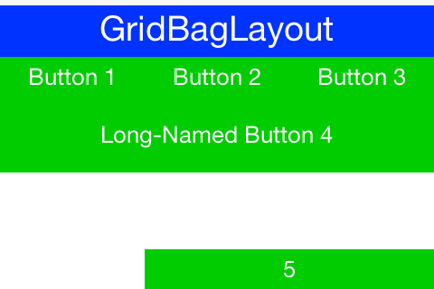
GridBagLayout was introduced to simplify the process of porting existing Swing/AWT code with a more familiar API. The API for this layout is problematic as it was designed for AWT/Swing where styles were unavailable. As a result it has its own insets API instead of using elements such as padding/margin.
Our recommendation is to use Table which is just as powerful but has better Codename One integration.
To demonstrate GridBagLayout we ported the sample from the Java tutorial to Codename One.
Button button;
hi.setLayout(new GridBagLayout());
GridBagConstraints c = new GridBagConstraints();
//natural height, maximum width
c.fill = GridBagConstraints.HORIZONTAL;
button = new Button("Button 1");
c.weightx = 0.5;
c.fill = GridBagConstraints.HORIZONTAL;
c.gridx = 0;
c.gridy = 0;
hi.addComponent(c, button);

button = new Button("Button 2");
c.fill = GridBagConstraints.HORIZONTAL;
c.weightx = 0.5;
c.gridx = 1;
c.gridy = 0;
hi.addComponent(c, button);

button = new Button("Button 3");
c.fill = GridBagConstraints.HORIZONTAL;
c.weightx = 0.5;
c.gridx = 2;
c.gridy = 0;
hi.addComponent(c, button);

button = new Button("Long-Named Button 4");
c.fill = GridBagConstraints.HORIZONTAL;
c.ipady = 40;      //make this component tall
c.weightx = 0.0;
c.gridwidth = 3;
c.gridx = 0;
c.gridy = 1;
hi.addComponent(c, button);

button = new Button("5");
c.fill = GridBagConstraints.HORIZONTAL;
c.ipady = 0;       //reset to default
c.weighty = 1.0;   //request any extra vertical space
c.anchor = GridBagConstraints.PAGE_END; //bottom of space
c.insets = new Insets(10,0,0,0);  //top padding
c.gridx = 1;       //aligned with button 2
c.gridwidth = 2;   //2 columns wide
c.gridy = 2;       //third row
hi.addComponent(c, button);
Notice that because of the way gridbag works we didn’t provide any terse syntax API for it although it should be possible.
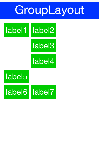
GroupLayout is a layout that would be familiar to the users of the NetBeans GUI builder (Matisse). Its a layout manager that’s really hard to use for manual coding but is powerful for some elaborate use cases. Although MiGLayout and LayeredLayout might be superior options.
It was originally added during the LWUIT days as part of an internal attempt to port Matisse to LWUIT. It’s still useful to this day as developers copy and paste Matisse code into Codename One and produce very elaborate layouts with drag and drop.
Since the layout is based on an older version of GroupLayout some things need to be adapted in the code or you should use the special "compatibility" library for Matisse to get better interaction. We also recommend tweaking Matisse to use import statements instead of full package names, that way if you use Label just changing the awt import to a Codename One import will make it use work for Codenmae One’s Label.
Unlike any other layout manager GroupLayout adds the components into the container instead of the standard API. This works nicely for GUI builder code but as you can see from this sample it doesn’t make the code very readable:
Form hi = new Form("GroupLayout");

Label label1 = new Label();
Label label2 = new Label();
Label label3 = new Label();
Label label4 = new Label();
Label label5 = new Label();
Label label6 = new Label();
Label label7 = new Label();

label1.setText("label1");

label2.setText("label2");

label3.setText("label3");

label4.setText("label4");

label5.setText("label5");

label6.setText("label6");

label7.setText("label7");

GroupLayout layout = new GroupLayout(hi.getContentPane());
hi.setLayout(layout);
layout.setHorizontalGroup(
    layout.createParallelGroup(GroupLayout.LEADING)
    .add(layout.createSequentialGroup()
        .addContainerGap()
        .add(layout.createParallelGroup(GroupLayout.LEADING)
            .add(layout.createSequentialGroup()
                .add(label1, GroupLayout.PREFERRED_SIZE, GroupLayout.DEFAULT_SIZE, GroupLayout.PREFERRED_SIZE)
                .addPreferredGap(LayoutStyle.RELATED)
                .add(layout.createParallelGroup(GroupLayout.LEADING)
                    .add(label4, GroupLayout.PREFERRED_SIZE, GroupLayout.DEFAULT_SIZE, GroupLayout.PREFERRED_SIZE)
                    .add(label3, GroupLayout.PREFERRED_SIZE, GroupLayout.DEFAULT_SIZE, GroupLayout.PREFERRED_SIZE)
                    .add(label2, GroupLayout.PREFERRED_SIZE, GroupLayout.DEFAULT_SIZE, GroupLayout.PREFERRED_SIZE)))
            .add(label5, GroupLayout.PREFERRED_SIZE, GroupLayout.DEFAULT_SIZE, GroupLayout.PREFERRED_SIZE)
            .add(layout.createSequentialGroup()
                .add(label6, GroupLayout.PREFERRED_SIZE, GroupLayout.DEFAULT_SIZE, GroupLayout.PREFERRED_SIZE)
                .addPreferredGap(LayoutStyle.RELATED)
                .add(label7, GroupLayout.PREFERRED_SIZE, GroupLayout.DEFAULT_SIZE, GroupLayout.PREFERRED_SIZE)))
        .addContainerGap(296, Short.MAX_VALUE))
);
layout.setVerticalGroup(
    layout.createParallelGroup(GroupLayout.LEADING)
    .add(layout.createSequentialGroup()
        .addContainerGap()
        .add(layout.createParallelGroup(GroupLayout.TRAILING)
            .add(label2, GroupLayout.PREFERRED_SIZE, GroupLayout.DEFAULT_SIZE, GroupLayout.PREFERRED_SIZE)
            .add(label1, GroupLayout.PREFERRED_SIZE, GroupLayout.DEFAULT_SIZE, GroupLayout.PREFERRED_SIZE))
        .addPreferredGap(LayoutStyle.RELATED)
        .add(label3, GroupLayout.PREFERRED_SIZE, GroupLayout.DEFAULT_SIZE, GroupLayout.PREFERRED_SIZE)
        .addPreferredGap(LayoutStyle.RELATED)
        .add(label4, GroupLayout.PREFERRED_SIZE, GroupLayout.DEFAULT_SIZE, GroupLayout.PREFERRED_SIZE)
        .addPreferredGap(LayoutStyle.RELATED)
        .add(label5, GroupLayout.PREFERRED_SIZE, GroupLayout.DEFAULT_SIZE, GroupLayout.PREFERRED_SIZE)
        .addPreferredGap(LayoutStyle.RELATED)
        .add(layout.createParallelGroup(GroupLayout.LEADING)
            .add(label6, GroupLayout.PREFERRED_SIZE, GroupLayout.DEFAULT_SIZE, GroupLayout.PREFERRED_SIZE)
            .add(label7, GroupLayout.PREFERRED_SIZE, GroupLayout.DEFAULT_SIZE, GroupLayout.PREFERRED_SIZE))
        .addContainerGap(150, Short.MAX_VALUE))
);
If you are porting newer Matisse code there are simple changes you can do:
-
Change
addComponenttoadd -
Change
addGrouptoadd -
Remove references to
ComponentPlacementand referenceLayoutStyledirectly
MigLayout is a popular cross platform layout manager that was ported to Codename One from Swing.
|
Warning
|
MiG is still considered experimental so proceed with caution! The API was deprecated to serve as a warning of its experimental status. |
The best reference for MiG would probably be its quick start guide (PDF link). As a reference we ported one of the samples from that PDF to Codename One:
Form hi = new Form("MigLayout", new MigLayout("fillx,insets 0"));

hi.add(new Label("First")).
    add("span 2 2", new Label("Second")).  // The component will span 2x2 cells.
    add("wrap", new Label("Third")).      // Wrap to next row
    add(new Label("Forth")).
    add("wrap", new Label("Fifth")).    // Note that it "jumps over" the occupied cells.
    add(new Label("Sixth")).
    add(new Label("Seventh"));
hi.show();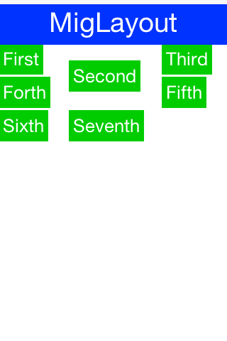
It should be reasonably easy to port MiG code but you should notice the following:
-
MiG handles a lot of the spacing/padding/margin issues that are missing in Swing/AWT. With Codename One styles we have the padding and margin which are probably a better way to do a lot of the things that MiG does
-
The
addmethod in Codename One can be changed as shown in the sample above. -
The constraint argument for Coedname One
addcalls appears before theComponentinstance.
Next we need to introduce you to 3 important terms in Codename One: Theme, Style and UIID.
Themes are very similar conceptually to CSS, in fact they can be created with CSS syntax as we’ll discuss soon. The various Codename One ports ship with a native theme representing the appearance of the native OS UI elements. Every Codename One application has its own theme that derives the native theme and overrides behavior within it.
If the native theme has a button defined, we can override properties of that button in our theme. This allows us to customize the look while retaining some native appearances. This works by merging the themes to one big theme where our application theme overrides the definitions of the native theme. This is pretty similar to the cascading aspect of CSS if you are familiar with that.
Themes consist of a set of UIID definitions. Every component in Codename One has a UIID associated with it. UIID stands for User Interface Identifier. This UIID connects the theme to a specific component. A UIID maps to CSS classes if you are familiar with that concept. However, Codename One doesn’t support the complex CSS selector syntax options as those can impact runtime performance.
E.g. see this code where:
nameText.setUIID("Label");This is a text field component (user input field) but it will look like a Label.
Effectively we told the text field that it should use the UIID of Label when it’s drawing itself. It’s very common to do tricks like that in Codename One. E.g. button.setUIID("Label") would make a button appear like a label and allow us to track clicks on a “Label”.
The UIID’s translate the theme elements into a set of Style objects. These Style objects get their initial values from the theme but can be further manipulated after the fact. So if I want to make the text field’s foreground color red I could use this code:
nameText.getAllStyles().setFgColor(0xff0000);The color is in hexadecimal RRGGBB format so 0xff00 would be green and 0xff0000 would be red.
getAllStyles() returns a Style object but why do we need “all” styles?
Each component can have one of 4 states and each state has a Style object. This means we can have 4 style objects per Component:
-
Unselected — used when a component isn’t touched and doesn’t have focus. You can get that object with
getUnselectedStyle(). -
Selected — used when a component is touched or if focus is drawn for non-touch devices. You can get that object with
getSelectedStyle(). -
Pressed — used when a component is pressed. Notice it’s only applicable to buttons and button subclasses usually. You can get that object with
getPressedStyle(). -
Disabled — used when a component is disabled. You can get that object with
getDisabledStyle().
The getAllStyles() method returns a special case Style object that lets you set the values of all 4 styles from one class so the code before would be equivalent to invoking all 4 setFgColor methods. However, getAllStyles() only works for setting properties not for getting them!
|
Warning
|
Don’t use
getStyle() for manipulationgetStyle() returns the current Style object which means it will behave inconsistently. The paint method uses getStyle() as it draws the current state of the Component but other code should avoid that method. Use the specific methods instead: getUnselectedStyle(), getSelectedStyle(), getPressedStyle(), getDisabledStyle() and getAllStyles()
|
As you can see, it’s a bit of a hassle to change styles from code which is why the theme is so appealing.
A theme allows the designer to define the styles externally via a set of UIID’s (User Interface ID’s), the themes are created via the Codename One Designer tool and allow developers to separate the look of the component from the application logic.
|
Tip
|
You can customize the theme using CSS which we’ll discuss a bit later |
The theme is stored in the theme.res file in the src root of the project. We load the theme file using this line of code in the init(Object) method in the main class of the application:
theme = UIManager.initFirstTheme("/theme");This code is shorthand for resource file loading and for the installation of theme. You could technically have more than one theme in a resource file at which point you could use initNamedTheme() instead. The resource file is a special file format that includes inside it several features:
-
Themes
-
Images
-
Localization Bundles
-
Data files
It also includes some legacy features such as the old GUI builder.
|
Note
|
We’re mentioning the legacy GUI builder for reference only we won’t discuss the old GUI builders in this guide |
We can open the designer tool by double clicking the res file. The UI can be a bit overwhelming at first so I’ll try to walk slowly through the steps.
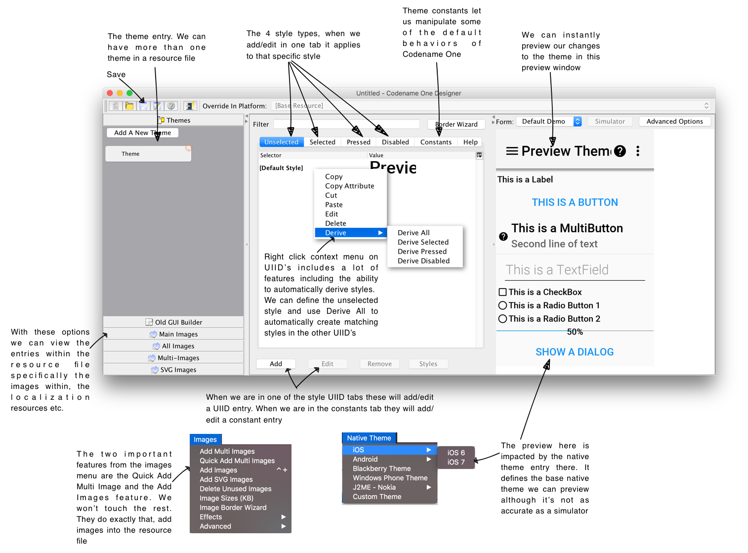
|
Tip
|
If you end up using CSS this section isn’t crucial but it’s worth browsing through as using the designer tool helps in tracking CSS issues |
There are two crucial features in this tool: theming and images.
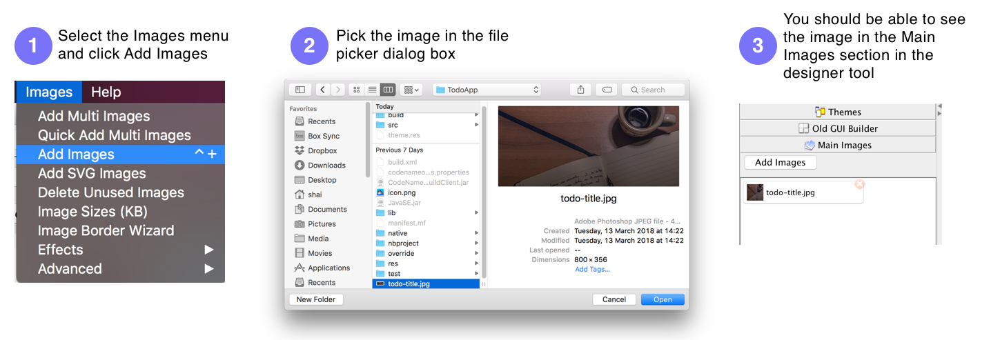
You will notice there is more than one type of image. We’ll discuss multi-images later.
Now we can go back to the theme view in the designer tool and press the Add button in the Unselected tab. Notice we have tabs for every state of Style as well as a special tabl for theme constants that we will discuss later.

After pressing that button we should see something that looks like this:
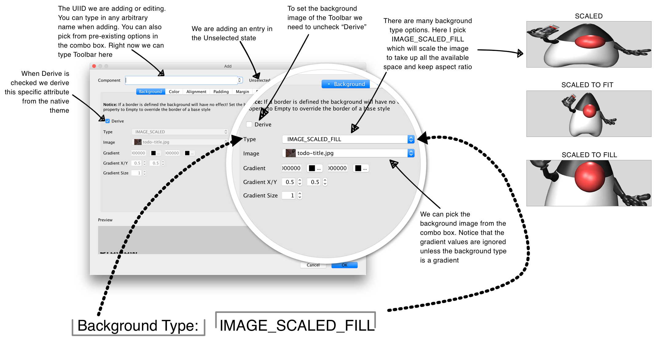
|
Tip
|
Don’t forget to press the save button in the designer after making changes |
There are several other options in the add theme entry dialog. Lets go over them and review what we should do for each tab in this UI:
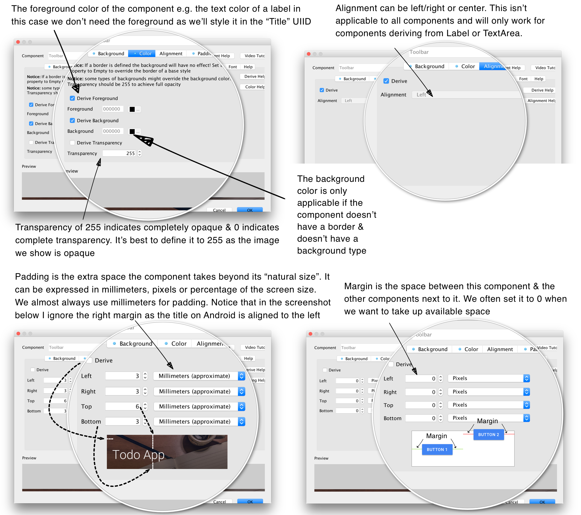
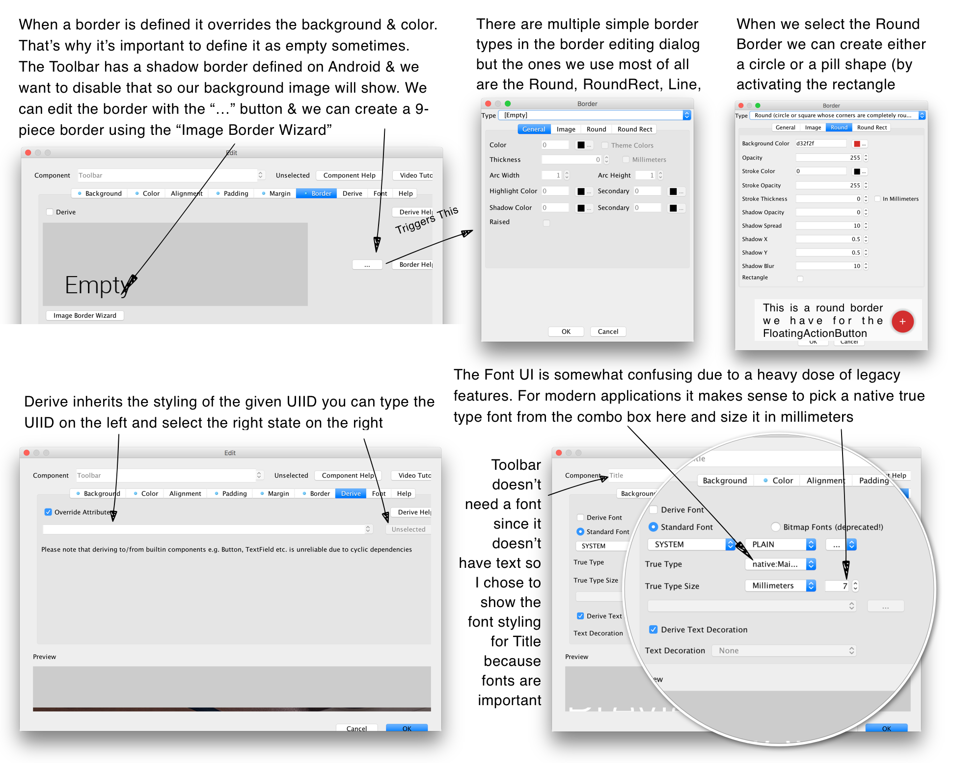
We’ll cover these options in-depth in the theming chapters.
By default Codename One applications are created with a theme that derives from the builtin OS native theme. You can add additional themes into the resource file by pressing the Add A New Theme button. You can also create multiple themes and ship them with your app or download them dynamically.
You can create a theme from scratch or customize one of the Codename one themes to any look you desire.
|
Tip
|
To preview the look of your theme in the various platforms use the Native Theme menu option in the designer |
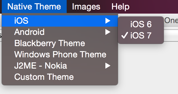
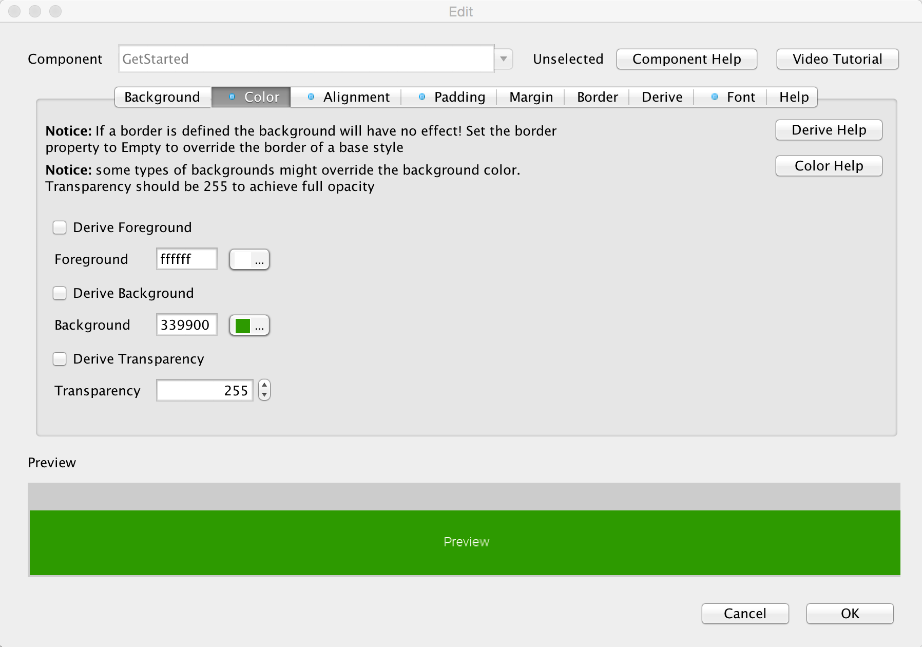
You can easily create deep customizations that span across all themes by adding a UIID or changing an existing UIID. E.g. looking at the getting started application that ships with the plugin you will notice a green button. This button is defined using the "GetStarted" UIID which is defined within the designer as:
-
A green background
-
White foreground
-
A thin medium sized font
-
Center aligned text
-
A small amount of spacing between the text and the edges
To achieve the colors we define them in the color tab.
|
Important
|
We define the transparency to 255 which means the background will be a solid green color. This is important since the native OS’s might vary with the default value for background transparency so this should be defined explicitly |
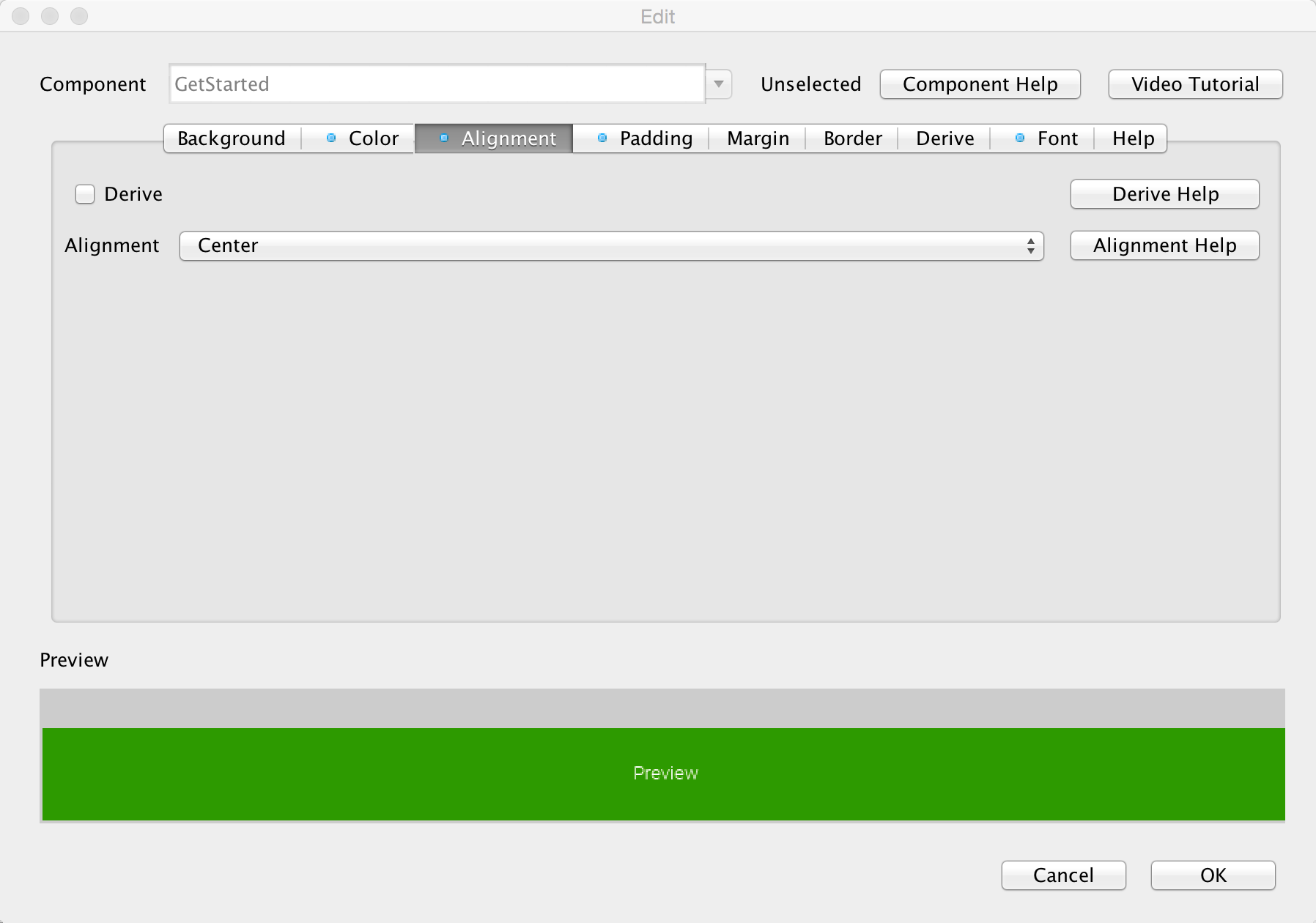
The alignment of the text is pretty simple, notice that the alignment style attribute applies to text and doesn’t apply to other elements. To align other elements we use layout manager logic.
Padding can be expressed in pixels, millimeters (approximate) or percentages of the screen size.
|
Tip
|
We recommend using millimeters for all measurements to keep the code portable for various device DPI’s. |
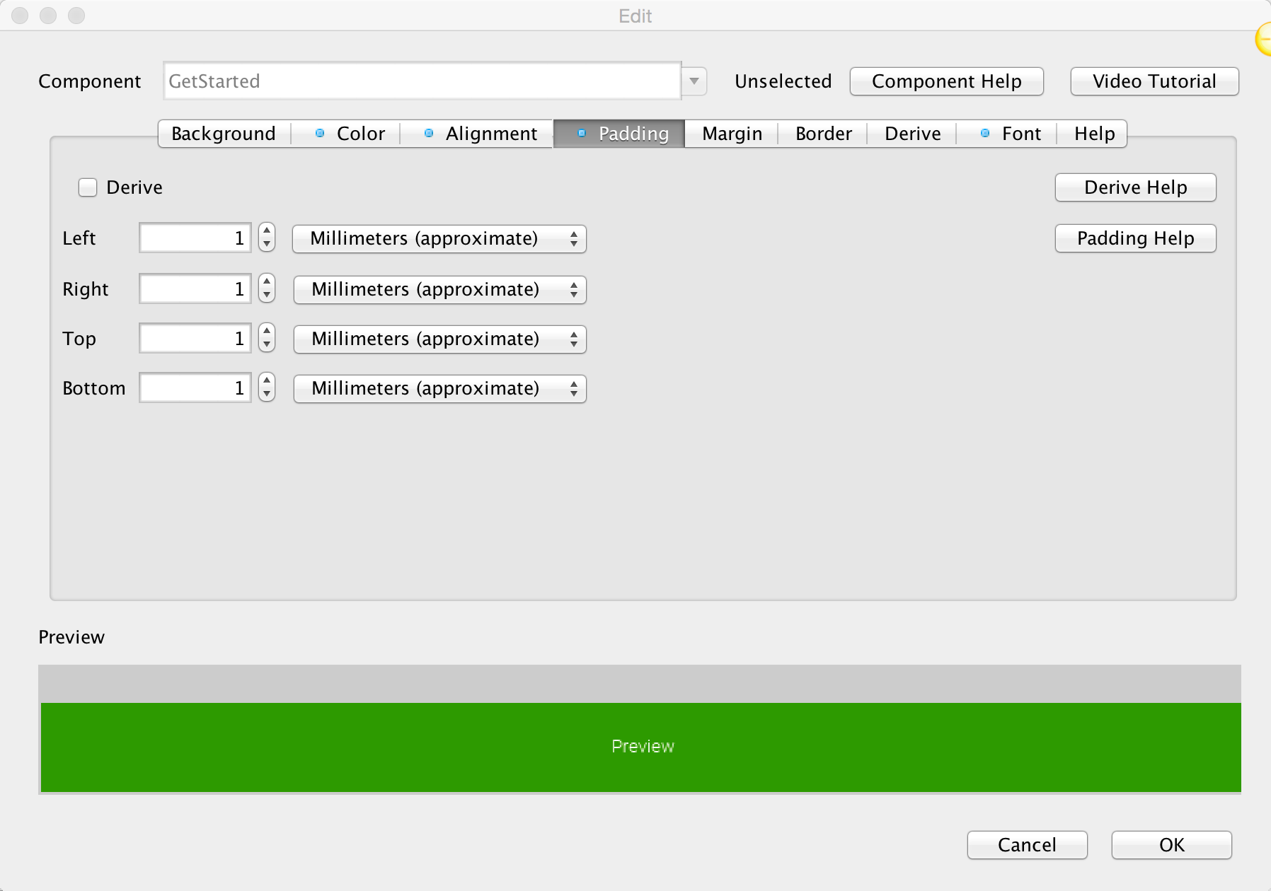
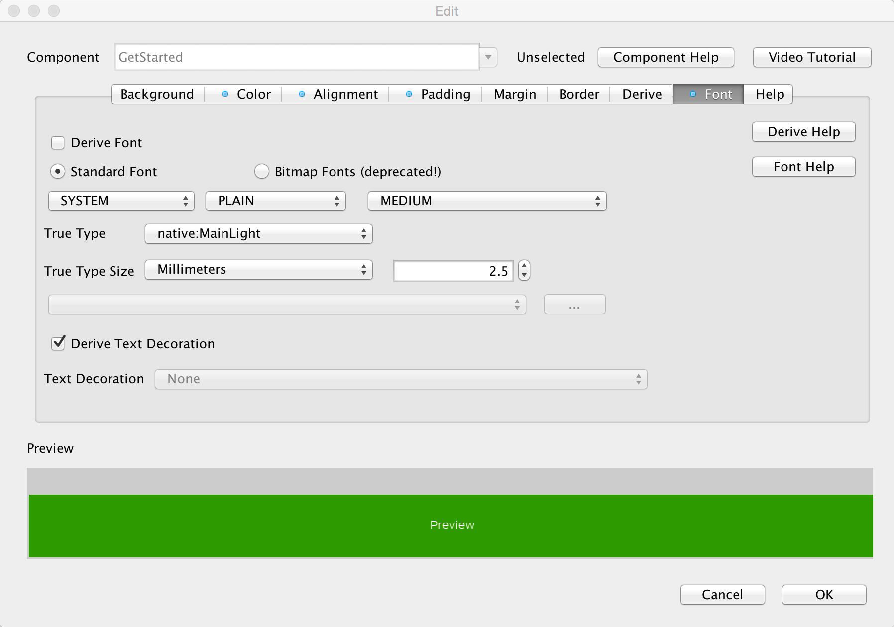
The font uses native OS light font but has a fallback for older OS’s that don’t support truetype fonts. The "True Type" font will be applicable for most modern OS’s. In the case of the "native:" fonts Android devices will use Roboto whereas iOS devices will use Helvetica Neue. You can supply your own TTF and work with that.
|
Important
|
Since Codename One cannot legally ship Helvetica Neue fonts the simulator will fallback to Roboto on PC’s. |
|
Warning
|
At the time of this writing the desktop/simulator version of the Roboto font doesn’t support many common character sets (languages). This will have no effect on an Android device where thenative font works properly. |
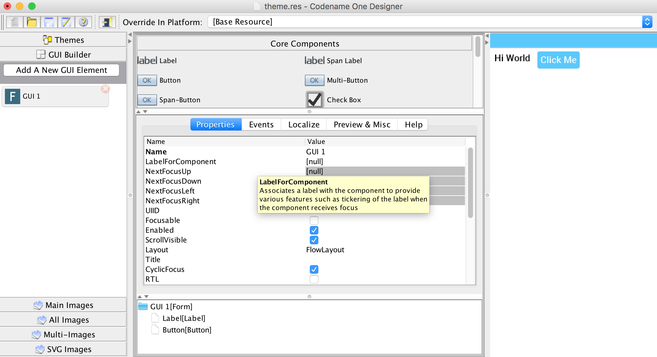
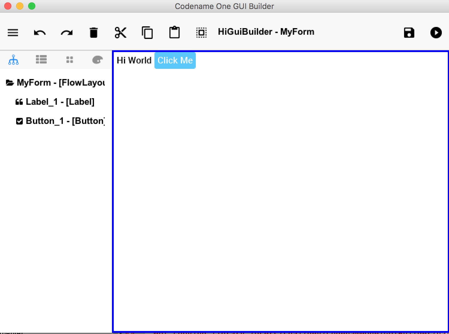
The GUI builder allows us to arrange components visually within a UI using drag and drop, property sheets etc. With the GUI builder we can create elaborate, rich UI’s without writing the layout code.
The original old GUI builder has its roots in our work at Sun Microsystems, it was developed directly into the designer tool and stores it’s data as part of the resource file. When creating an application for the old GUI builder you must define it as a "visual application" which will make it use the old GUI builder.
The roots of this GUI builder are pretty old. When we initially built it we still had to support feature phones with 2mb of RAM and the iPad wasn’t announced yet. Due to that we picked an architecture that made sense for those phones with a greater focus on navigation and resource usage. Newer mobile applications are rivaling desktop applications in complexity and in those situations the old GUI builder doesn’t make as much sense
The old GUI builder is in the designer tool, it’s a Swing application that includes the theme design etc.
It generates a Statemachine class that contains all the main user GUI interaction code.
The new GUI builder is a standalone application that you launch from the right click menu by selecting a form as explained below. Here are screenshots of both to help you differentiate:
As of version 3.7, the new GUI Builder also supports an auto layout mode which allows you to freely position and resize components on a canvas. This mode is now the default for new GUI forms, and it always uses LayeredLayout as the root layout manager.
Creating a hello world app in the new GUI builder is actually pretty trivial, you need to start with a regular handcoded application. Not a GUI builder application as it refers to the old GUI builder!
This is the exact same hello world application we created before…
Following are the instructions for creating a form and launching the GUI builder. While they are similar there are minor IDE differences. Usage of the GUI builder is identical in all IDE’s as the GUI builder is a separate application.
In NetBeans you need to follow these 4 steps:
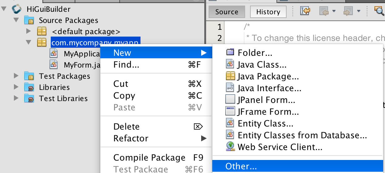

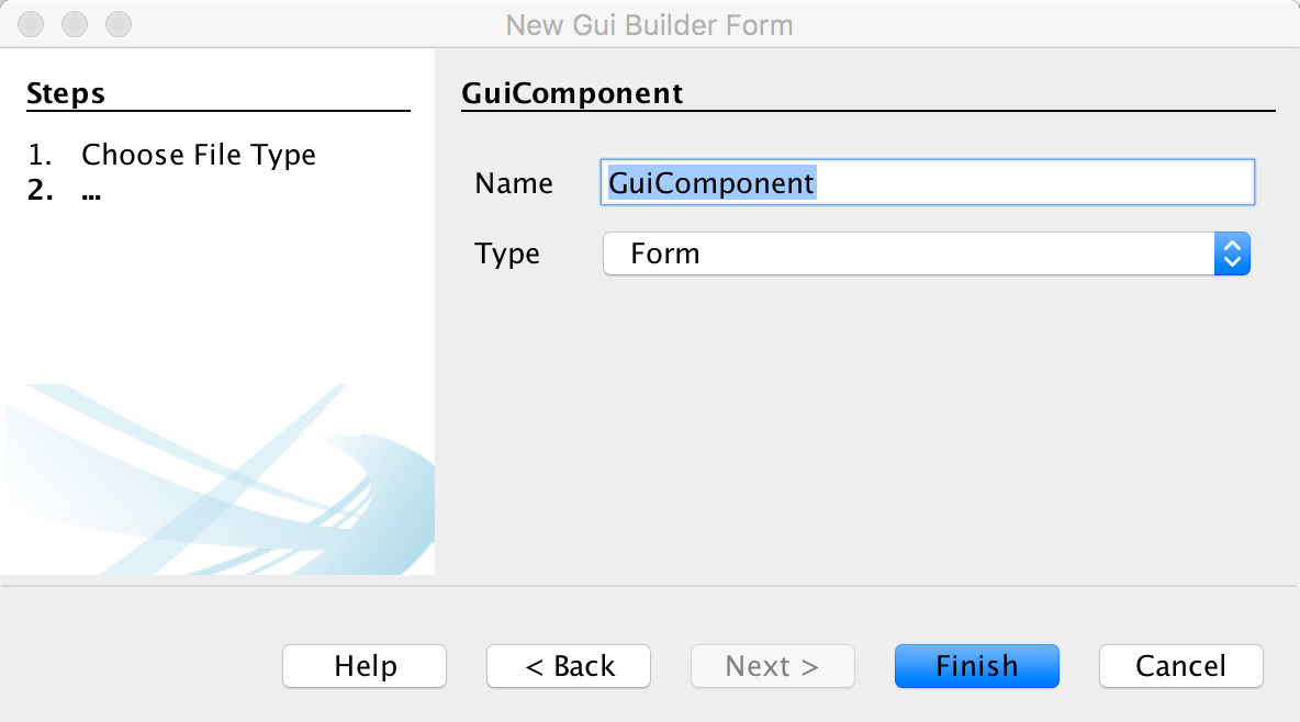

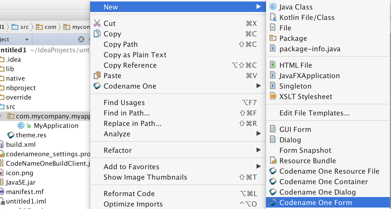
In IntelliJ you need to follow these 3 steps:

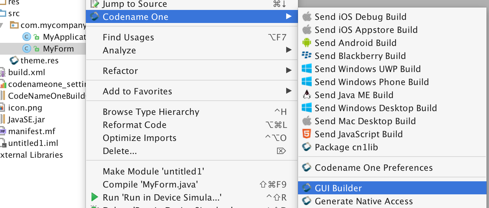
In Eclipse you need to follow these 4 steps:
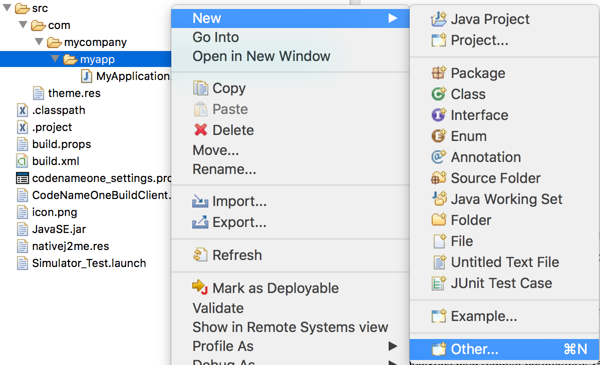
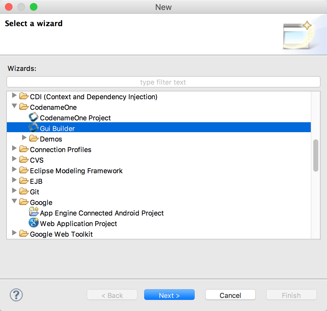
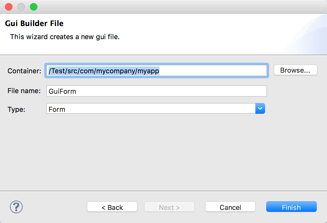
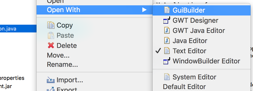
Notice that the UI of the new GUIBuilder might change in various ways but the basic concepts should remain the same.
The GUI builder is controlled via it’s main toolbar, notice that your changes will only be applied when you click the Save button on the right:
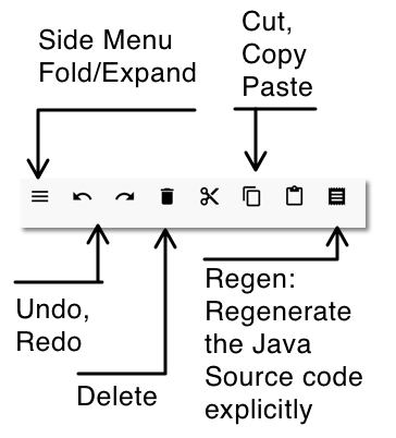
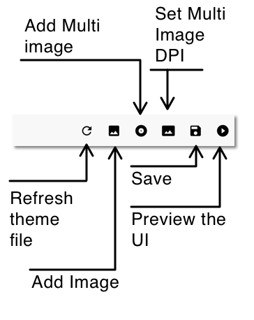
The main UI includes four important parts:
-
Main Form — This is where we place the components of the UI we are building
-
Component Tree — This is a logical representation of the component hierarchy within the Main Form. It’s often easier to pick a component from the tree rather than the form itself
-
Property Inspector — When we select an element in the tree or form we can see its details here. We can then edit the various details of the component in this area
-
Palette — Components can be dragged from the palette to the Main Form and placed in the UI

We’ll start by selecting the Component Palette and dragging a button into the UI:
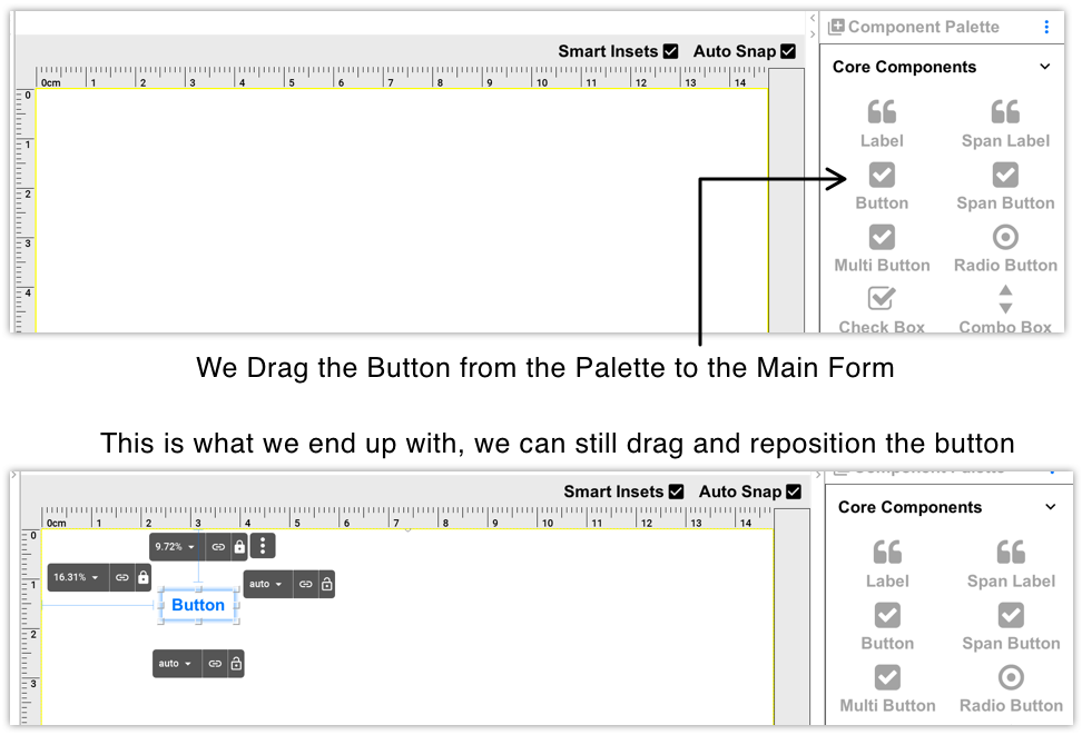
By default the auto-layout mode of the GUI builder uses layered layout to position components. Sides can be bound to a component or to the Form. We then use distance units to determine the binding behavior. The GUI builder tries to be "smart" and guesses your intention as you drag the components along.
When you select the component you placed you can edit the properties of that component:

There are five property sheets per component:
-
Basic Settings — These include the basic configuration for a component e.g. name, icon, text etc.
-
Advanced Settings — These include features that aren’t as common such as icon gap, mask etc.
-
Events — By clicking a button in this tab a method will be added to the source file with a callback matching your component name. This will let you bind an event to a button, text field etc.
-
Layout — You can determine the layout of the parent
Containerhere. For auto-layout this should stay as layered layout, however you can nest other layout types in here -
Style Customization — This isn’t a theme, if you want to customize the style of a specific component you can do that through this UI. The theme works on a more global/reusable level and this is designed for a specific component only
For things like setting the text on the component we can use a convenient "long click" on the component to edit the text in place as such:

|
Important
|
As of now, the events tab was completely disabled. See issue 3593 for more info. |
When a component supports broadcasting events you can bind such events by selecting it, then selecting the events tab and clicking the button matching the event type
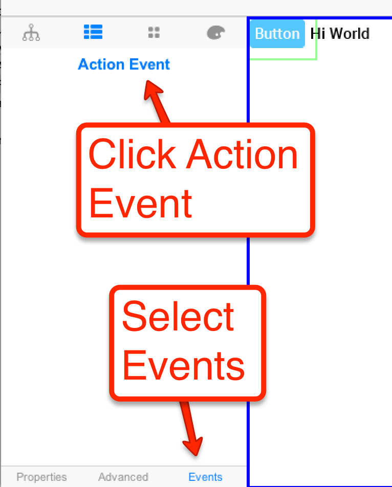
Once an event is bound the IDE will open to the event code e.g.:
public void onButton_1ActionEvent(com.codename1.ui.events.ActionEvent ev) {
}|
Tip
|
Some IDE’s only generate the project source code after you explicitly build the project so if your code needs to access variables etc. try building first |
Within the code you can access all the GUI components you defined with the gui_ prefix e.g. Button_1 from the
UI is represented as:
private com.codename1.ui.Button gui_Button_1 = new com.codename1.ui.Button();Saving the project generates an XML file representing the UI into the res directory in the project, the GUI file is created in a matching hierarchy in the project under the res/guibuilder directory:
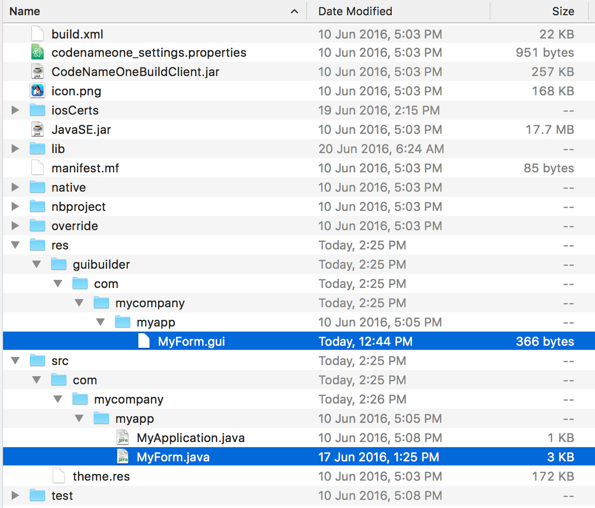
|
Important
|
If you refactor (rename or move) the java file it’s connection with the GUI file will break. You need to move/rename both |
You can edit the GUI file directly but changes won’t map into the GUI builder unless you reopen it. These files should be under version control as they are the main files that change. The GUI builder file for the button and label code looks like this:
<?xml version="1.0" encoding="UTF-8"?>

<component type="Form" layout="FlowLayout" flowLayoutFillRows="false" flowLayoutAlign="1"
flowLayoutValign="0"  title="My new title" name="MyForm">
  <component type="Button" text="Button" name="Button_1" actionEvent="true">
  </component>
  <component type="Label" text="Hi World" name="Label_1">
  </component>
</component>
This format is relatively simple and is roughly the same format used by the old GUI builder which makes the migration to the new GUI builder possible. This file triggers the following Java source file:
package com.mycompany.myapp;

/**
 * GUI builder created Form
 *
 * @author shai
 */
public class MyForm extends com.codename1.ui.Form {

    public MyForm() {
        this(com.codename1.ui.util.Resources.getGlobalResources());
    }

    public MyForm(com.codename1.ui.util.Resources resourceObjectInstance) {
        initGuiBuilderComponents(resourceObjectInstance);
    }

//-- DON'T EDIT BELOW THIS LINE!!!
    private com.codename1.ui.Label gui_Label_1 = new com.codename1.ui.Label();
    private com.codename1.ui.Button gui_Button_1 = new com.codename1.ui.Button();


// <editor-fold defaultstate="collapsed" desc="Generated Code">
    private void guiBuilderBindComponentListeners() {
        EventCallbackClass callback = new EventCallbackClass();
        gui_Button_1.addActionListener(callback);
    }

    class EventCallbackClass implements com.codename1.ui.events.ActionListener, com.codename1.ui.events.DataChangedListener {
        private com.codename1.ui.Component cmp;
        public EventCallbackClass(com.codename1.ui.Component cmp) {
            this.cmp = cmp;
        }

        public EventCallbackClass() {
        }

        public void actionPerformed(com.codename1.ui.events.ActionEvent ev) {
            com.codename1.ui.Component sourceComponent = ev.getComponent();
            if(sourceComponent.getParent().getLeadParent() != null) {
                sourceComponent = sourceComponent.getParent().getLeadParent();
            }

            if(sourceComponent == gui_Button_1) {
                onButton_1ActionEvent(ev);
            }
        }

        public void dataChanged(int type, int index) {
        }
    }
    private void initGuiBuilderComponents(com.codename1.ui.util.Resources resourceObjectInstance) {
        guiBuilderBindComponentListeners();
        setLayout(new com.codename1.ui.layouts.FlowLayout());
        setTitle("My new title");
        setName("MyForm");
        addComponent(gui_Label_1);
        addComponent(gui_Button_1);
        gui_Label_1.setText("Hi World");
        gui_Label_1.setName("Label_1");
        gui_Button_1.setText("Click Me");
        gui_Button_1.setName("Button_1");
    }// </editor-fold>

//-- DON'T EDIT ABOVE THIS LINE!!!
    public void onButton_1ActionEvent(com.codename1.ui.events.ActionEvent ev) {
    }

}|
Warning
|
Don’t touch the code within the DON’T EDIT comments… |
The GUI builder uses the "magic comments" approach where code is generated into those areas to match the XML defined in the GUI builder. Various IDE’s generate that code at different times. Some will generate it when you run the app while others will generate it as you save the GUI in the builder.
You can write code freely within the class both by using the event mechanism, by writing code in the constructors or thru overriding functionality in the base class.
As of version 3.7, new forms created with the GUI Builder will use auto-layout mode. In this mode you can move and resize your components exactly as you see fit. You aren’t constrained to the positions dictated by the form’s layout manager.
|
Note
|
All forms designed in auto-layout mode use
Auto-Layout Mode is built upon the inset support in LayeredLayout. Component positioning uses insets and reference components, not absolute positioning
LayeredLayout
|
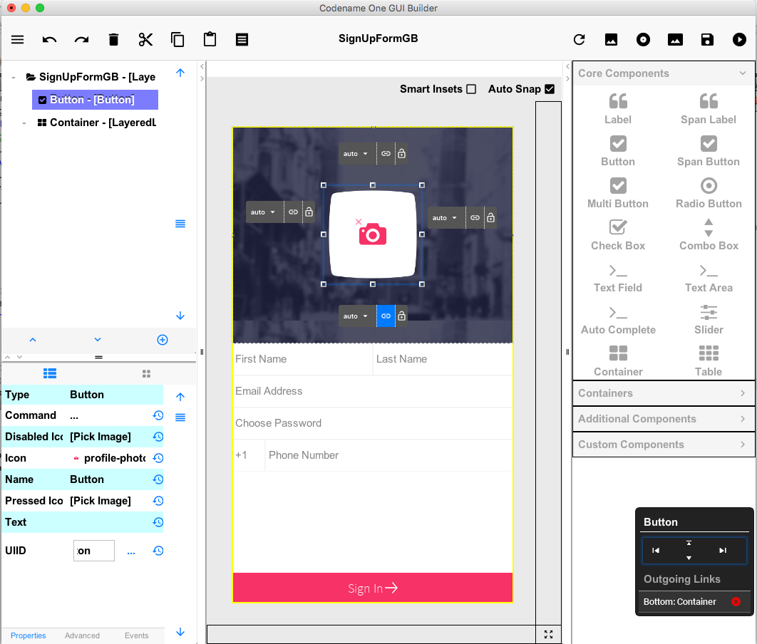
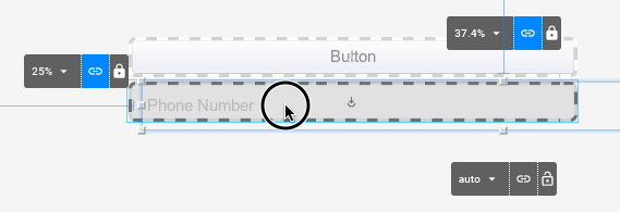
As an example, let’s drag a button onto a blank form and see what happens. The button will be "selected" initially after adding, it so you’ll see its outline, and resize handles for adjusting its size and position. You’ll also see four floating labels (above, below, to the left, and to the right) that show the corresponding side’s inset values and allow you to adjust them.

Press the mouse inside the bounds of the button and drag it around to reposition it. You will notice that the inset labels change to reflect the new inset values. If you drag the button close to the edge of the form, the corresponding inset value will change to millimetres. If you move farther away from the edge, it will change to percentage values.
Let’s take a closer look at the inset control (the inset controls are the black buttons that appear to the top, bottom, left, and right of the selected component).

Each control has three sections:
-
The inset value drop-down menu. This shows the current value of the inset (e.g. 0mm, 25%, auto, etc…). If you click on this, it will open a menu that will allow you to change the units. If the inset is currently in millimetres, it will have options for pixels, and percent. If the inset is in percent, it will have options for pixels and millimetres. Etc.. It also includes a text field to enter a an inset value explicitly.
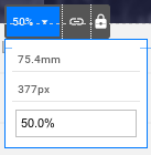
-
The "Link" Button
 - If the inset is linked to a reference component, then this button will be highlighted "blue", and hovering over it will highlight the reference component in the UI so that you can clearly see which component it is linked to. Clicking on this button will open a dialog that will allow you to "break" this link. You can drag this button over any component in the form to "link".
 -
The "Lock" Button"
 - This button allows you to toggle the inset between "flexible" (i.e. auto) and "fixed" (i.e. millimetres or percent).
Notice the "auto-snap" checkbox that appears in the top-right corner of the designer.

Auto-snap does exactly what it sounds like: It automatically snaps two components together when you drag them near each other. This is handy for linking components together without having to explicitly link them (using the "link" button). This feature is turned on by default. If auto-snap is turned off, you can still initiate a "snap" by holding down the ALT/Option key on your keyboard during the drag.
Beside the "auto-snap" checkbox is another checkbox named "Smart Insets".

Smart Inset uses some heuristics during a drag to try to determine how the insets should be linked. Currently the heuristics are quite basic (it tries to link to the nearest neighbor component in most cases), but we will be working on improving this for future releases. This feature is turned off by default while it is still being refined. The goal is to improve this to the point where it always makes the correct link choices - at which time you will be able to use the designer without having any knowledge of insets or reference components.
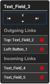
When a component is selected, you should see a black floating panel appear in the lower right of the screen.
This is the widget control pad, and it provides an alternative view of the component’s links. It also provides a useful list of incoming links (i.e. components that "depend on" this component’s positioning). In some cases, you may want to disconnect incoming links so that you can drag the component without affecting the position of dependent components.
This control pad also includes game-pad-like controls (up, down, left, right), that allow you to "tab" the component to the next guide in that direction. Tab positions exist at component edges in the form. This is useful for aligning components with each other.
-
Arrow Keys - Use the up/down/left/right arrow keys to nudge the currently selected component a little bit at a time. This is a convenient way to move the component to a position that is more precise than can easily be achieved with a mouse drag.
-
Arrow Keys + SHIFT - Hold down the SHIFT key while pressing an arrow key and it will "tab" the component to the next tab marker. The form has implicit tab markers at the edge of each component on the form.
-
ALT/Option Key + Click or Drag - Holding down the option/alt key while clicking or dragging a component will resulting in "snapping" behaviour even if auto-snap is turned off.
In some cases, you may need to add sub-containers to your form to aid in grouping your components together. You can drag a container onto your form using the "Container" palette item (under "Core Components"). The default layout the subcontainer will be LayeredLayout so that you are able to position components within the sub-container with precision, just like on the root container.
You can also change the layout of subcontainers to another classical layout manager (e.g. grid layout, box layout, etc..) and drag components directly into it just as you did with the old designer. This is very useful if parts of your form lend themselves. As an example, let’s drag a container onto the canvas that uses BoxLayout Y. (You can find this under the "Containers" section of the component palette).
Drag the button (that was previously on the form) over that container, and you should see a drop-zone become highlighted.

You can drop the button directly there. You can As you drag more components into the sub-container, you’ll see them automatically laid out vertically.
When designing a UI with the new designer it is very important that you periodically test the form’s "resizing" behavior so that you know how it will behave on different devices. Components may appear to be positioned correctly when the canvas is one size, but become out of whack when the container is resized. After nearly every manipulation you perform, it is good practice to drag the canvas resize tool (the button in the lower right corner of the designer) smaller and bigger so you can see how the positions are changed. If things grow out of whack, you may need to toggle an inset between fixed and auto, or add a link between some of the components so that the resizing behavior matches your expectations.
About This Guide
Introduction
Basics: Themes, Styles, Components & Layouts
Theme Basics
Advanced Theming
Working With The GUI Builder
The Components Of Codename One
Using ComponentSelector
Animations & Transitions
The EDT - Event Dispatch Thread
Monetization
Graphics, Drawing, Images & Fonts
Events
File-System,-Storage,-Network-&-Parsing
Miscellaneous Features
Performance, Size & Debugging
Advanced Topics/Under The Hood
Signing, Certificates & Provisioning
Appendix: Working With iOS
Appendix: Working with Mac OS X
Appendix: Working With Javascript
Appendix: Working With UWP
Security
cn1libs
Appendix: Casual Game Programming