Walkthrough Part 2
In Walkthrough Part 1 we discovered how Metrics, Events and Snapshots extracted from the AppDynamics Platform become available for offline data mining and archival use.
In this article, we’ll dig deep into application performance analysis with Snapshot data. When exploring as opposed to going into immediate triage, it can be beneficial to analyze code snapshots en masse.
In the Entity Details report (reviewed in Part One), we saw Oracle database slowdowns in the ECommerce application. Let’s learn more about those slowdowns.
The Snapshots report (Report\Snapshots.<Job File Name>.<Start Date and Time in yyyyMMddHHmm>.<Number Of Hours Spanned By Report>.xlsx) contains information about all Snapshots in a given time range, including:
- Snapshot summary
- Segments that Snapshots consist of, representing separate threads and/or executables
- Exit Calls in all Segments, such as database queries and HTTP calls
- Service Endpoints traversed by Segments, if configured
- Business Data (HTTP and Method Invocation Data Collectors) with context data about variables
- Call Graphs with detailed method timing
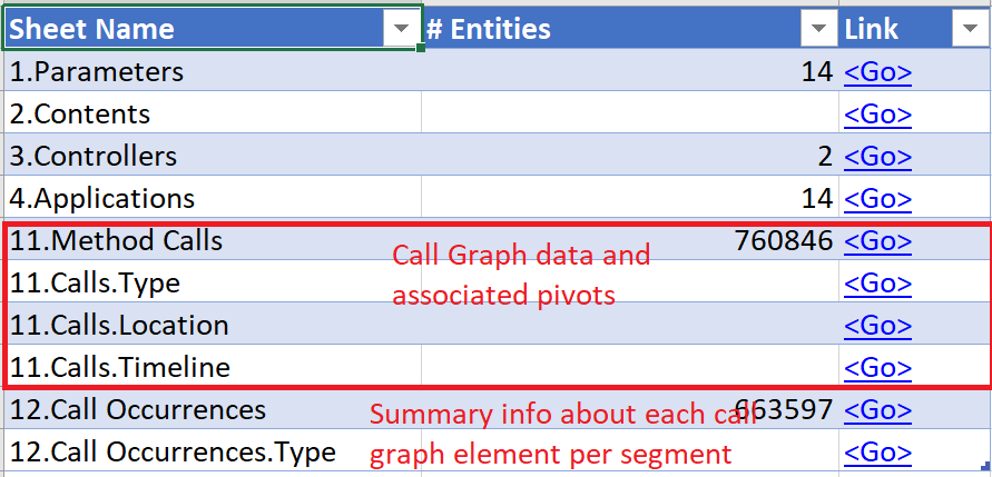
The Snapshots report table of contents sheet shows the vast amount of valuable data that has been captured by AppDynamics’ APM agents and sent to the AppDynamics Controller. There are 73K Snapshots available in this report, spread across 14 applications. It’s not practical to review them all individually, of course. This report, however, provides easy access to that data, letting you turn it into valuable insights:

Opening the 5.Snapshots.Type sheet and filtering it to Application (ApplicationName=ECommerce) and desired Business Transactions (BTName=Checkout and Checkout - Mobile), we see the Snapshot counts segmented by user experience:

Switching to the 5.Snapshots.Timeline sheet, we see the same data ordered by the event time stamp. In its collapsed state, the sheet shows very similar performance between the 7PM and 8PM time intervals:

Let’s expand the Hours column to include per-minute transaction activity. A new pattern emerges—a slowdown in the first 15 to 18 minutes of each hour:

In the Entity Details report from Part 1 of this series, we saw evidence that database calls to Oracle were causing slowdowns in application performance. Let’s find out exactly which queries are to blame.
Switching to the 7.Exit Calls.Type sheet, we again filter to Application (ApplicationName=ECommerce) and desired Business Transactions (BTName=Checkout and Checkout - Mobile). Immediately, we see the main offenders: first, a SQL statement calling the JDBC Backend (Oracle database); and second, a frequent web service call:

By taking a closer look at the 7.Exit Calls.Timeline sheet - filtered to the two Business Transactions we care about - we can confirm the time those activities occurred. Clearly, the database calls are the main culprit behind the regular hourly slowdowns:

Let’s do a wider cast here and use alternative exploration tools to review all Snapshot data in every Application, not just ECommerce.
Since the Snapshots report is provided in clean, well-formatted CSV files, we can easily analyze it using powerful data visualization utilities such as Tableau and Microsoft Power BI Studio.
With the same data we used in Excel, let’s create a scatter plot in Power BI, one that graphs all Exit Calls by call duration vs. frequency. The resulting data is filtered to show items > a one-second duration, and color-coded to the type of Exit Call. One simple screen shows us a summary of all 287K calls:
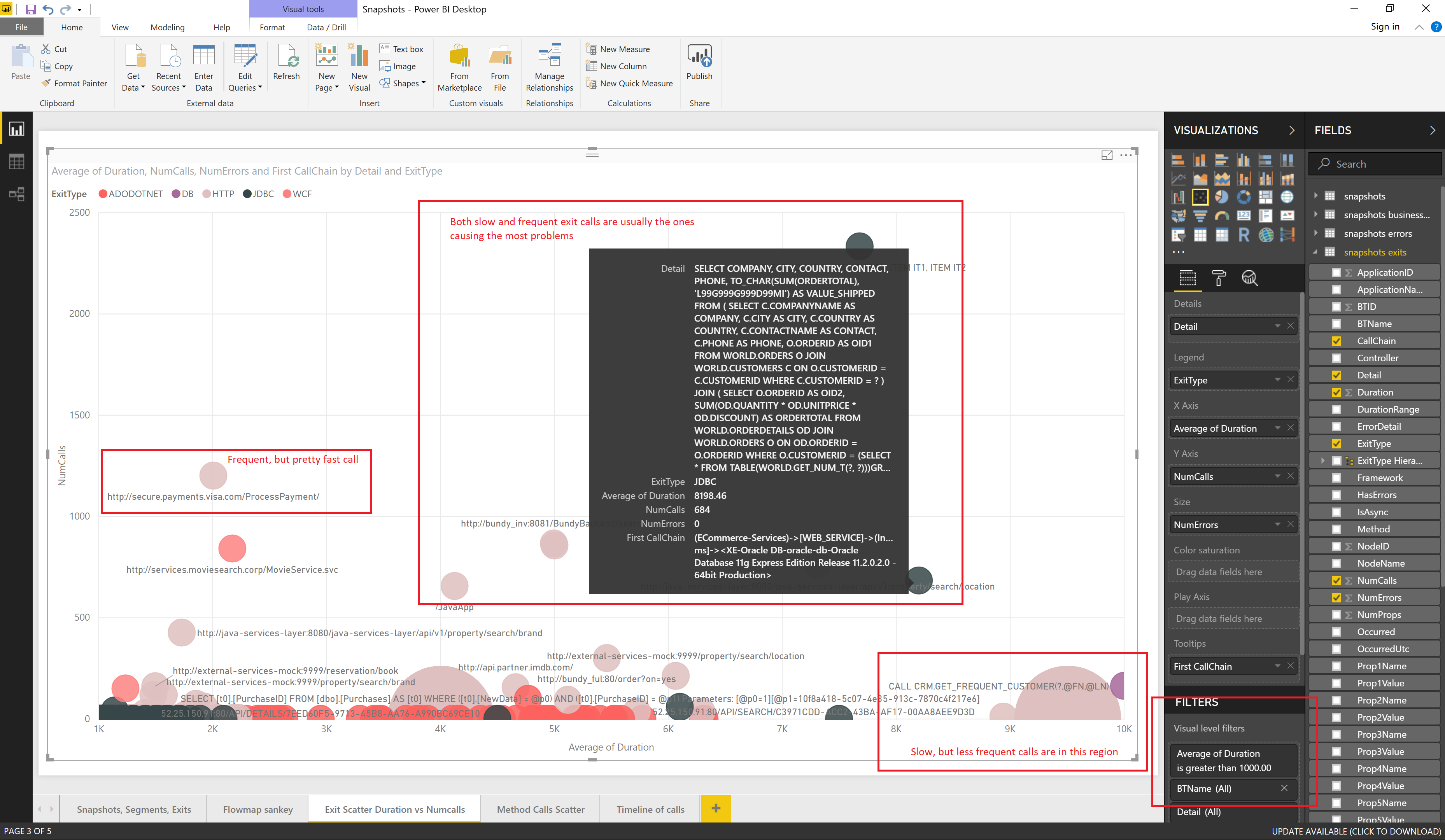
Let’s now look at the most frequent slow-offenders. By adding a filter (Number of Calls > 50 and Average Duration > 5000 ms.) we see that one HTTP and two database calls to a microservice are to blame for the majority of our slow calls across two Controllers and 14 Applications:

With just a few clicks, here is the same visualization in Tableau:

In AppDynamics APM monitoring, Call Graphs are often the most valuable component of Snapshots. Their detailed method call information is very beneficial for analyzing the performance of application code not directly related to database queries and HTTP calls.
AppDynamics DEXTER provides a Snapshot Method Calls report (Report\Snapshots.MethodCallLines<Job File Name>.<Start Date and Time in yyyyMMddHHmm>.<Number Of Hours Spanned By Report>.xlsx), allowing for aggregate call graph analysis. This added capability is beneficial, as the AppDynamics UI currently focuses on digging into individual snapshots.
Our data extraction resulted in a Method Calls report containing 760K call graph elements from 73K snapshots:
The 11.Calls.Type Excel sheet provides a drill-down PivotTable of method calls in all Snapshots, grouped by Business Transaction and call type and its associated Framework. AppDynamics DEXTER derives Framework from the class and method signature during the Transformation phase.
The report below shows the performance of each method in the specific namespace (Framework=com.appdynamics), which the ECommerce application produced in both the demo1 and demo2 Controllers:

We can also look at methods that fall into one of the 14 Execution Range "bucket" calculated by DEXTER. Here we remove everything faster than 100 ms:

Let’s also filter to just the "Checkout" Business Transaction and expand the PivotTable to give all the details. Looking at the method names in the FullName column of the PivotTable, it appears that all the methods are exit calls:

The same data, pivoted in another way in 11.Calls.Location Excel sheet, shows us which Frameworks contain the slowest performing methods. Below, we filter to "Checkout" Business Transaction and group all but the SPRING_BEAN call types. We see that the methods in the "com.appdynamicspilot (AppDynamics)" namespace are responsible for the majority of calls that consume execution time:

Let’s filter everything except for "com.appdynamics" and "com.appdynamicspilot" Frameworks, and filter out fast execution ranges. Here we see the offending methods: "raisePO", which sends many queries downstream, and "executeOracleQuery", which executes very slow SQL queries:

By loading the CSV files from our PivotTable into Microsoft Power BI, we can plot the 760K rows of Call Graph data in a single, compact, interactive scatter plot. Here we plot Execution time vs Frequency of Calls, and color-code by type of Framework, filtering to show only methods with an execution time > 50 ms.

One of the Method Call measurements created by AppDynamics DEXTER during the Transformation phase is ExecToHere, which is how long it takes in a given Snapshot to get to the specific call. That ExecToHere measurement is assigned to the size of the scatter plot bubble. The bigger the bubble, the later the method is executed during the application request.
If you have invested in the deployment and configuration of AppDynamics APM agents, you’ve seen the value that even a single Snapshot can provide when you’re diagnosing performance problems.
AppDynamics DEXTER provides access to all Snapshots, allowing you to turn your application data into valuable insights. In addition, you can analyze this data in popular data warehousing applications such as Power BI and Tableau, and combine it with additional data to produce your own reports.
Return to Getting Started
Return to Walkthrough Part 1
Proceed to Walkthrough Part 3